
When you're always working on such interesting projects for other people, it can be surprisingly hard to get round to your own home. There's always something more pressing, another project that needs your attention, another client whose home deserves the best of you right now.
The honest truth is that being an interior designer doesn't mean your own home gets done first. Client projects always take priority, and your own rooms have a habit of waiting. But there's something rather wonderful about that. Every decision in this house has had time to breathe. Nothing was rushed, nothing was a compromise, and I still love every single thing I've chosen.
After twenty years in my 1916 Edwardian semi in Devon – with its generous windows and 270cm ceilings – here's a room by room tour of what I did, why I did it, and what I'd tell a client in exactly the same situation.
The Entrance Hall
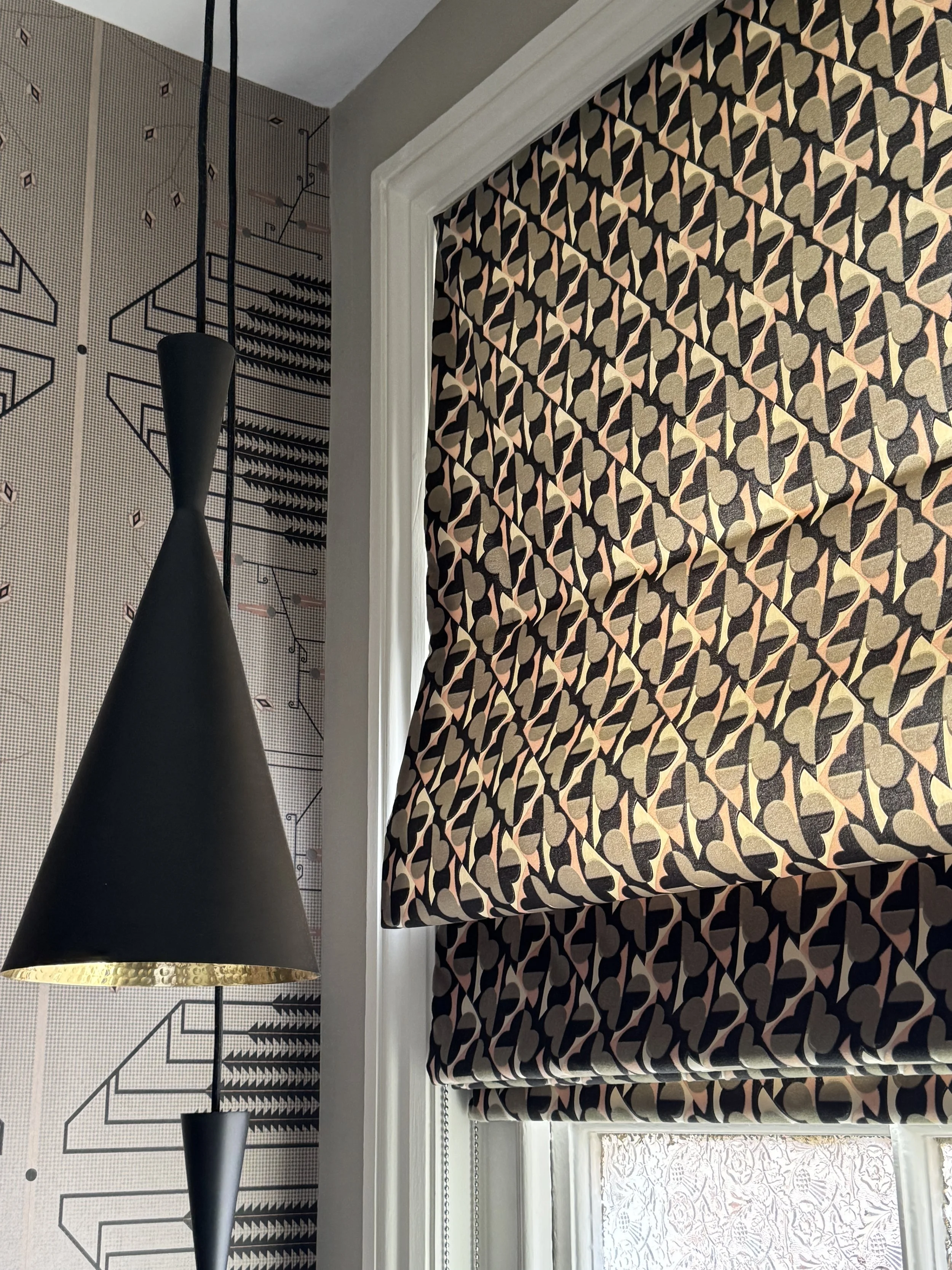
This is the window that stops people in their tracks the moment they walk through the front door – which is exactly what a hall window treatment should do.
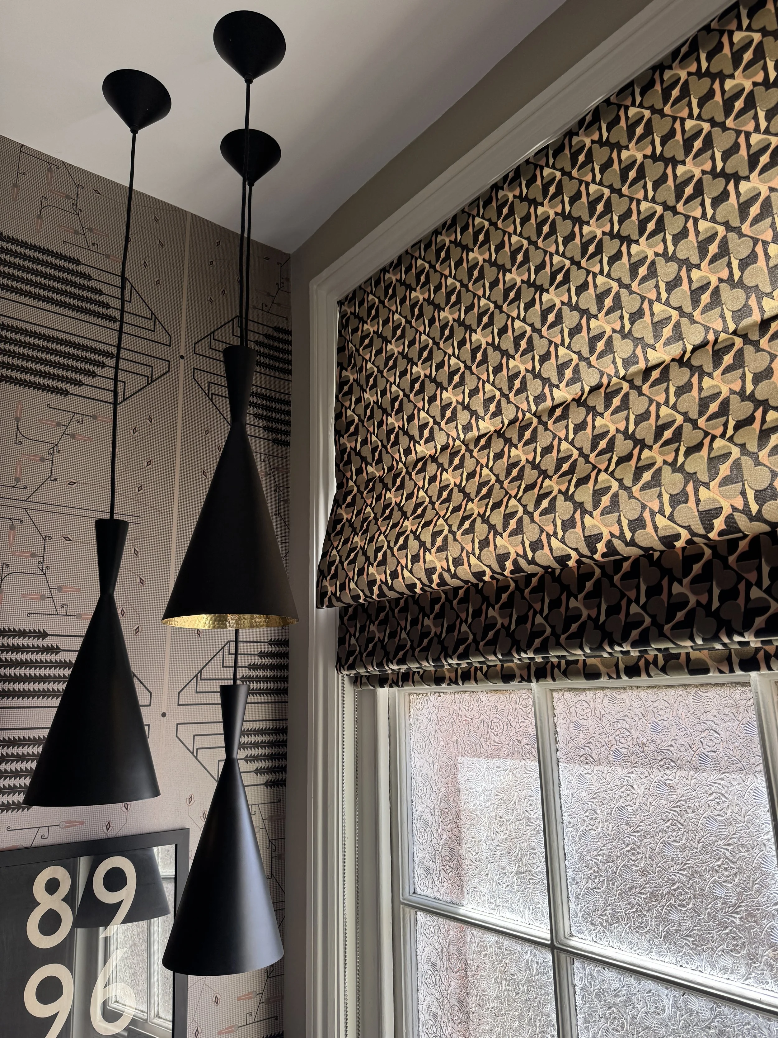
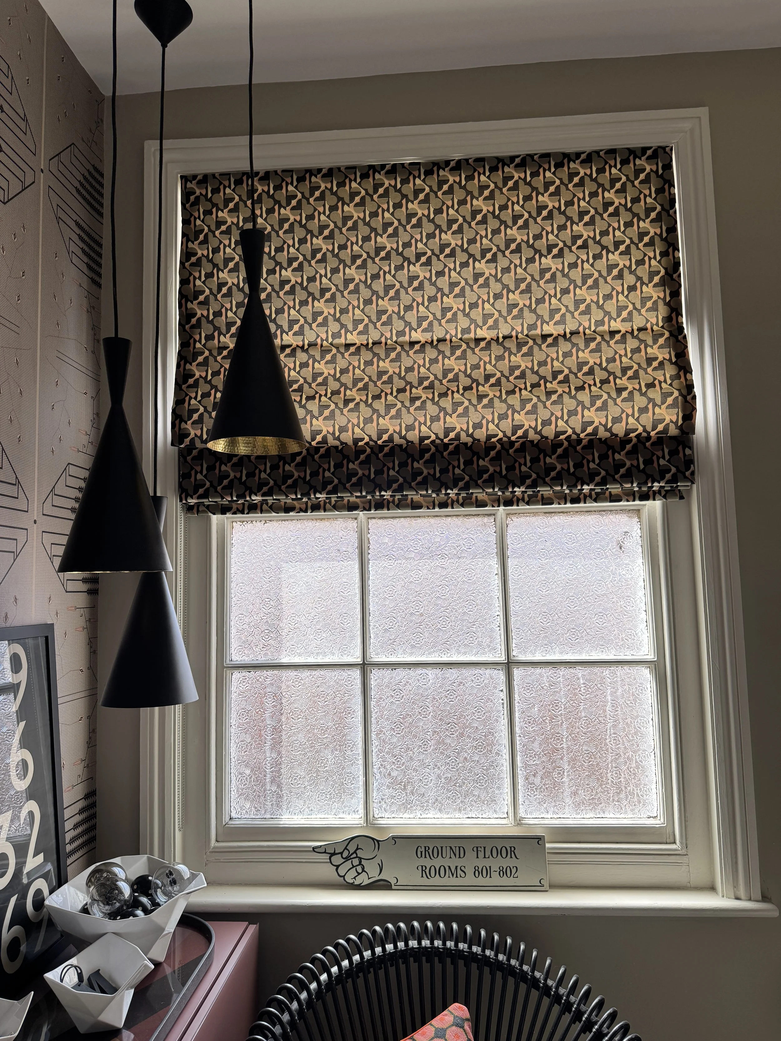
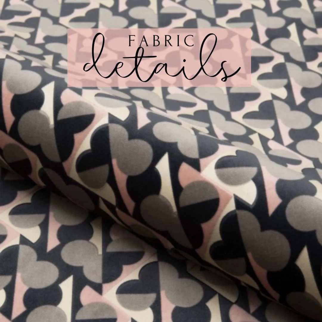
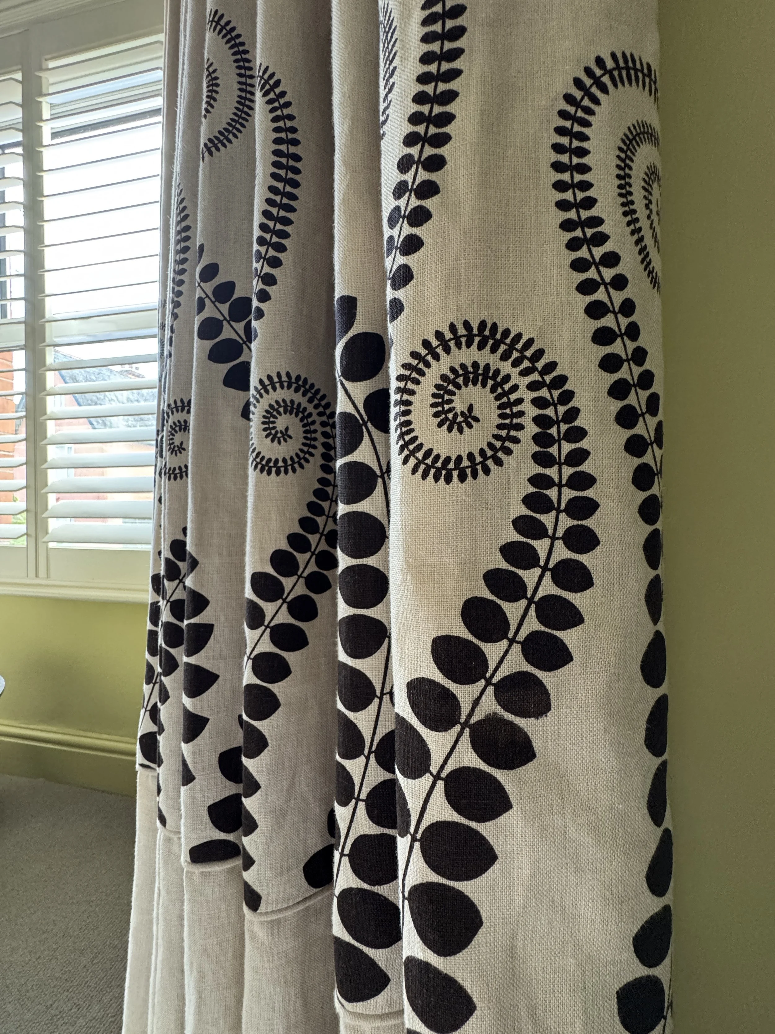
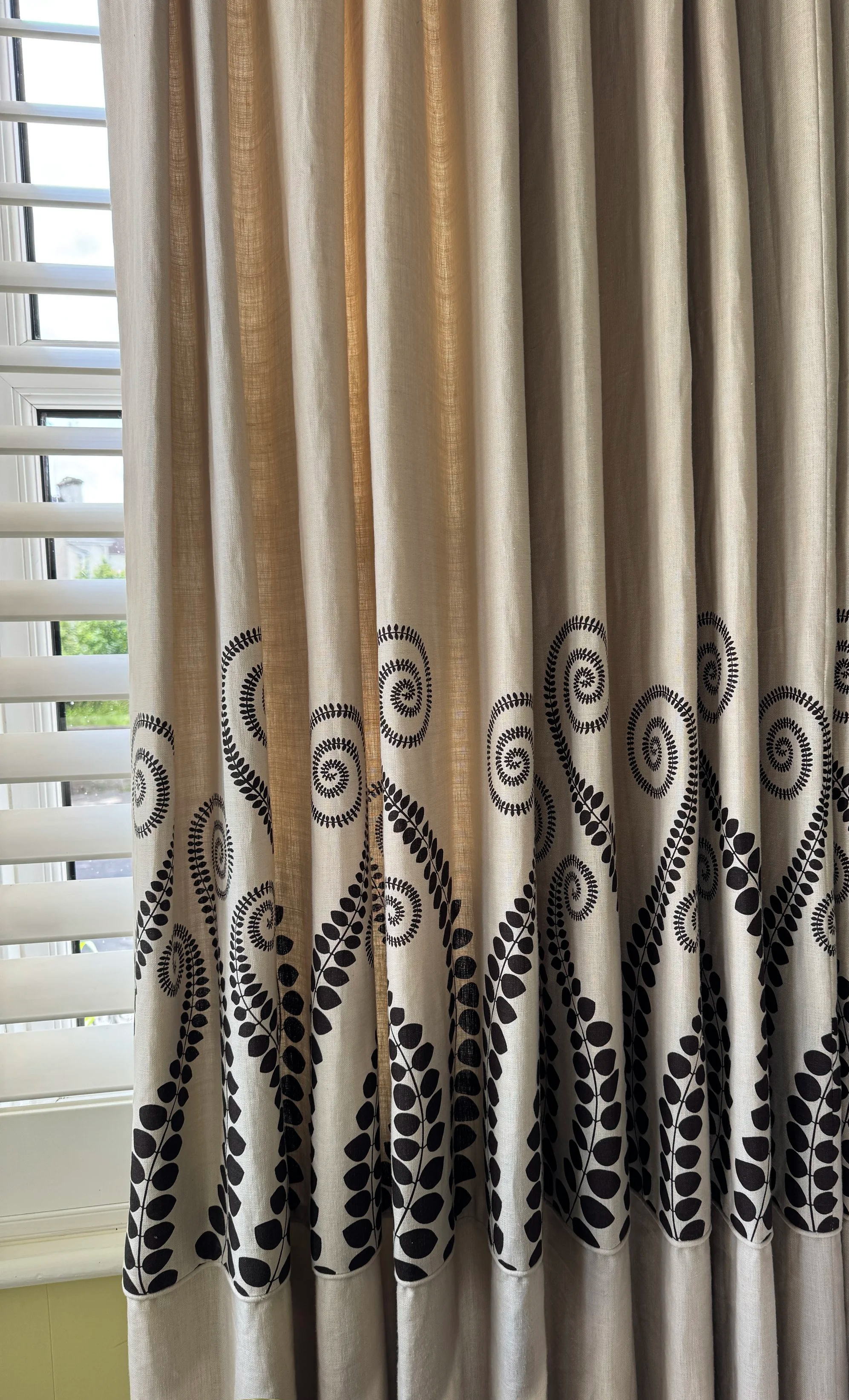
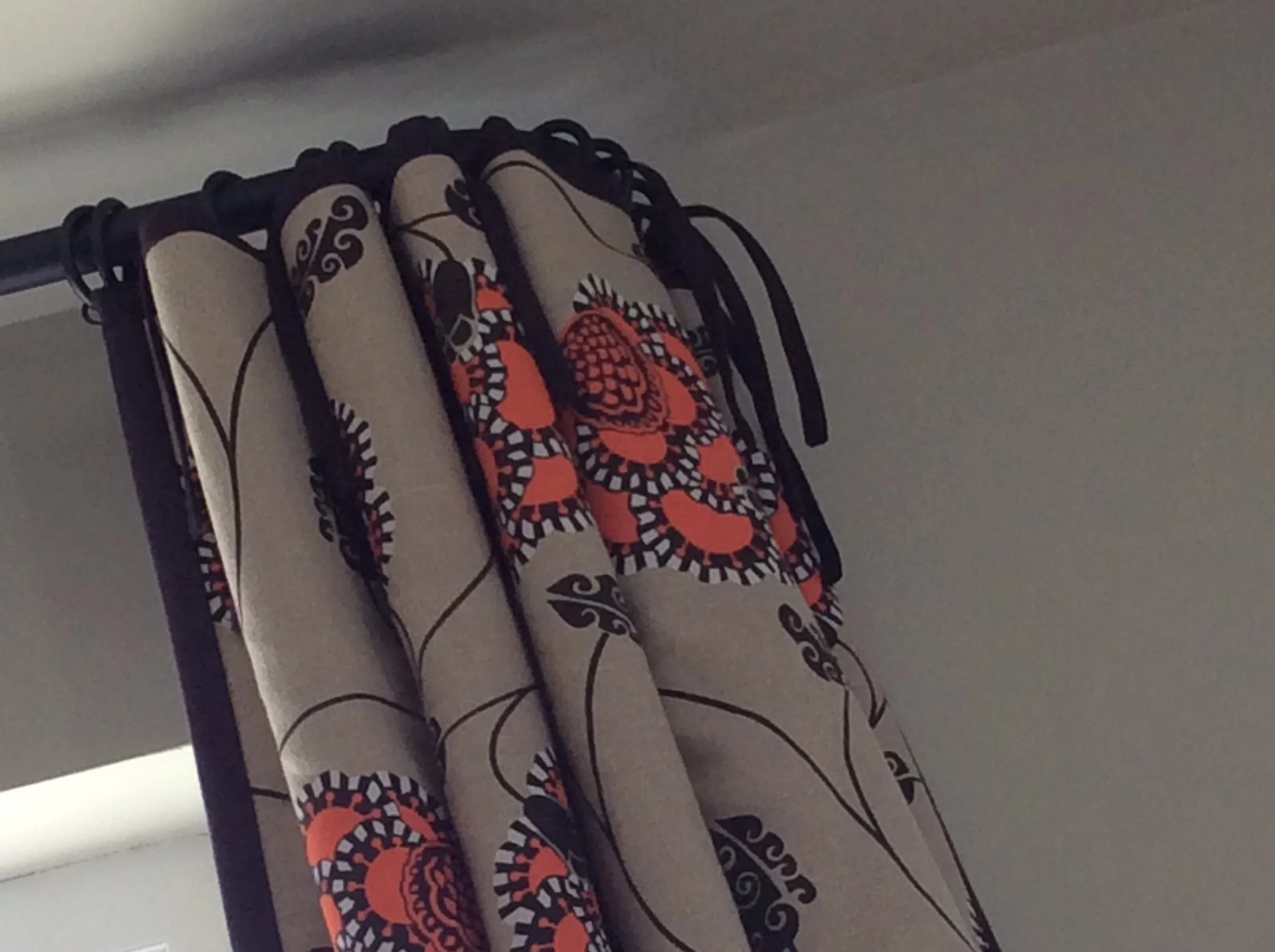
The bespoke Roman blind is made in a Nobilis velvet, Velours Otello Cerame, featuring a striking club motif that has always reminded me of playing cards – something I've loved collecting over the years. Fitted neatly within the window architrave, the blind sits comfortably within the architecture of the room rather than hiding it. Wherever proportions allow, I prefer this approach as it keeps the original window frame visible and part of the overall composition. In this case, it also allows the beautiful Edwardian frosted glass in the lower sash to remain on display – a period detail I had no intention of covering up.
When designing window treatments, I always consider how they will work alongside the other elements in the room. Here, the wallpaper is Donegal Palm by Neisha Crosland – bold, graphic and completely confident. The velvet Roman blind holds its own beautifully against it, with the club motif quietly echoing the energy of the wallpaper without competing for attention.
Above, three Tom Dixon pendant lights hang at different heights, their gold interiors catching the light and adding warmth and drama to the entrance hall throughout the day.
On the windowsill sits a hotel sign rescued from The Barcelona Hotel in Exeter when it was sold – one of several pieces I couldn't resist bringing home. It's a small personal detail that still makes me smile every time I walk past.
I loved the Nobilis velvet so much that I later had cushions made in the same fabric, which are now available through my Cushionbank collection if you'd like to bring a little of this look into your own home.
Designer's Tip: Don't be afraid to use pattern in a hall. It's a space people move through rather than spend long periods sitting in, which means you can often be much bolder with fabric, wallpaper and window treatments than you might dare elsewhere in the home.
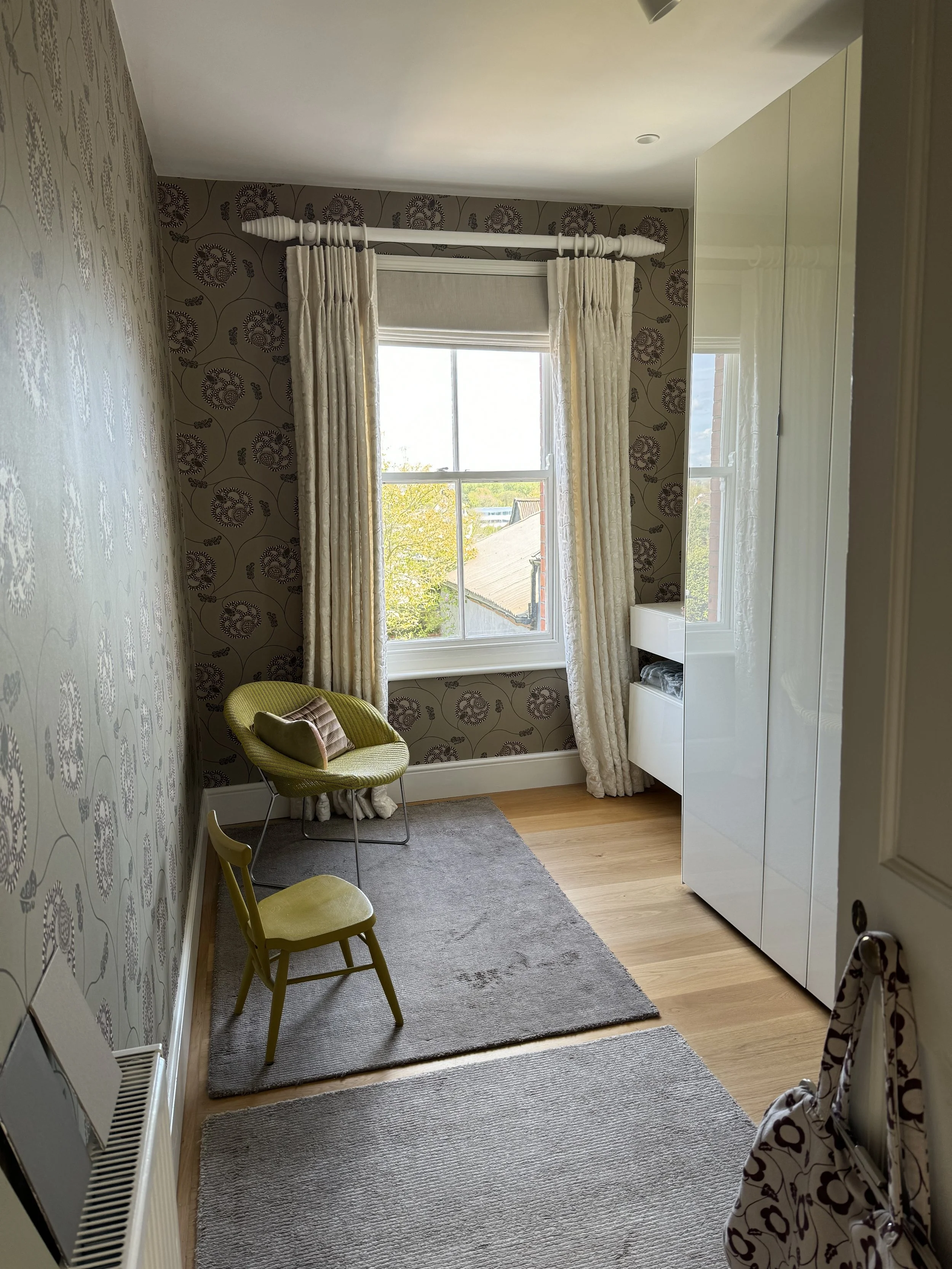
The Living Room
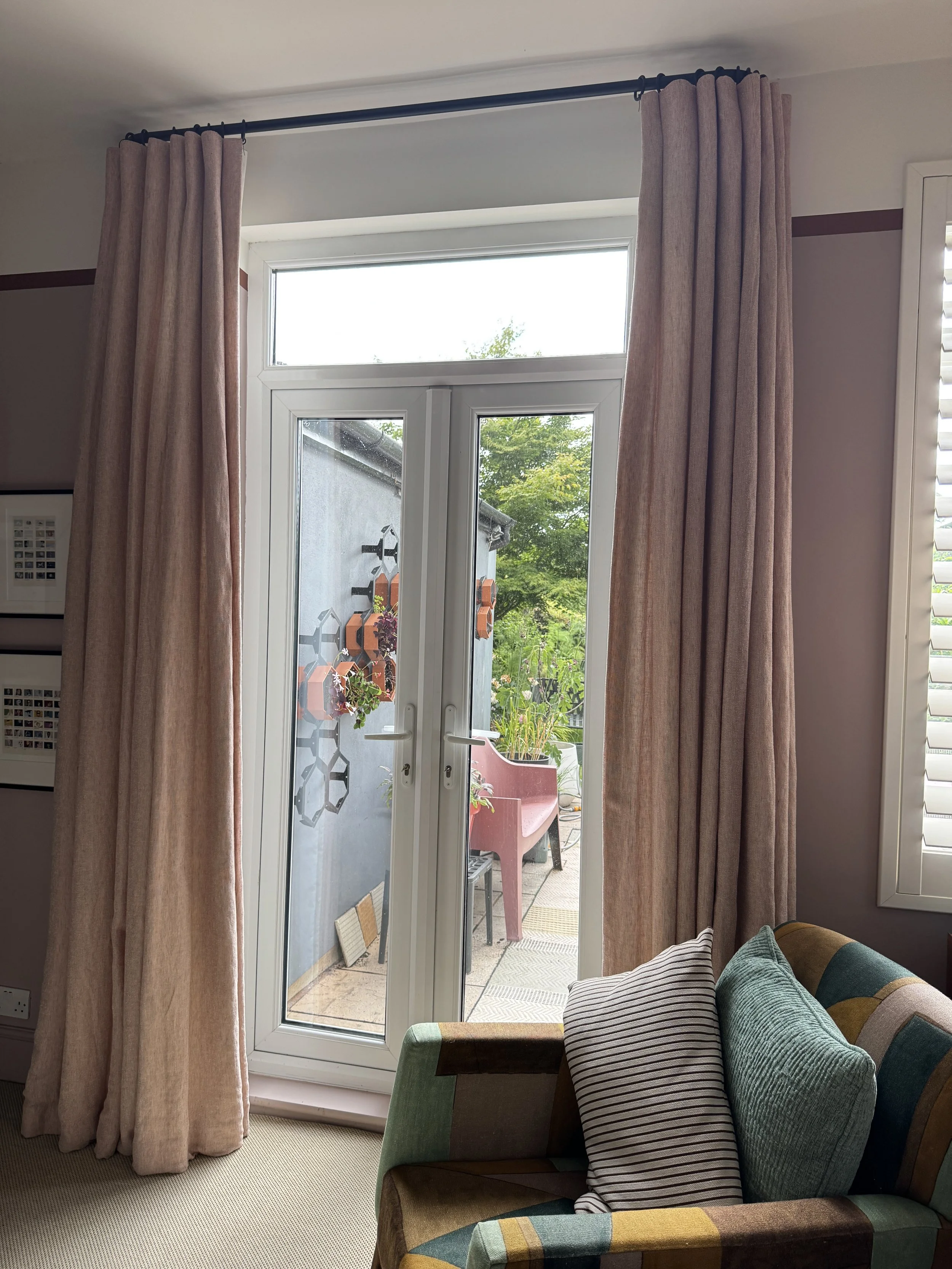
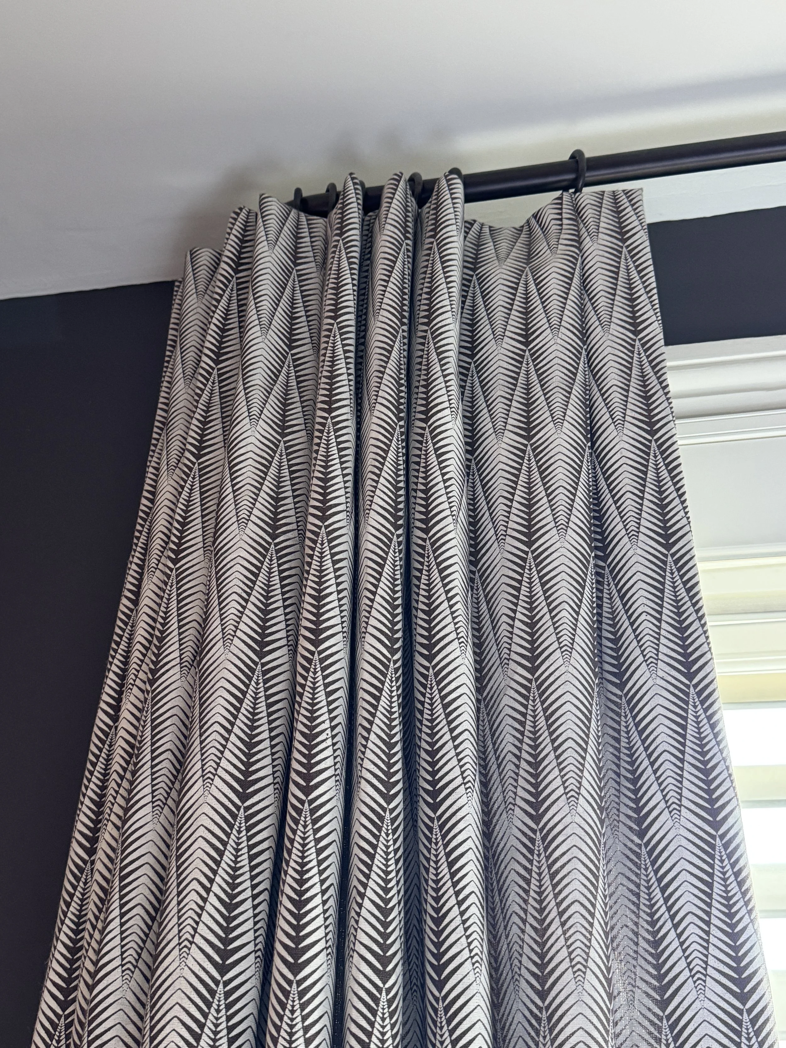
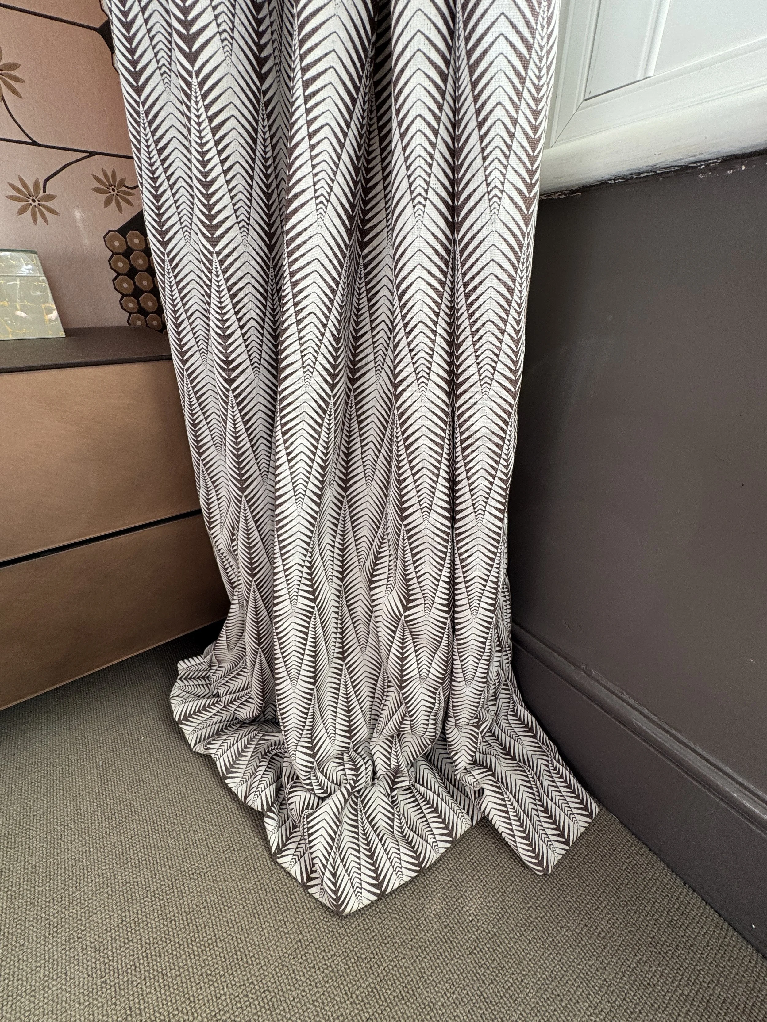
The living room has a beautiful Edwardian bay window and I wanted to make the most of every centimetre of it.
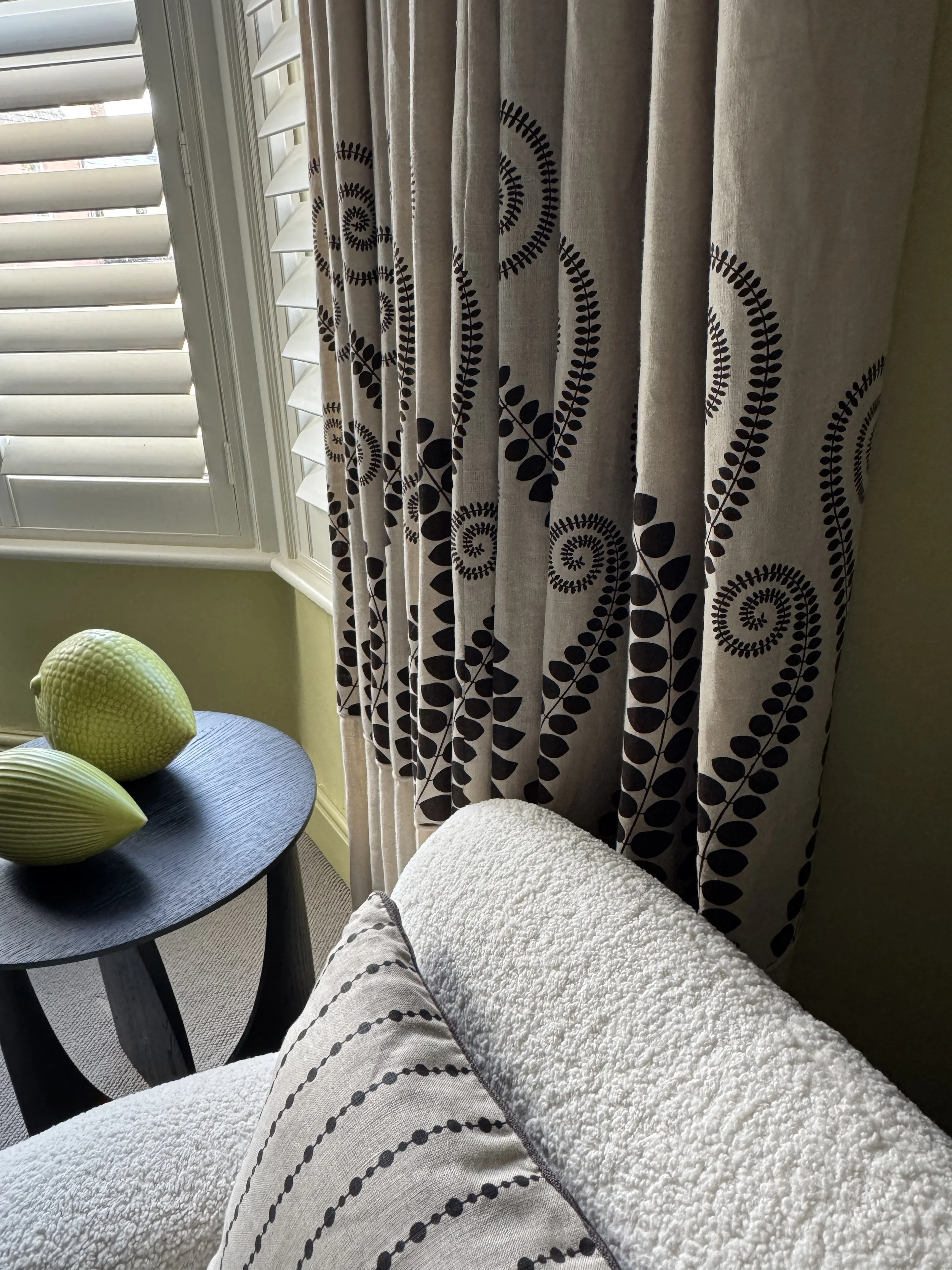
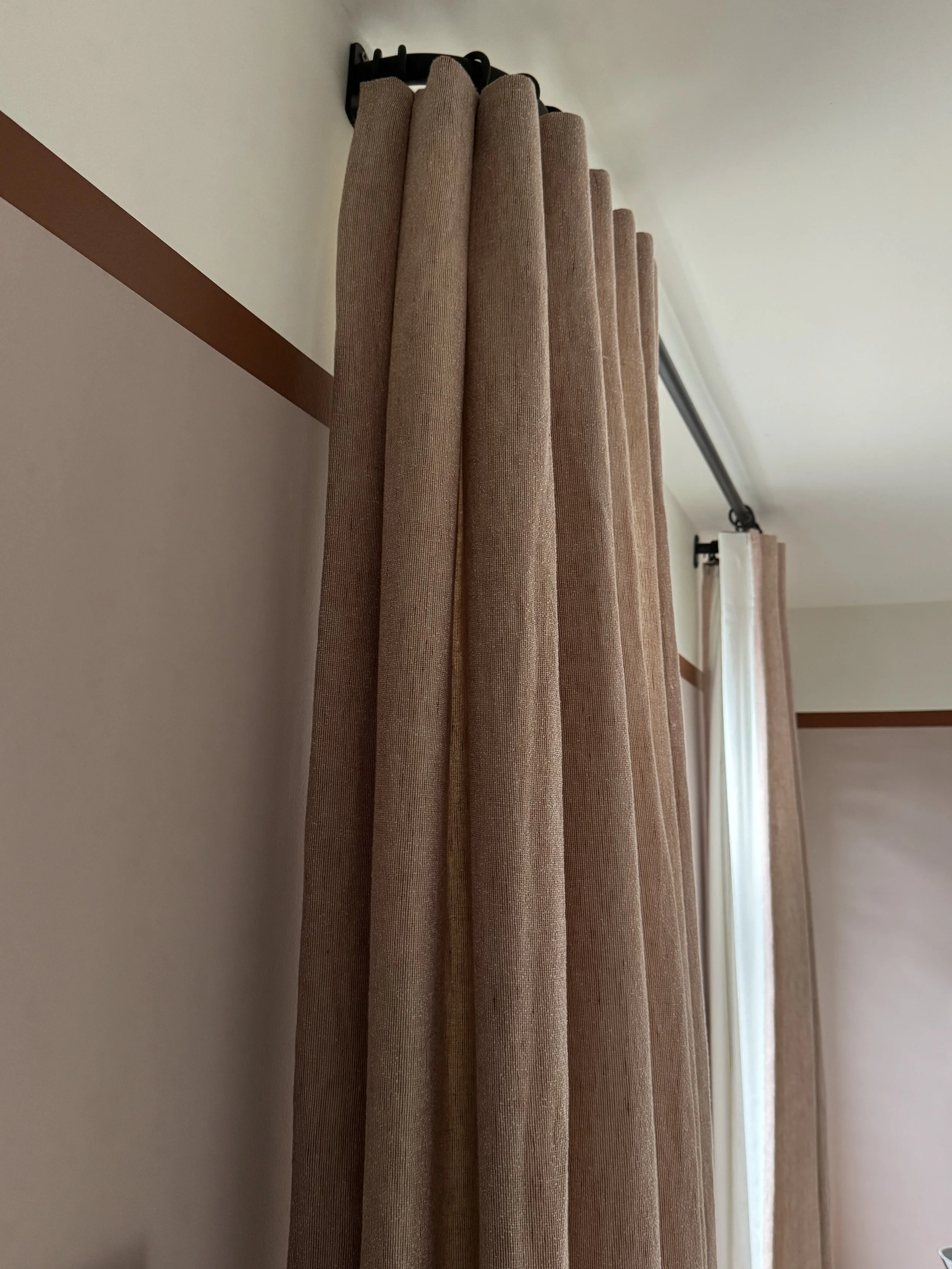
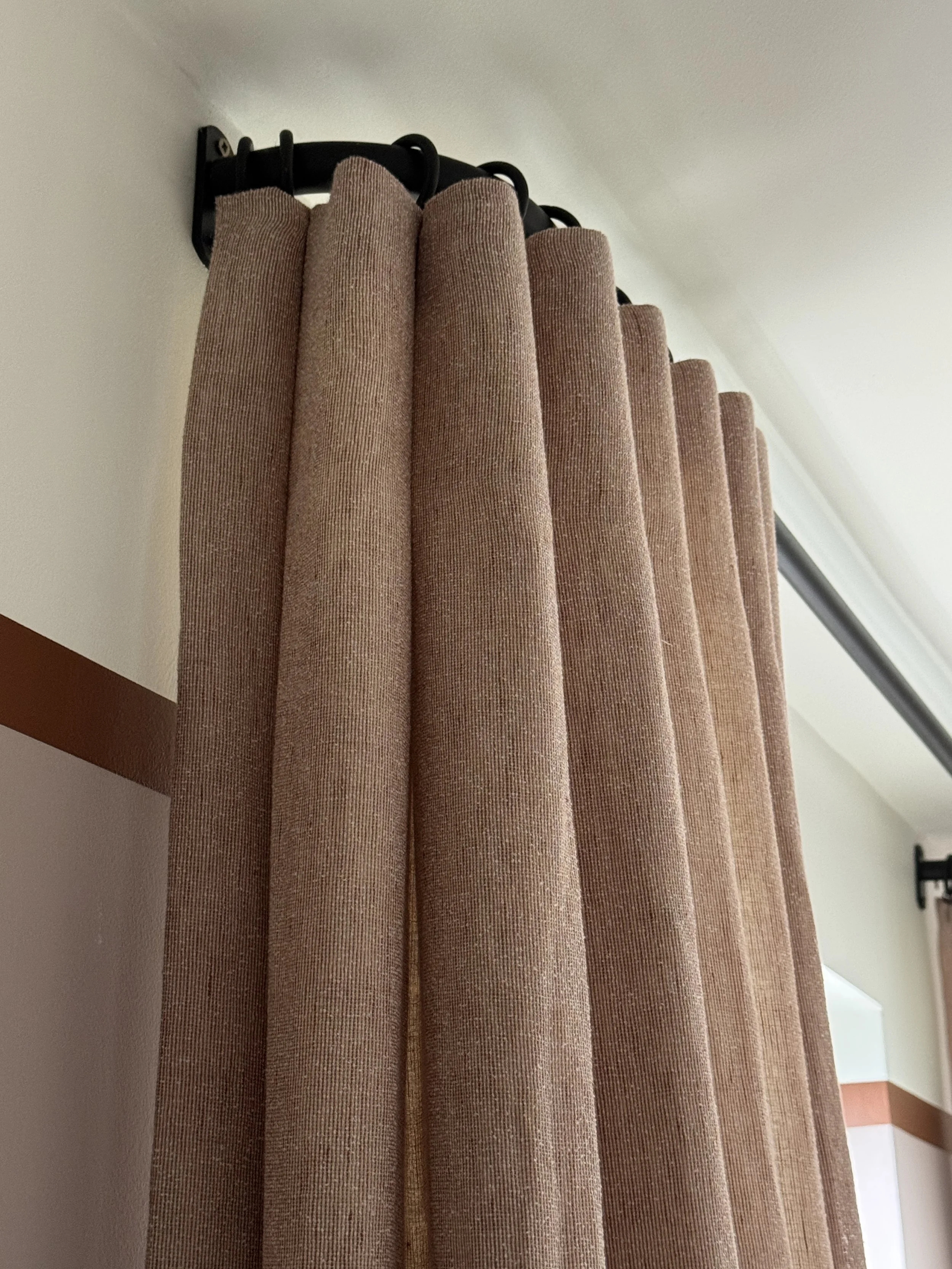
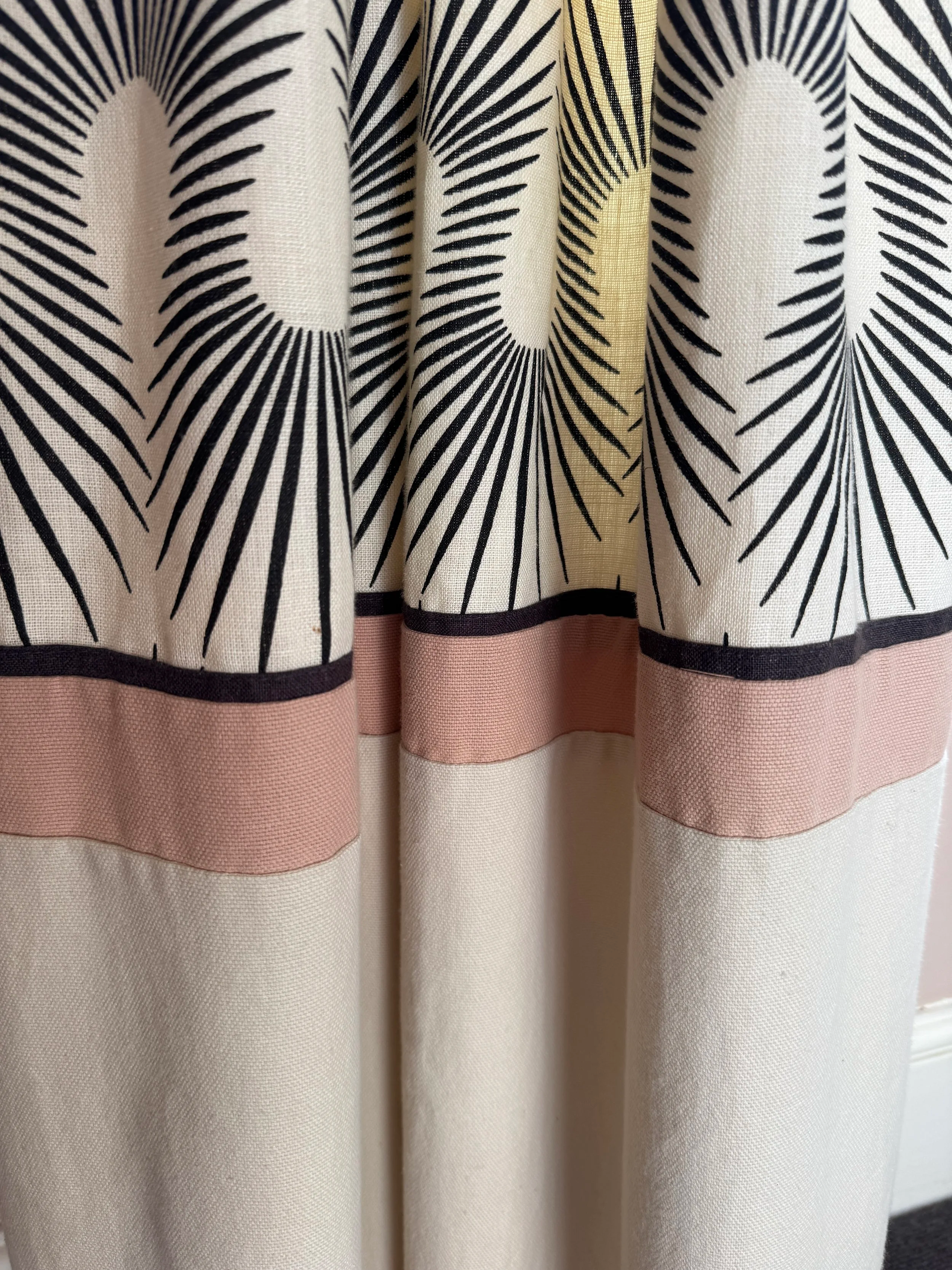
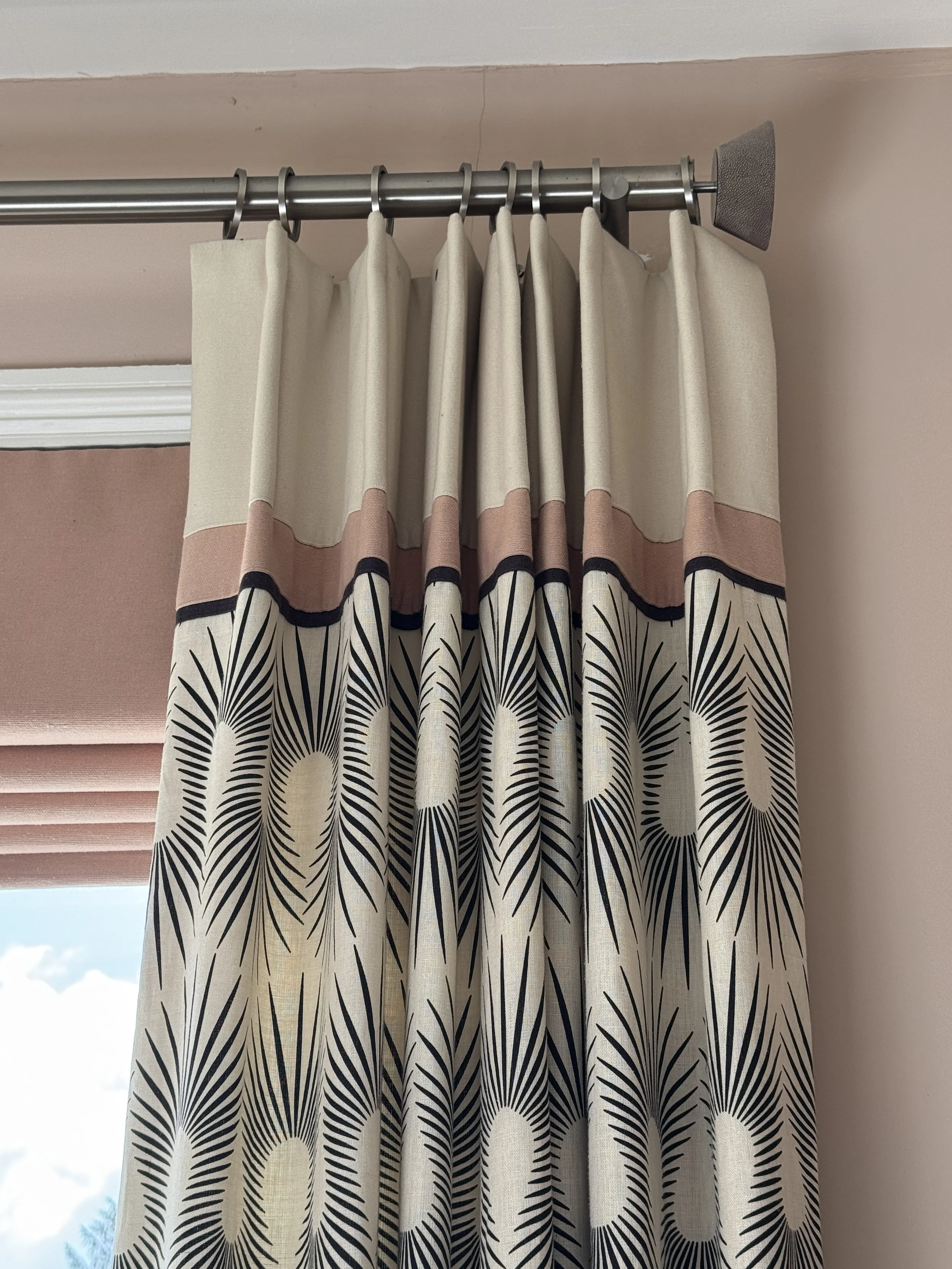
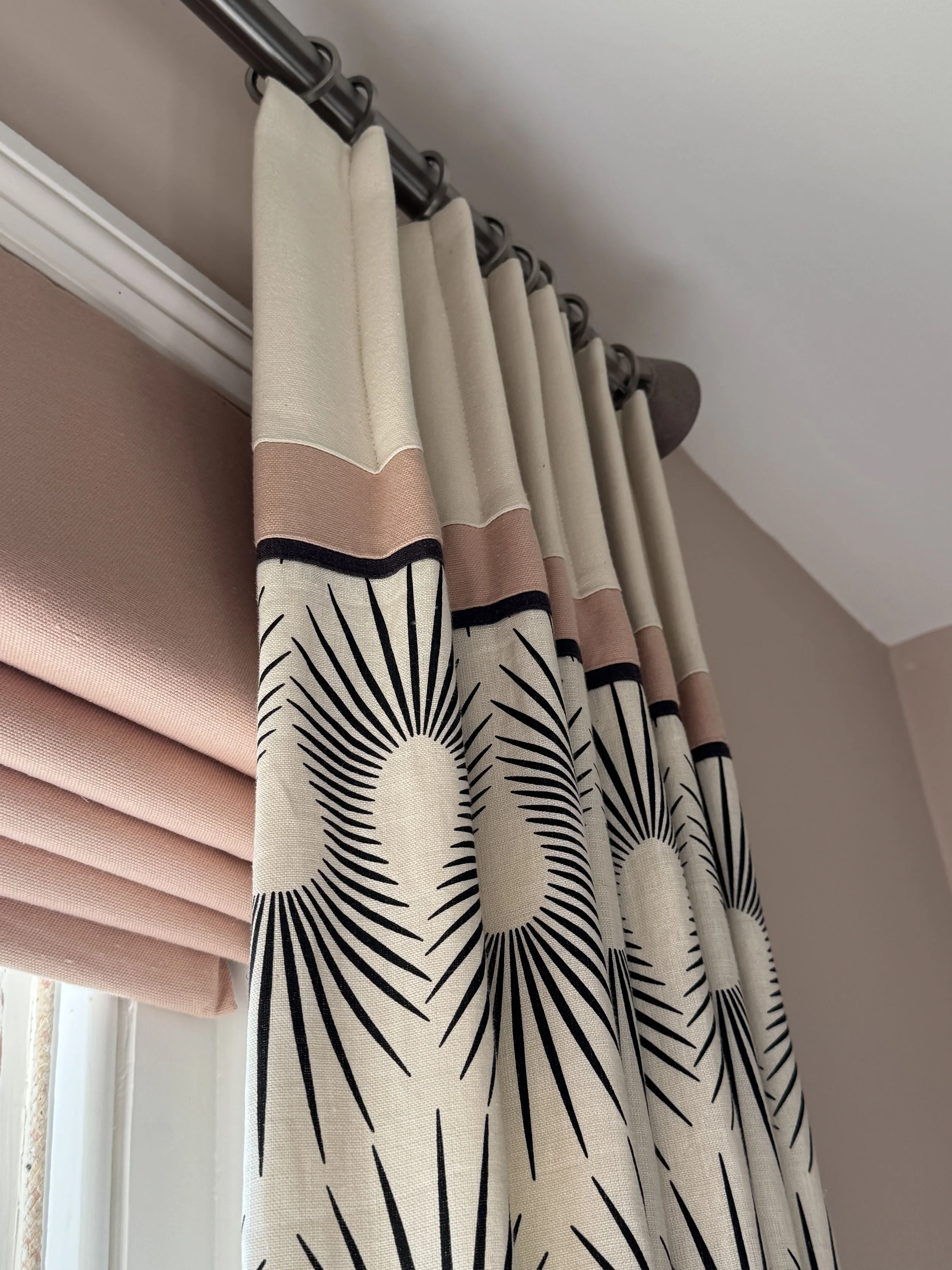
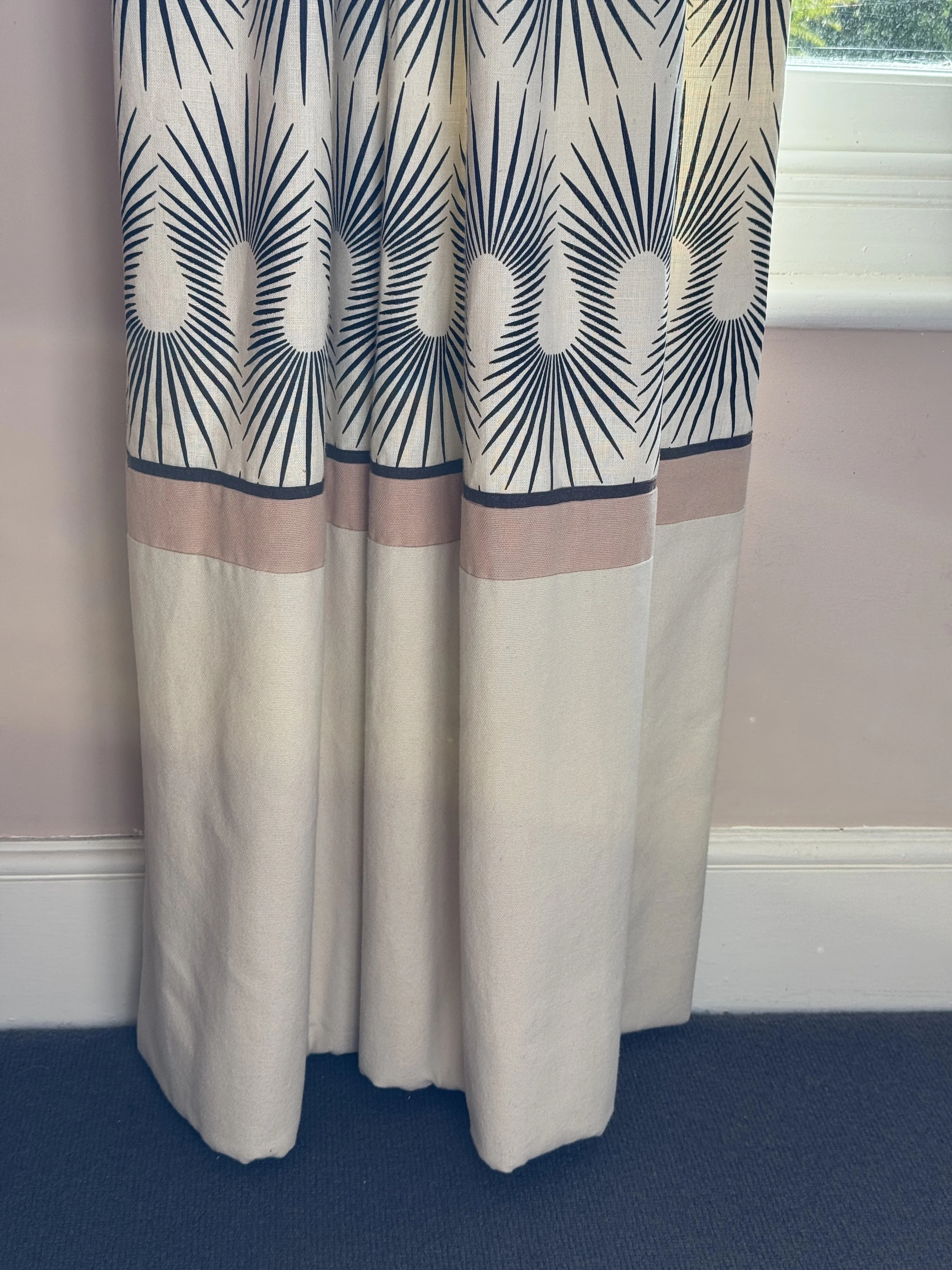
The curtain fabric is Gypsy Panels Linen by Neisha Crosland – a timeless design with real presence and scale. One of the decisions I'm most pleased with is the pattern placement. Rather than allowing the design to disappear behind furniture or fall awkwardly at floor level, I added a section of plain linen to the bottom of each curtain so the Gypsy Panels motif sits at exactly the right height to be seen and appreciated when the curtains are drawn.
A piped detail at the join turns what could have been an invisible seam into a deliberate design feature. It's a small detail, but one that demonstrates the difference between bespoke curtains and anything bought ready-made. Every element has been considered, from the fabric placement to the finished proportions of the room.
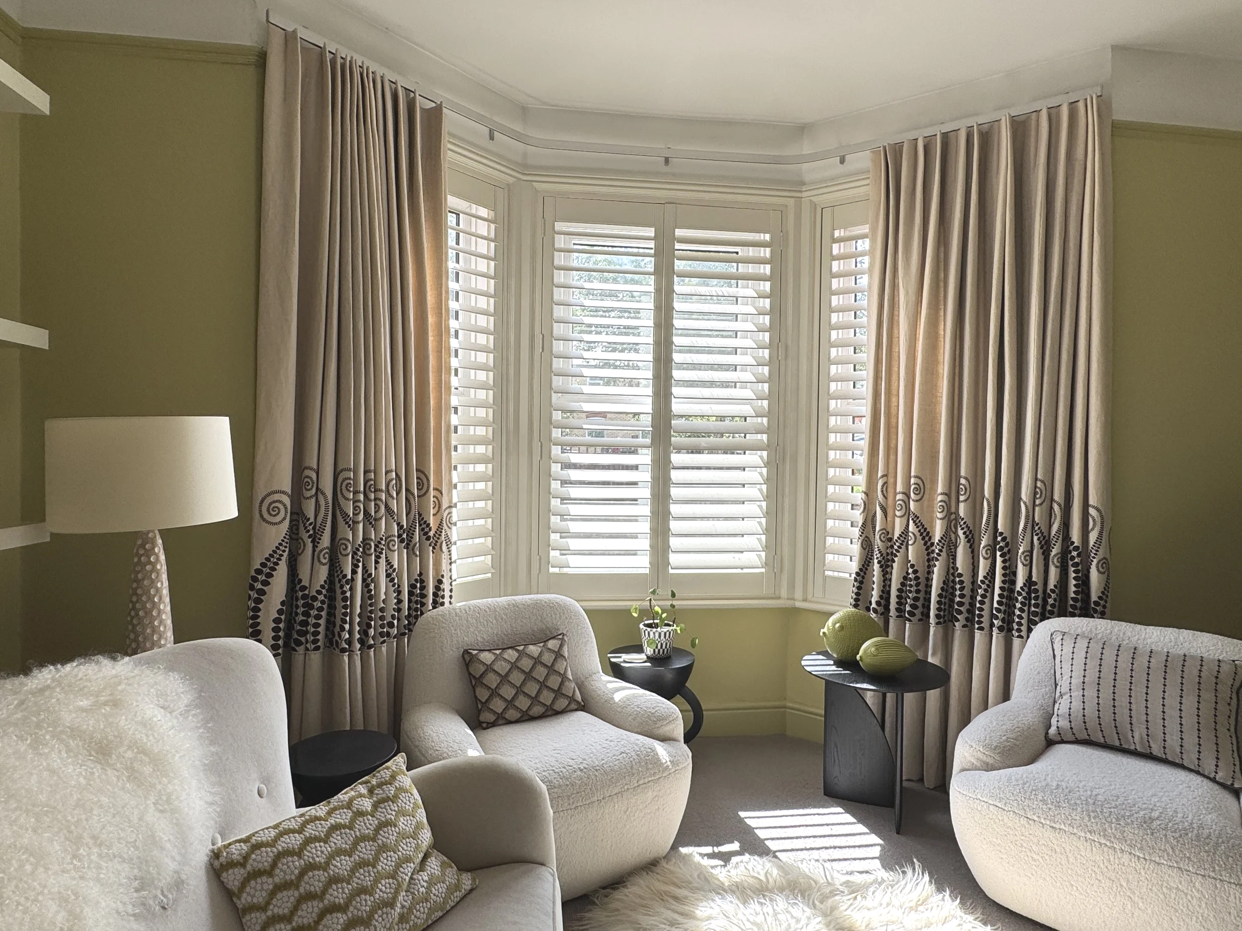
Custom-made curtains and shutters working together to provide privacy, light control and a beautifully balanced bay window design.
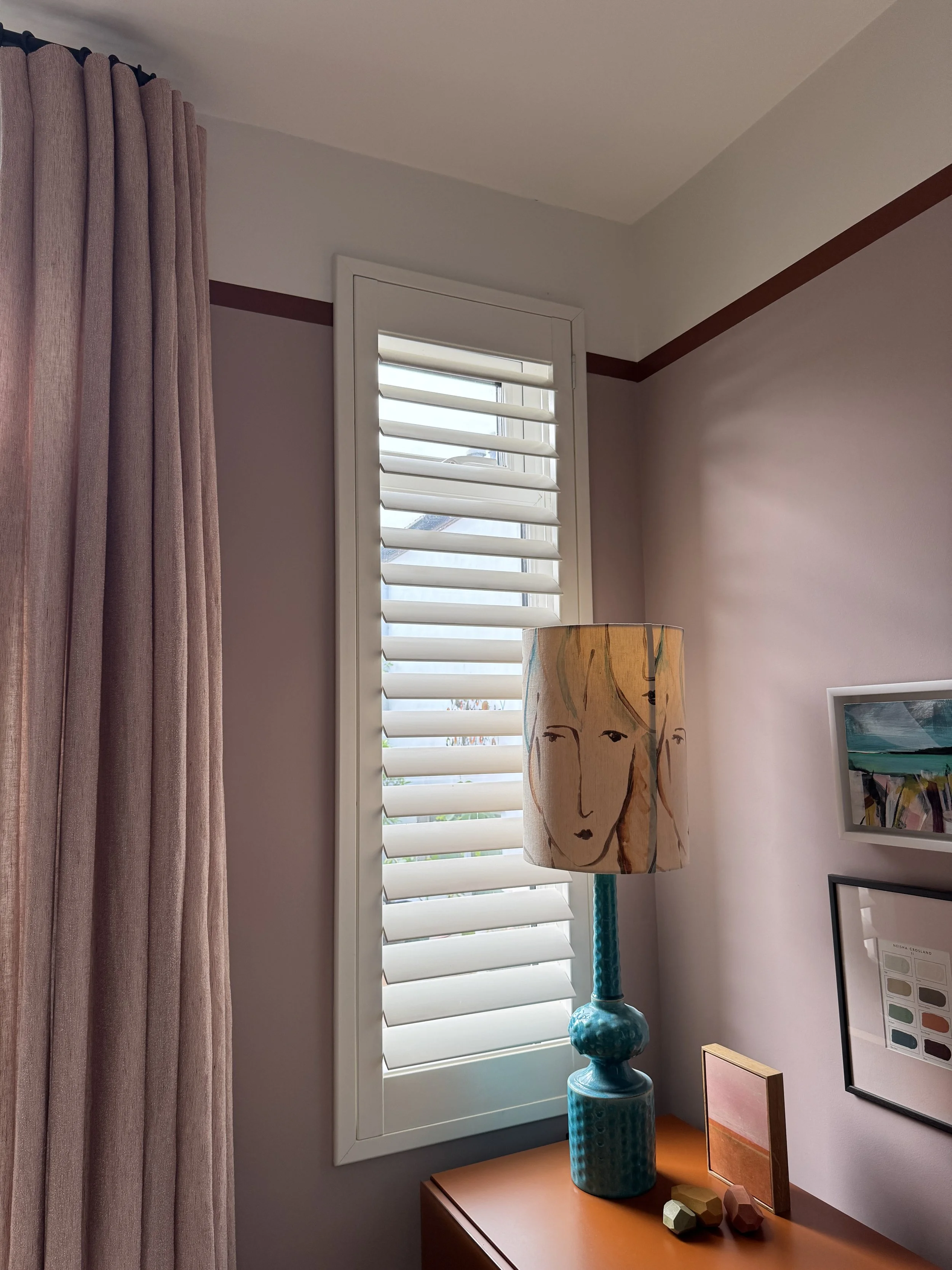
The heading is a cartridge pleat on a Silent Gliss track that curves smoothly around the bay, with wooden plantation shutters fitted behind for privacy and light control during the day. I recommend this combination regularly to clients. The shutters allow the curtains to remain perfectly dressed while still giving complete control over light and privacy.
This combination of bespoke curtains and plantation shutters is one of my favourite window treatment solutions for bay windows. It provides privacy, light control and softness while allowing the architecture of the window to remain the star of the room.
The close-up photographs show another detail that was important to me. The placement of the motif has been carefully aligned around the room so the pattern appears intentional and balanced from every angle. It required additional planning and fabric at the making stage, but details like this are what elevate a curtain from simply functional to truly bespoke.
On the side table, a pair of Jonathan Adler ceramic fish add just the right note of humour and personality. Design should never take itself too seriously.
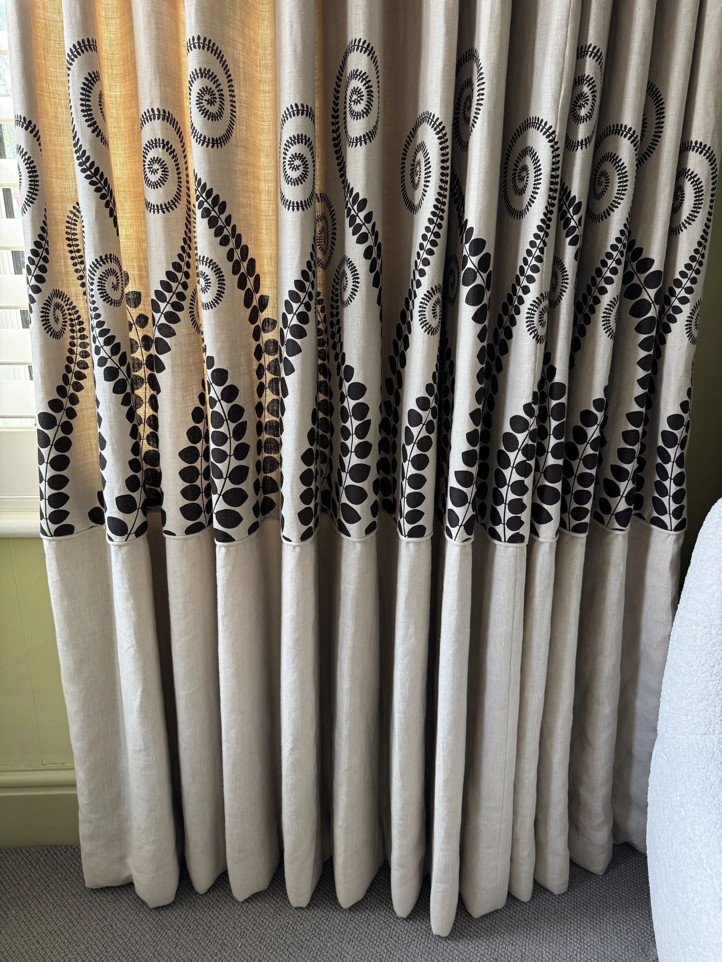
Pattern placement is one of the details that transforms a made-to-measure curtain from good to exceptional.
Designer’s tip: When using a bold fabric, think carefully about pattern placement. A little extra thought at the making stage can make the difference between curtains that simply look good and curtains that look exceptional.
The Dining Room / Studio – A Room That Has Evolved
This room has had more changes than any other in the house – and not just to its curtains.
It started life with a single window, painted in charcoal, with a Roman blind in Charcoal Beaded Stripe by Neisha Crosland sitting neatly inside the frame. Considered, contained, and exactly right for what the room was at the time.
Then the wall came down.
Removing a wall to a small utility room transformed everything. Suddenly I had three narrow windows flooding the room with light and a completely different sense of space. The original window became doors when I reconfigured the kitchen layout and blocked up the back door. What had been a modest room became something far more generous and interesting.
Which meant starting again with the window treatments.
The next chapter was Flamenco in Tangerine by Neisha Crosland – fluorescent orange with black edging on all four sides and individual ties on each ring. Bold, joyful and completely committed. They made the room sing and I loved them for years.
The Flamenco curtains served the room beautifully and remain one of my favourite examples of how a bold fabric can completely transform a space. If you love the look of them, I'm currently offering them for sale on eBay. They have some gentle fading, as you would expect from well-loved curtains, but they're beautifully made and still full of character. Simply search Neisha Crosland Flamenco curtains on eBay to find them.
But the room changed again. This is the room I use every single day – it's my studio as much as my dining room, with a large glass table, alcoves full of sample books and fabrics, and a constant rotation of project work. A room that works this hard needs its window treatments to support it rather than compete with everything else going on inside it.
The starting point for the current scheme was the Kelly Wearstler District chair – a fabric I'd originally considered for the curtains. I decided against it for two reasons: the quantity needed made it too expensive, and I wanted to see the pattern flat rather than pleated up. As a chair it's perfect. Which meant the curtains needed to do something completely different.
So I made them disappear.
LET IT BREATHE
Sometimes the best window treatment isn't the one that demands attention – it's the one that allows everything else to shine.
The current curtains are Bouclin by Kvadrat, in a tone that matches the wall colour almost exactly – Light Peach Blossom by Little Greene, with a painted terracotta border at picture rail height that gives the room a warmth and character entirely specific to this space.
The curtains are lined and interlined, with an inverted pleat heading on a black French pole hung almost to the ceiling, elongating the three narrow windows and making the most of all the light the structural work created. They wrap around the corner of the room in a way that always draws comment.
This room is a good example of how window treatments should evolve with the way a space is used. What began as a dining room now functions primarily as my design studio, and the curtains needed to support that change. Choosing fabrics, colours and headings that complement the architecture rather than dominate it creates a more flexible and timeless interior.
When they're drawn, the curtains quietly recede into the background, allowing the architecture, artwork and furniture to take centre stage. The chair gets to be the star. Everything else gets to breathe.

Designer’s tip: Sometimes your starting point for a room shouldn't be the curtains. If you fall in love with a fabric, consider where it will have the most impact – flat on a chair or sofa rather than pleated into a heading. Then let your window treatments support the scheme quietly.
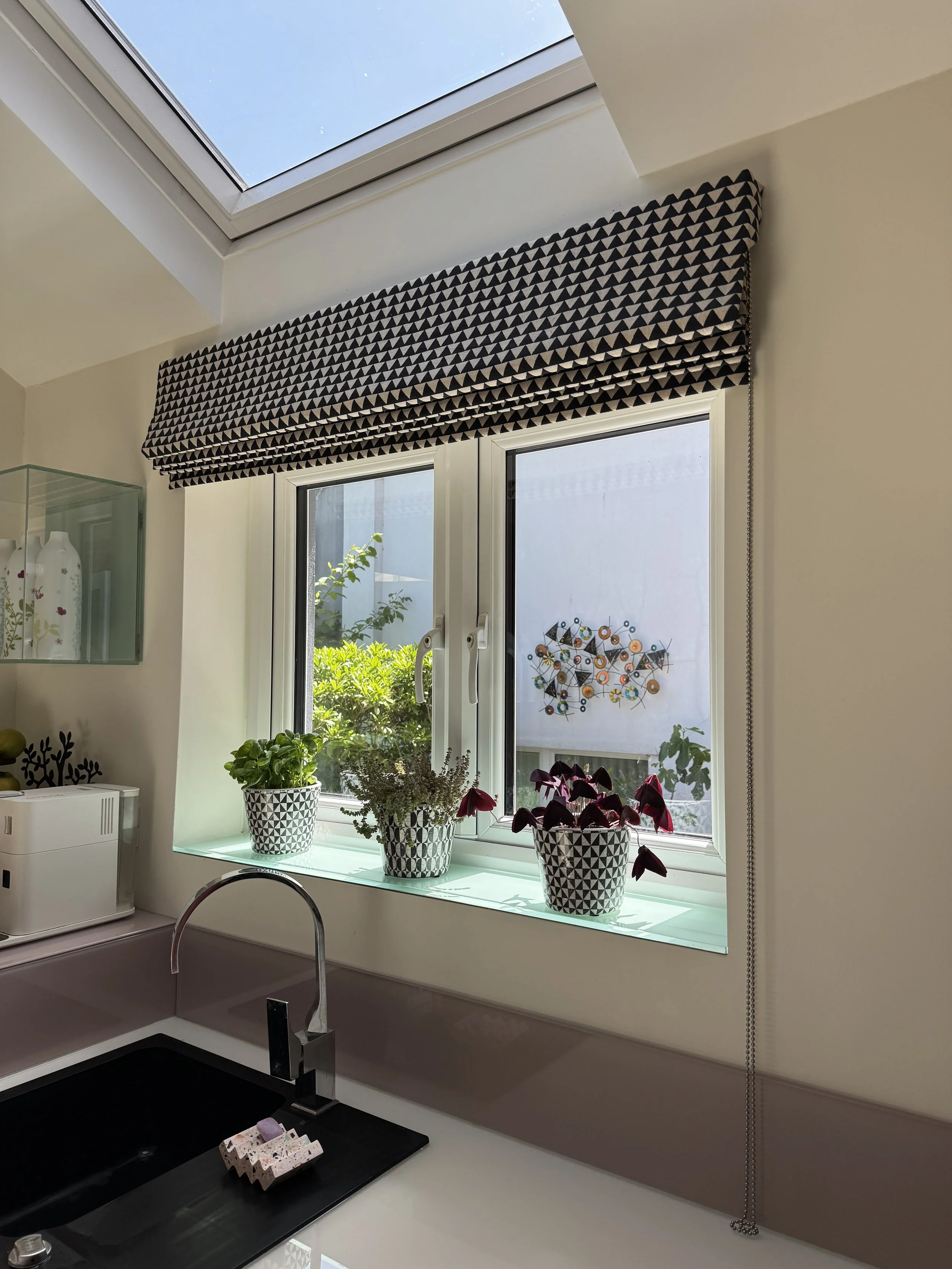
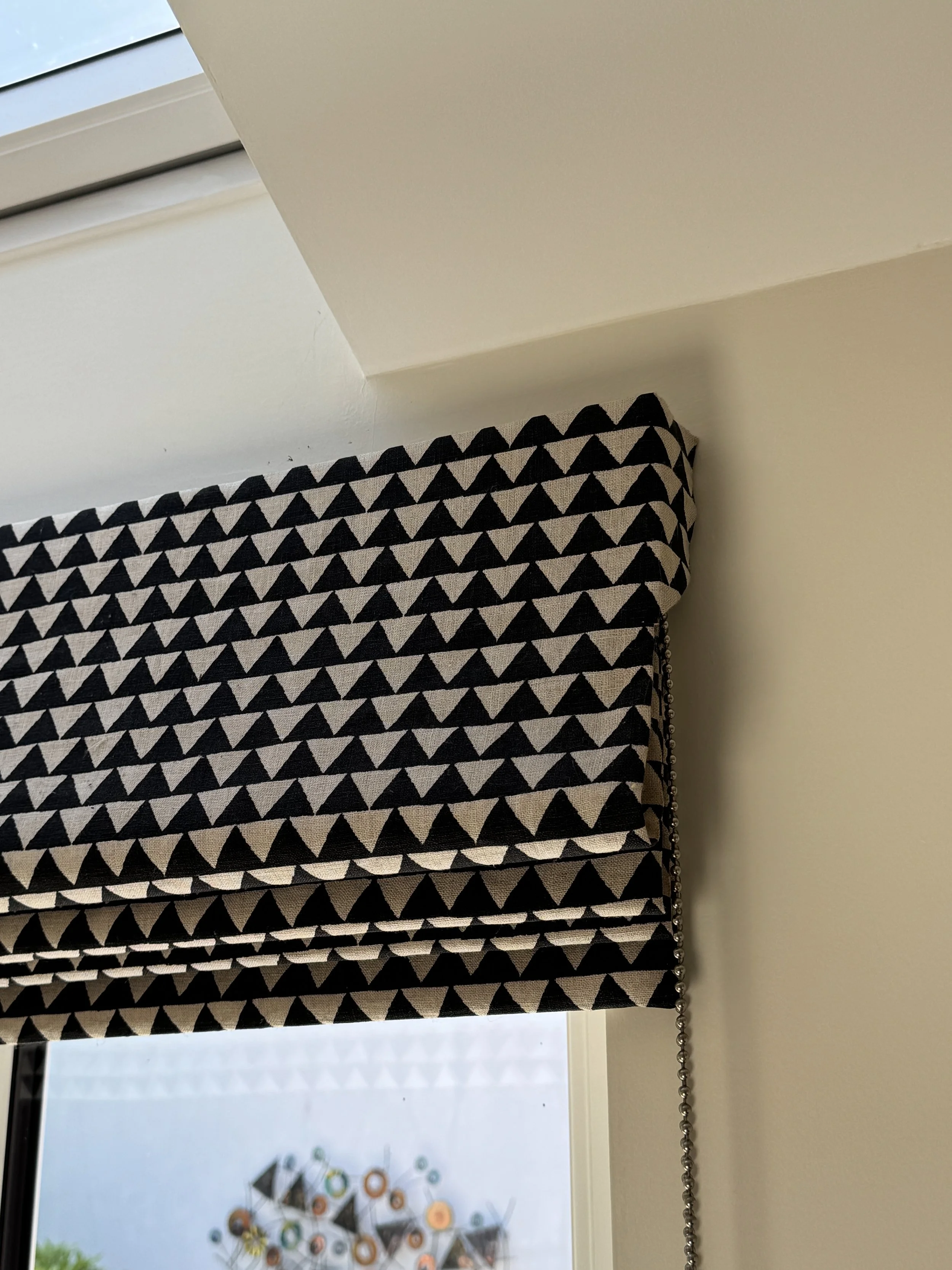
The Kitchen
The kitchen has a Roman blind in a bold geometric print by Robert Allen. Its strong graphic pattern brings personality to the space while sitting comfortably alongside the collection of plants on the windowsill and the clean contemporary lines of the kitchen.
One detail I'm particularly pleased with is the covered return on the blind, which means the mechanism and track aren't visible from the sides. It's a detail I always recommend and one I rarely see done elsewhere. It requires a little more fabric and a little more skill from the workroom, but the result is a blind that looks as considered from the side as it does from the front.
With a rooflight above flooding the room with natural light, the blind adds character and pattern without overwhelming the space. It's a good example of how a window treatment can make a statement while still allowing the architecture of the room to shine.
Designer’s tip: Ask for covered returns on your Roman blinds. It's a small detail that makes a surprisingly big difference to the finished result.
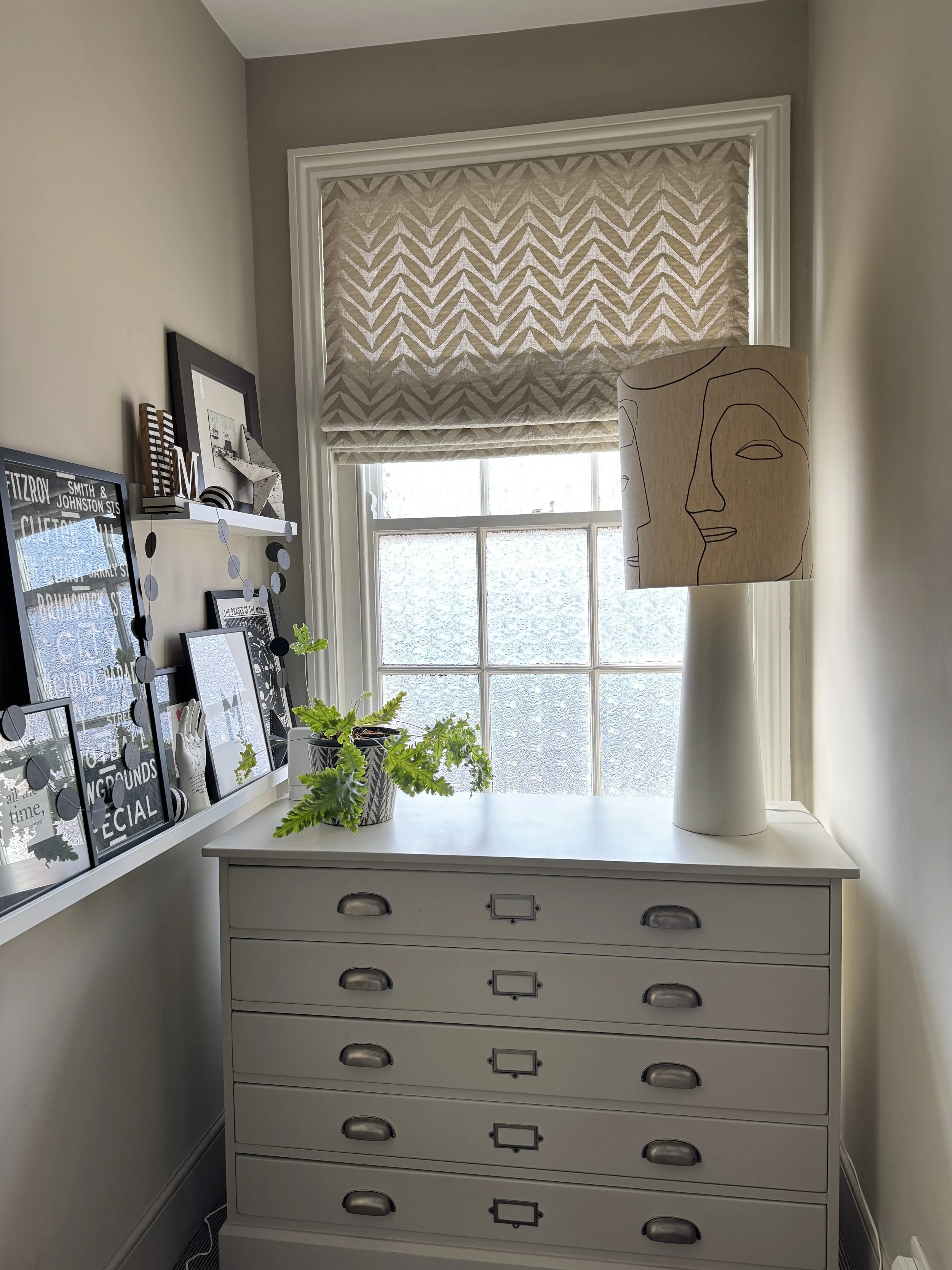
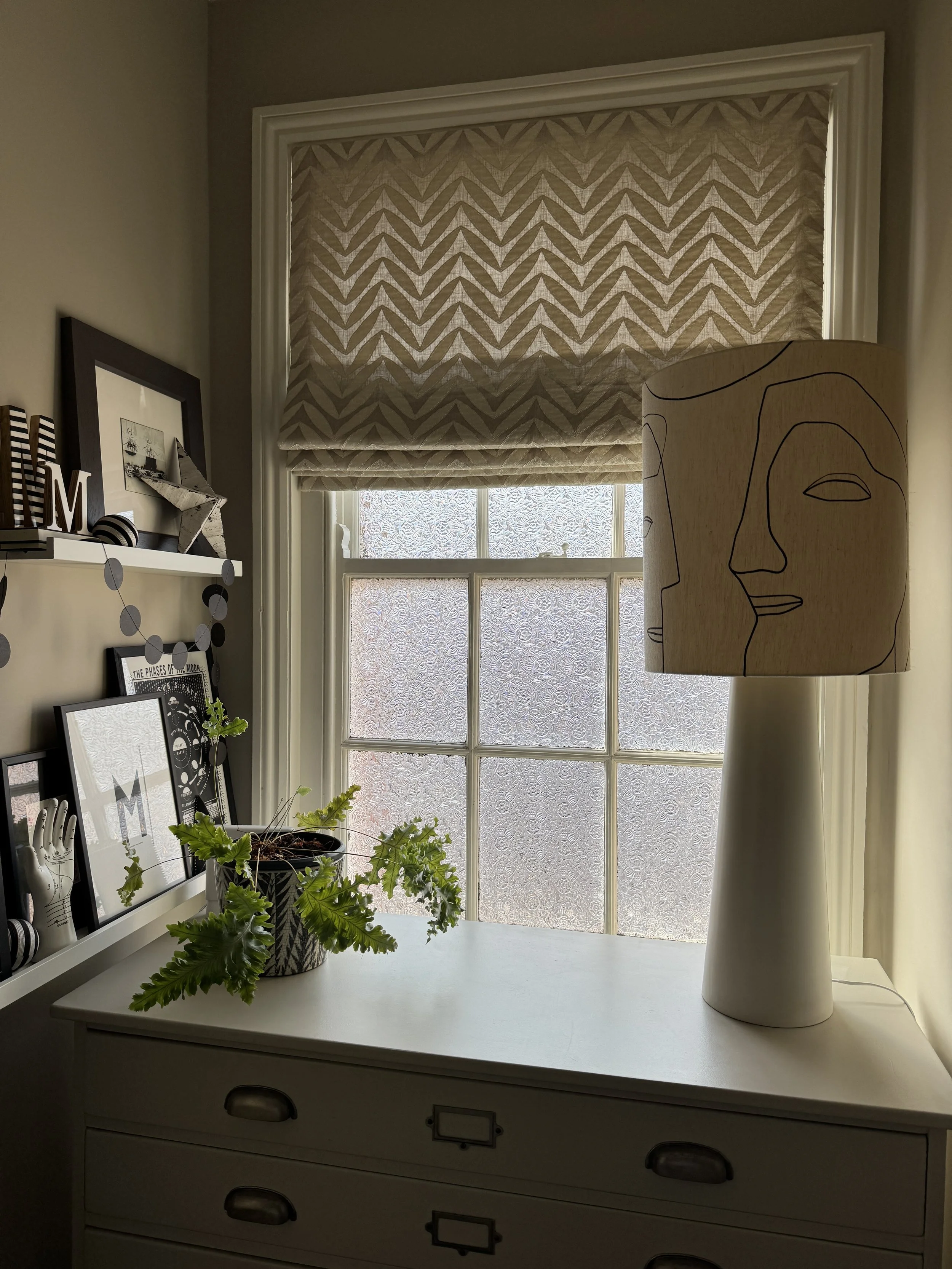
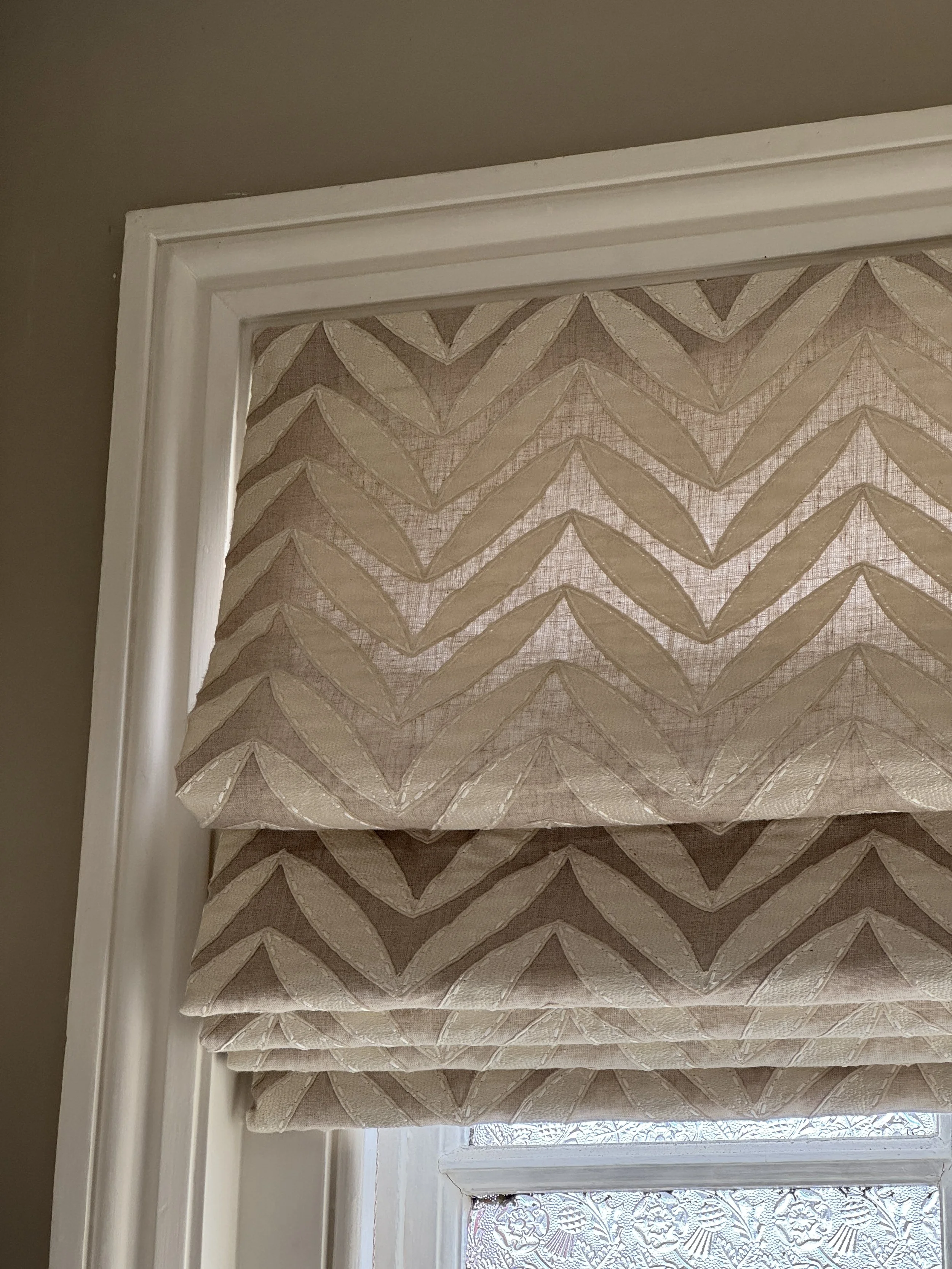
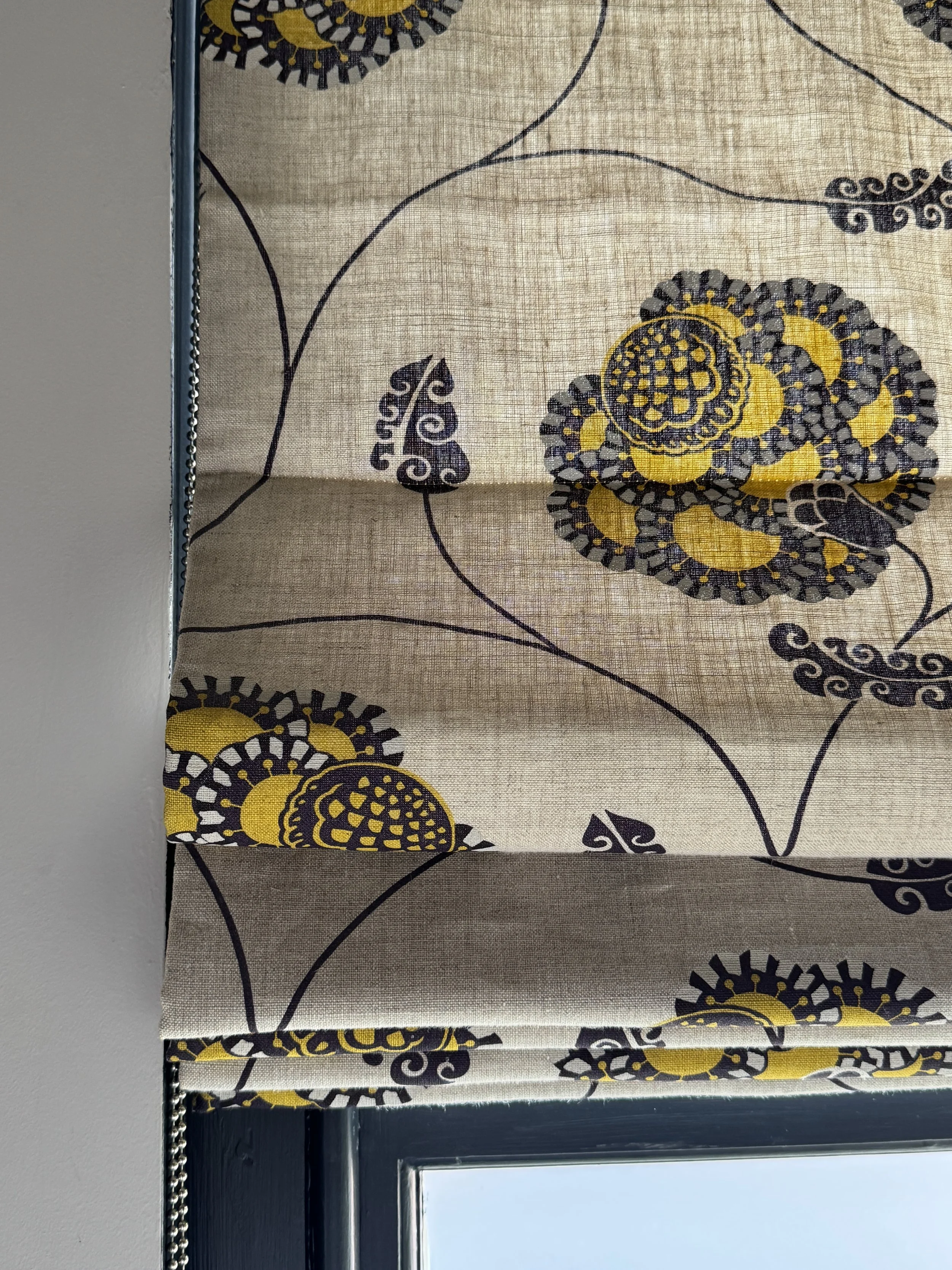
The Landing
The landing has a Roman blind in a fabric with a story behind it. I originally sourced it as a sample bolt for a client project and had just enough left over for myself – a happy accident I've never regretted. The design has appliqué leaves in a graphic, contemporary style by Jim Dickens, a name familiar to anyone who works with quality British fabric houses. It never became a permanent part of their collection, which is a shame, I think it was quietly ahead of its time.
A contemporary Roman blind bringing pattern and texture to an often-overlooked landing window.
The window sits directly above the hall window, sharing the same generous sash proportions and original Edwardian frosted glass in the lower pane. On the plan chest below sits an HKLiving lampshade with a line-drawing face – the sort of quietly unexpected detail that helps a landing feel like a room in its own right rather than simply a space you pass through.
Designer's tip: Landing and hallway windows are often overlooked. They deserve just as much thought as any other room – and a well-dressed landing sets the tone for the whole upper floor.
The Main Bedroom
This is the room I'm asked about most, for good reason.
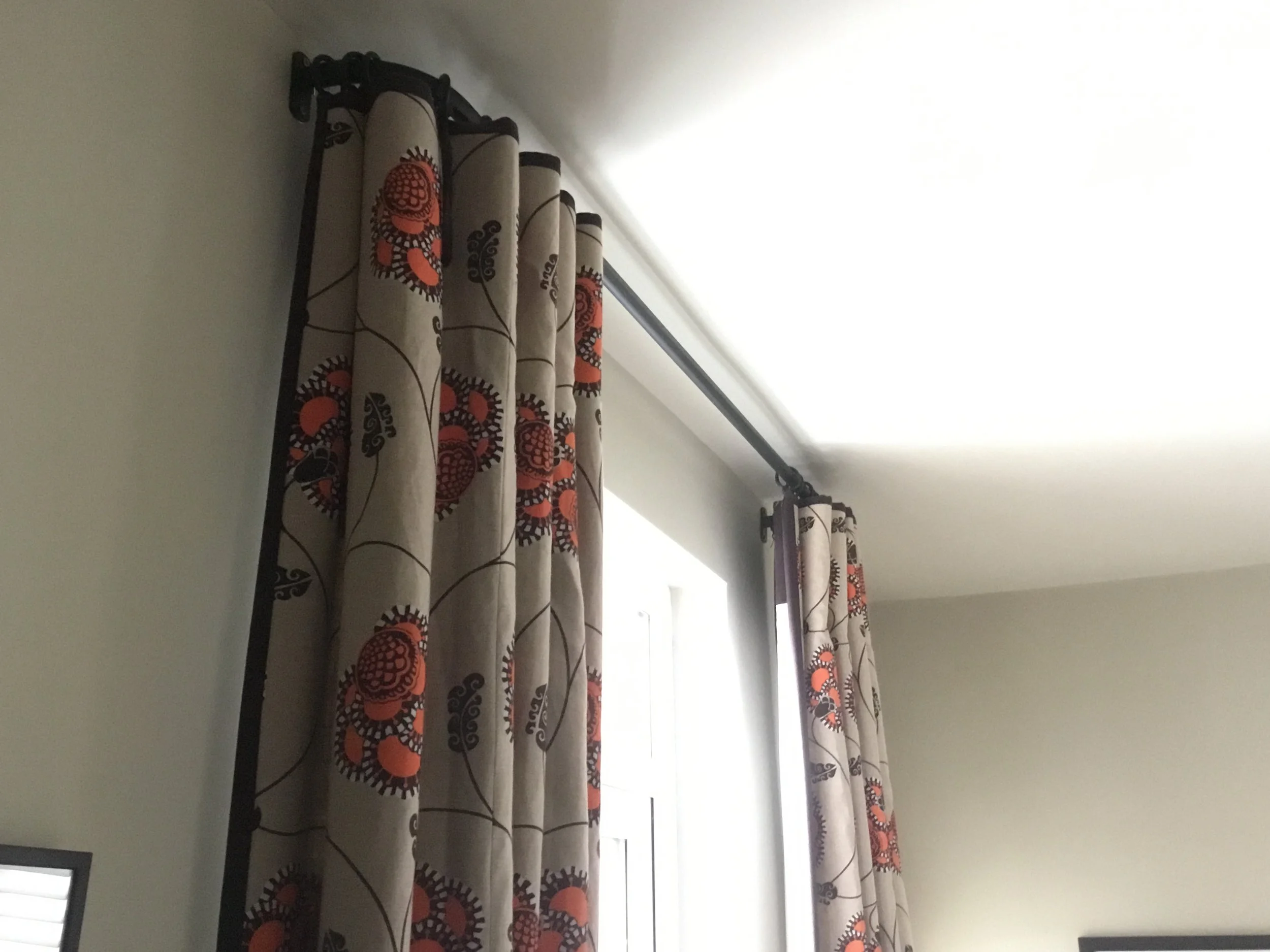
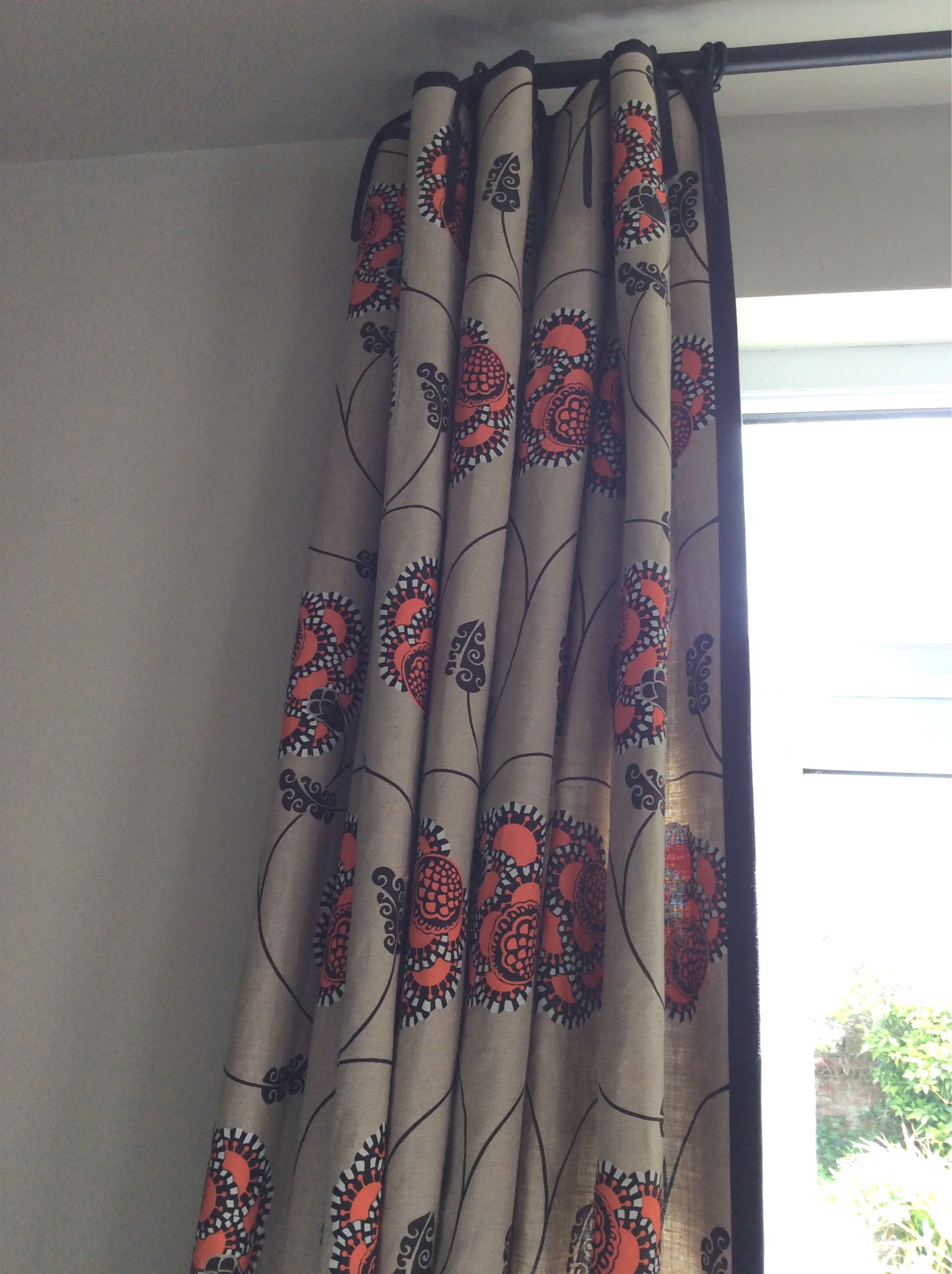
The curtains are in Small Zebra by Neisha Crosland – an inverted pleat heading on a bronze French pole hung almost to the ceiling. The walls are custom colour-matched to the fabric itself, which means the curtains and walls exist in the same tonal world without being identical. It's a decision that took confidence but I've never questioned it for a moment.
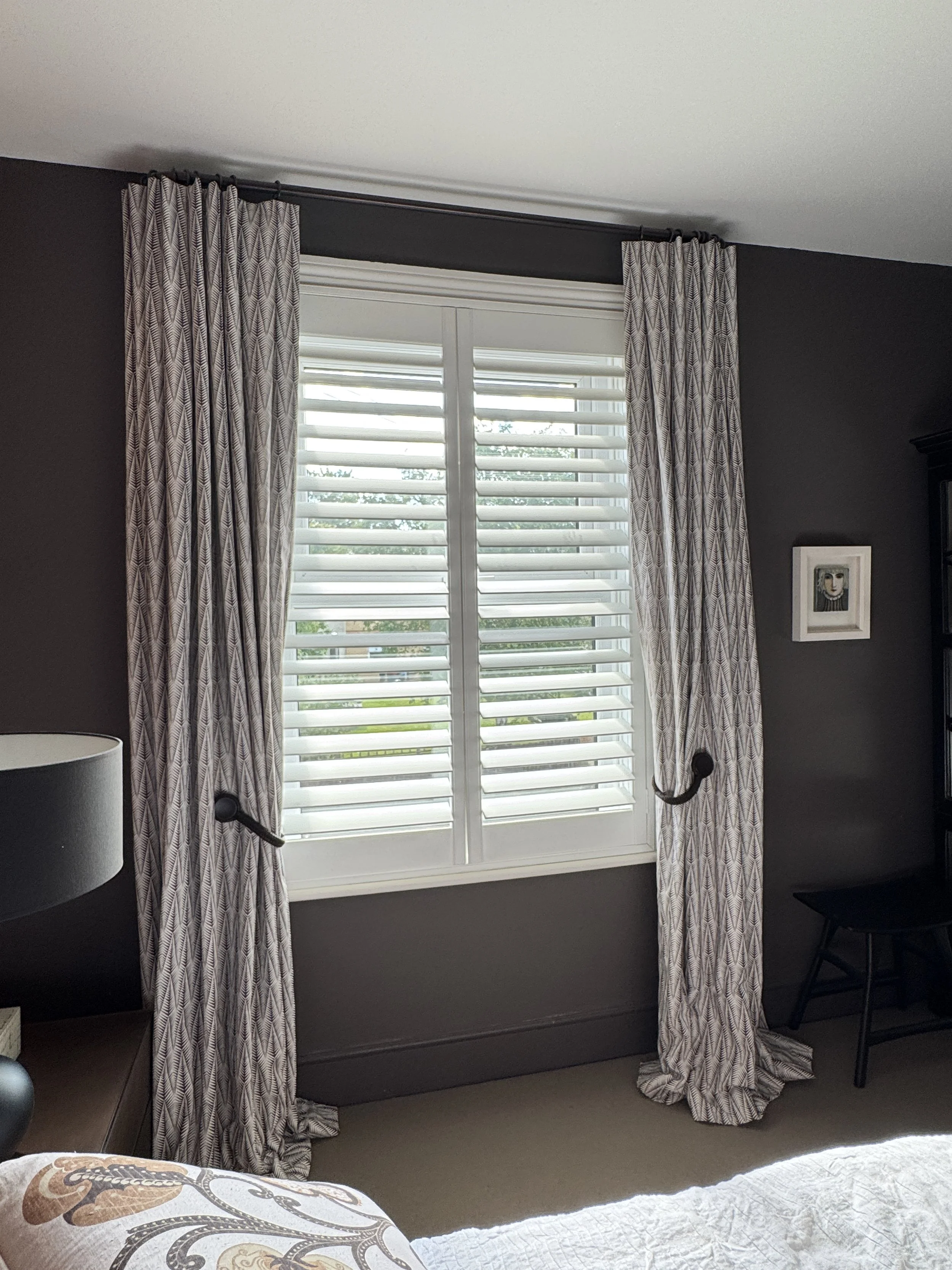
Pattern, texture and colour working together to create a rich, layered bedroom scheme.
On two walls, Hollywood Grape by Neisha Crosland. Yes, two Neisha Crosland patterns in the same room. The reason it works is palette discipline. Both patterns live in the same dark, smoky colour family and neither fights for dominance. The effect is rich and enveloping without being overwhelming.
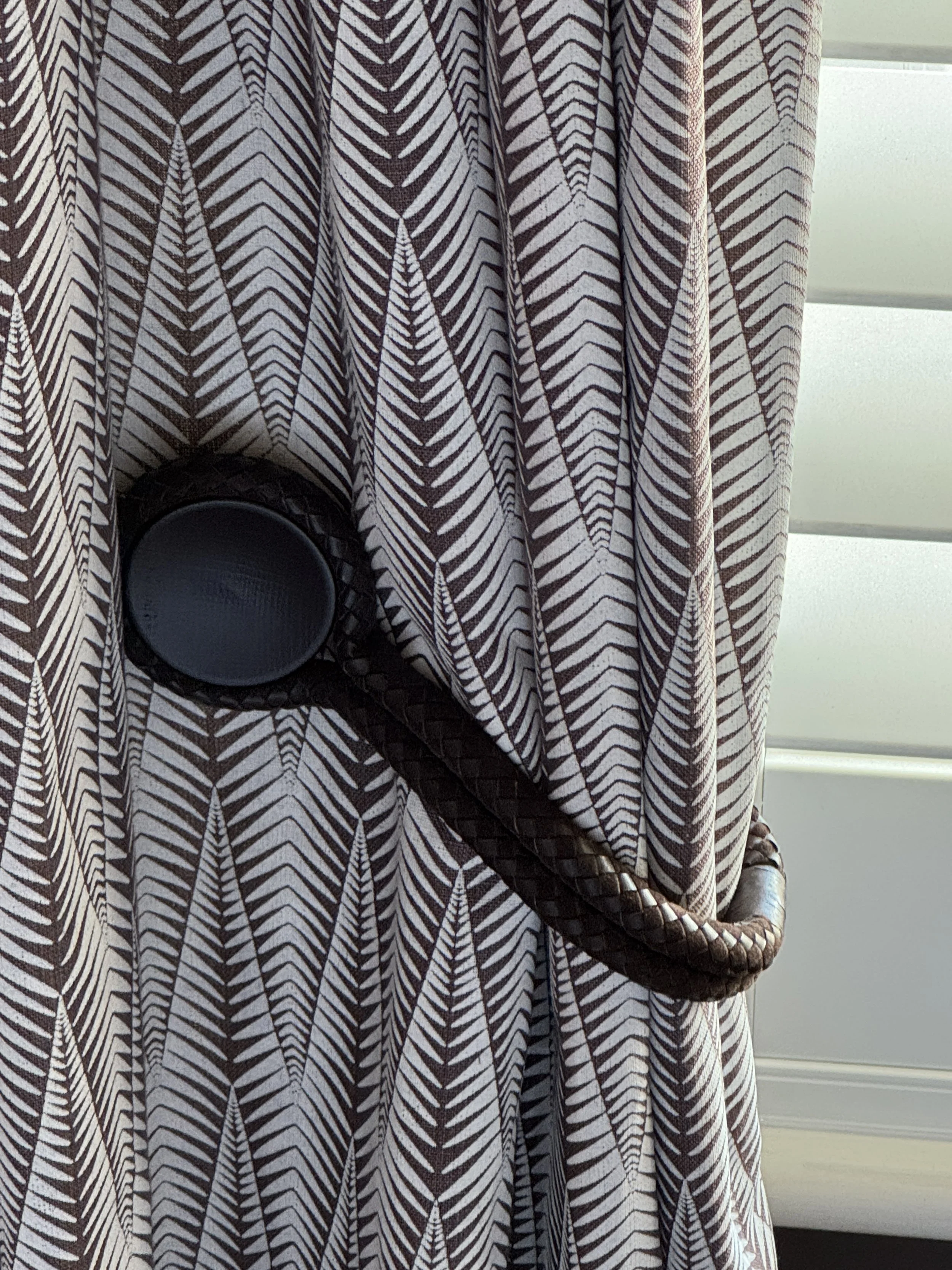
A white plantation shutter sits behind the curtains for light control, and the curtains are held back with a braided leather tieback with a black button detail, the kind of accessory that elevates the whole window and is worth every penny.
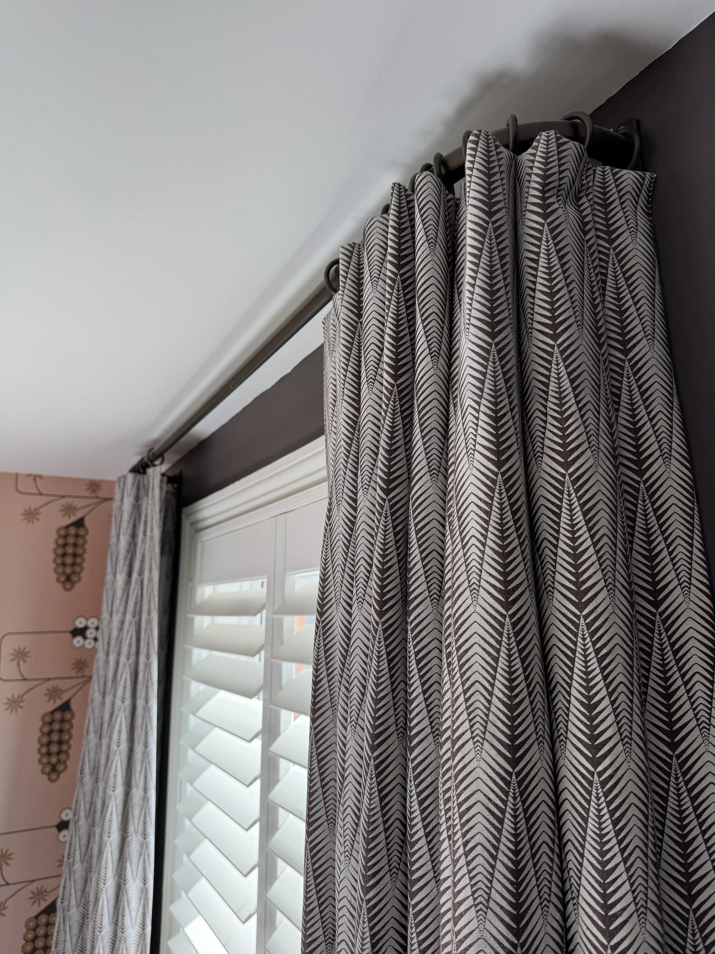
Layering patterned curtains with shutters adds depth without overwhelming the room.
Designer's tip: Pattern on pattern works beautifully when the colours are held within the same family. Don't be afraid of it, but do trust your eye, or ask someone who knows.
The Guest Bedroom
This is one of my favourite windows in the house and one of the most technically involved.
The main fabric is Hedgehog by Neisha Crosland, a bold graphic print that manages to feel both contemporary and timeless. I used a plain canvas in putty as the ground, with a 5cm band of plaster pink at the top and again before the hem, each outlined with a fine black trim. The Roman blind behind is made in the same plaster pink, tying the whole window together.
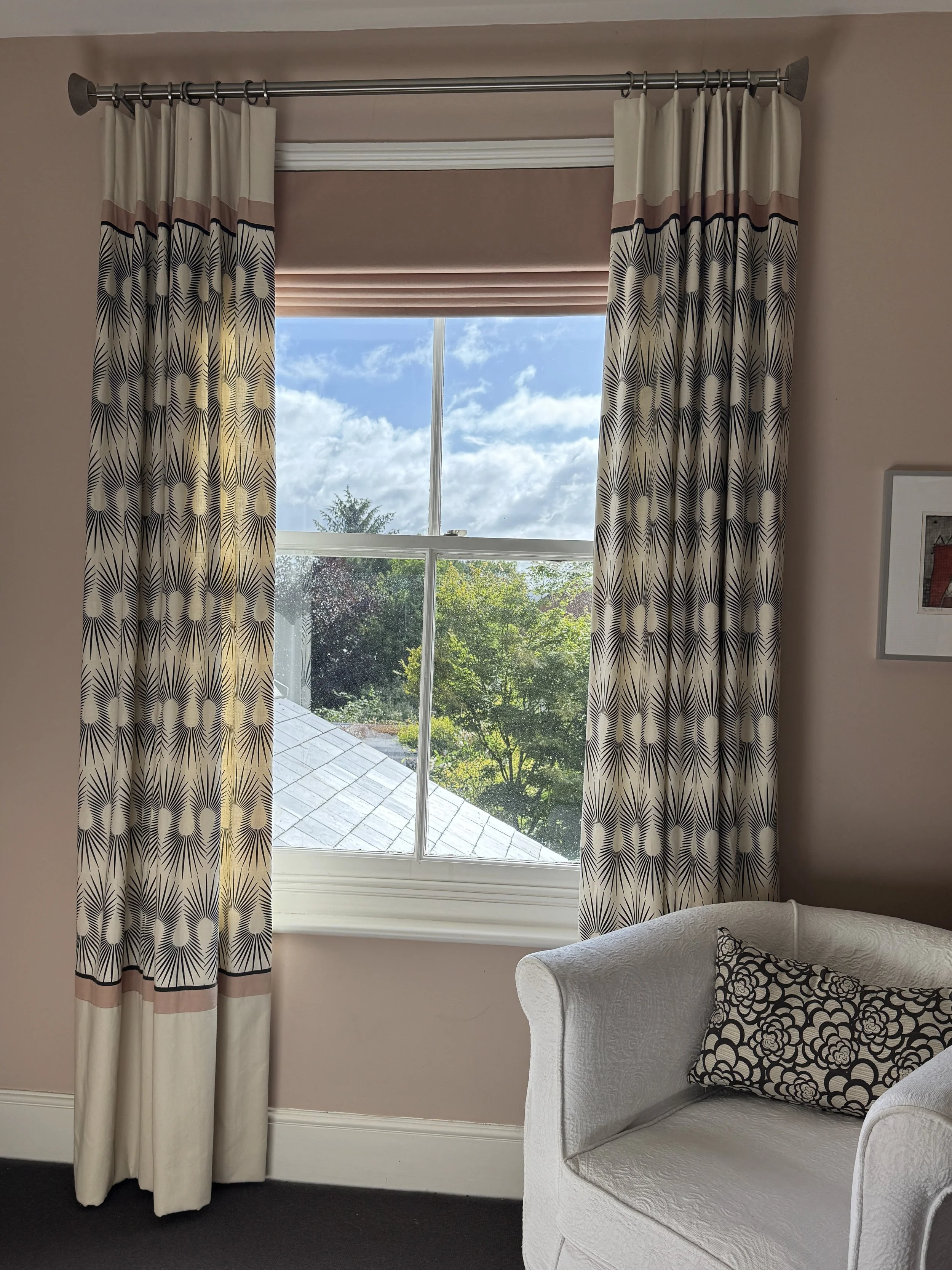
Bespoke curtains and a coordinating Roman blind, layered to create a balanced and beautifully detailed window.
What makes this window work is that every detail is mirrored top and bottom. The plaster pink band and fine black trim appear at both the heading and the hem, creating a sense of balance and intention. Every element has been considered, from the overall composition right down to the smallest detail. This is the kind of bespoke workmanship that simply cannot be achieved with off-the-peg curtains.
Designer's tip: When you add contrast details to curtains, think about whether they work at both ends of the drop. A band at the top that's mirrored at the bottom creates a sense of intention and craft that lifts the whole treatment.
The Cloakroom
Flamenco Yolk by Neisha Crosland. Bold, joyful and completely unexpected in a small loo – which is precisely why it works. The chain edging detail on the sides of the blind is a finishing touch that most people wouldn't think to specify, but it's exactly the kind of thing that makes a bespoke blind look and feel truly special.
If there's one piece of advice I give clients about small rooms, it's this: don't play it safe.
Make it stand out
Bold pattern and unexpected colour turn a small window into a memorable design feature.
Designer's tip: A downstairs loo or cloakroom is one of the best places in the house to try something you'd never dare do in a larger room. Be bold – you won't regret it.
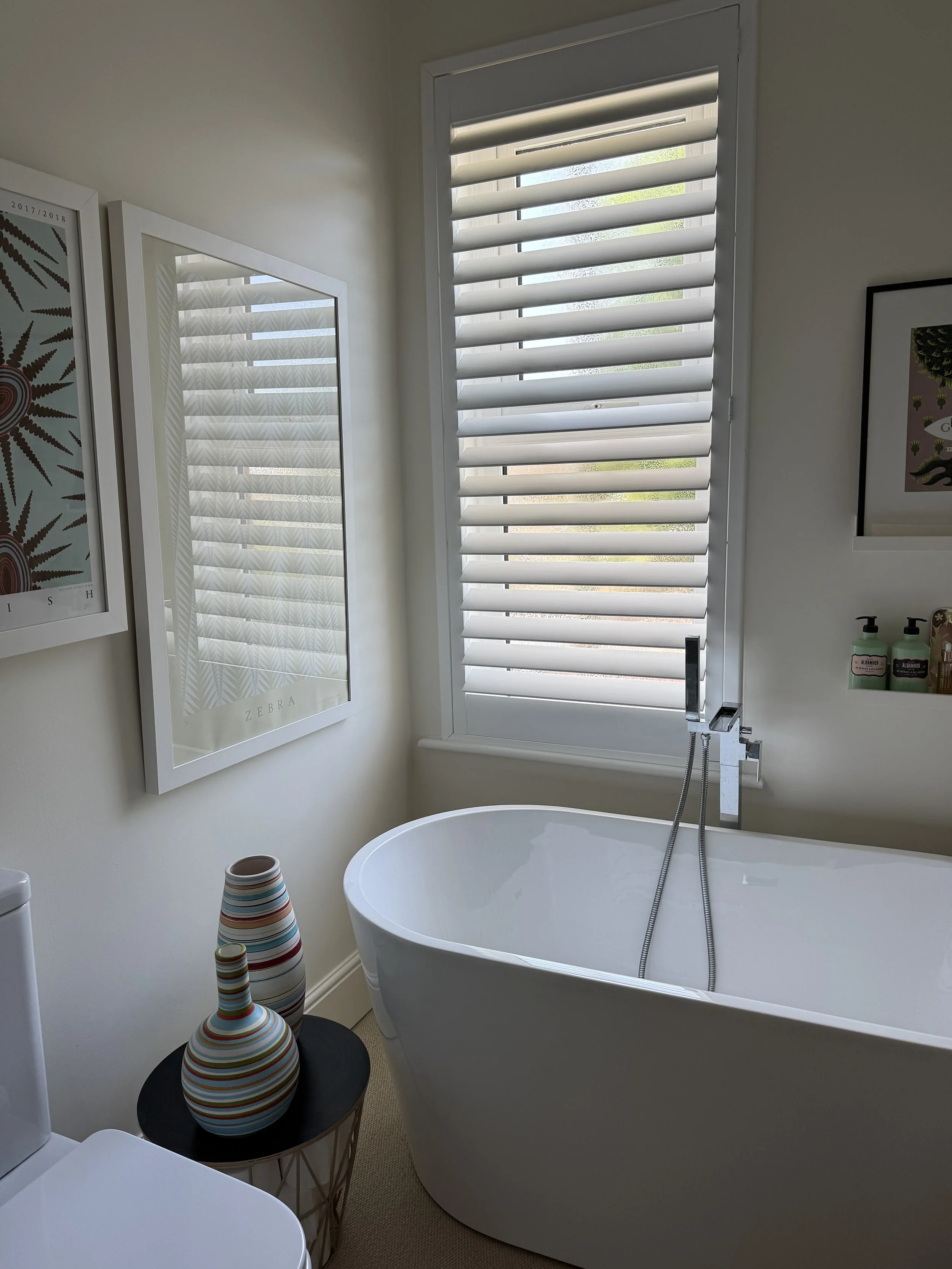
The Bathroom
The bathroom window currently has white plantation shutters – clean, practical and timeless. But it didn't always.
For years it had the most beautiful cutout lace panels by Tord Boontje – a botanical design that filtered the light in the most extraordinary way, like standing inside a garden. I used to sell these in my own interiors shop and I still think they're one of the most beautiful window treatments I've ever used.
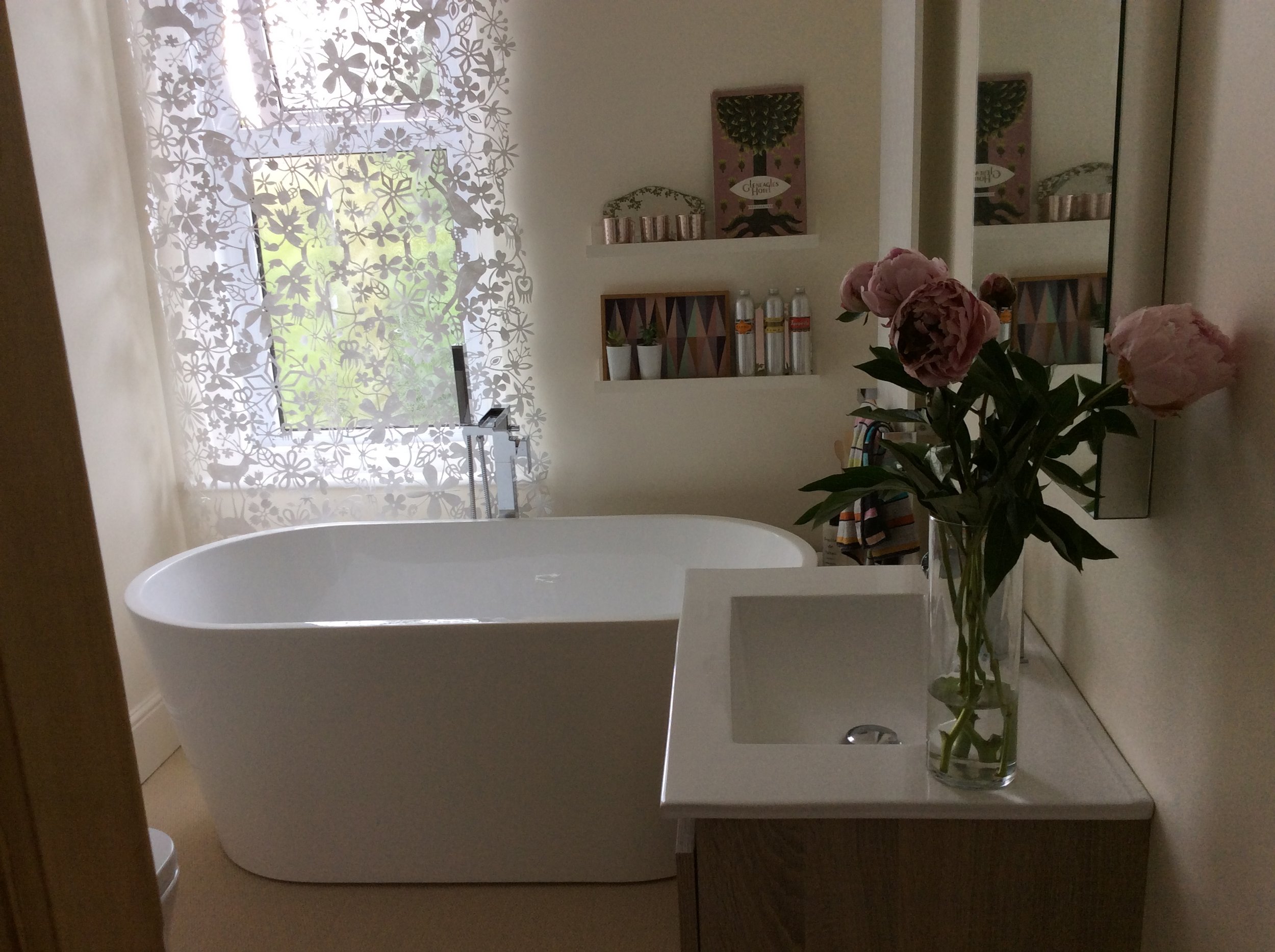
Tord Boontje lace panels transformed daylight into something magical.
The reason I changed to shutters wasn't actually about the bathroom at all, it was about the exterior of the house. With plantation shutters already in the living room and main bedroom, it made sense for the bathroom to match from outside – consistency of appearance from the street matters, especially on an Edwardian semi where the façade has such presence. Sometimes the right decision for a room is made by looking at it from outside.
Designer's tip: When choosing window treatments, don't only think about how they look from inside. Consider how your house presents itself from the street, and whether your choices work together as a whole.
The Dressing Room – Then and Now
This room has had two completely different lives and I love both of them.
The original bedroom scheme with embroidered Neisha Crosland curtains and coordinating wallpaper.
When it was a bedroom it had a pair of embroidered ivory curtains by Neisha Crosland on a chunky white pole with beehive finials, against wallpaper that gave the room a rich, layered quality entirely right for a bedroom. Traditional, considered, and genuinely lovely.

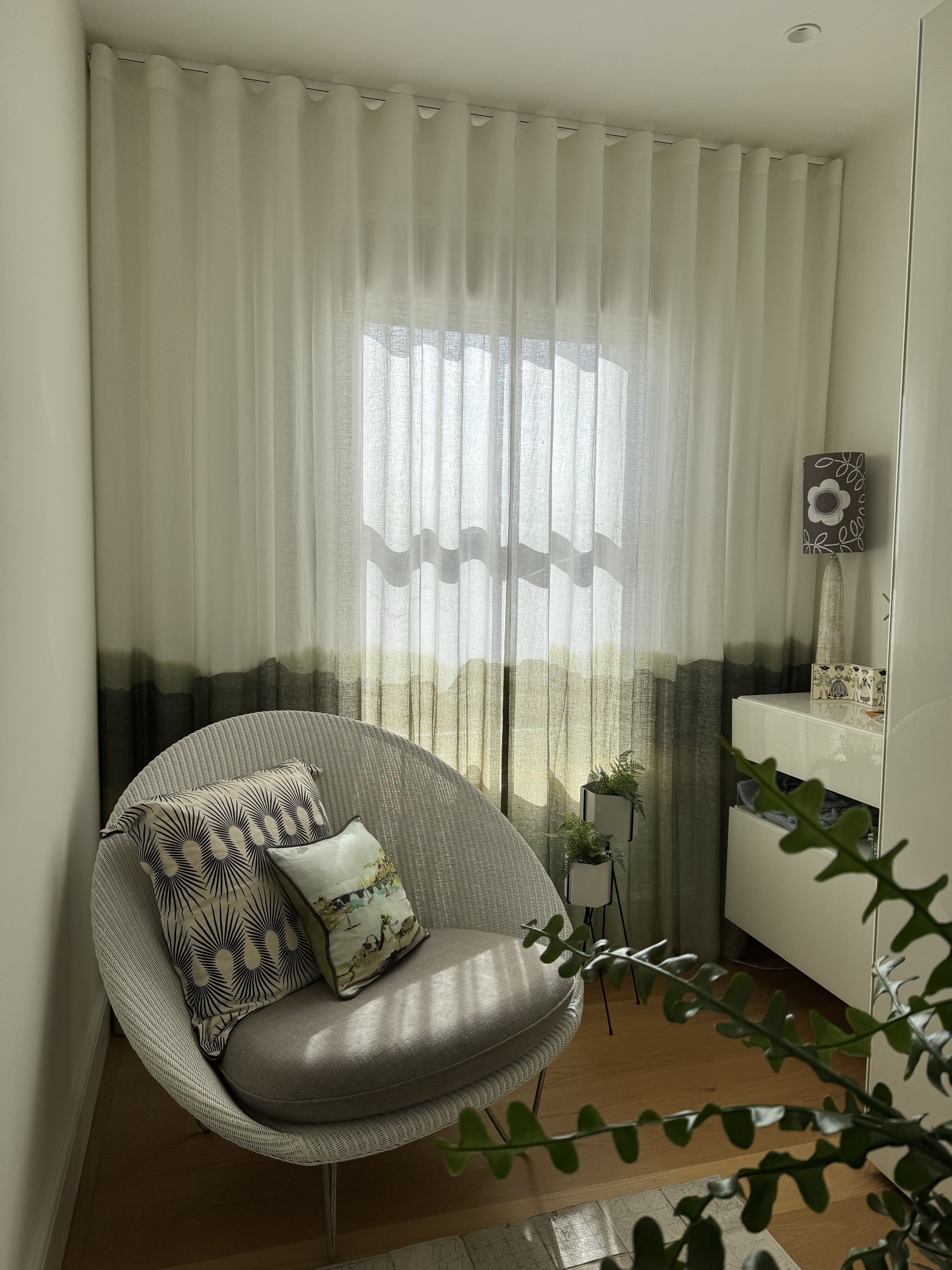
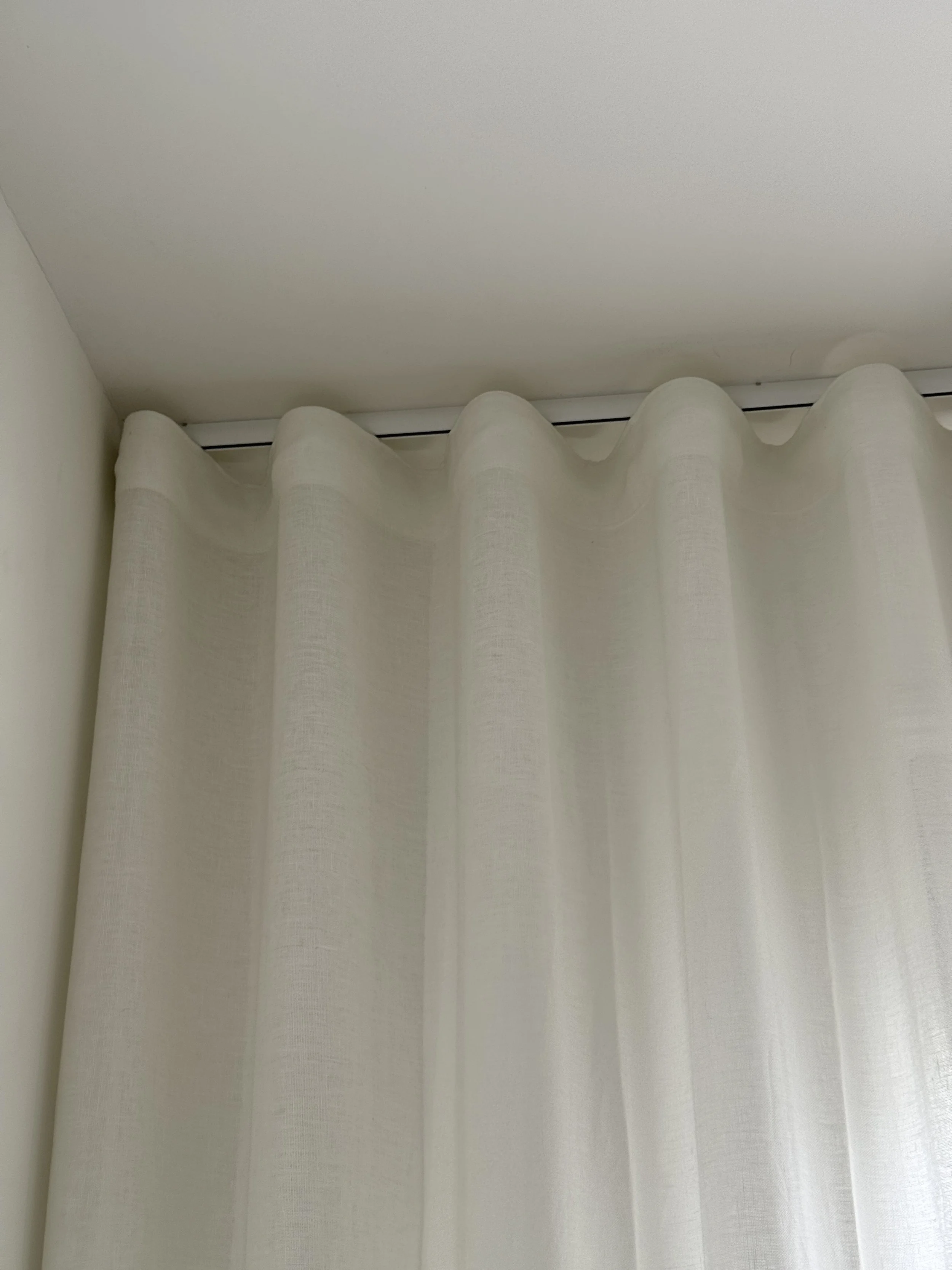
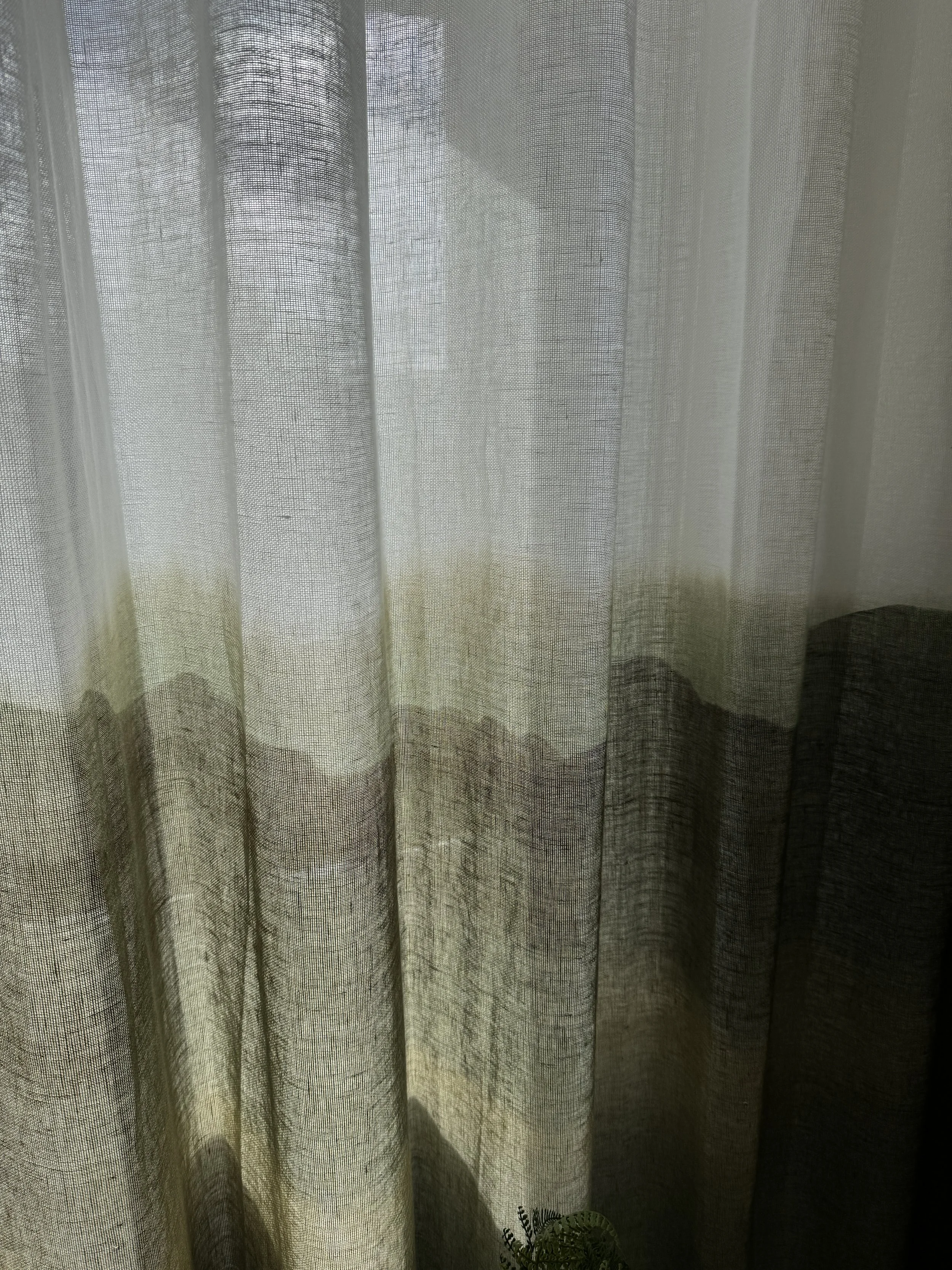
Wall-to-wall sheer curtains transformed the room into a calm dressing space.
But when the room became a dressing room everything needed to change. A room you get dressed in needs to feel calm and spacious, not cocooned. So out came the curtains and in came something completely different – Haze by Casamance, a sheer with an ombre green hem, hung wall to wall and floor to ceiling on a wave heading. The floor to ceiling treatment makes the room feel significantly wider than it actually is, which in a small dressing room matters enormously. When the curtains are drawn it feels like standing inside a quiet green landscape. Light, airy and fresh – exactly right for starting your day.
It's probably the best example I have of how the right window treatment doesn't just dress a window. It defines what a room feels like to be in.
Designer's tip: When a room changes its purpose, your window treatment should change too. What works for a bedroom won't necessarily work for a dressing room, a home office or a playroom. Start from what the room needs to feel like, not what it looked like before.
Thinking about your own windows?
If you'd like help thinking through your own windows, whether it's a single Roman blind, a tricky bay, or a whole house full of windows that have been waiting far too long – I'd genuinely love to hear from you. Window treatments are one of my favourite things to get right, and there's almost always a solution that's better than you imagined possible.