
Inside WOW!house 2026: My First Visit, Five Years in the Making
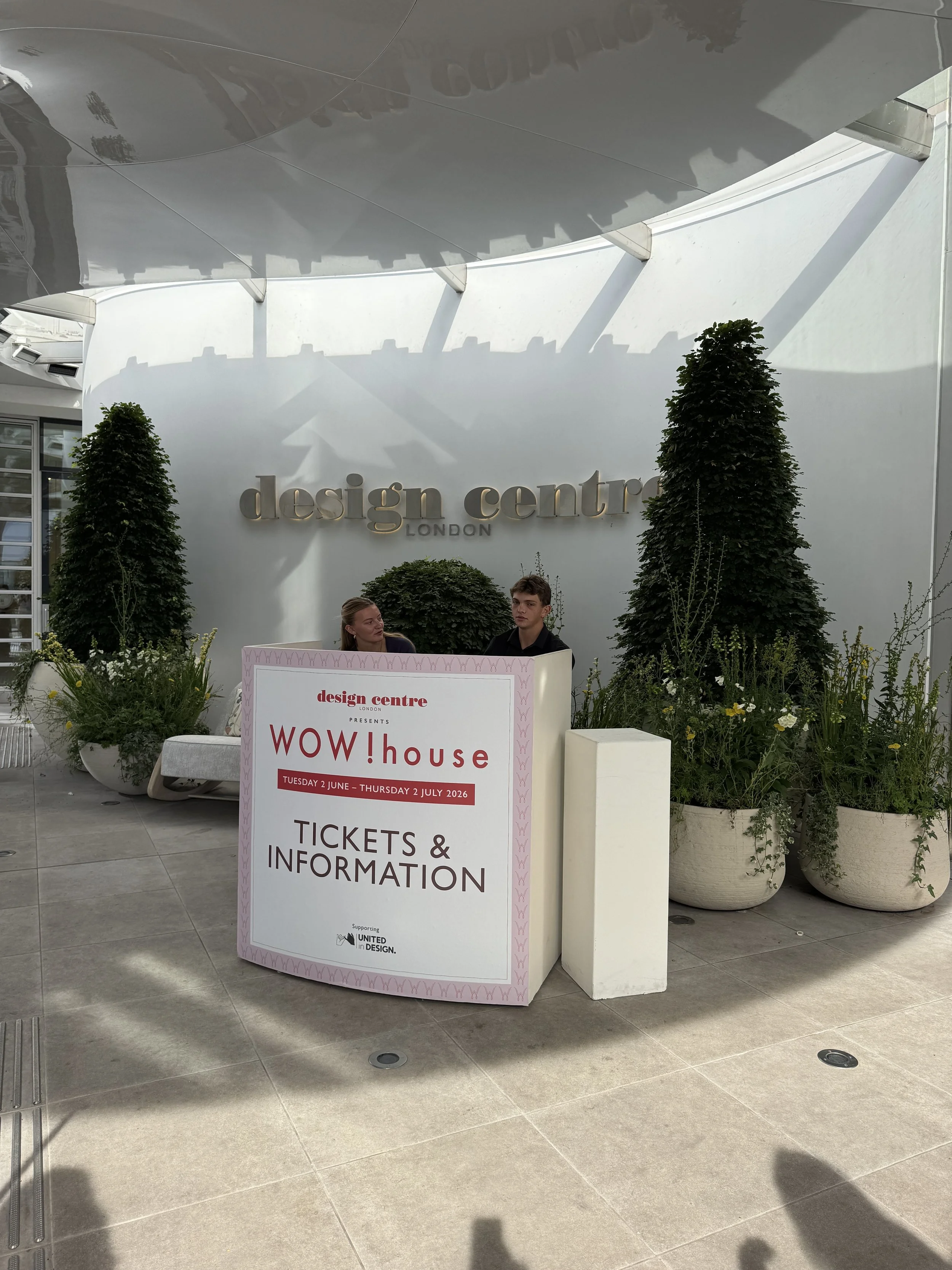
WOW!house has been taking place at the Design Centre, Chelsea Harbour since 2022, and this year marked its fifth edition.
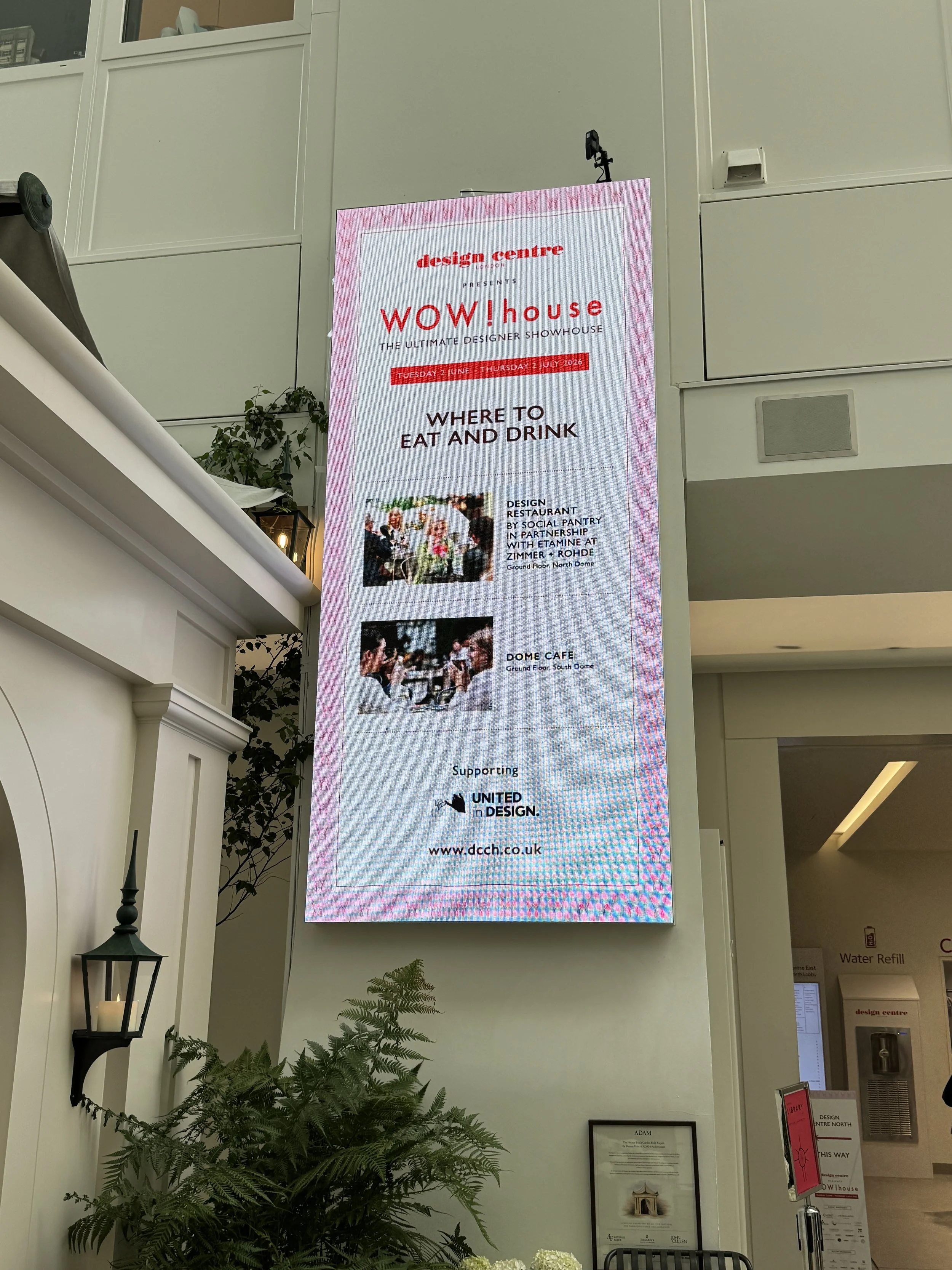
Every summer, Design Avenue is transformed into a full-scale show house made up of 22 individual rooms, each created by a leading interior designer in collaboration with one of the showrooms or luxury brands based at the Design Centre.
I have wanted to visit for years, so I was delighted to finally make it this year. It certainly lived up to its reputation.
What makes WOW!house particularly special is the calibre of designers involved. Many work at the very top end of residential interior design, where client confidentiality and non-disclosure agreements mean that much of their work is rarely published or photographed.
WOW!house gives them an opportunity to design without the restrictions of a client brief, so you are seeing a much more personal and unfiltered expression of their creativity.
One thing became very clear as I walked through the house: ceilings were very much part of the design this year.
Nearly every room had a properly considered ceiling, rather than simply leaving it painted white and forgotten. There were tented ceilings, coffered ceilings, carved timber, tiles, wallpaper, fabric and high-gloss lacquer.
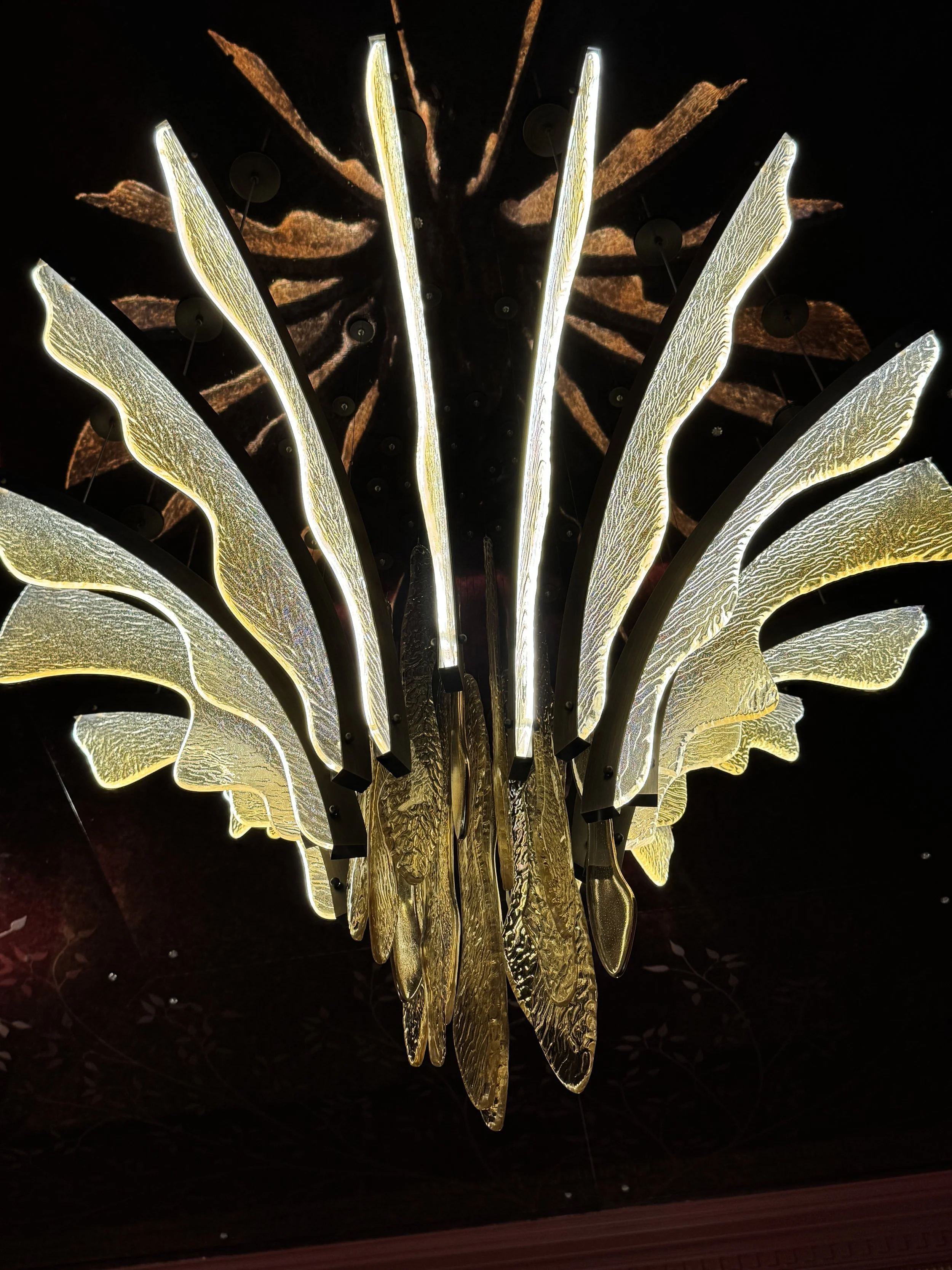
The ceilings gave the chandeliers and pendant lights a real sense of purpose. I found myself looking upwards almost as much as I was looking around the rooms.
Fabric wall panels appeared again and again too, softening the architecture and taking the edge off rooms that might otherwise have felt quite formal. I also spotted several hidden cupboards, cocktail bars and cabinets concealed within the panelling, which added a lovely sense of theatre.
Here is my walk through WOW!house 2026, in the order I experienced the rooms.
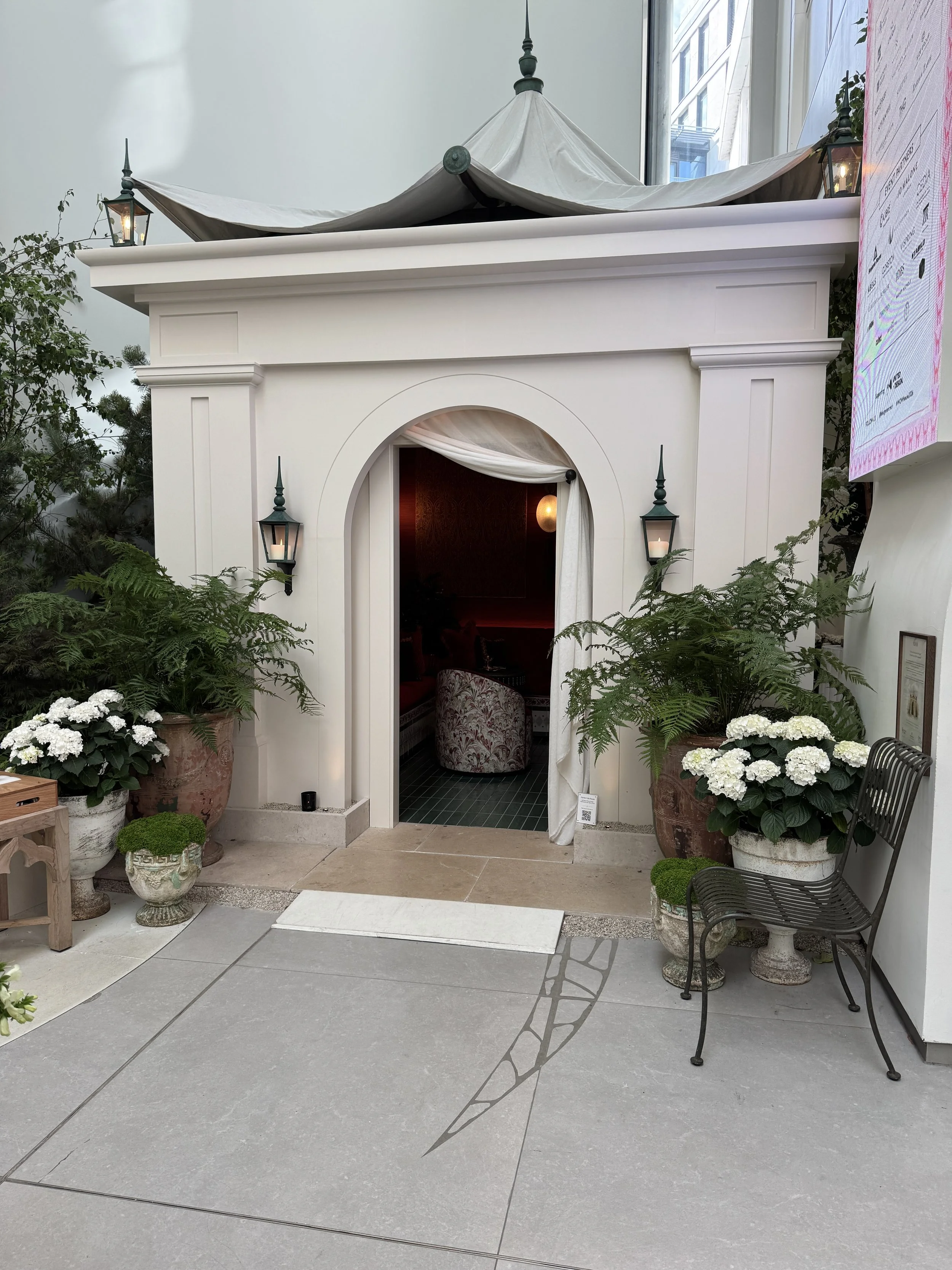
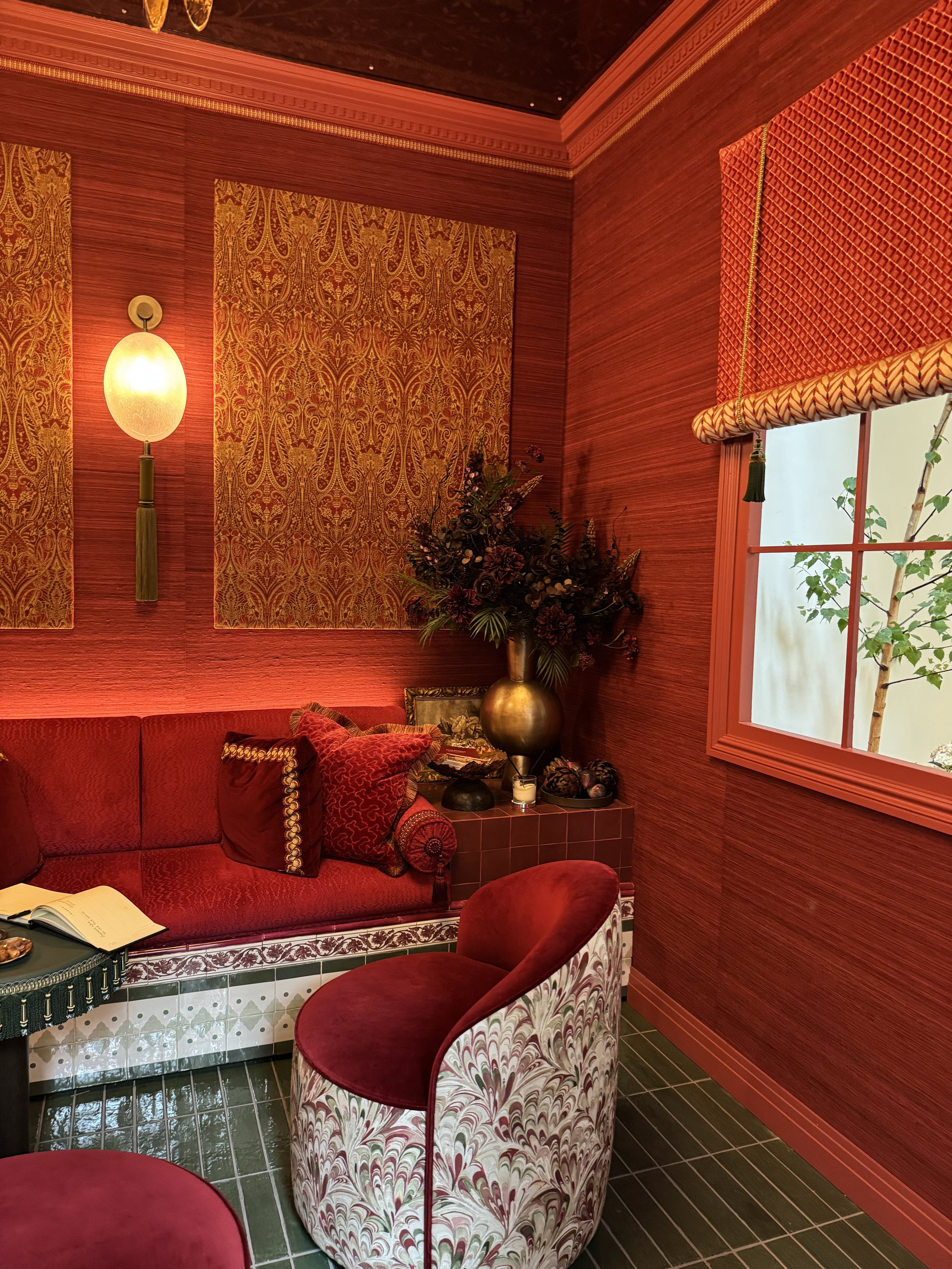
Garden Folly Room by Studio Enass
Treasure Island
A jewel-box hideaway where the mood is sensuous, opulent and deeply indulgent. Designer Enass Mahmoud steps into the role of imaginary client, creating an indulgent retreat for intimate, joyful moments
Garden Folly Room by Studio Enass
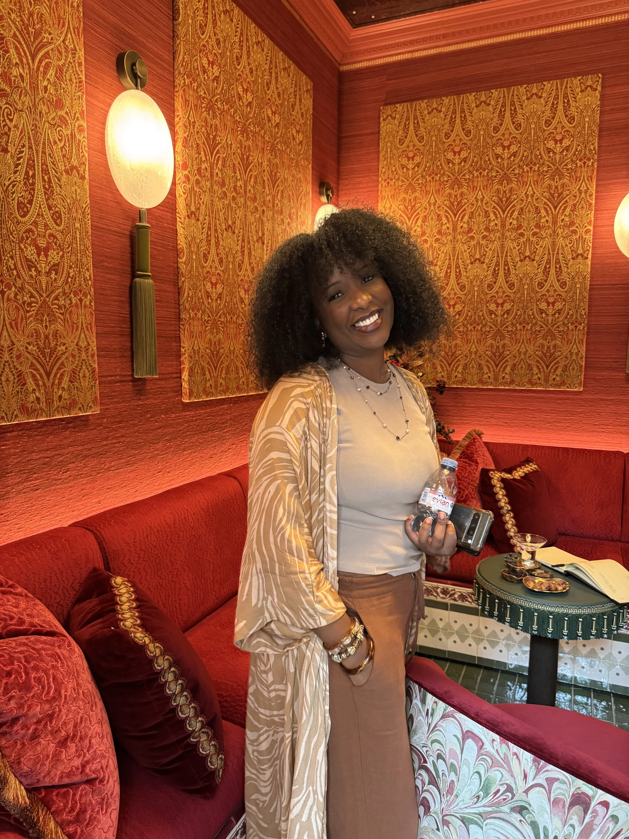
This was my first room, and I was lucky enough to meet Enass Mahmoud while I was there.
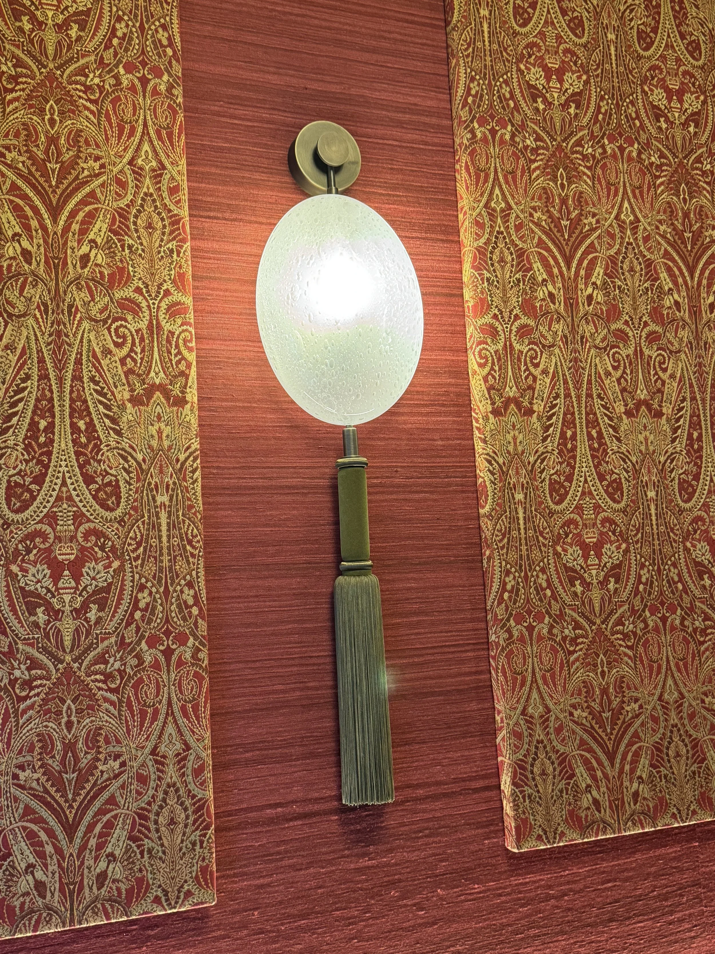
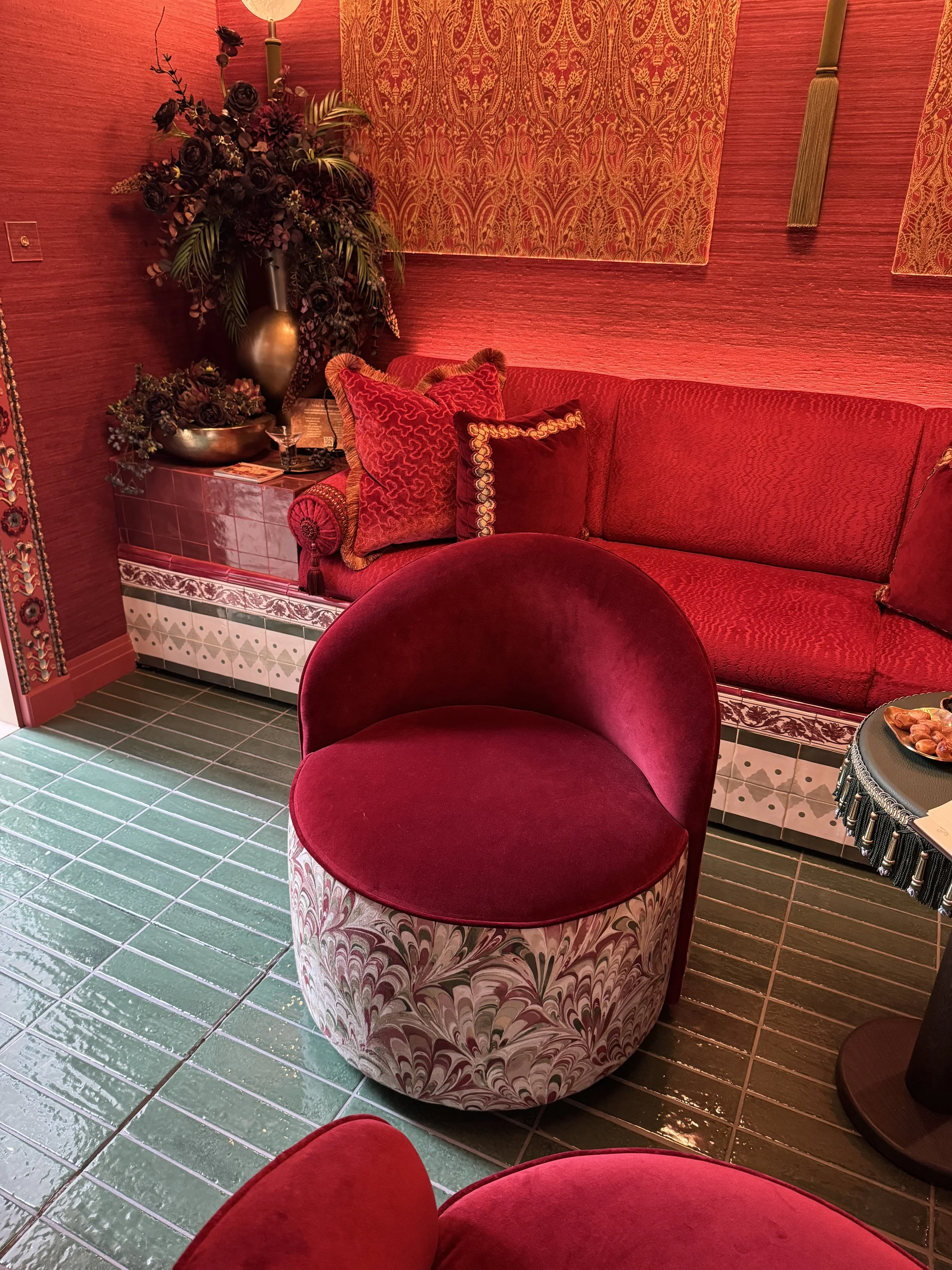
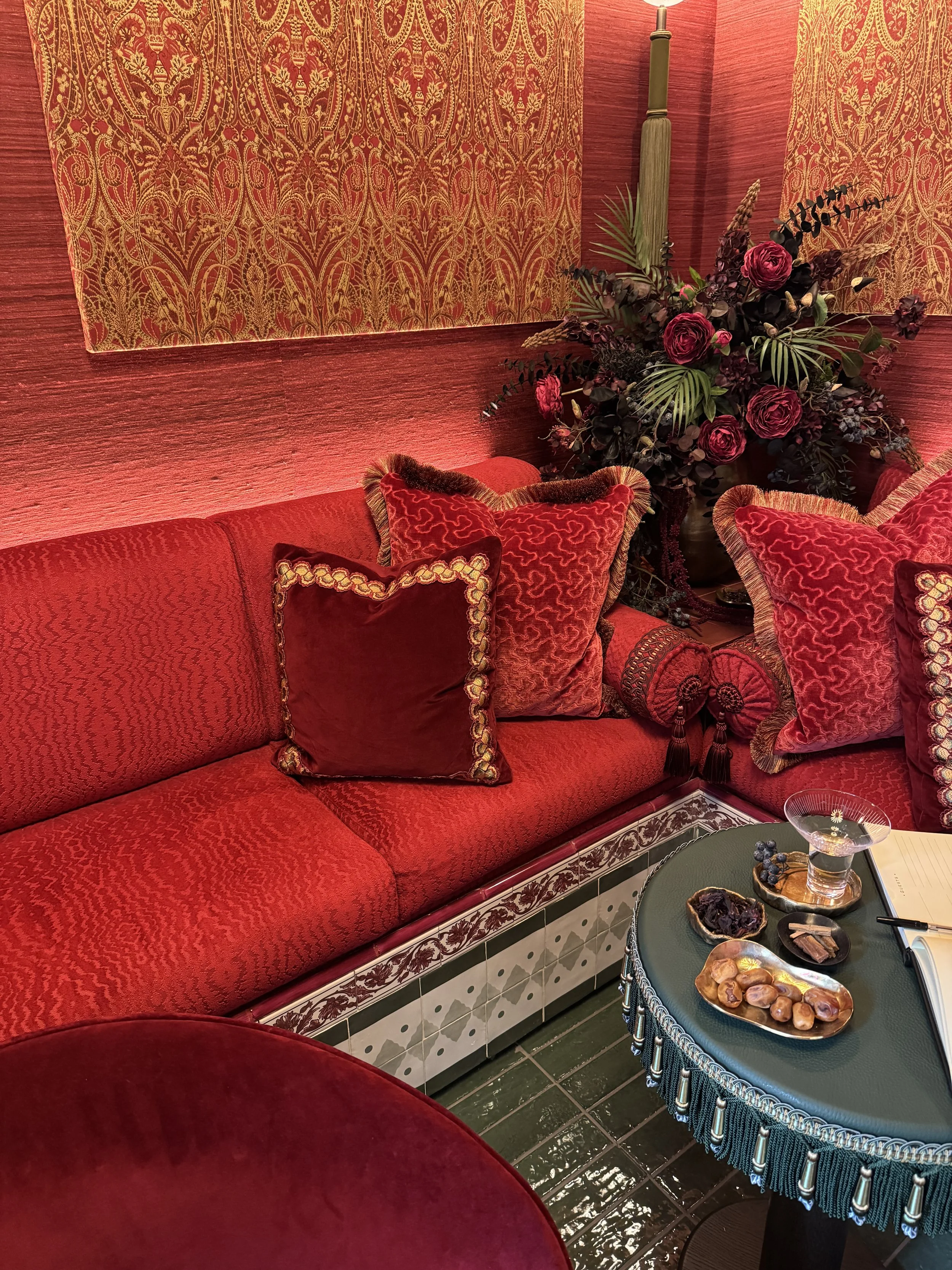
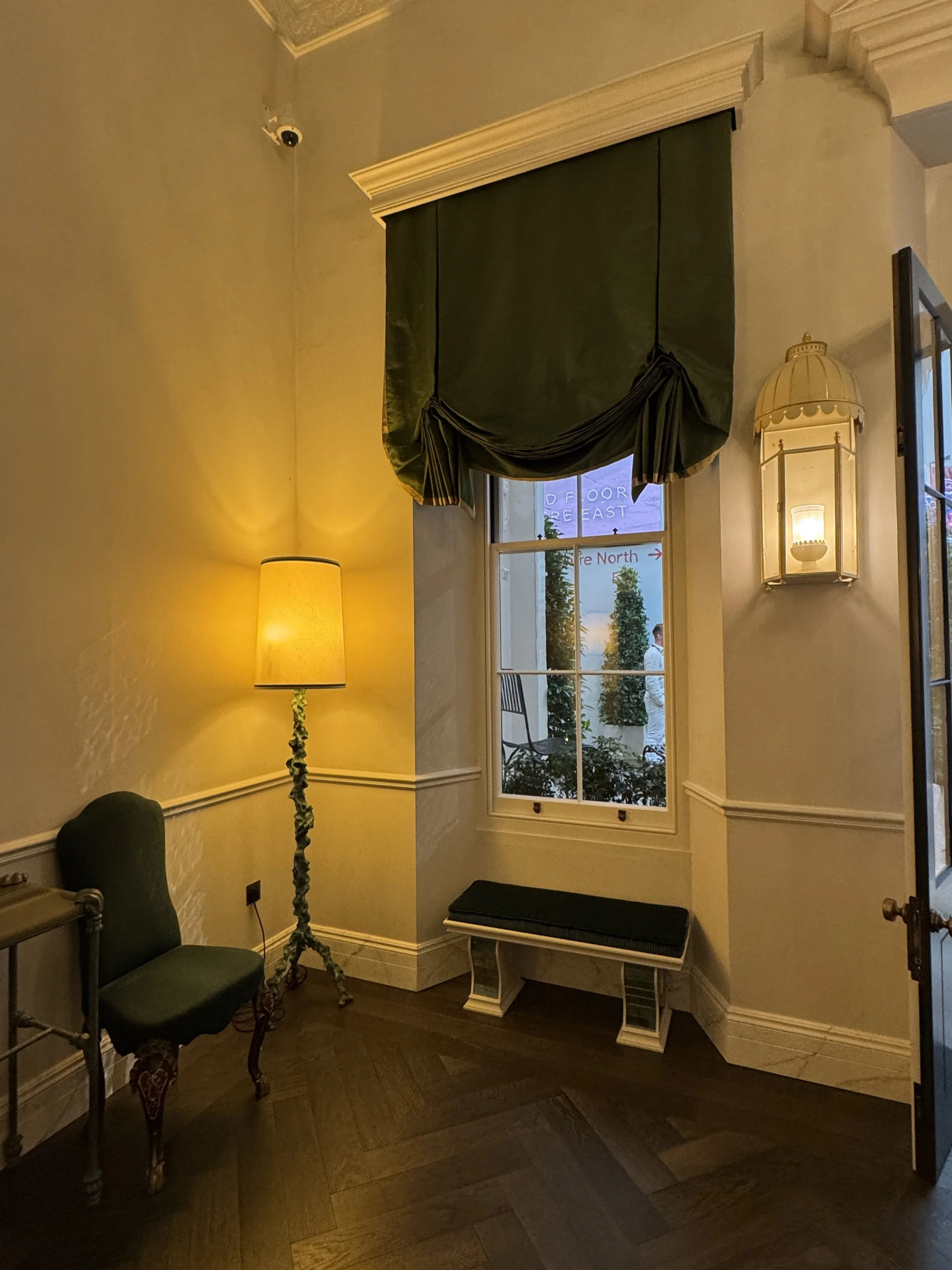
Called Treasure Island, it was a real jewel box of a space. The tiled banquette immediately caught my attention, with a beautiful mixture of Ca’ Pietra tiles in raspberry, forest green, Bordeaux and green dot, finished with a Victorian-style rose carnation border.
There were several different colours and patterns working together, but the details complemented one another rather than competing.
The banquette seat was upholstered in GP & J Baker’s Callow Velvet, which picked up the rich jewel tones within the tiles. This is exactly the sort of thoughtful relationship between fabric and surface that I love to see.
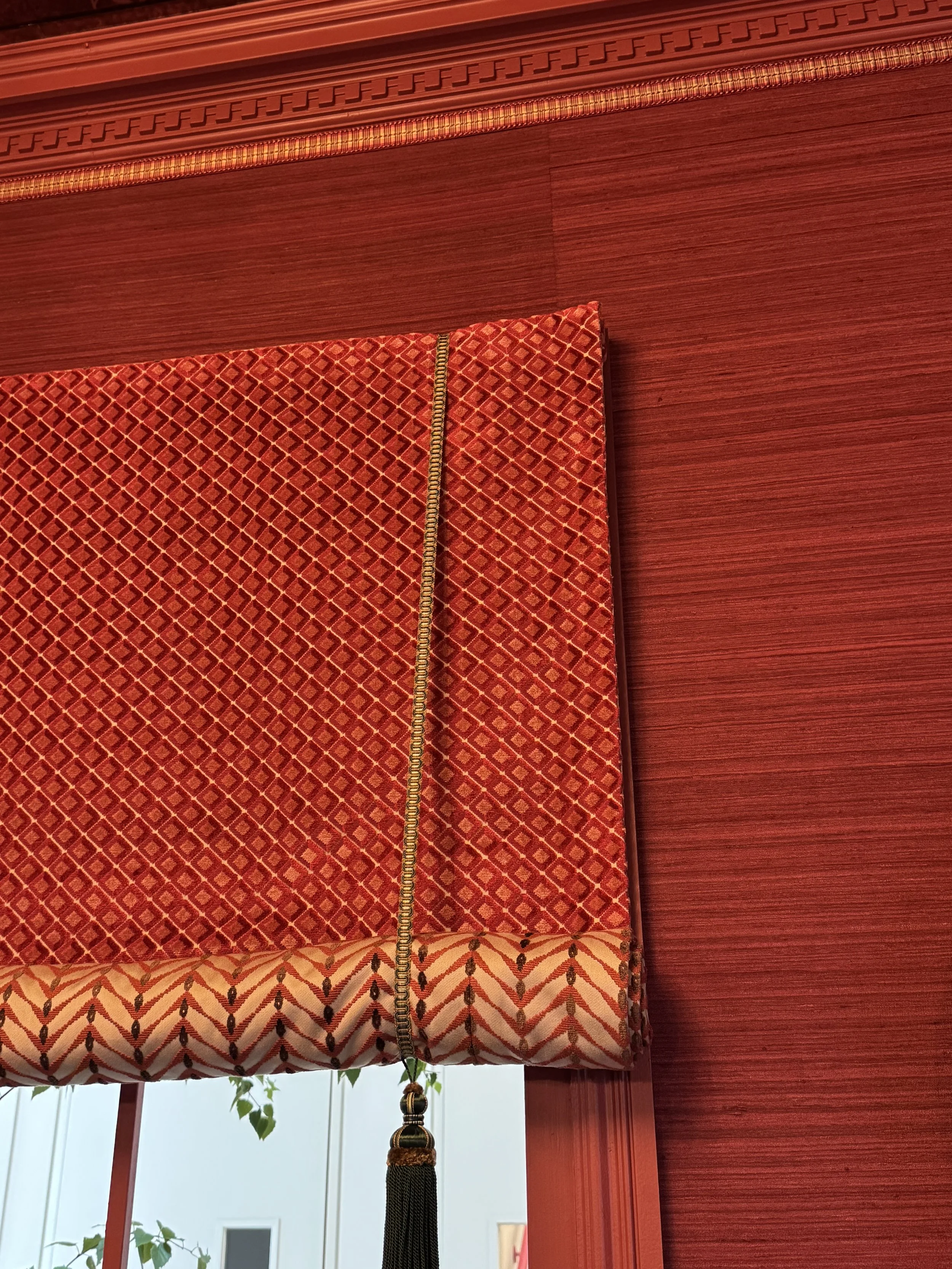
Enass had also used a roller blind in a deliberately relaxed way, leaving it loosely rolled at the top. Proper trimmings from Samuel & Sons and Houlès gave it a beautifully finished appearance, without losing that casual quality.
It was a generous, welcoming little room and a lovely way to begin the visit.
Entrance Hall by Francis Sultana
The Art of Arrival
Francis Sultana takes the grand entrance hall of the British stately home as a starting point, but this is no historical throwback. Filled with contemporary art and collectible design, exquisite elements delight and surprise at every turn
Entrance Hall by Francis Sultana
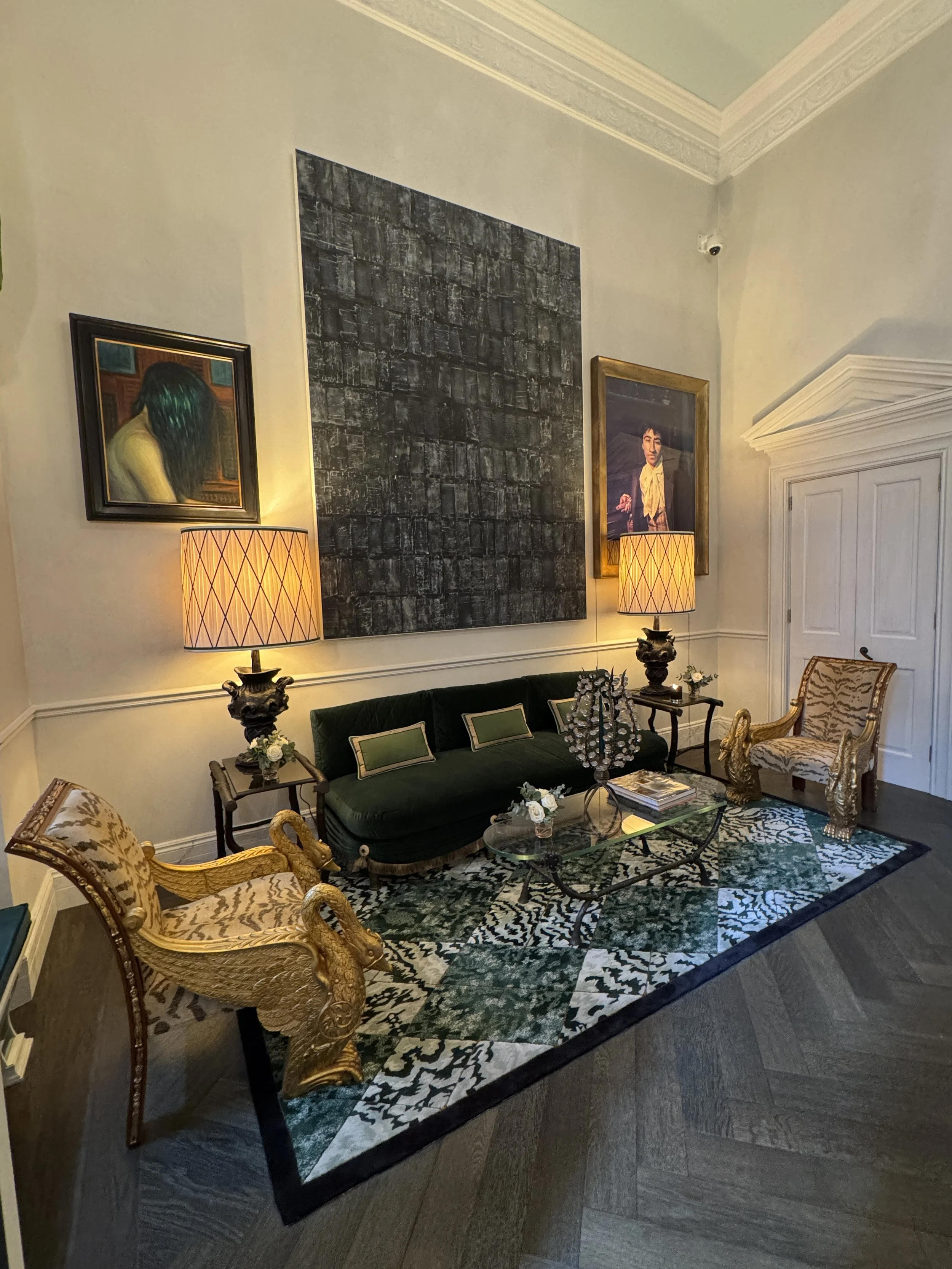
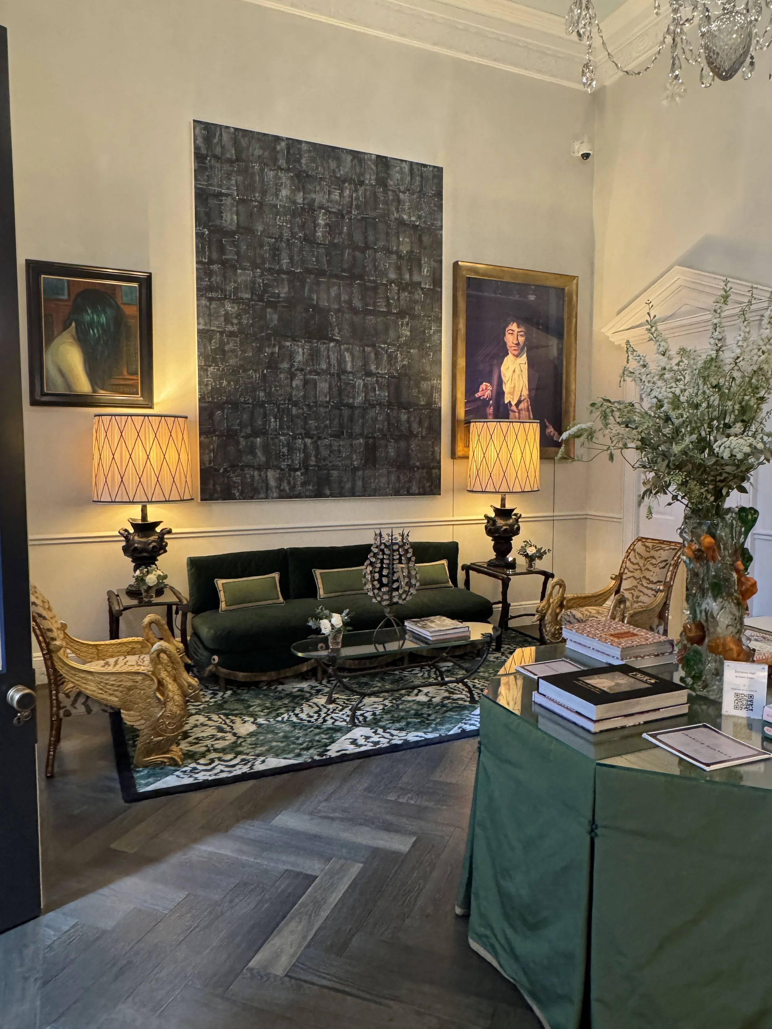
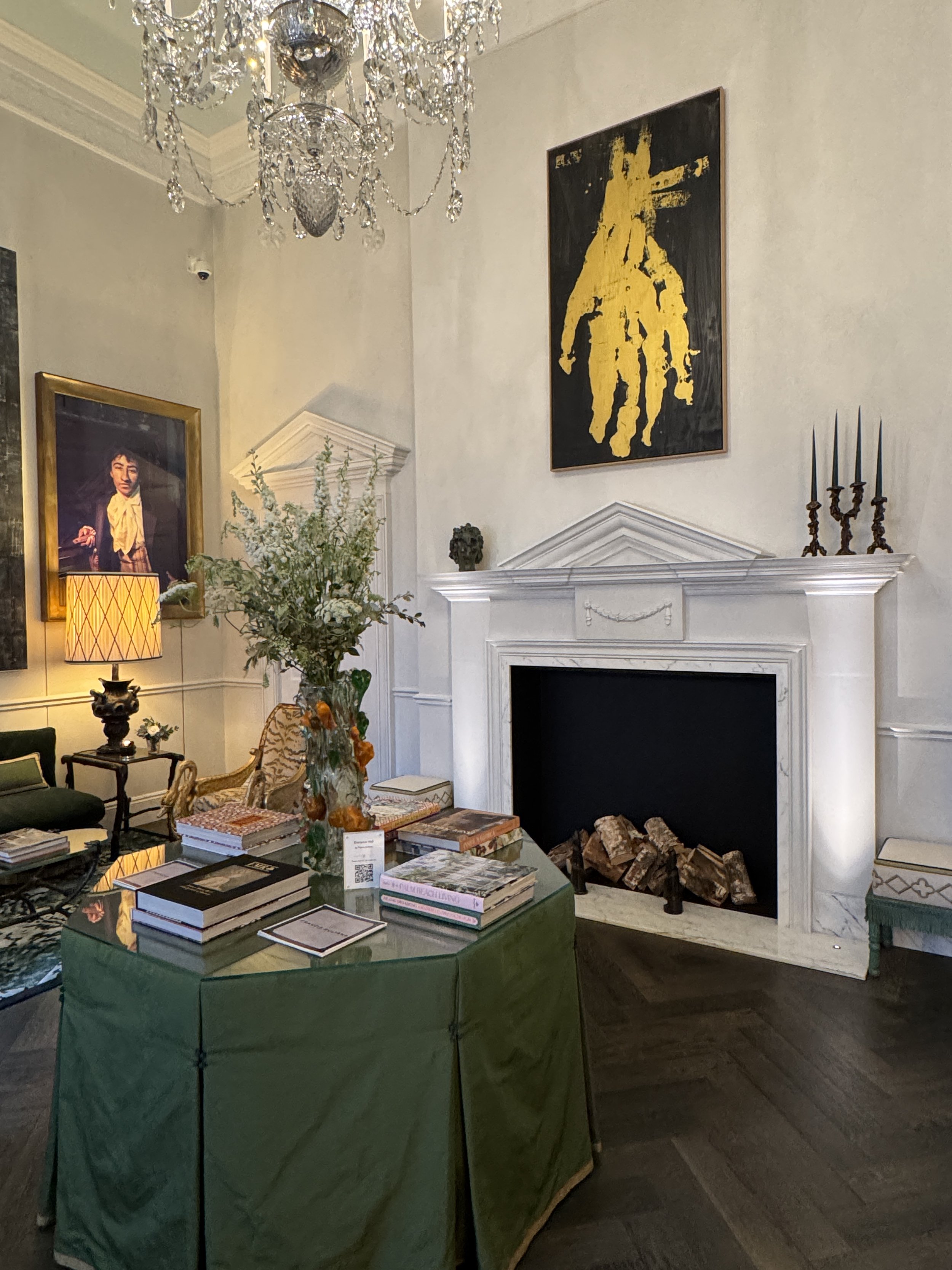
This room was called The Art of Arrival, which was very appropriate, although I might describe it as wonderfully over the top.
It felt more Buckingham Palace than English country house.
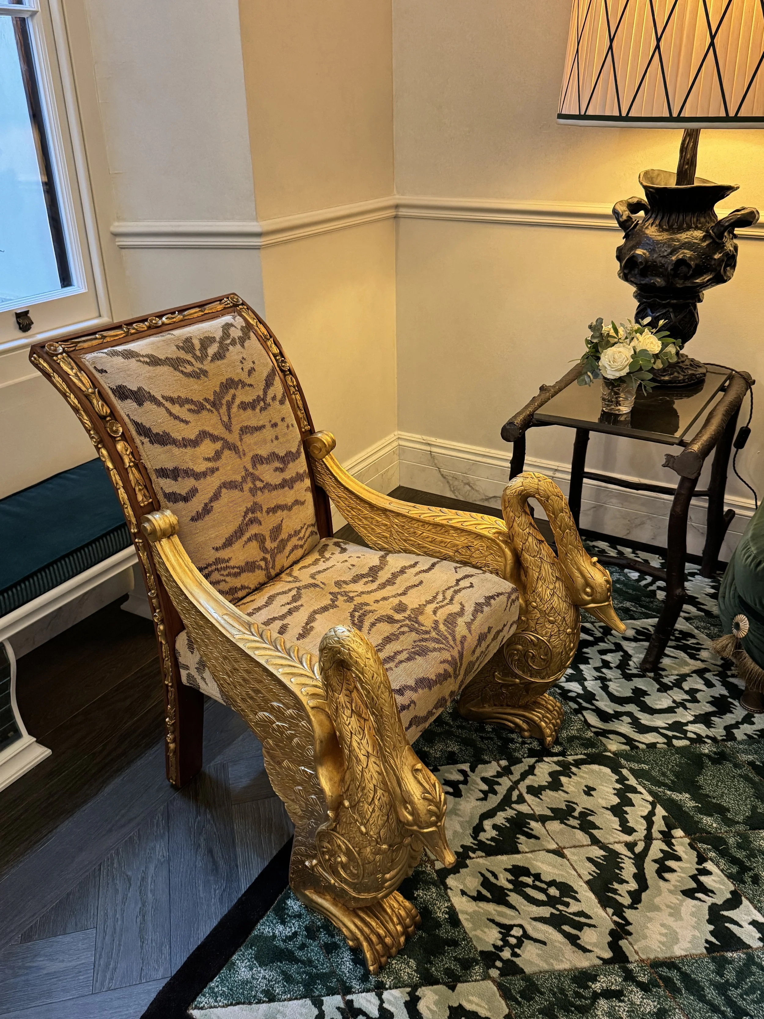
Gilded chairs with carved swan arms sat either side of the sofa like thrones, alongside sculptural furniture by Mattia Bonetti and Garouste & Bonetti, supplied through the David Gill Gallery.
The room also included significant pieces of contemporary art by artists including Yayoi Kusama and Georg Baselitz.
I visited a large Kusama exhibition in Melbourne a couple of years ago, so it was fascinating to see her work again in a completely different environment. Rather than filling a gallery, it was sitting relatively quietly within a luxurious residential interior.
The cornice, dado rail, pediments and fireplace were supplied by Poliform, creating a clean architectural framework for all the gilt, sculpture and glamour.
I also noticed a panelled tablecloth on the central table, which took me straight back to the early 1990s when I first started working in interiors. It is funny how so many ideas eventually come back around.
Turnell & Gigon Group Drawing Room by Albion Nord
Custodians of Craft
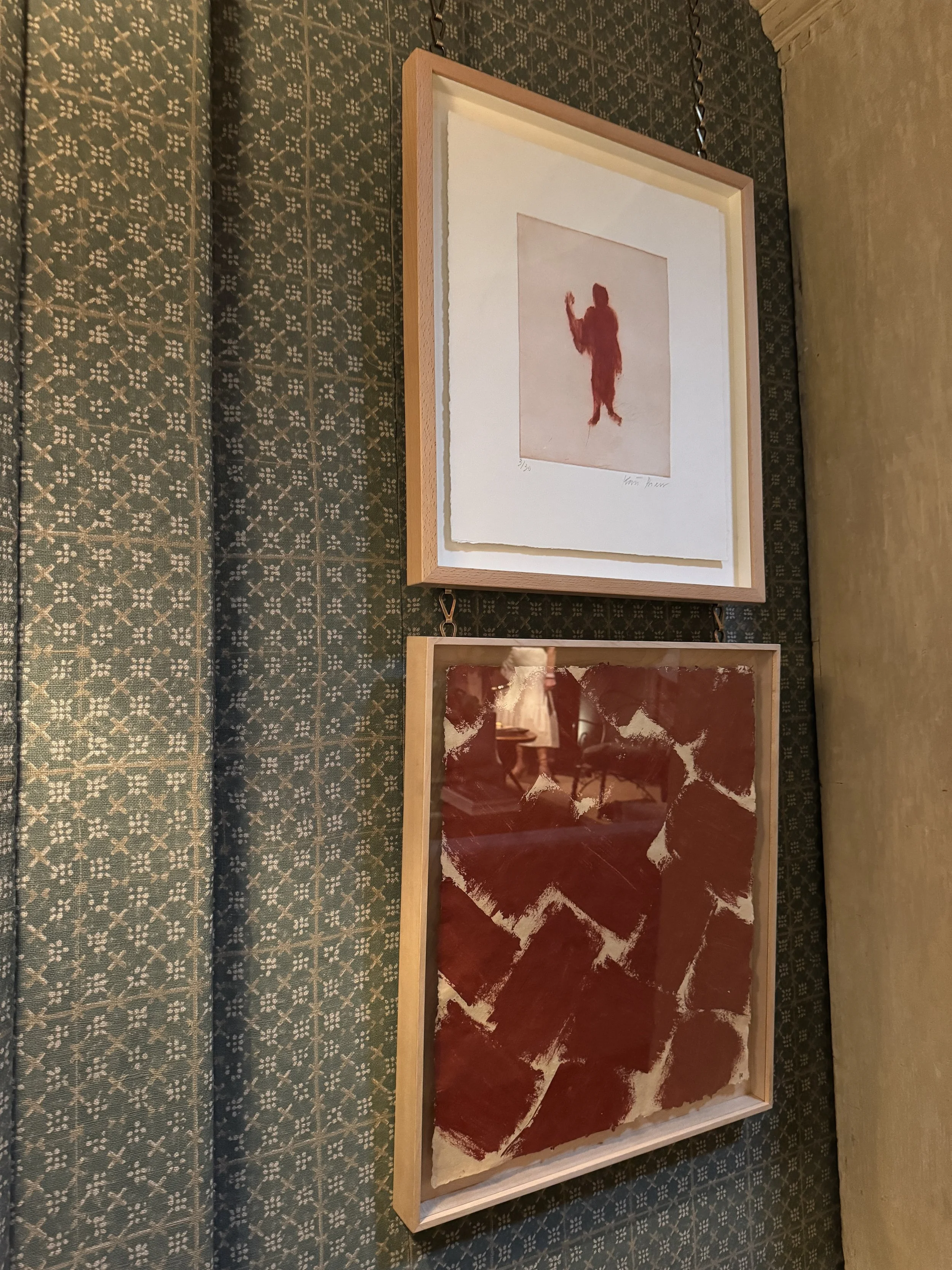
This classically proportioned octagonal gathering space is described as “a showcase of provenance and centuries-old skills” by designers Albion Nord. Built by Barr Build, the room incorporates work from Turnell & Gigon Group’s outstanding portfolio of brands
Turnell & Gigon Group Drawing Room by Albion Nord
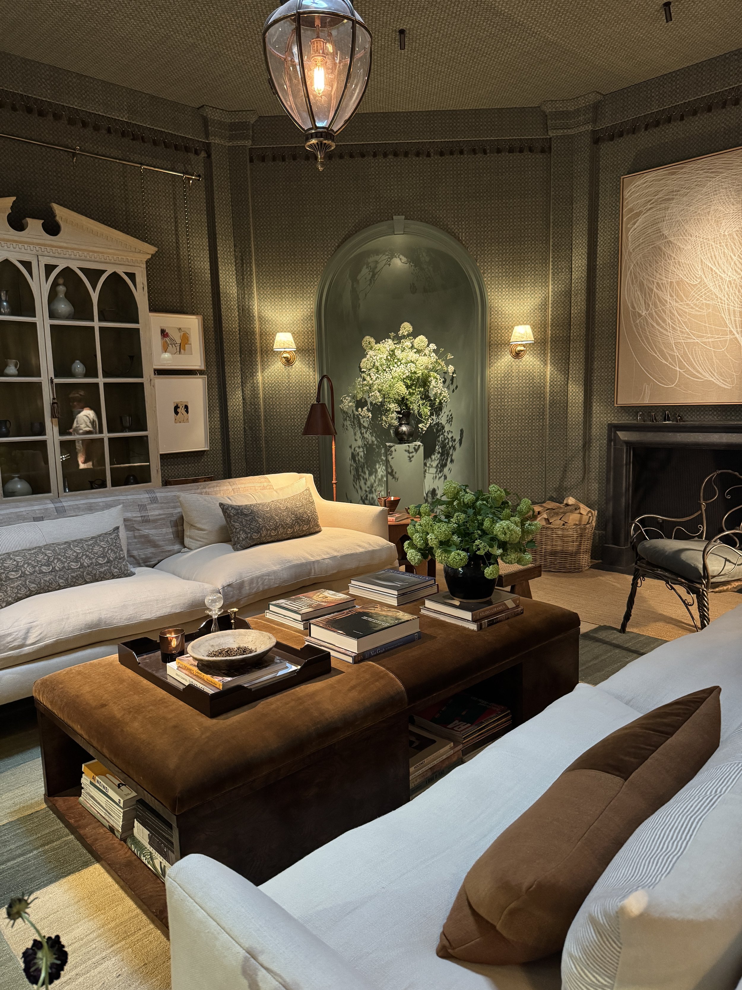
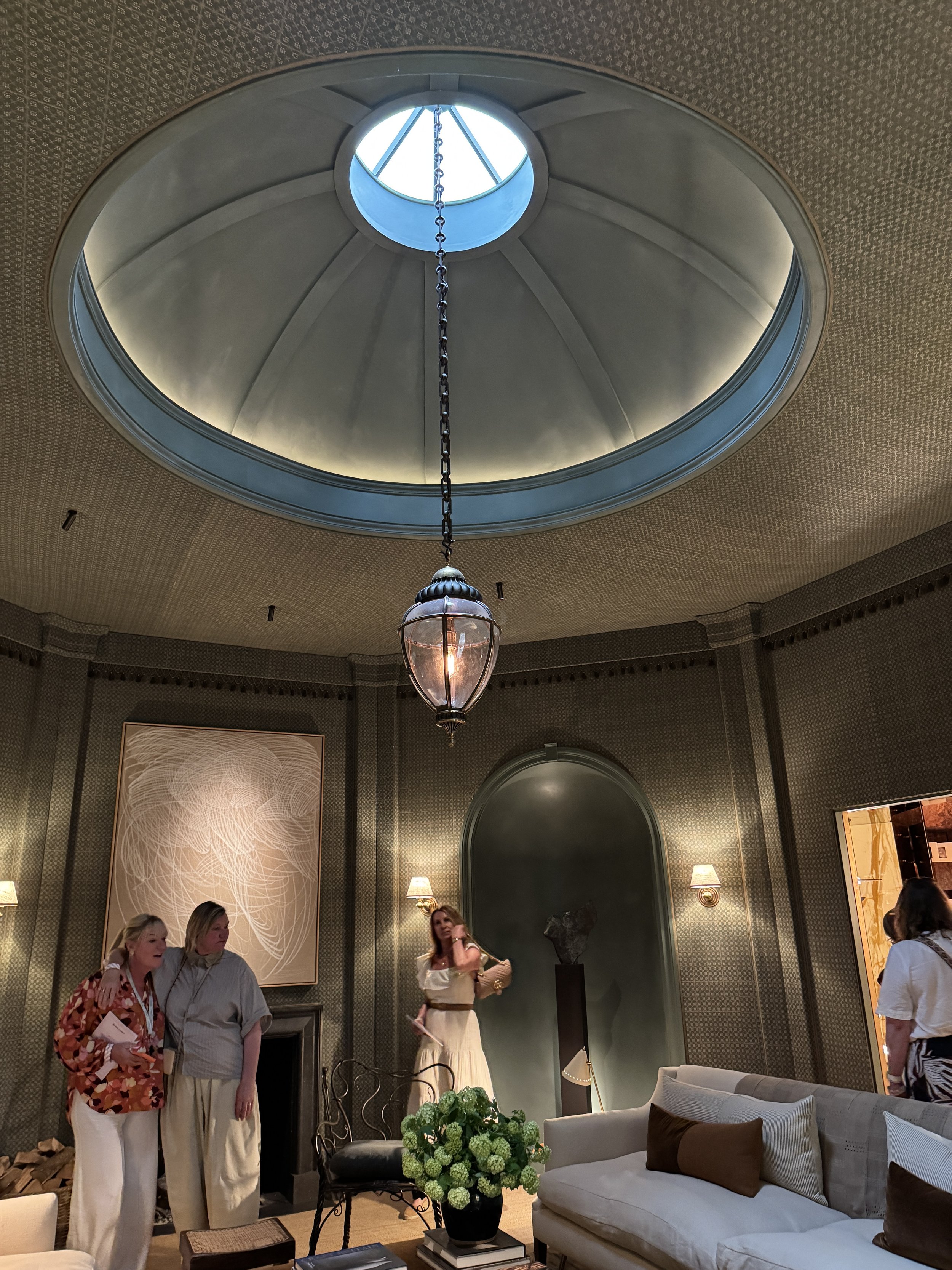
This room gave me my first major ceiling moment of the day.
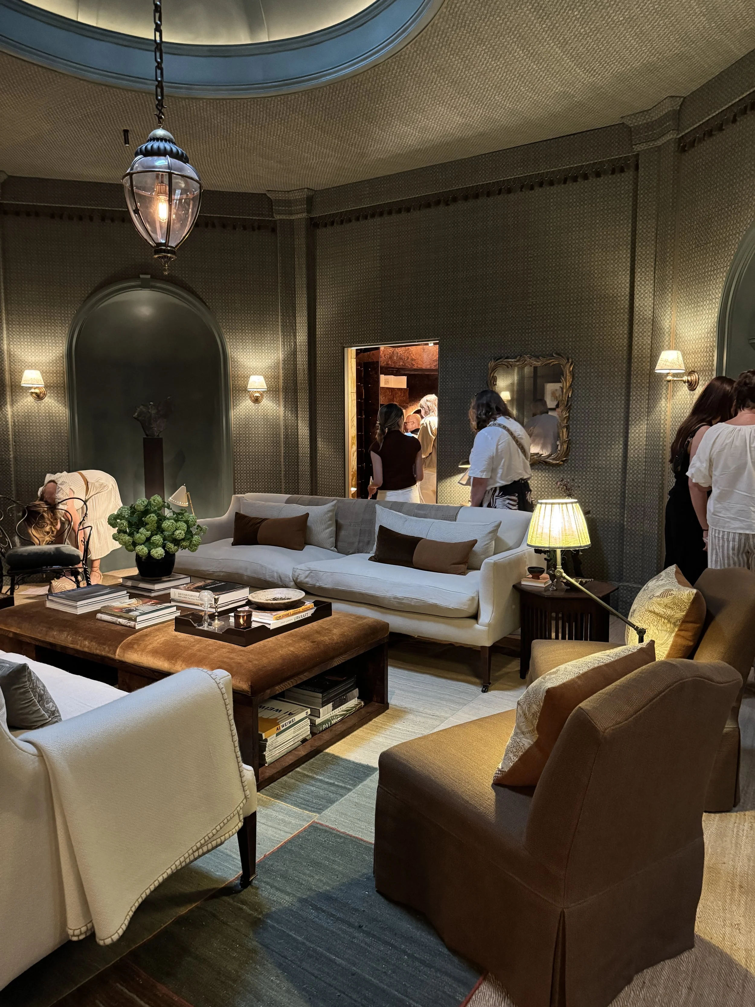
The classically proportioned octagonal room, built by Barr Build, had an extraordinary domed ceiling with a roof lantern in the centre.
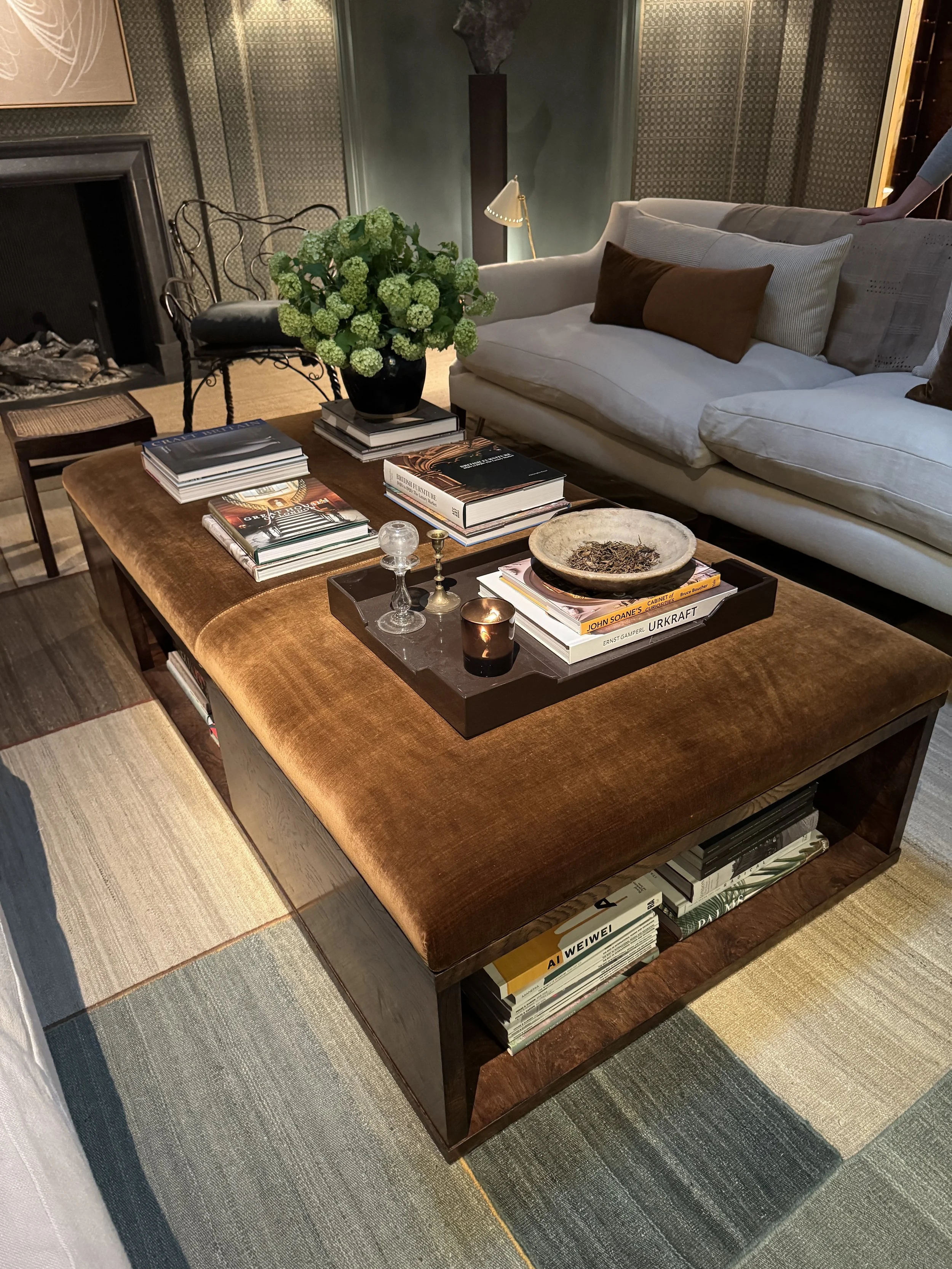
I also loved the furniture layout. Two sofas faced each other, with upholstered coffee tables positioned between them. It felt comfortable and genuinely usable, rather than arranged purely for a photograph.
A curved cocktail cabinet was hidden within the wall panelling, with beautiful scalloped, roll-bead shelving inside. It was the first of several concealed cabinets and bars that I noticed throughout the house.
Albion Nord combined studio pottery, Nigerian textiles and mid-century furniture, giving the room a collected feel rather than making it appear newly decorated all at once.
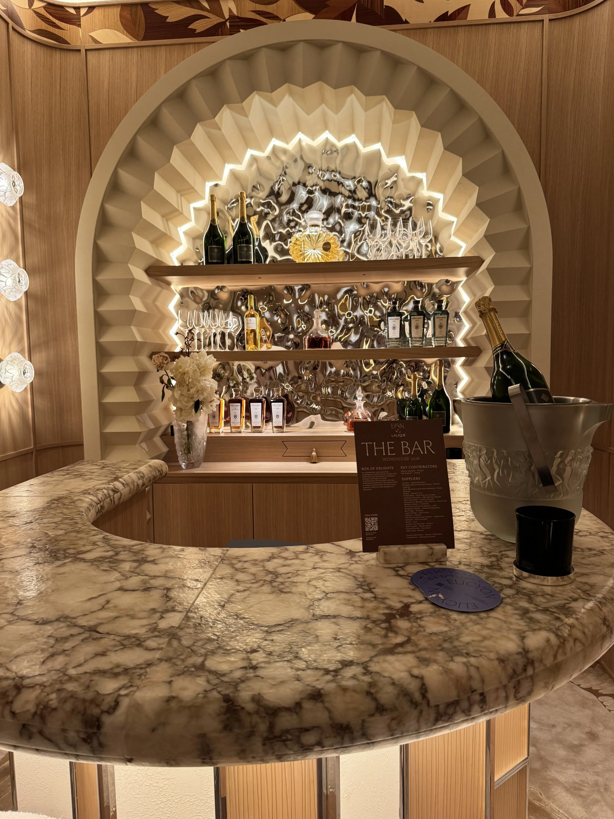
Lalique Home Bar by Elicyon
Box of Delights
This intimate, precious retreat, designed by Charu Gandhi of Elicyon, reimagines the ritual of entertaining at home. Sparkling Lalique crystal is integrated throughout as an intrinsic architectural element
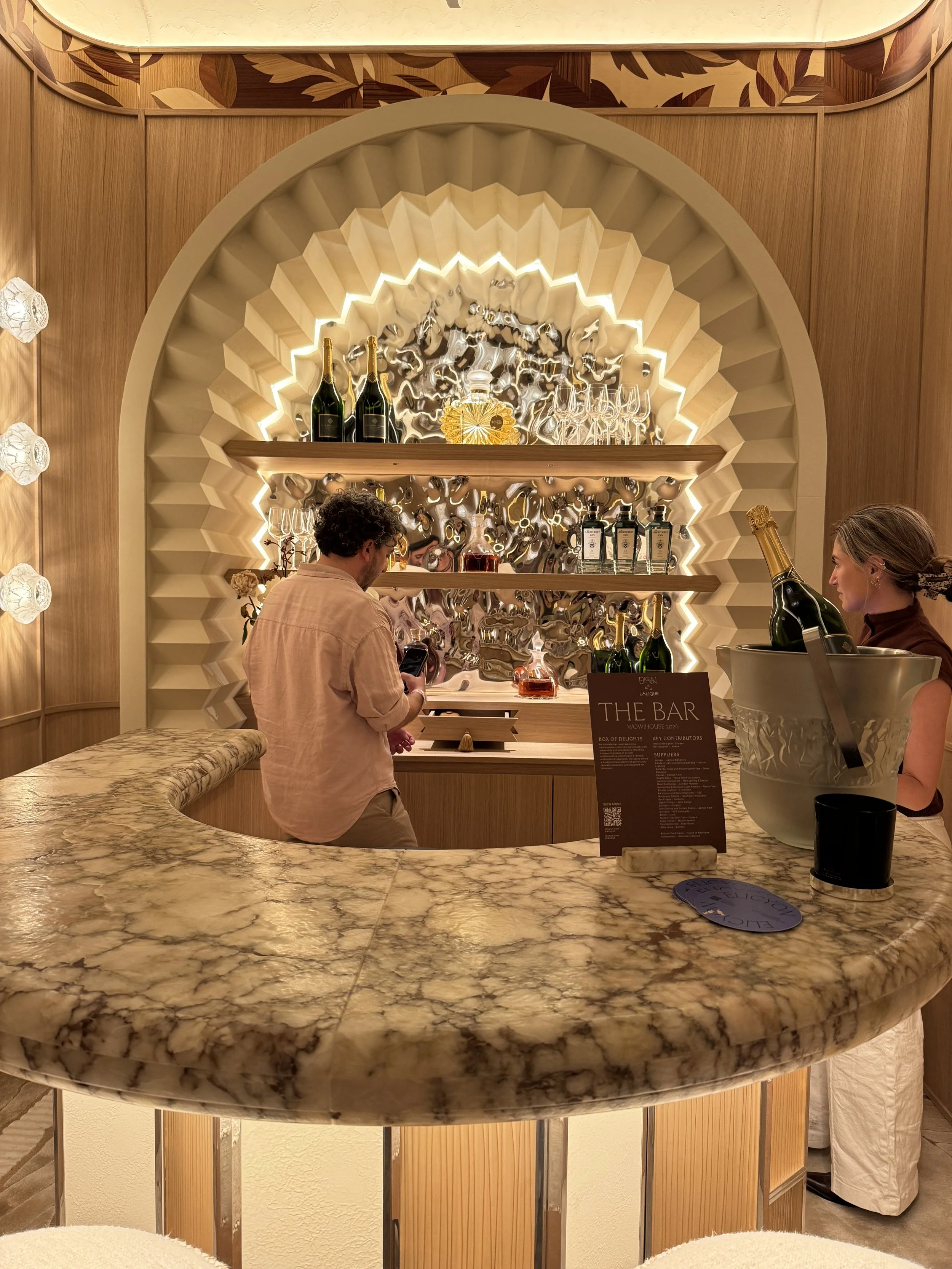
Lalique Home Bar by Elicyon
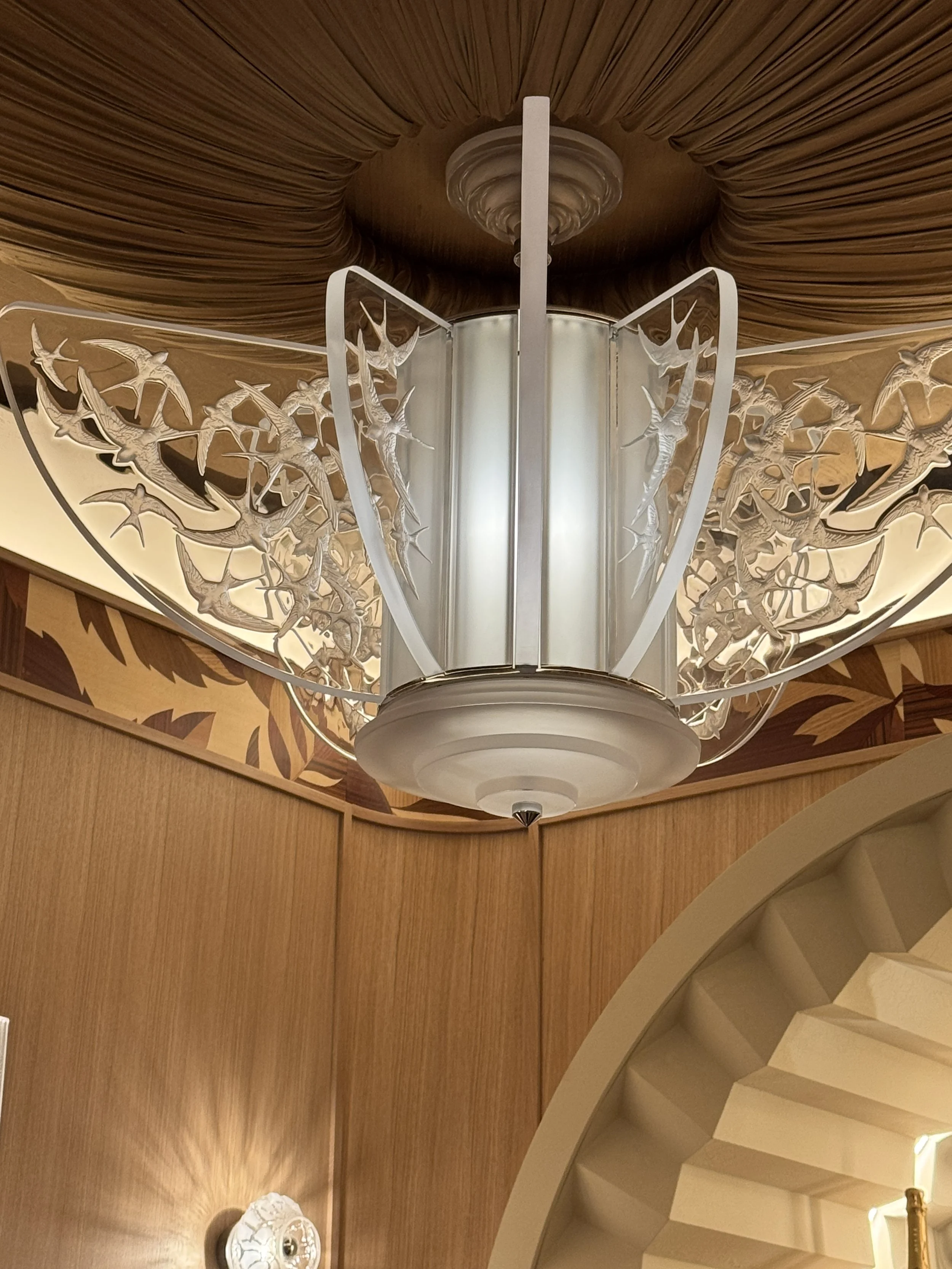
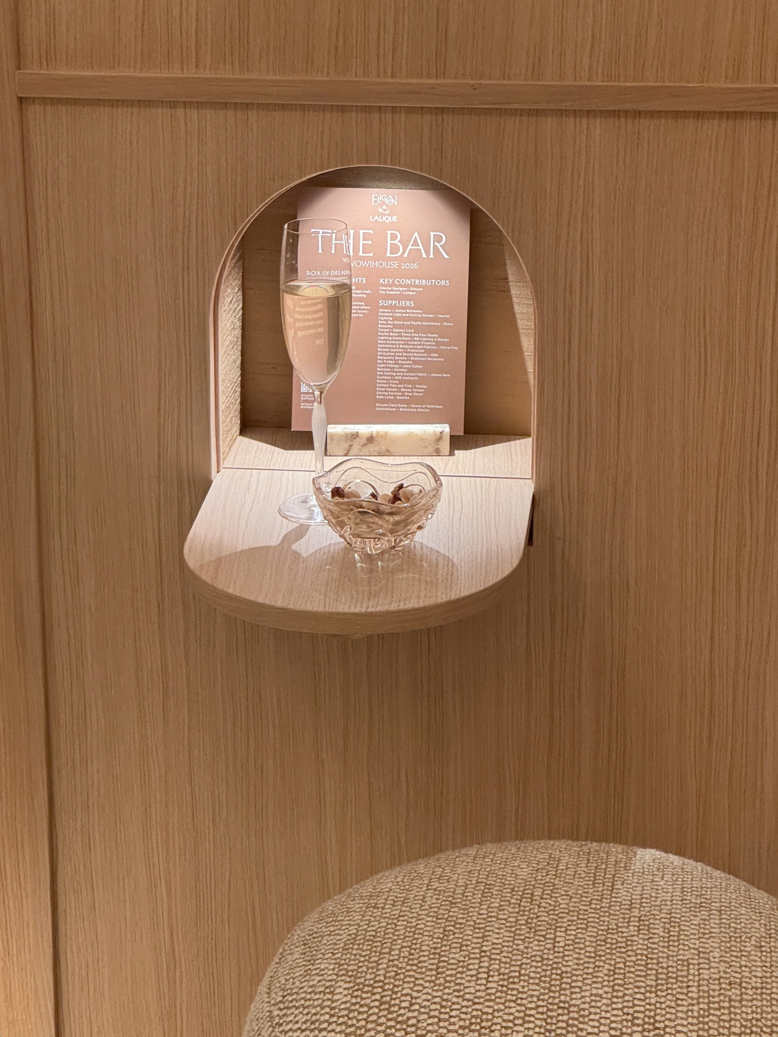
Charu Gandhi’s Box of Delights used Lalique crystal almost as an architectural material rather than simply as decoration.
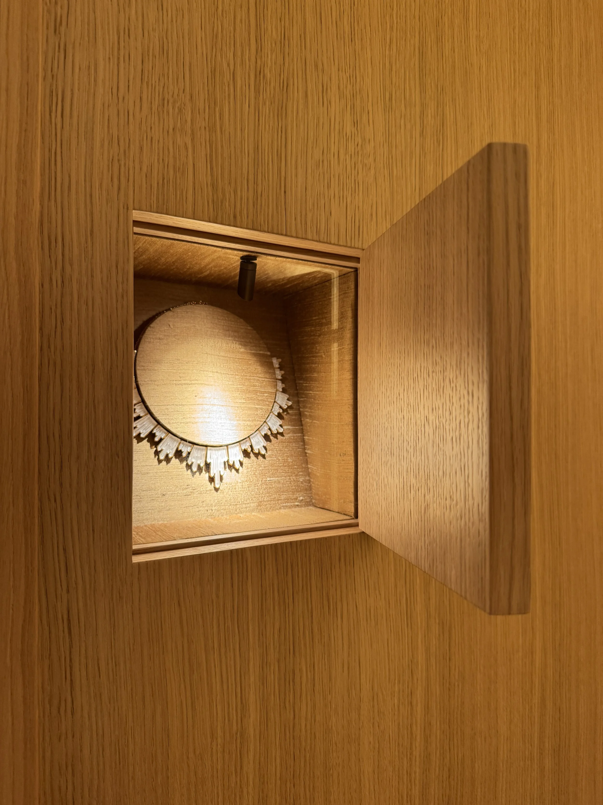
Crystal panels and a bespoke totem-style pendant light were incorporated into the bar itself. The whole space reminded me of stepping inside a very luxurious jeweller, complete with small display cupboards concealed within the joinery.
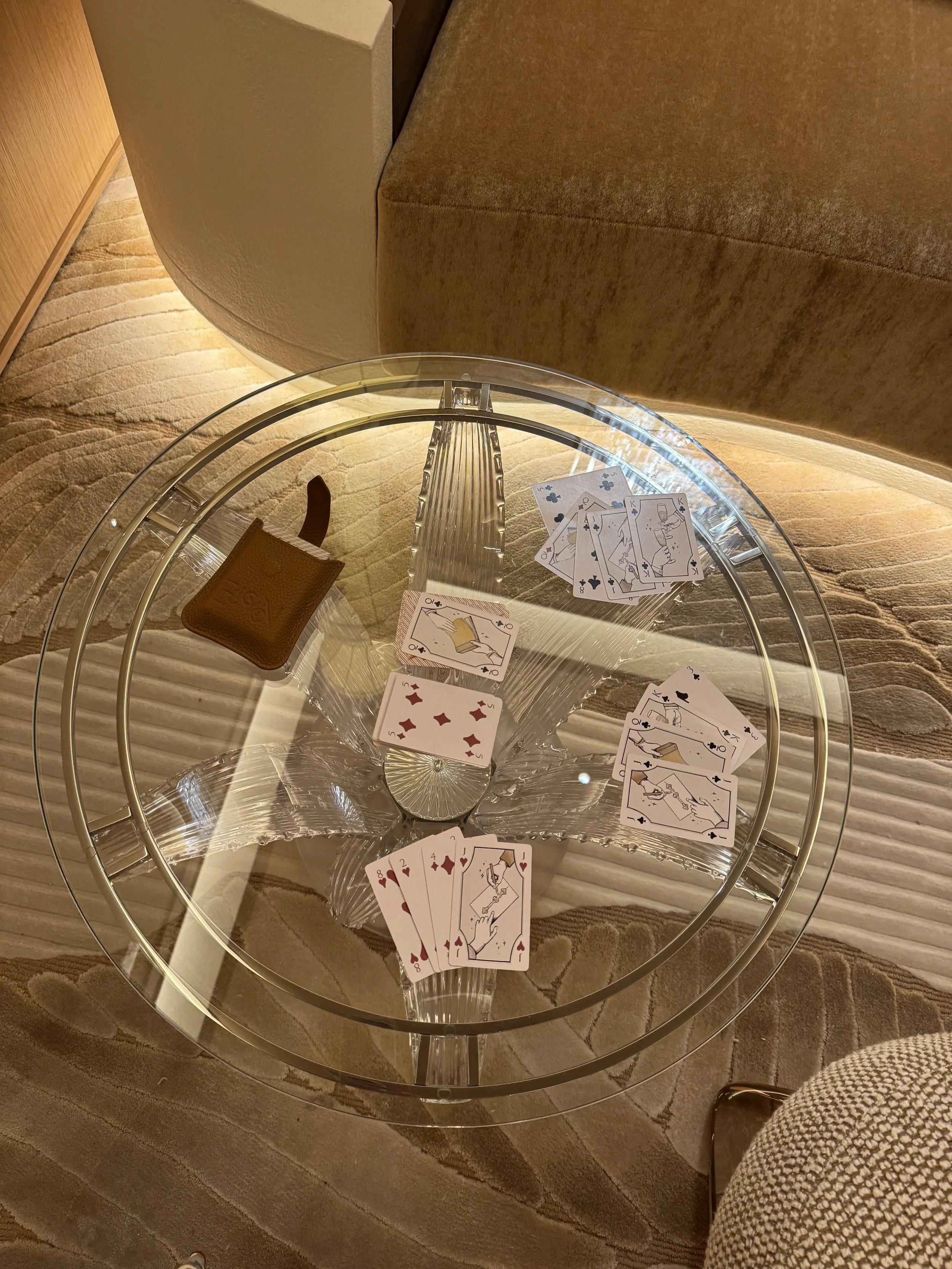
There was also a set of playing cards arranged on the table, with the five of diamonds and the queen of spades placed face up in the centre.
In cardology, the five of diamonds is the birth card for 2 November, which is my birthday, while the queen of spades is traditionally associated with Scorpio, my star sign.
Seeing both cards sitting there together felt like a small sign that this was finally my year to visit WOW!house.
It may sound slightly strange written down, but this is my blog, so I am allowed to be honest about how a room made me feel.
Benjamin Moore Minhwa Salon by Young Huh
Colour Pop
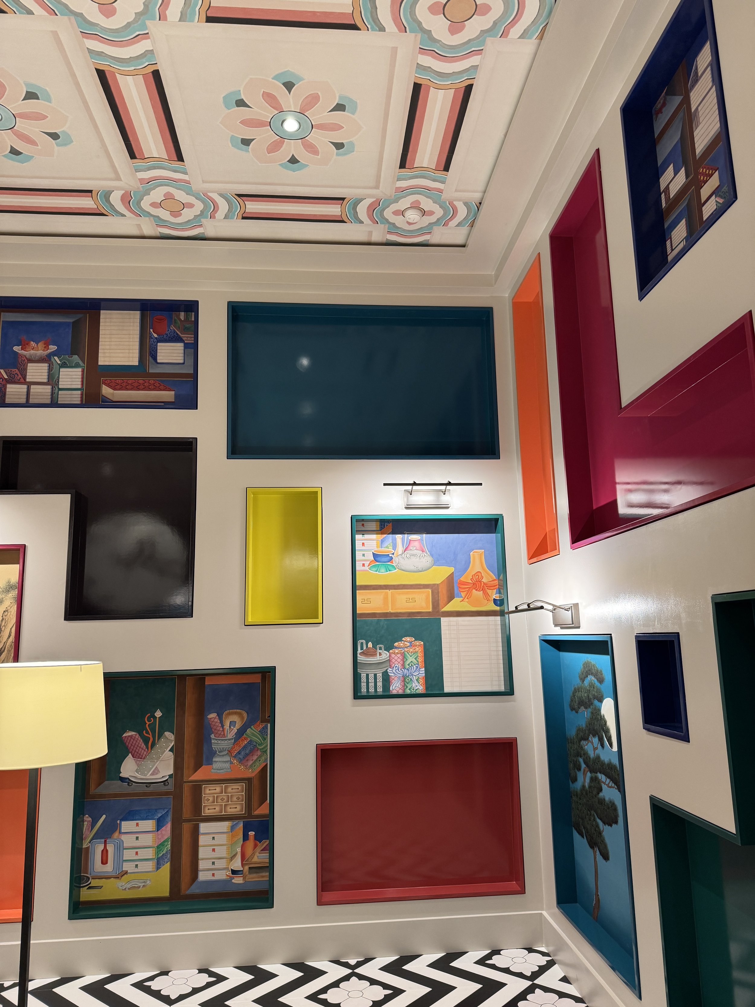
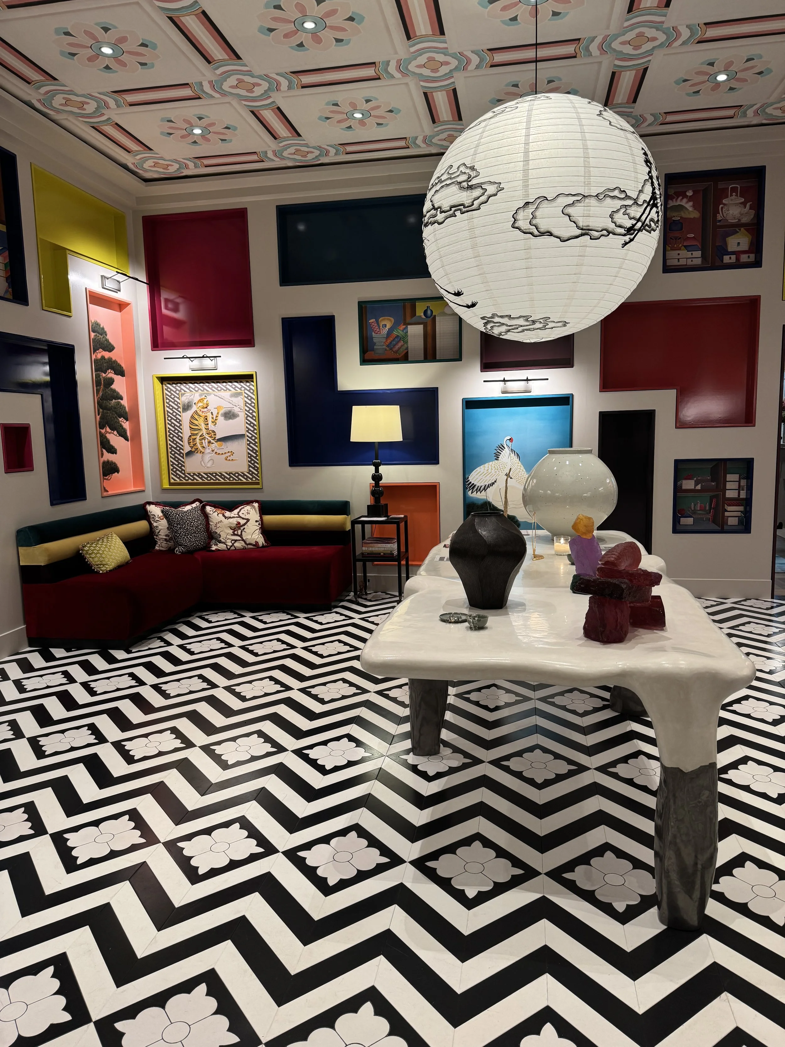
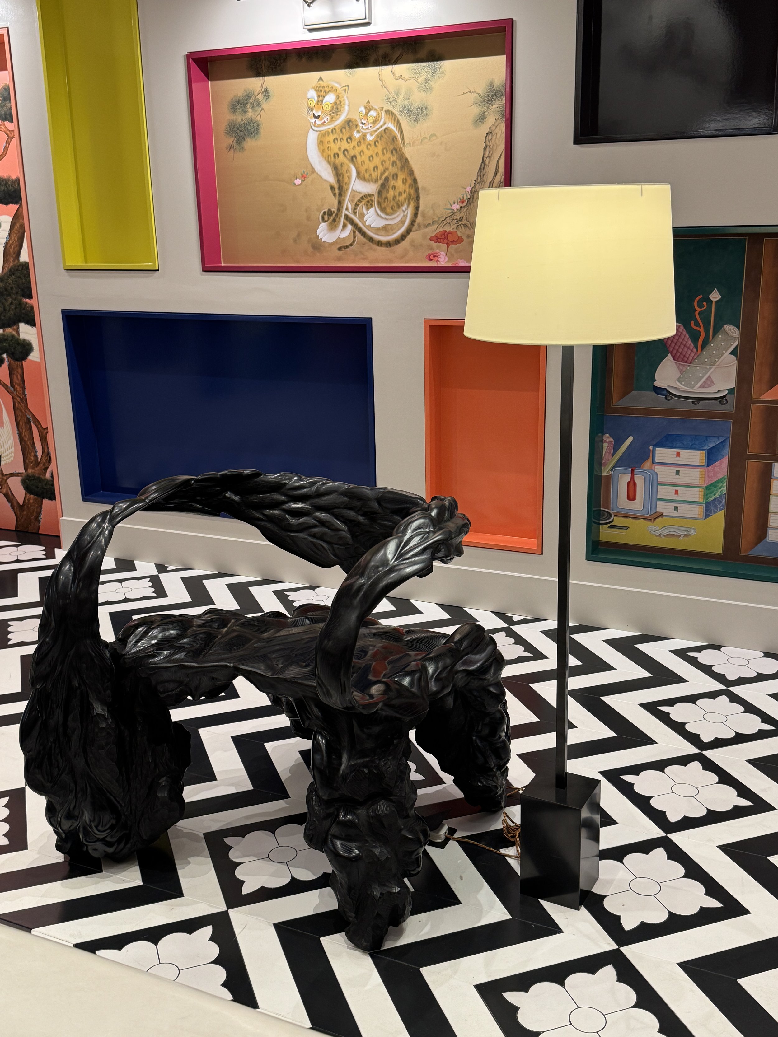
This explosion of pulse-quickening colour and pattern comes courtesy of Benjamin Moore and designer Young Huh. The room tells the story of minhwa (Korean folk art) within a playful modern design
Benjamin Moore Minhwa Salon by Young Huh
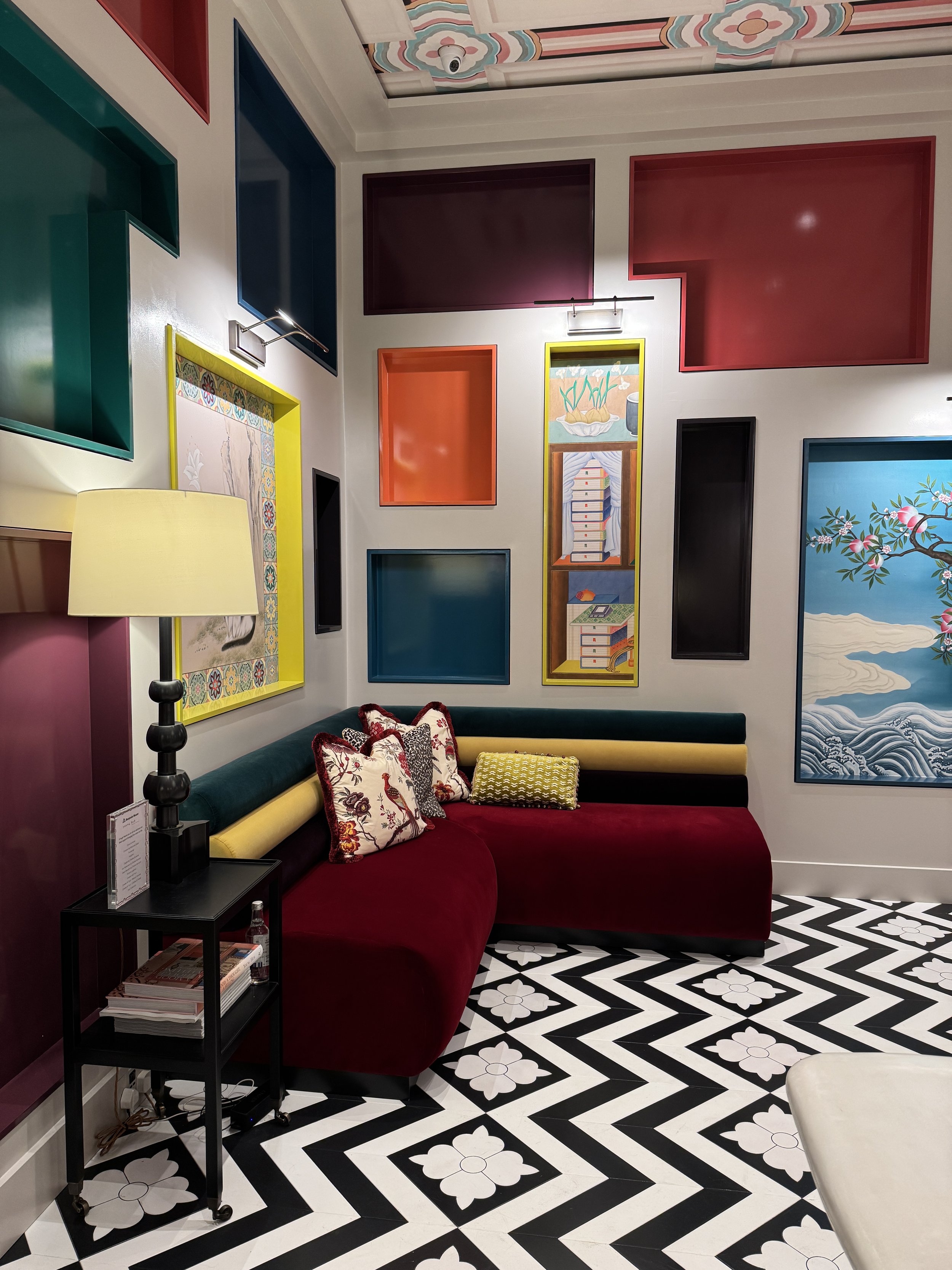
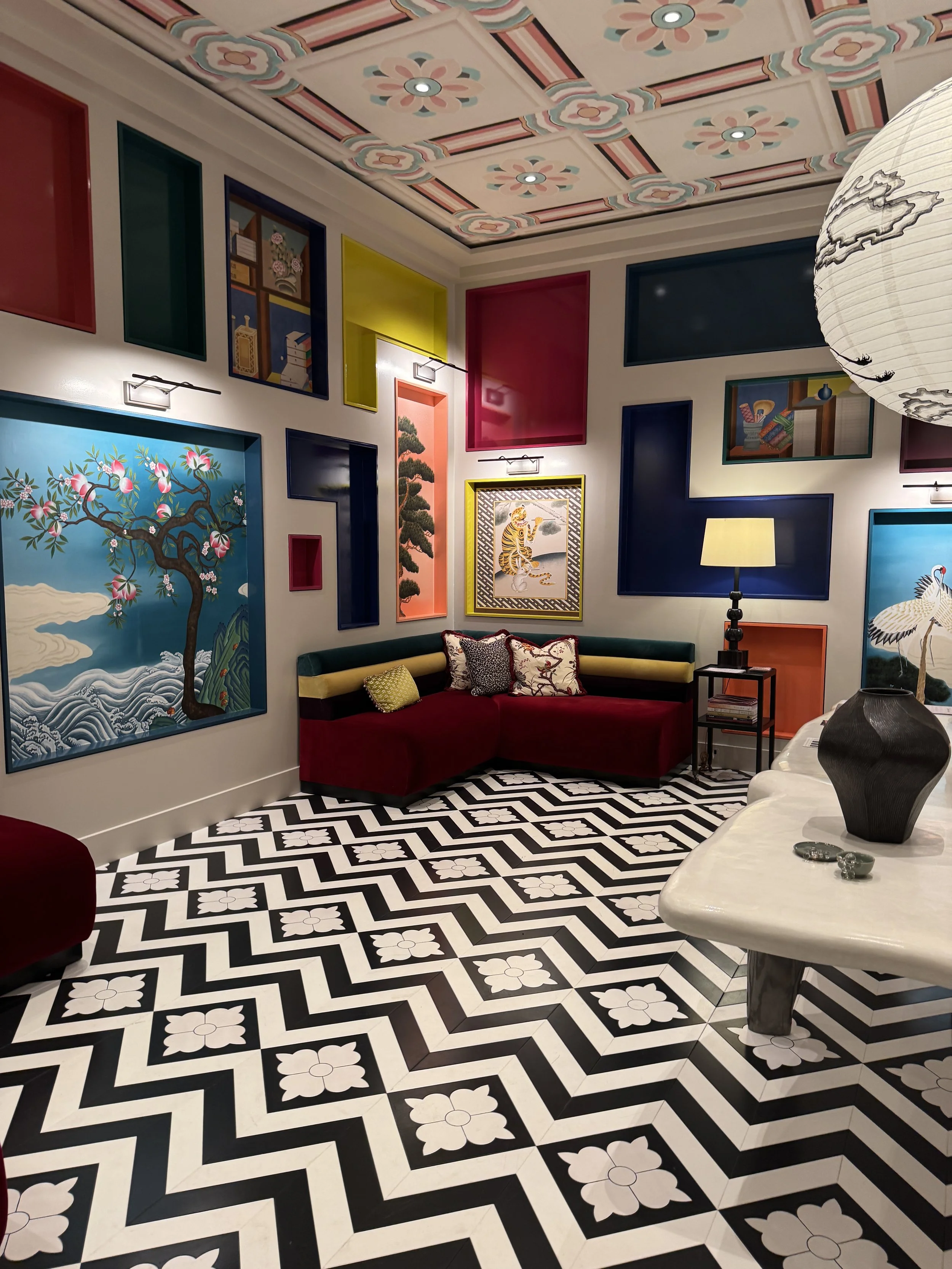
This room delivered a wonderful hit of colour and produced one of my strangest reactions of the day.
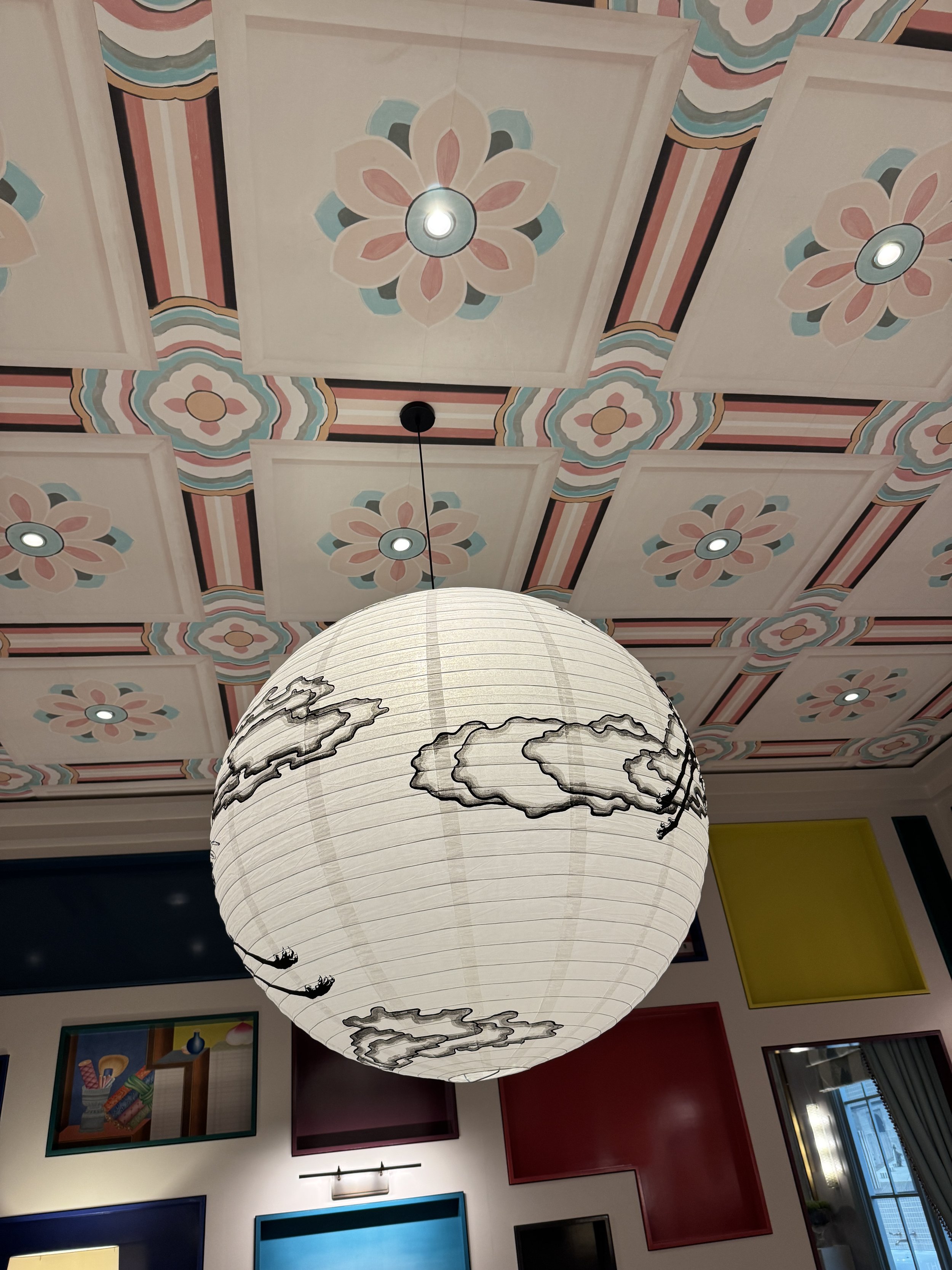
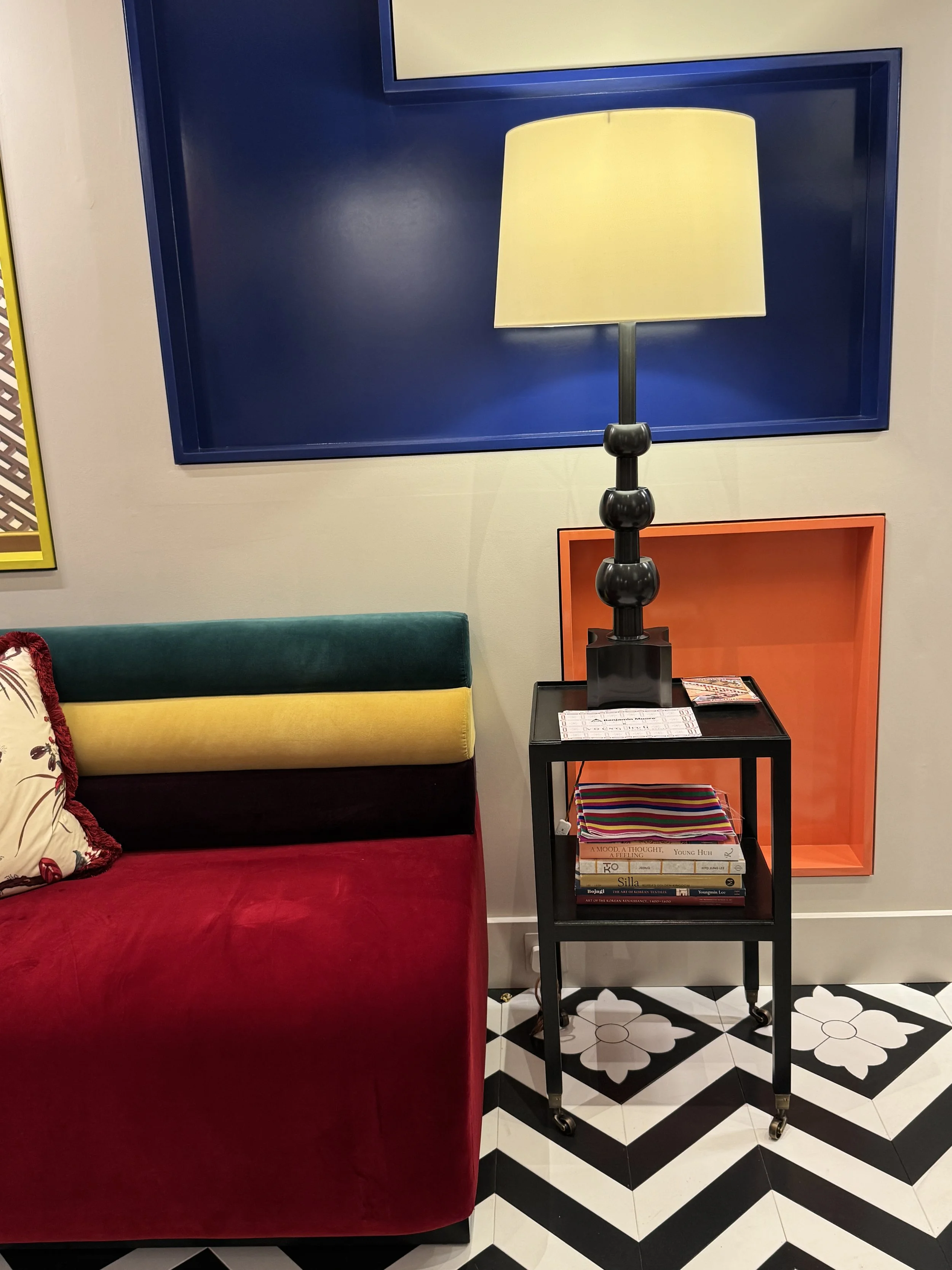
Young Huh’s salon explored minhwa, the tradition of Korean folk art. Glossy recessed display boxes filled with artwork covered the walls from floor to ceiling.
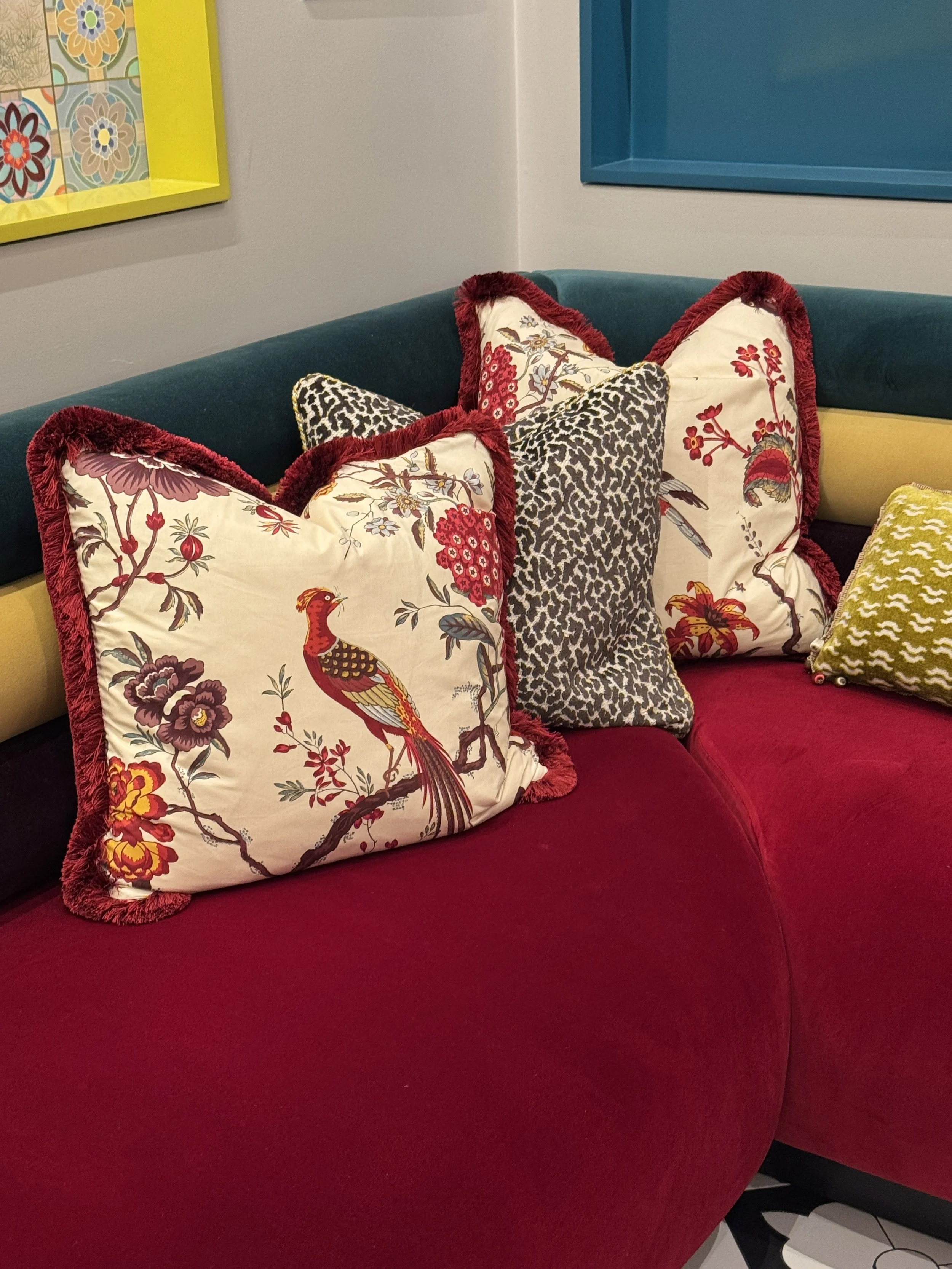
Curved, tubular-backed banquette seating was upholstered in red velvet and Manuel Canovas’ Rivoli velvet in aubergine, yellow and forest green. The seats were piled with floral cushions and decorative trimmings.
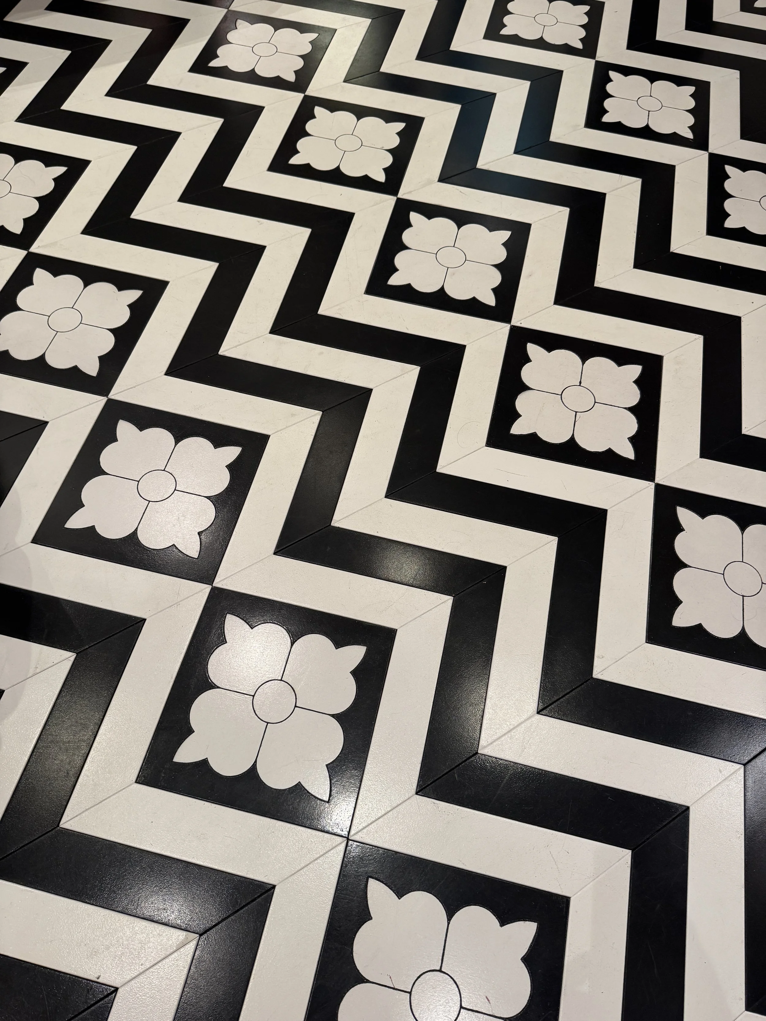
The black and white zigzag tiled floor included a small square floral motif between each chevron, adding another layer of pattern.
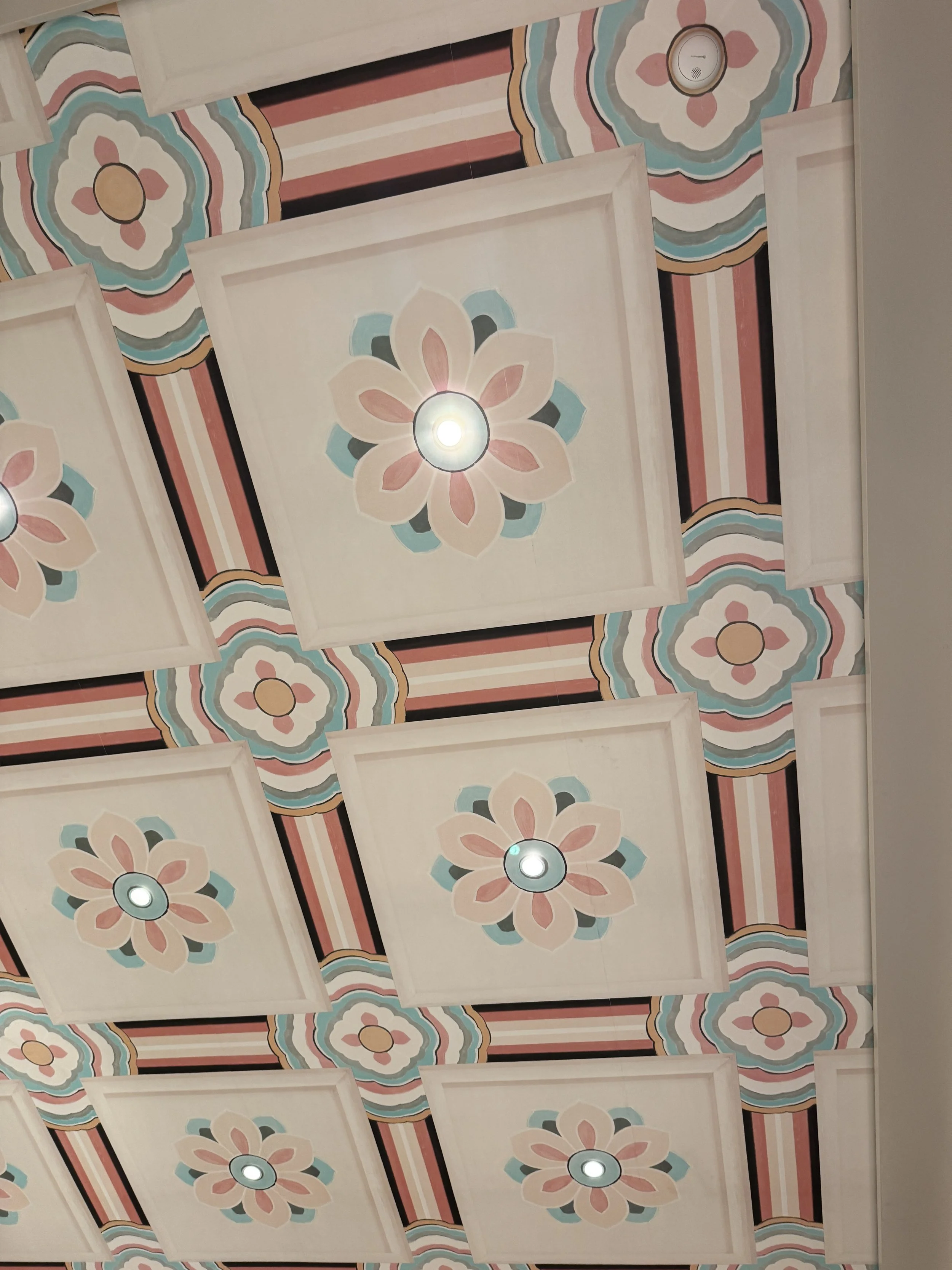
The ceiling, or perhaps the fifth wall, was completely different again. Stripes and florals created what felt like a modern interpretation of an ornate ceiling in a stately home.
My immediate reaction was that I did not like the room. Then, within seconds, I suddenly loved it.
I am still not entirely sure how that happened, but perhaps that is exactly what confident maximalist design is supposed to do. It challenged me, but it also stayed with me.
Phillip Jeffries Morning Room by Sara Cosgrove
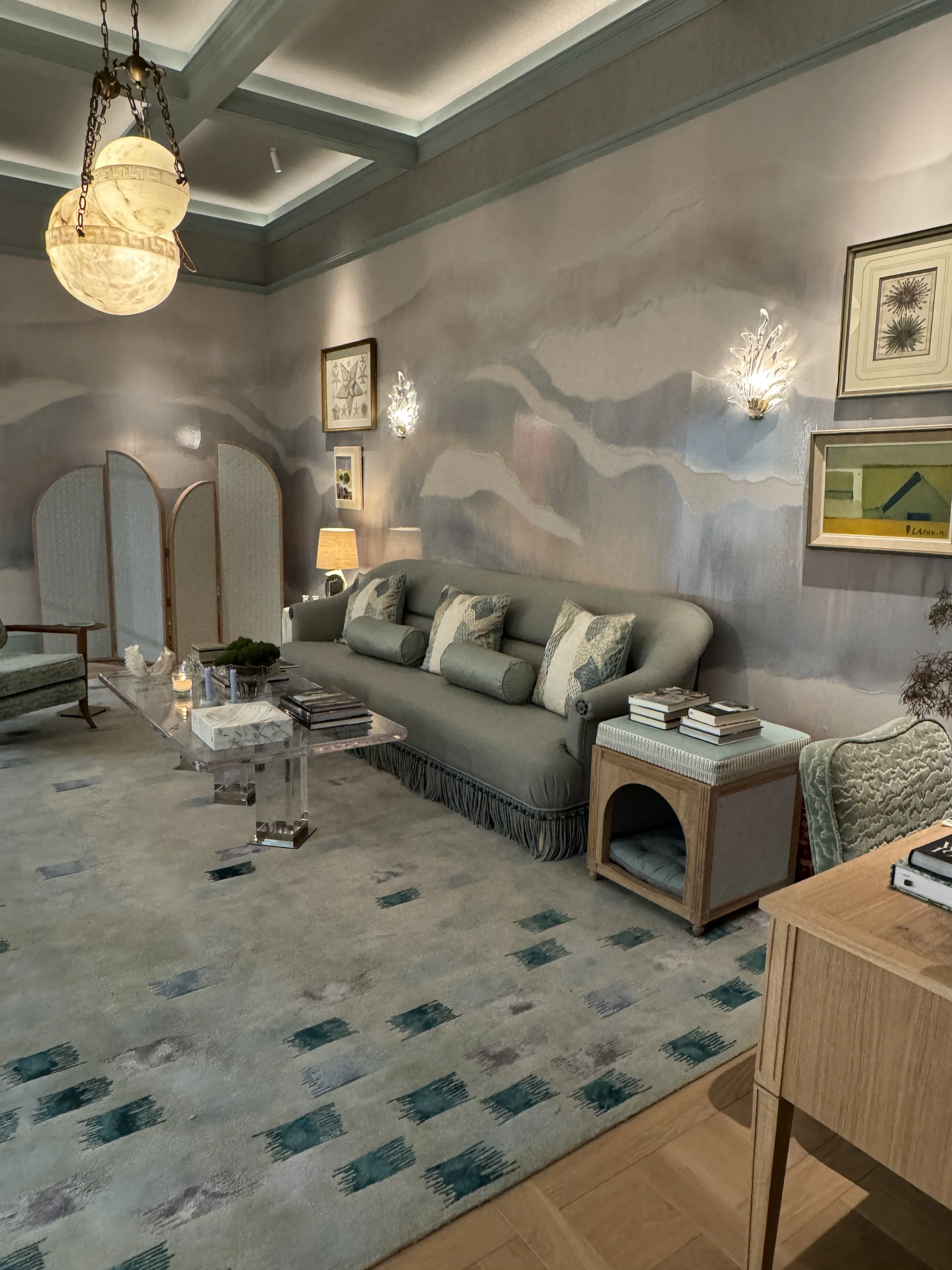
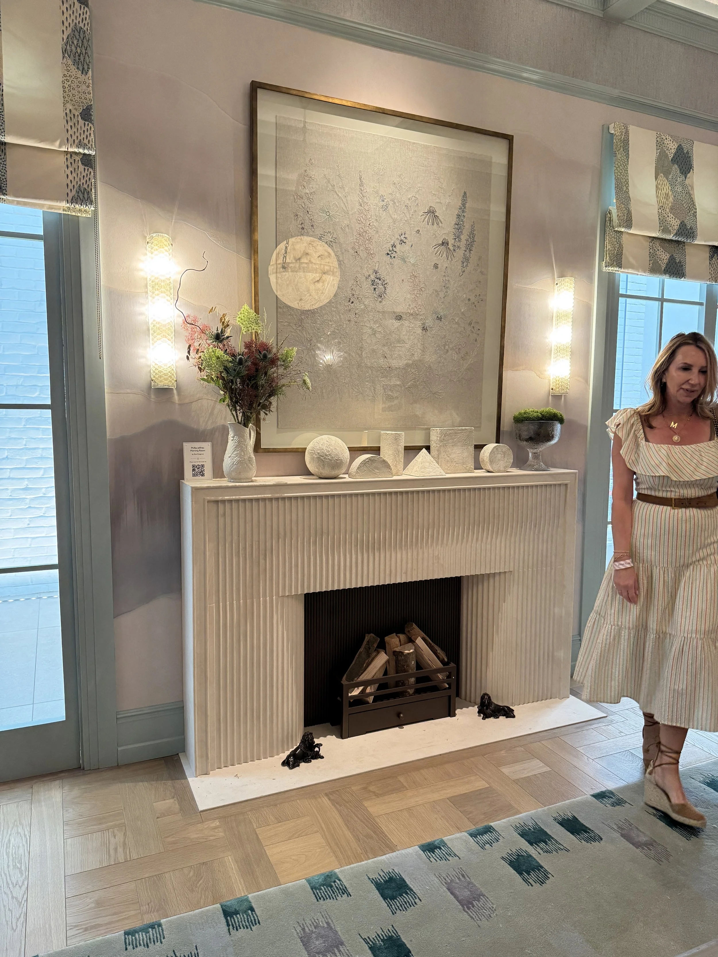
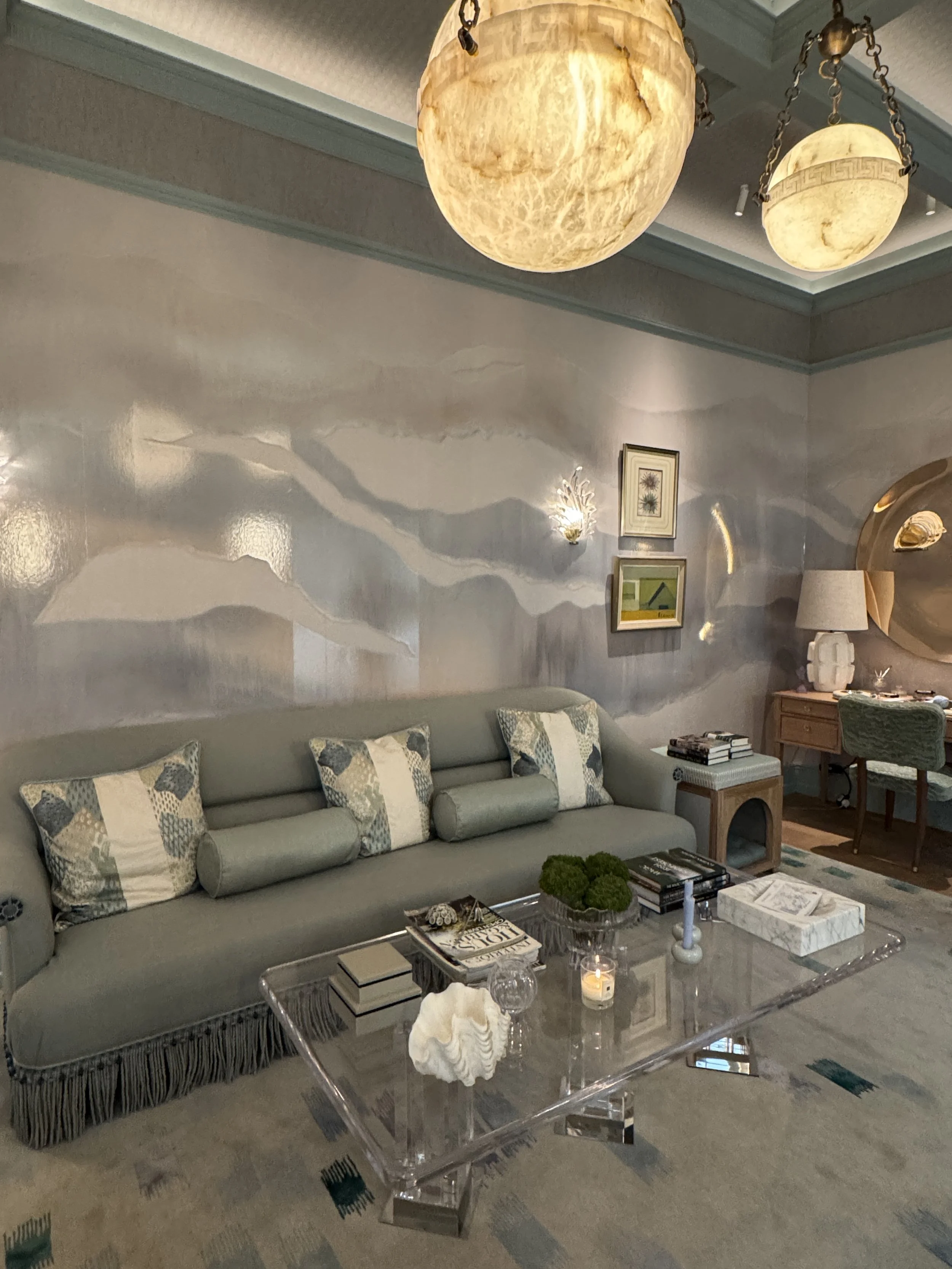
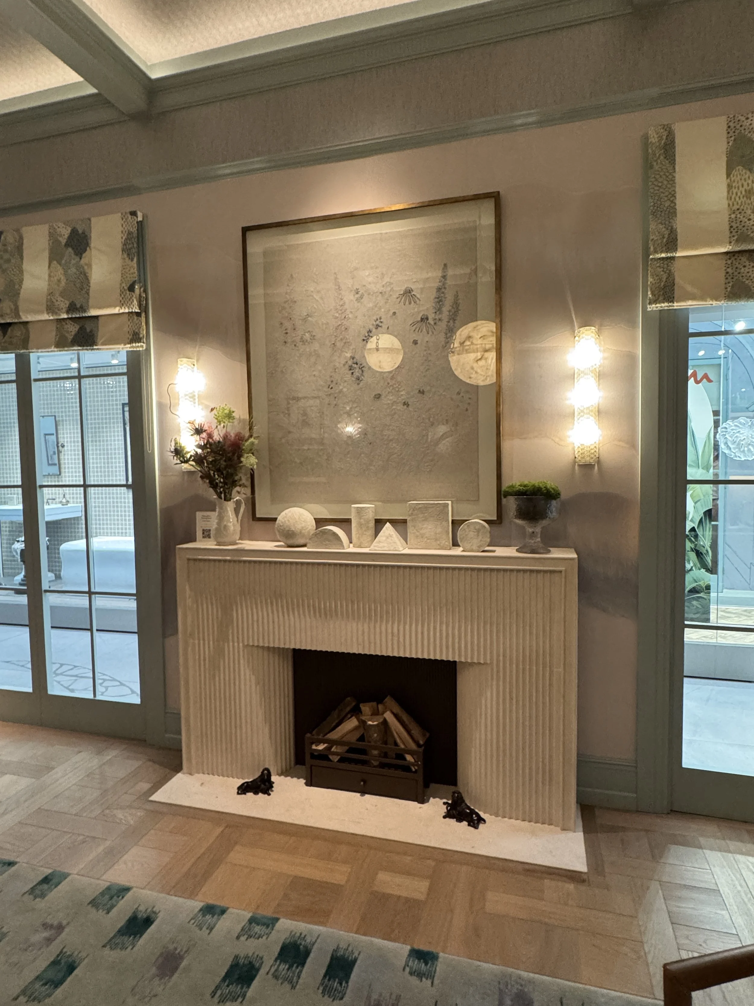
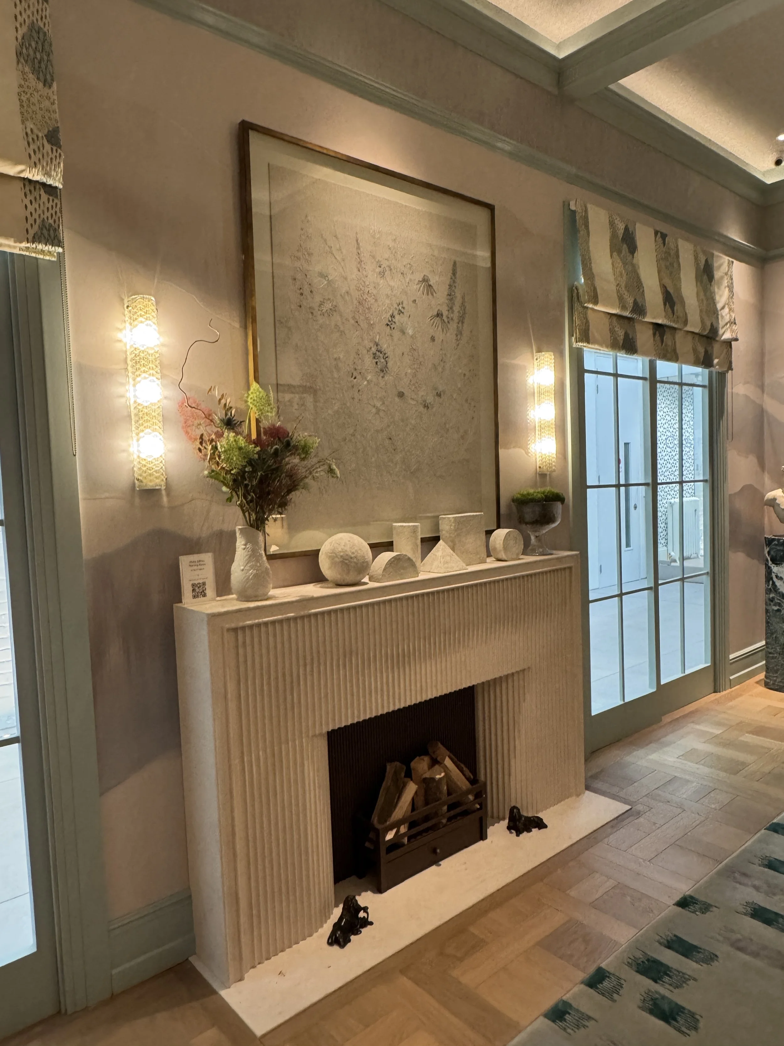
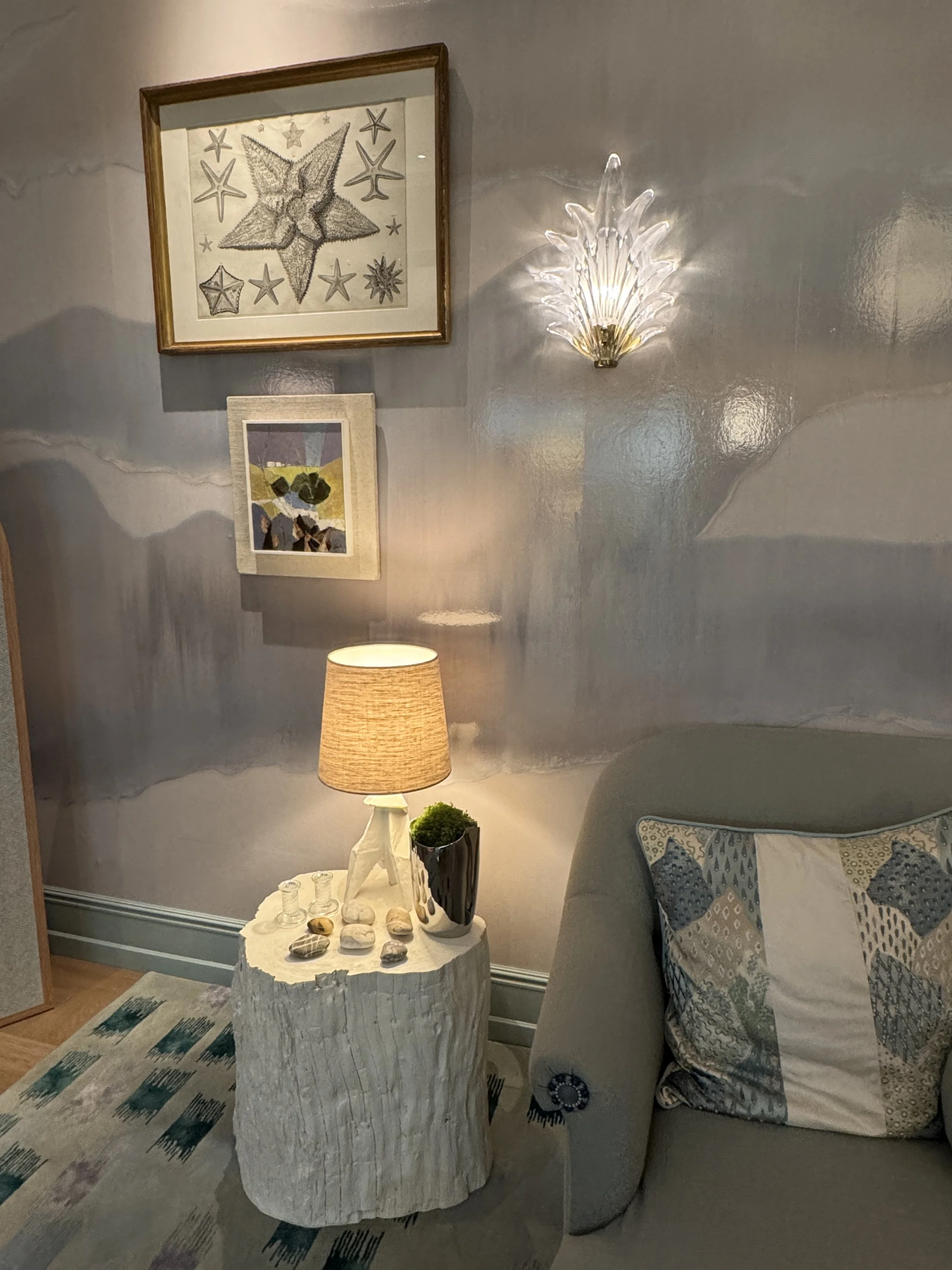
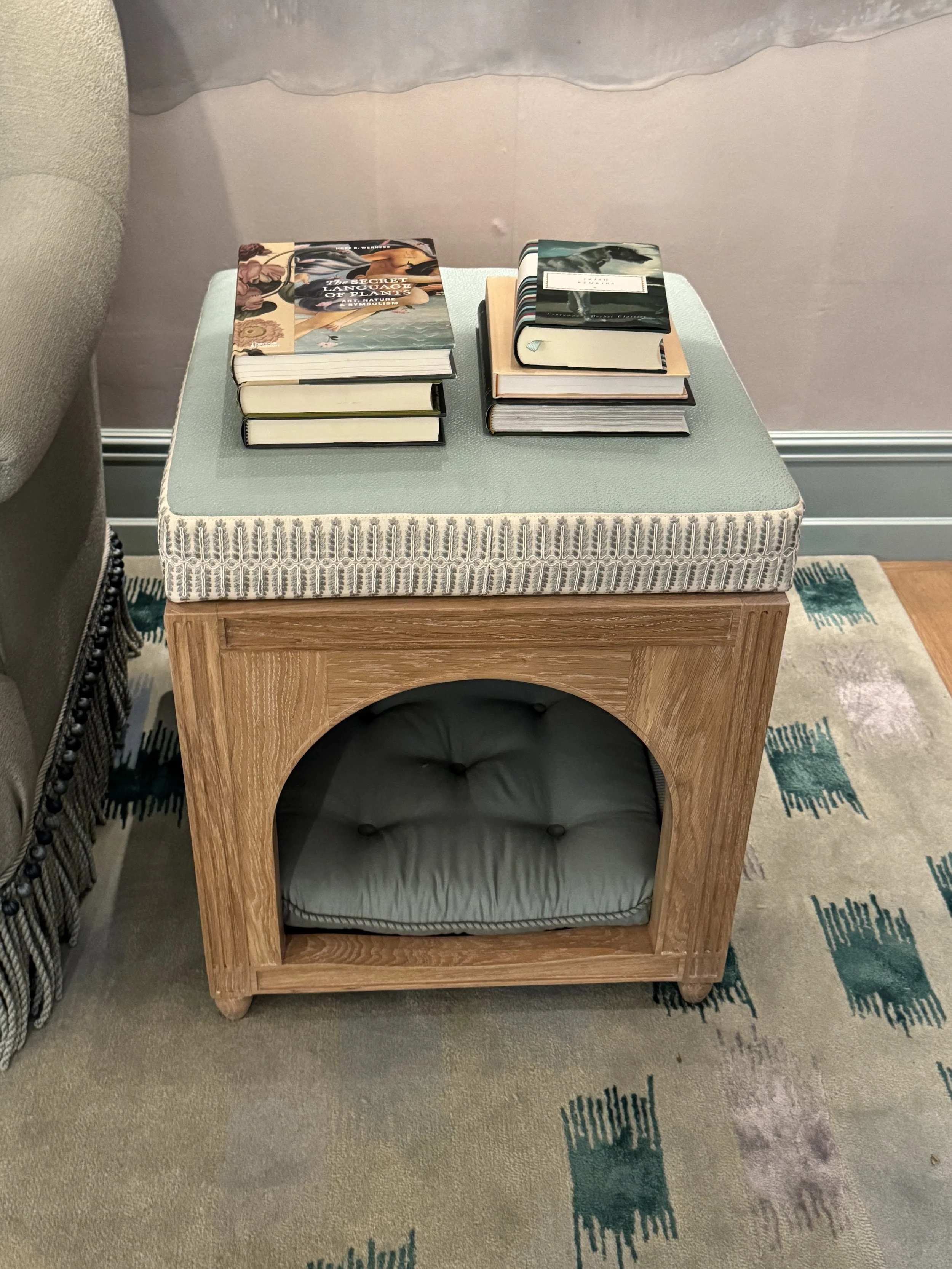
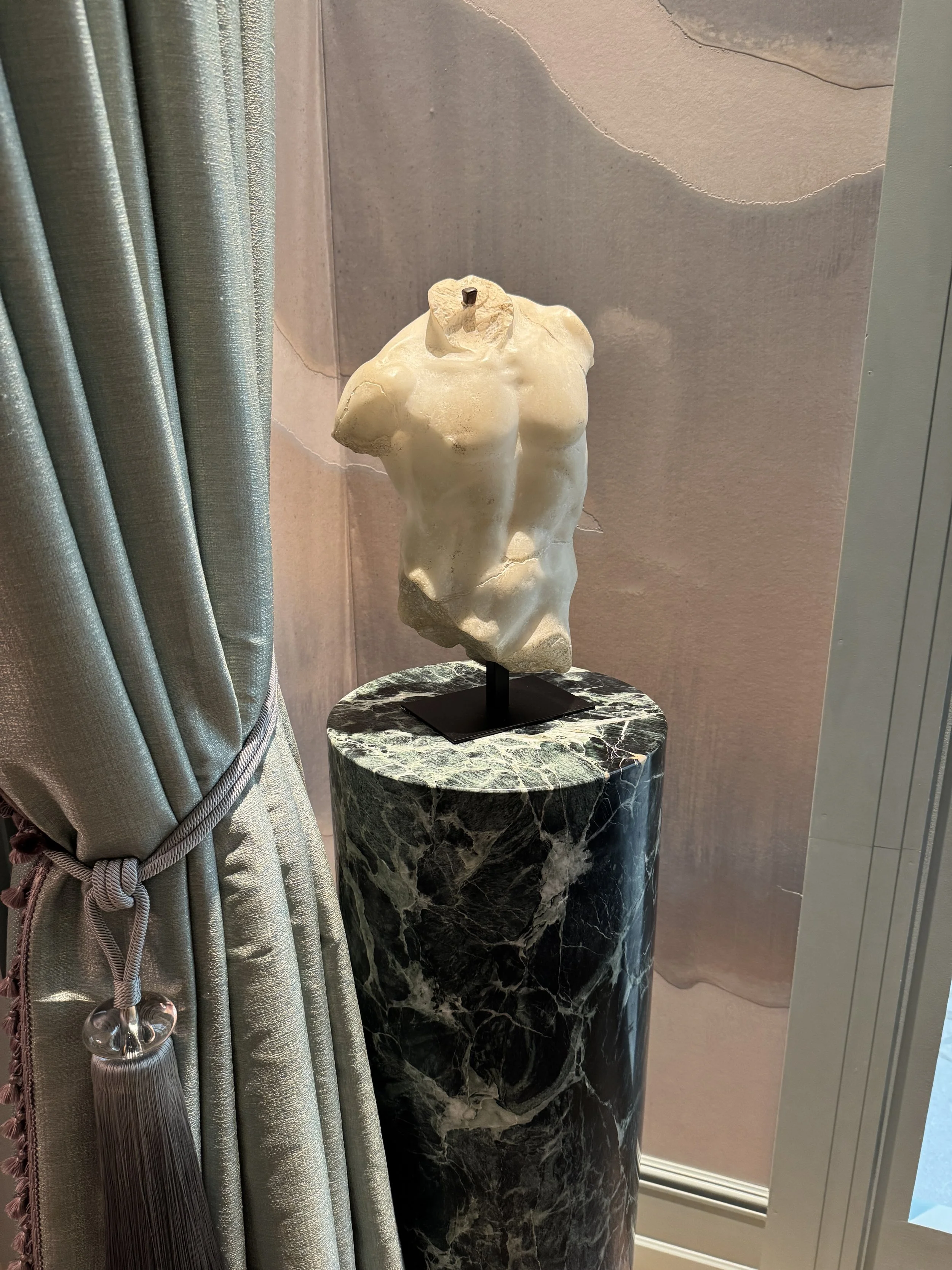
After the intensity of the previous room, this felt soft, serene and very calm.
The scheme was centred around a delicate lacquered mural wallcovering from Phillip Jeffries. Sara Cosgrove drew on her previous career in fashion to create a quiet, uplifting palette.
A pale Sutton Weave wallcovering continued upwards onto the ceiling, gently wrapping the room.
The sofa was finished with a deep bullion fringe around its base, while the cushions and bolsters were positioned formally in a line rather than styled in a more relaxed way.
It was beautifully executed, although I have to admit that it did not inspire me quite as much as the rooms on either side.
Salvesen Graham The Collection Primary Bedroom
Soft Strength
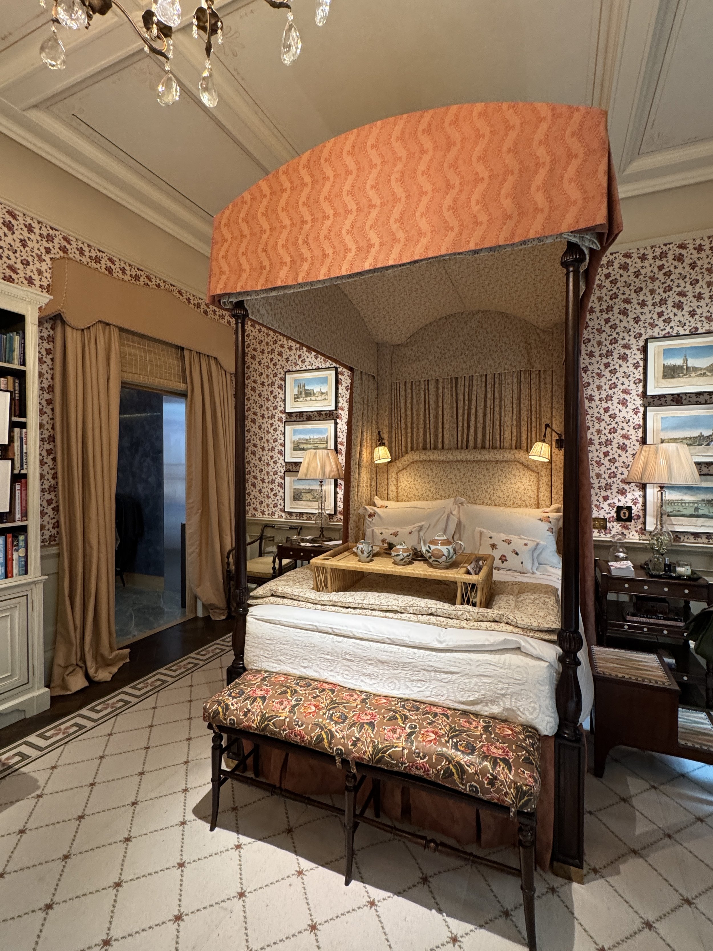
Generously scaled and graced with classical detail, Mary Graham and Nicole Salvesen have envisaged a quietly restorative bedroom. Antique flooring and furniture are paired with fabrics and wallcovering from Salvesen Graham’s latest collection, designed for layering
Salvesen Graham The Collection Primary Bedroom
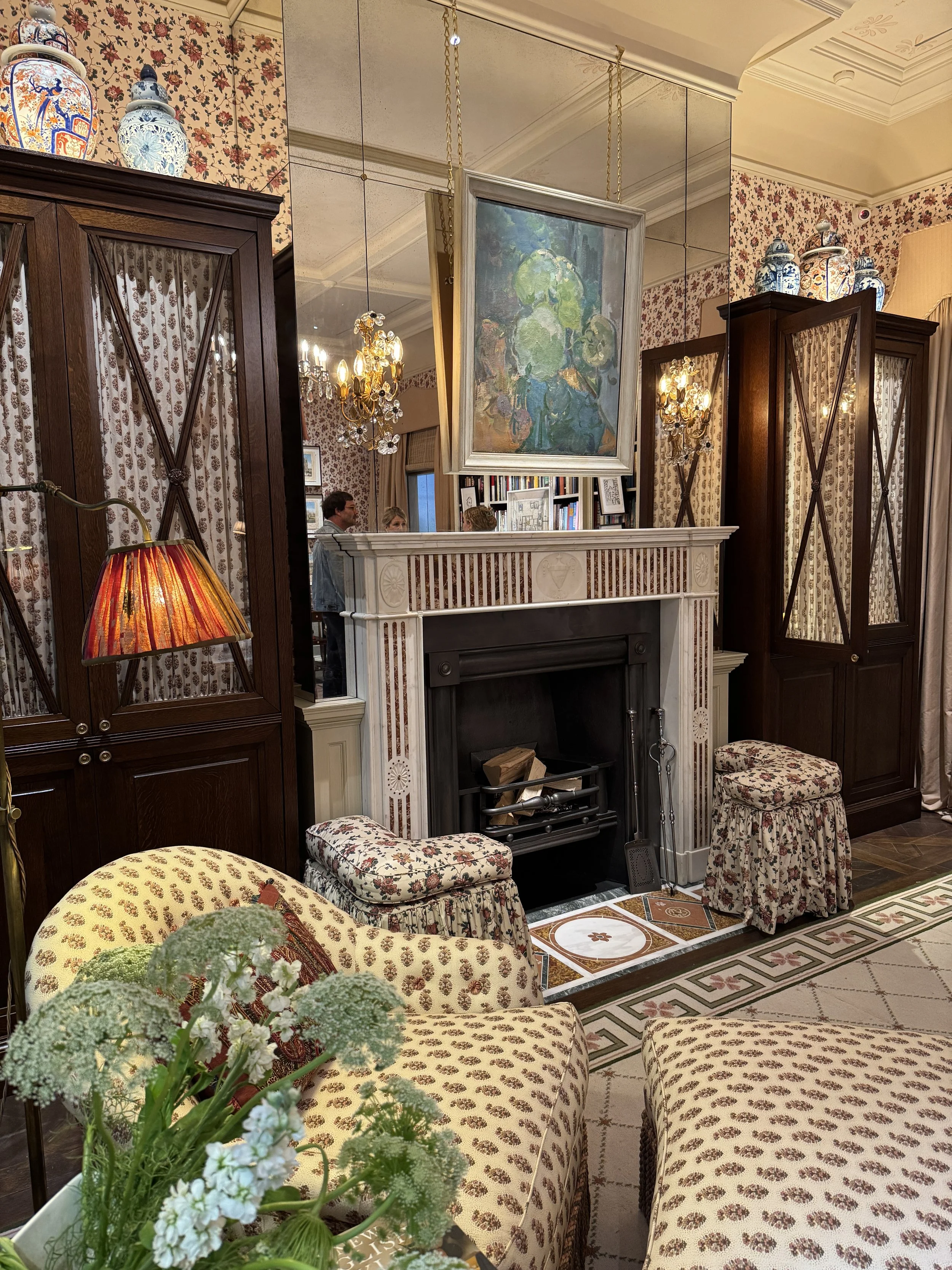
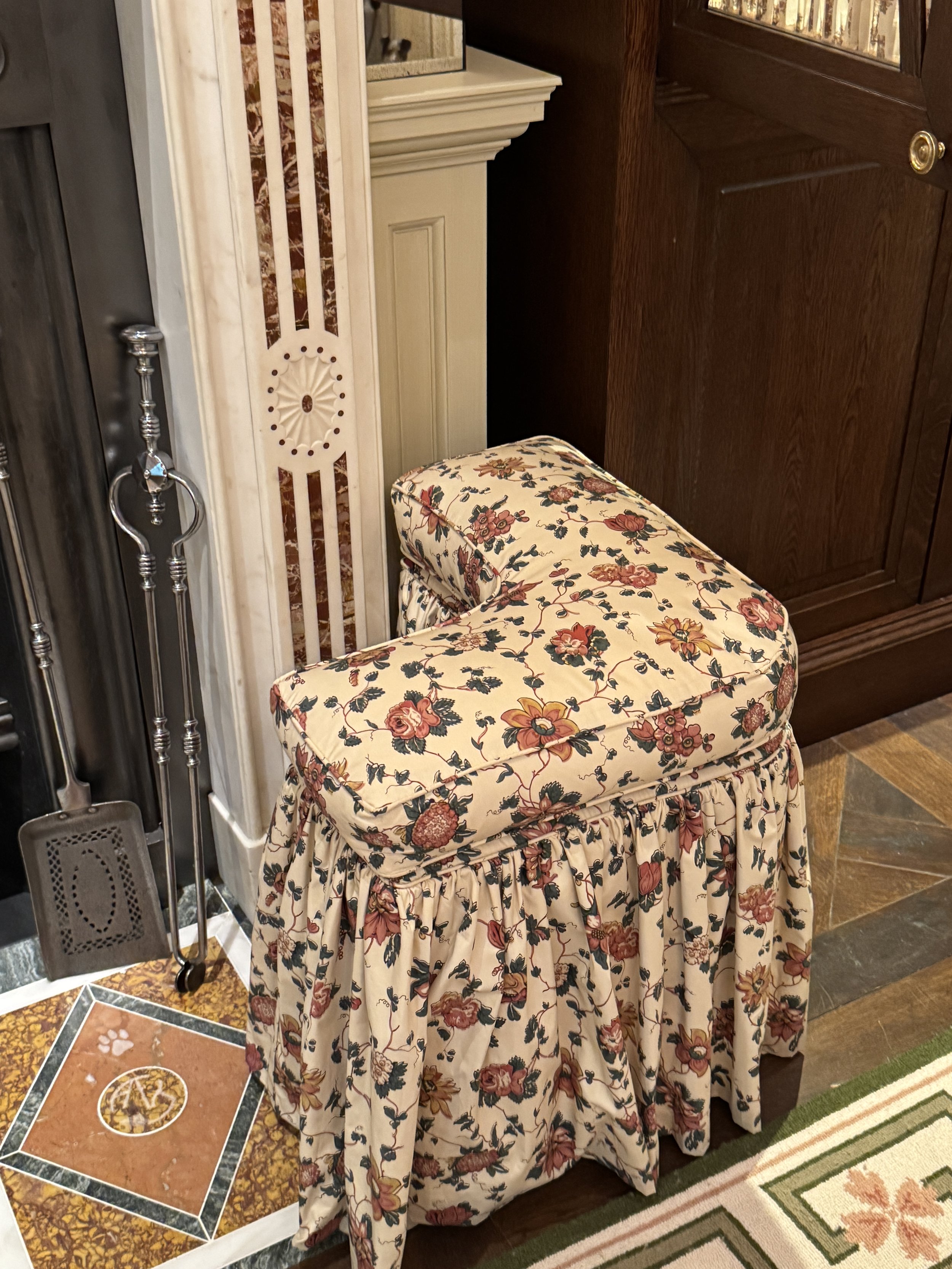
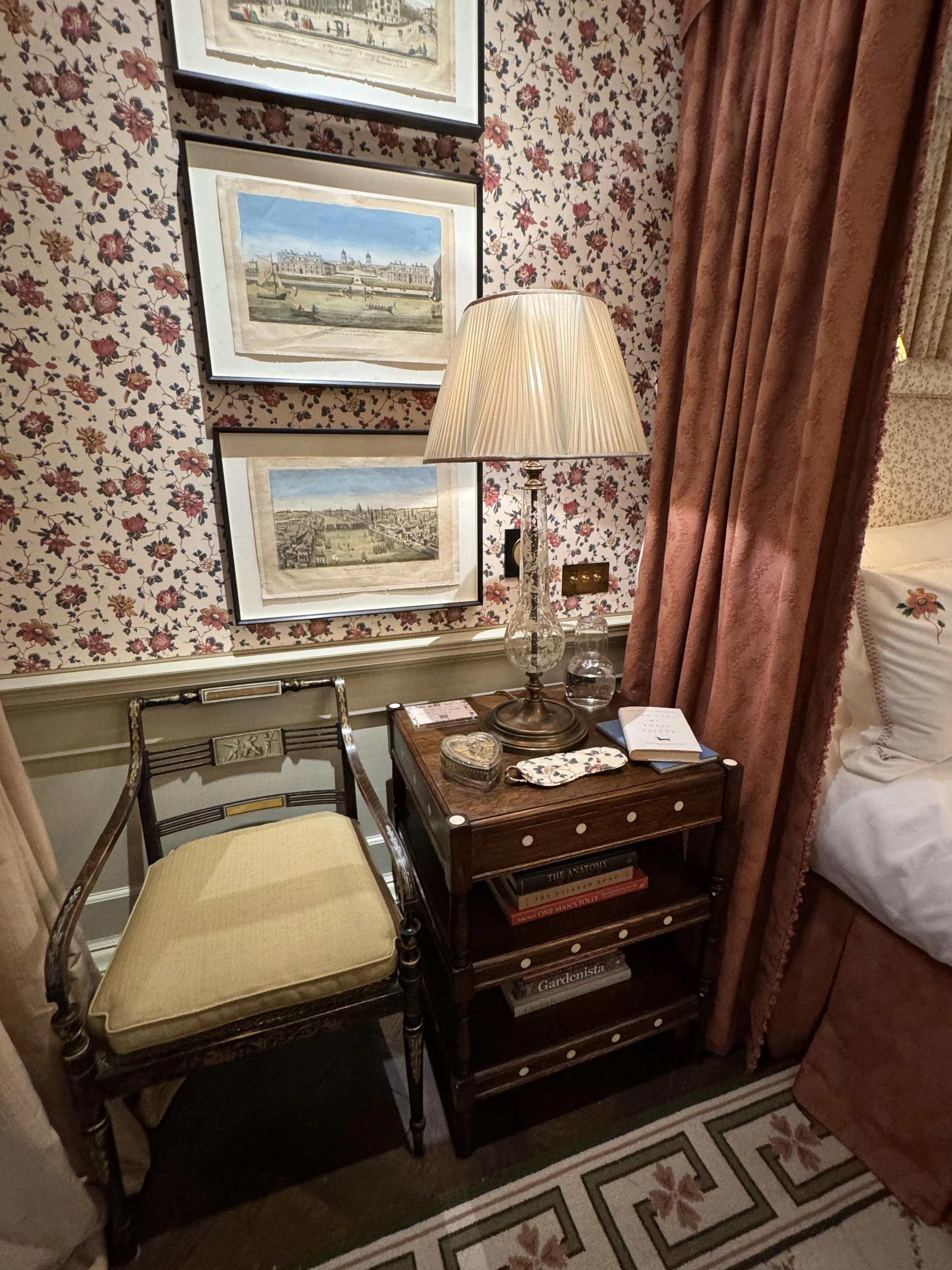
This room was not particularly my style, as it was rather more traditional than I would normally choose, but it did feel genuinely homely.
Mary Graham and Nicole Salvesen created the room around their new furniture and homeware collection, combining antique flooring and furniture with fresh fabrics and wallcoverings.
A decorative painted ceiling motif sat above the room, together with an antique Italian crown chandelier dating from the 1870s.
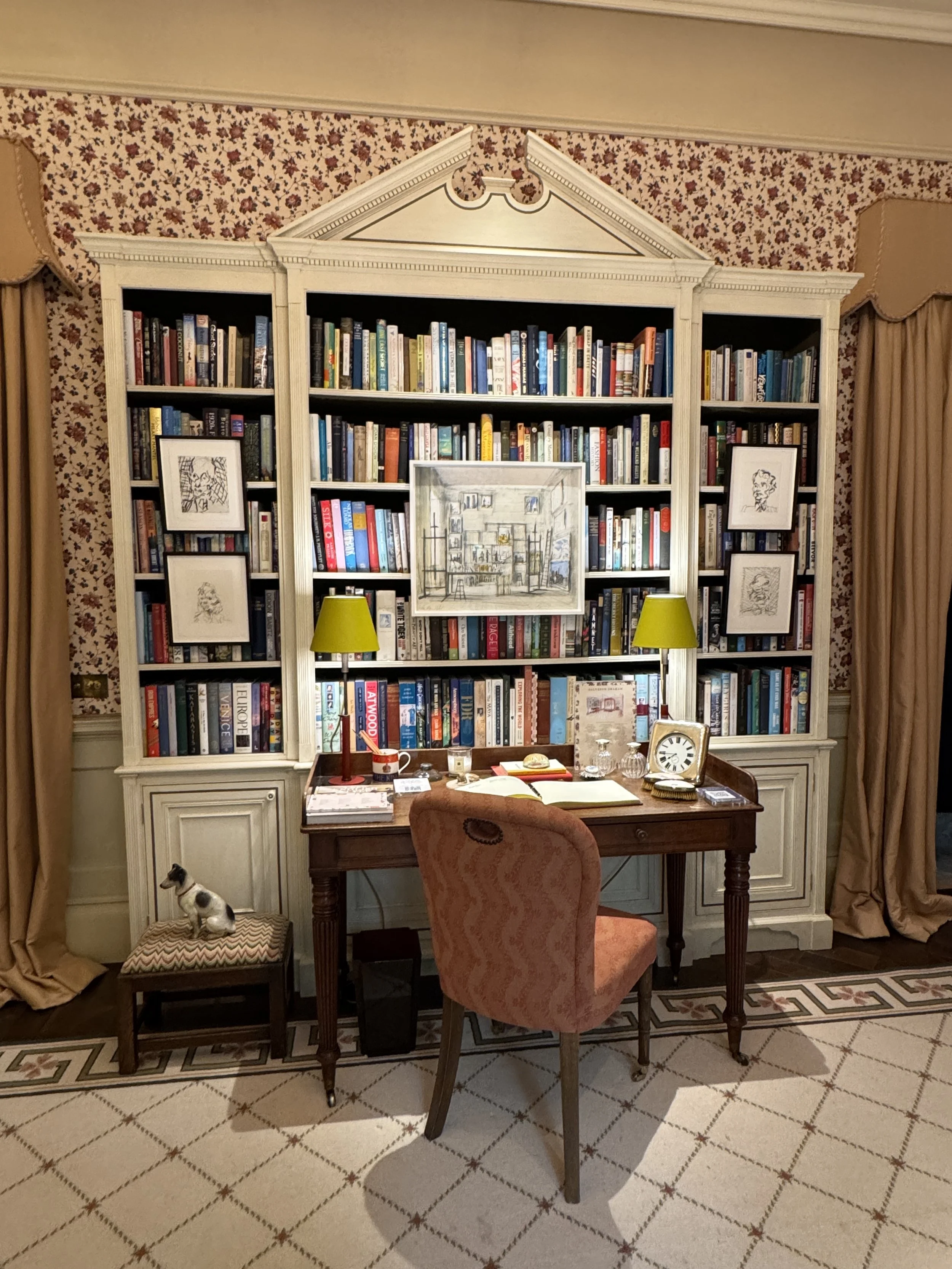
One detail I did love was the custom bookcase, where small pictures had been hung along the front edges of the shelves, partially overlapping the books.
I have seen this done before and it works every time. It breaks up a large wall of book spines and gives the eye somewhere else to rest.
Samuel Heath Primary Bathroom by Rigby & Rigby
Bathing Beauty
A bathroom that distils timeless Japanese and Scandinavian wellness spaces, with digital screens that transport visitors far away. Rigby & Rigby’s room is a showcase for Samuel Heath’s British-made sanitaryware
Samuel Heath Primary Bathroom by Rigby & Rigby
This was one of my absolute favourites of the day.
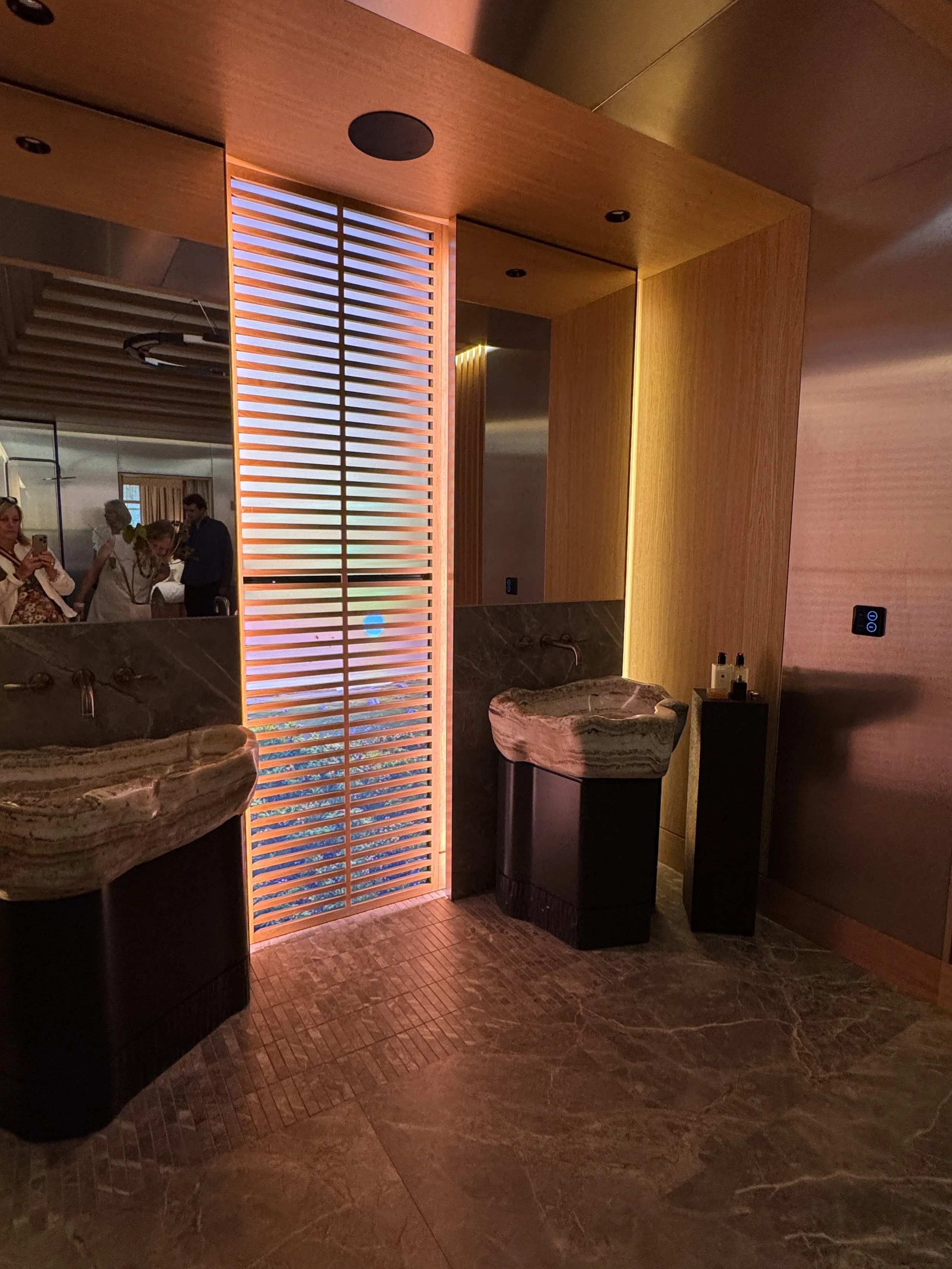
It was dark, atmospheric and slightly moody, with definite nightclub undertones.
Called Bathing Beauty, the room brought together influences from Japanese and Scandinavian wellness interiors.
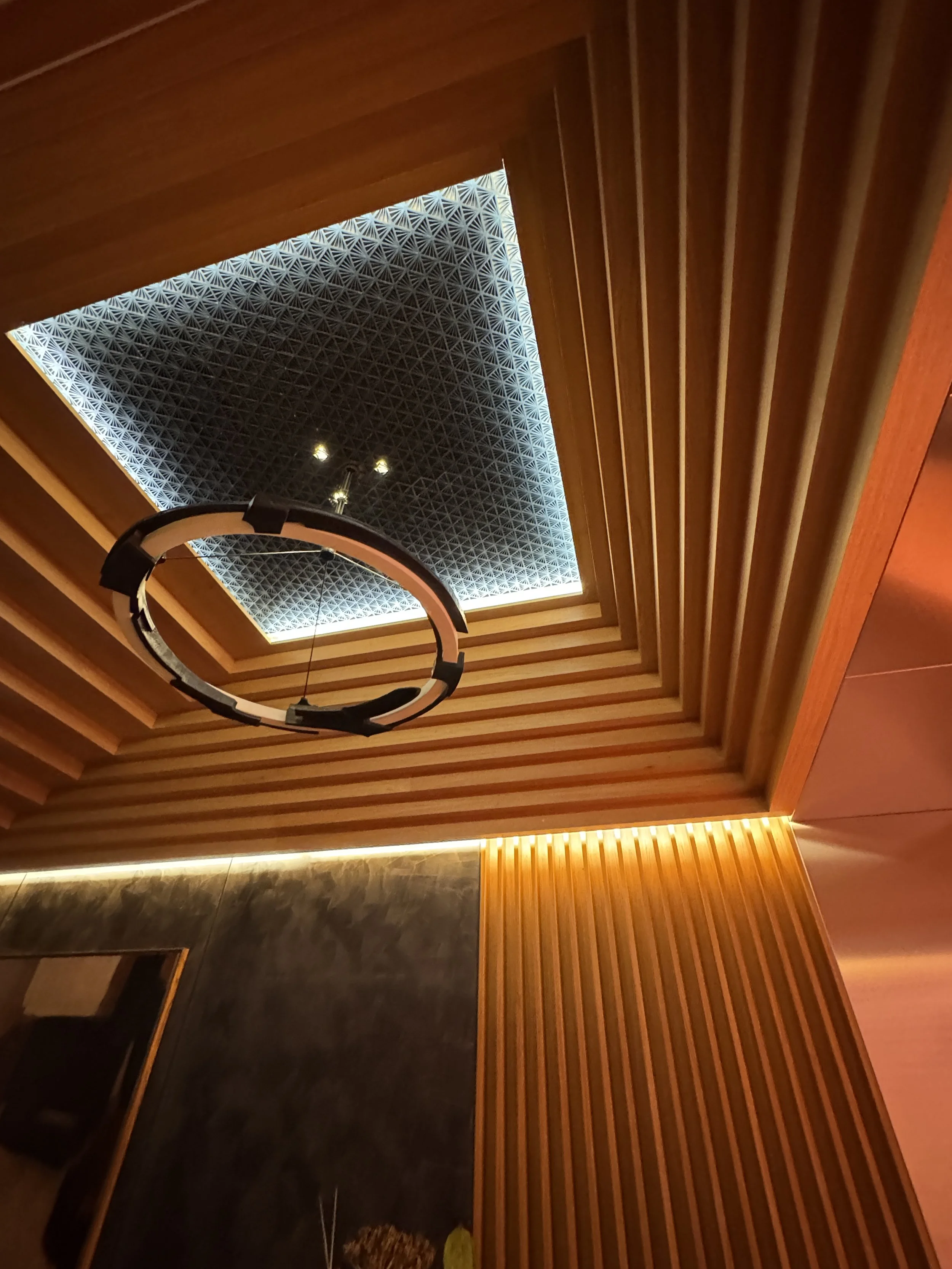
A stepped timber ceiling featured a kumiko-inspired lattice pattern developed through Rigby & Rigby’s AI Lab. This sat above oak-lined walls created by James Wellesley Bespoke Interiors.
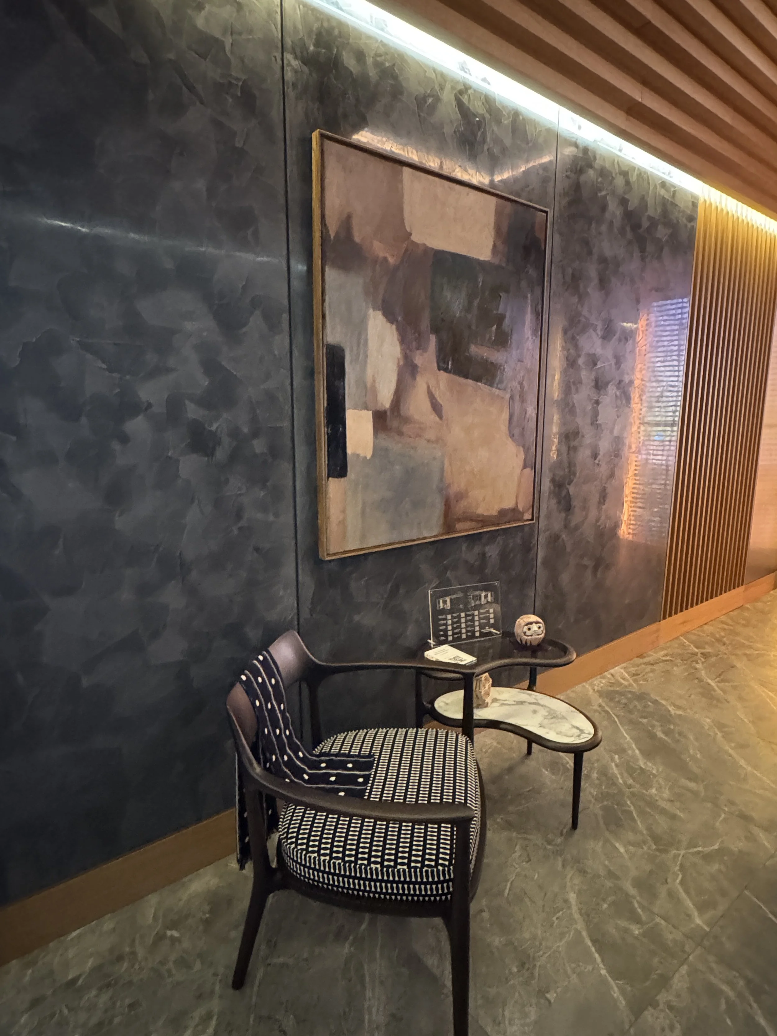
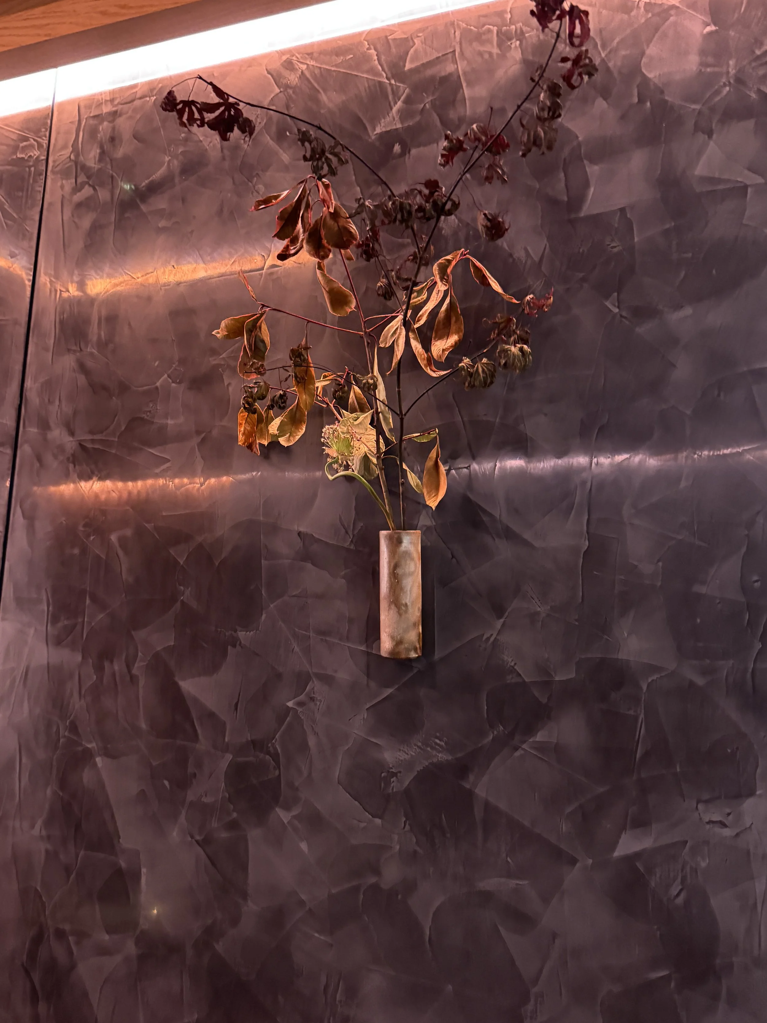
There were some delicate metal pieces on the wall that I initially could not identify. I wondered whether they were lights or artwork, and later discovered that they formed a sculptural artwork called Resonate by Hannah Ludnow.
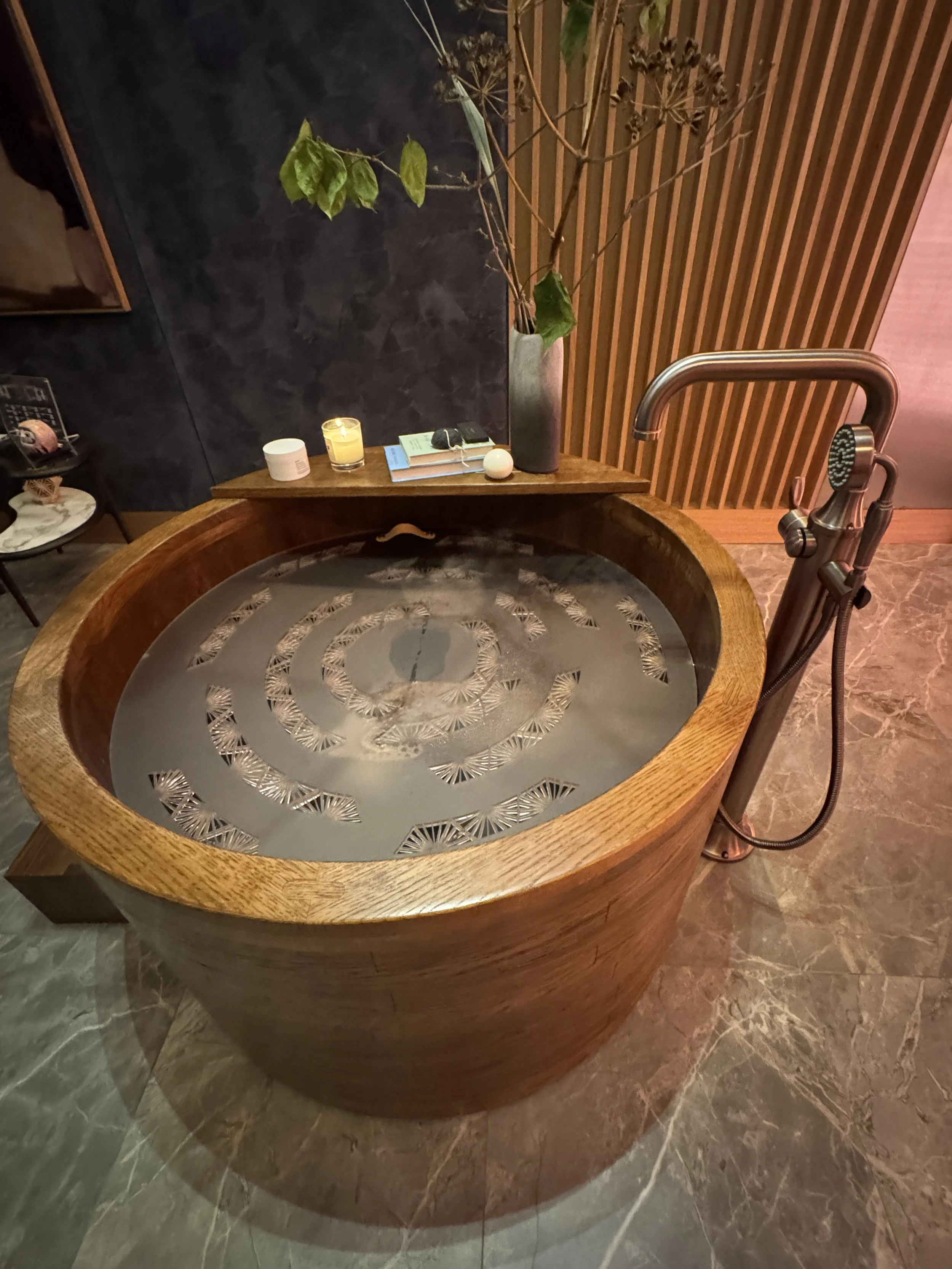
The floor combined several different tile sizes, while an oak ofuro-style soaking tub and an onyx basin from Lapicida anchored the room.
Samuel Heath’s British-made brassware included bespoke concept taps, a freestanding bath filler and a shower, demonstrating the level of craftsmanship for which the company is known.
I am not certain that every individual element worked together for my personal taste, but the polished plaster, tiled floor, timber bath and black lounge chair with its side table have all gone straight onto my wish list.
Munder Skiles Courtyard by Richard Miers
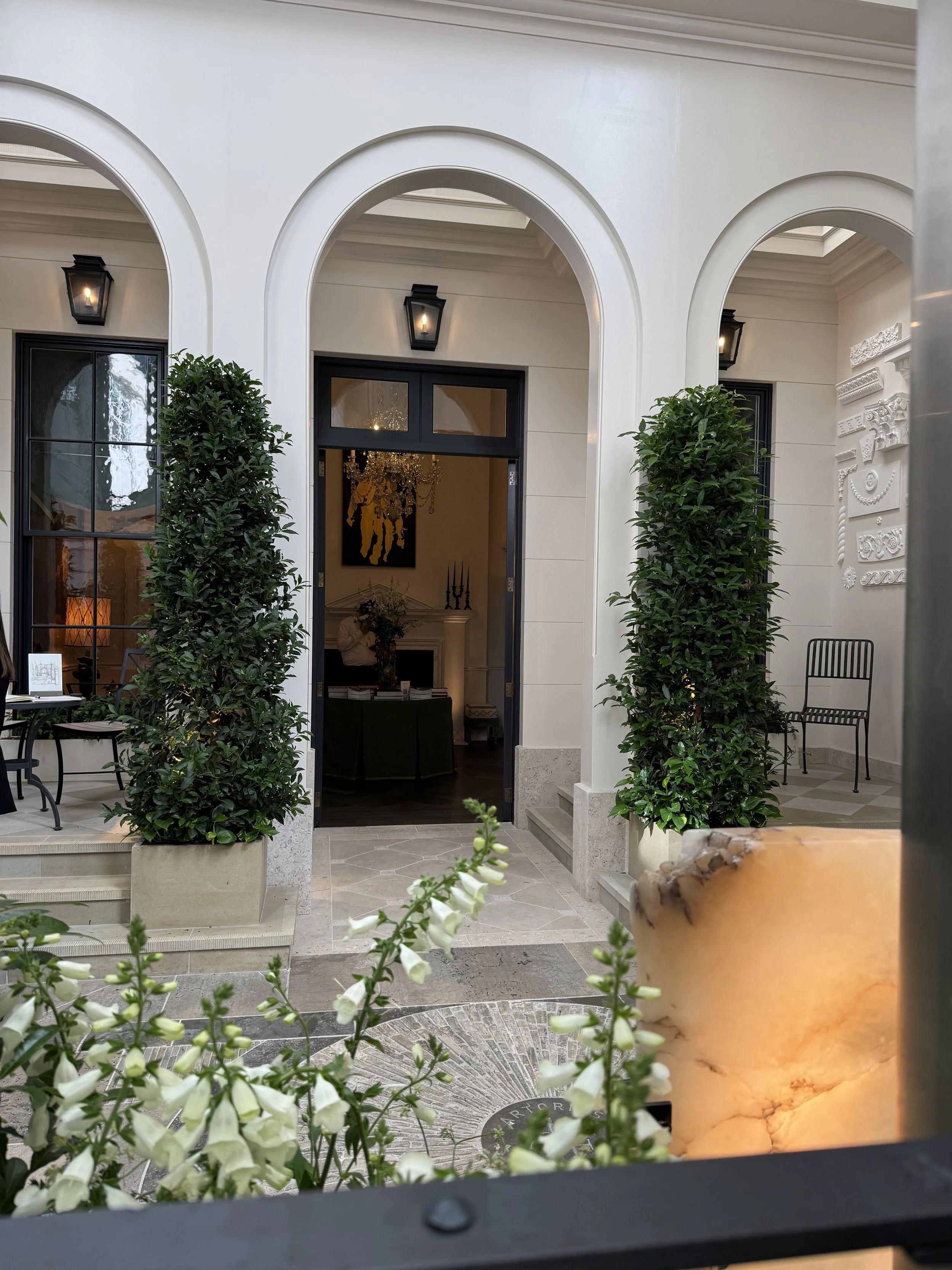
This was the one genuine exception to my ceiling theory, because the courtyard was an outdoor room open to the sky.
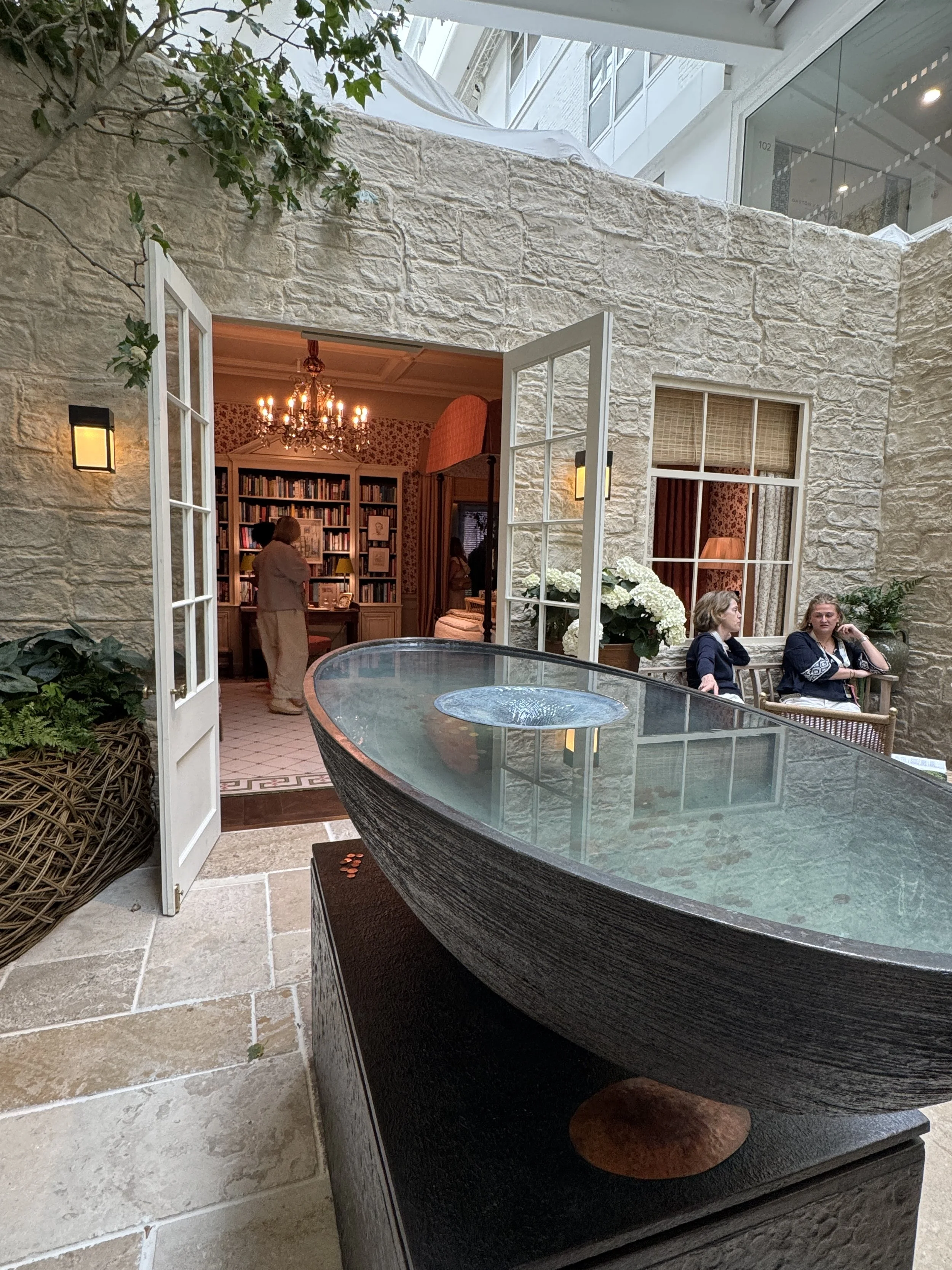
A central water feature brought a sense of movement and calm, while the surrounding planting created soft, dappled shade.
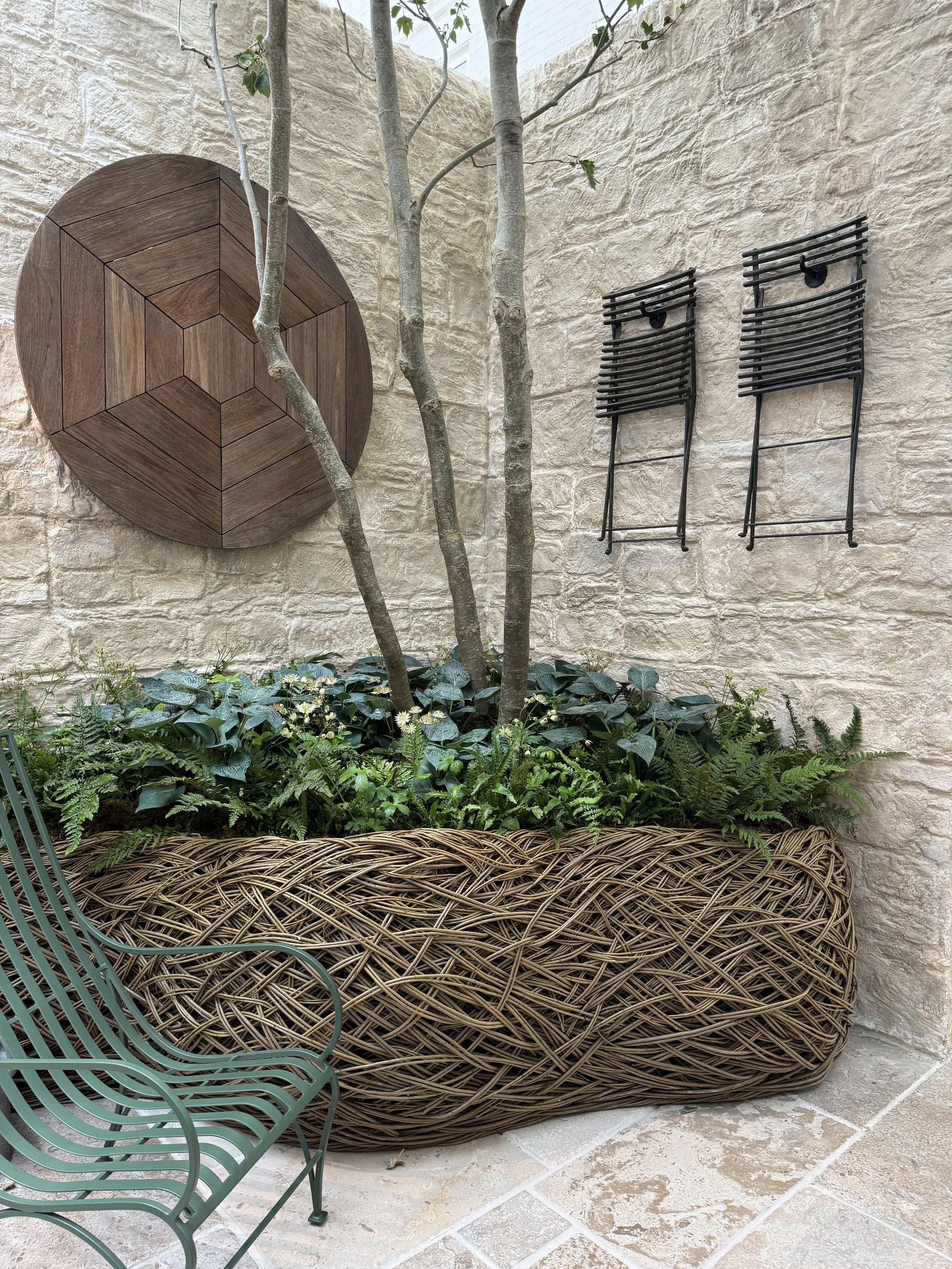
I particularly liked the woven willow planters placed around the courtyard.
The water bowl clearly had a calming effect on other visitors too, as several people were sitting quietly around it before continuing through the next section of the house.
Richard Miers’ bespoke outdoor furniture, made in beautifully crafted teak and metal by Munder Skiles, helped the courtyard feel like a properly designed exterior room rather than an afterthought.
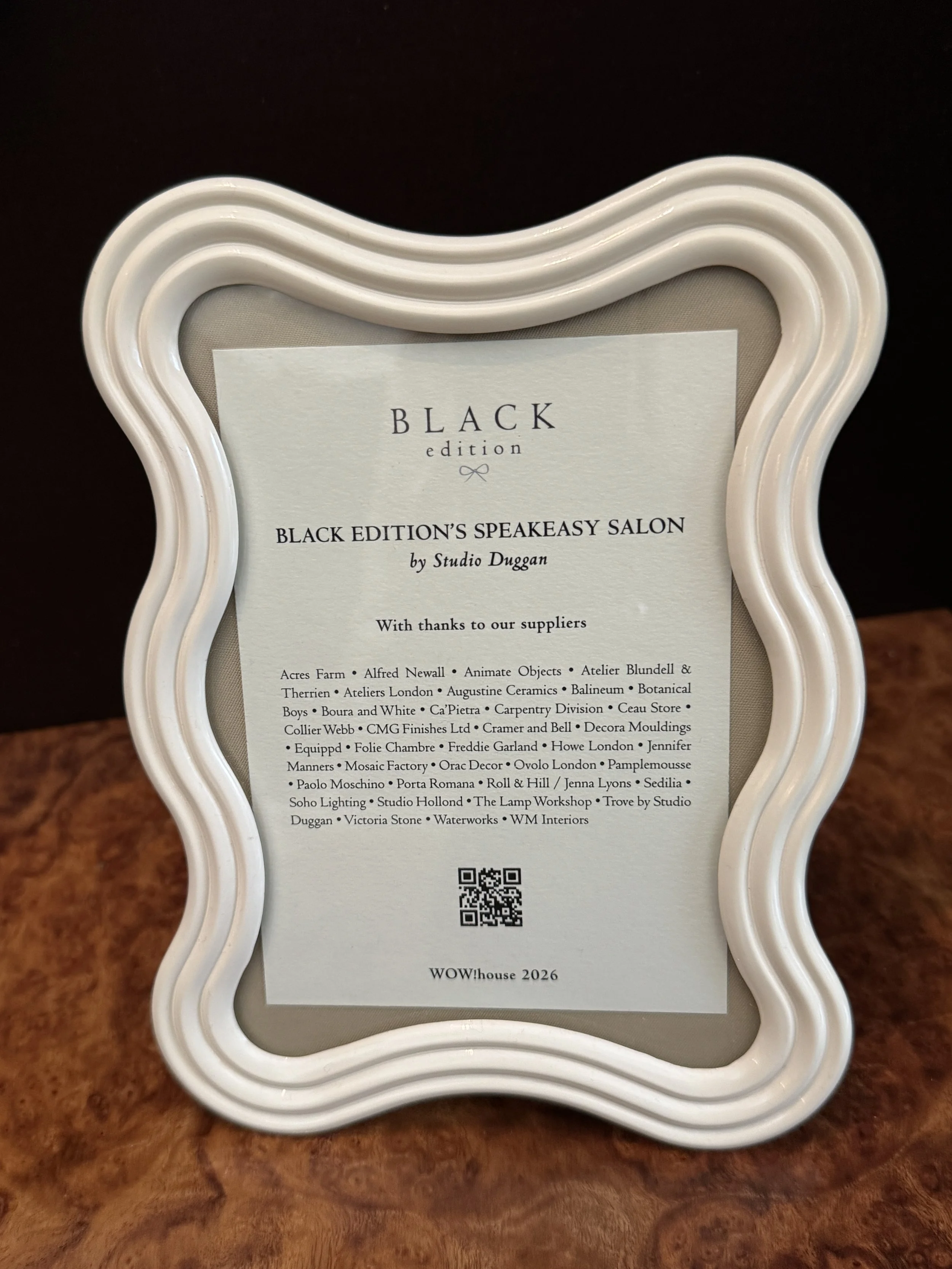
Black Edition at Romo Speakeasy Salon by Studio Duggan
Hidden Pleasures
The depth and decadence of Black Edition’s fabrics set the tone in this space. Tiffany Duggan has imagined a homeowner with discerning taste, who uses the room for working, relaxing or entertaining – with an aesthetic that explores the interplay between heritage and modernity
Black Edition at Romo Speakeasy Salon by Studio Duggan
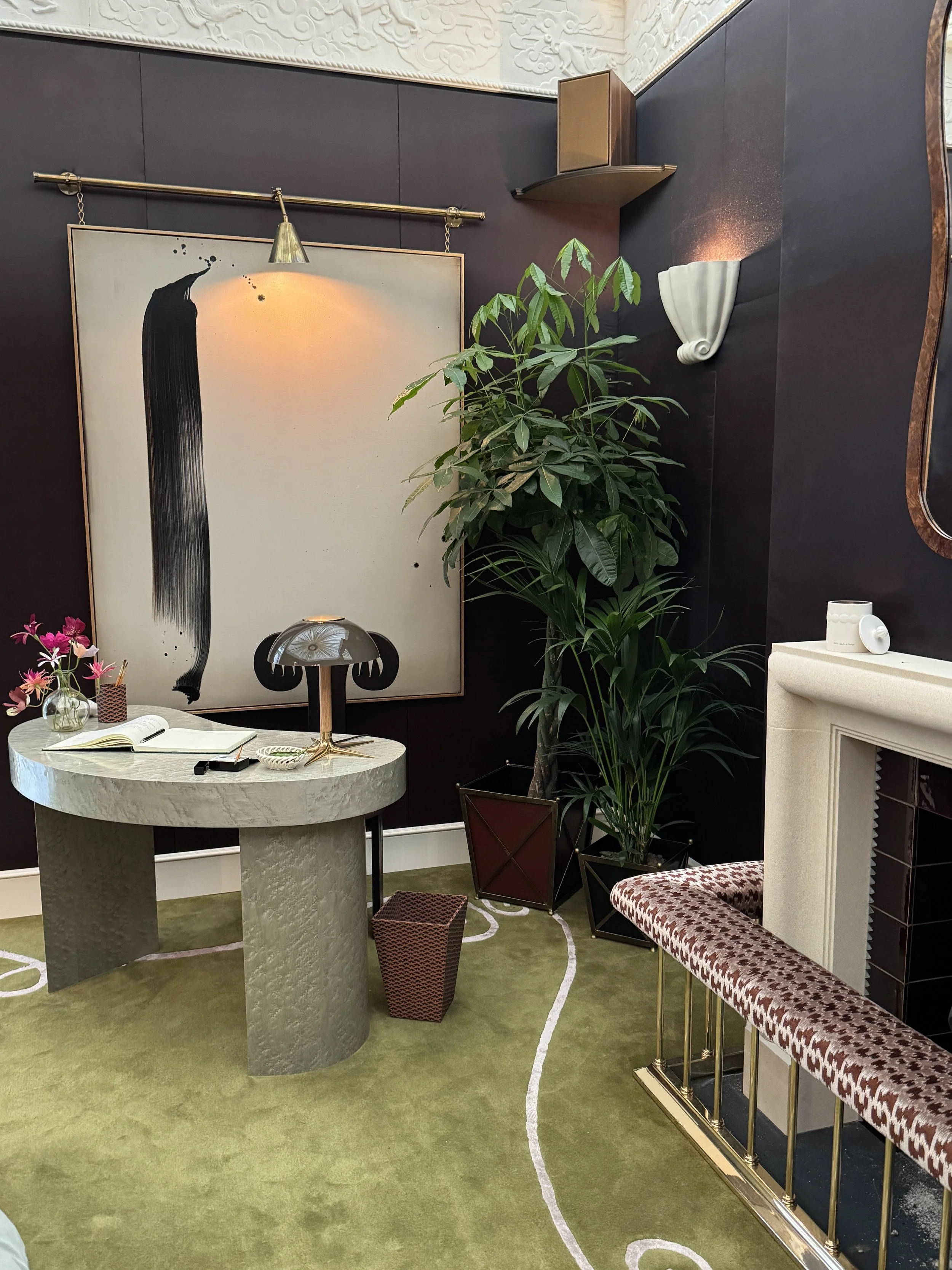
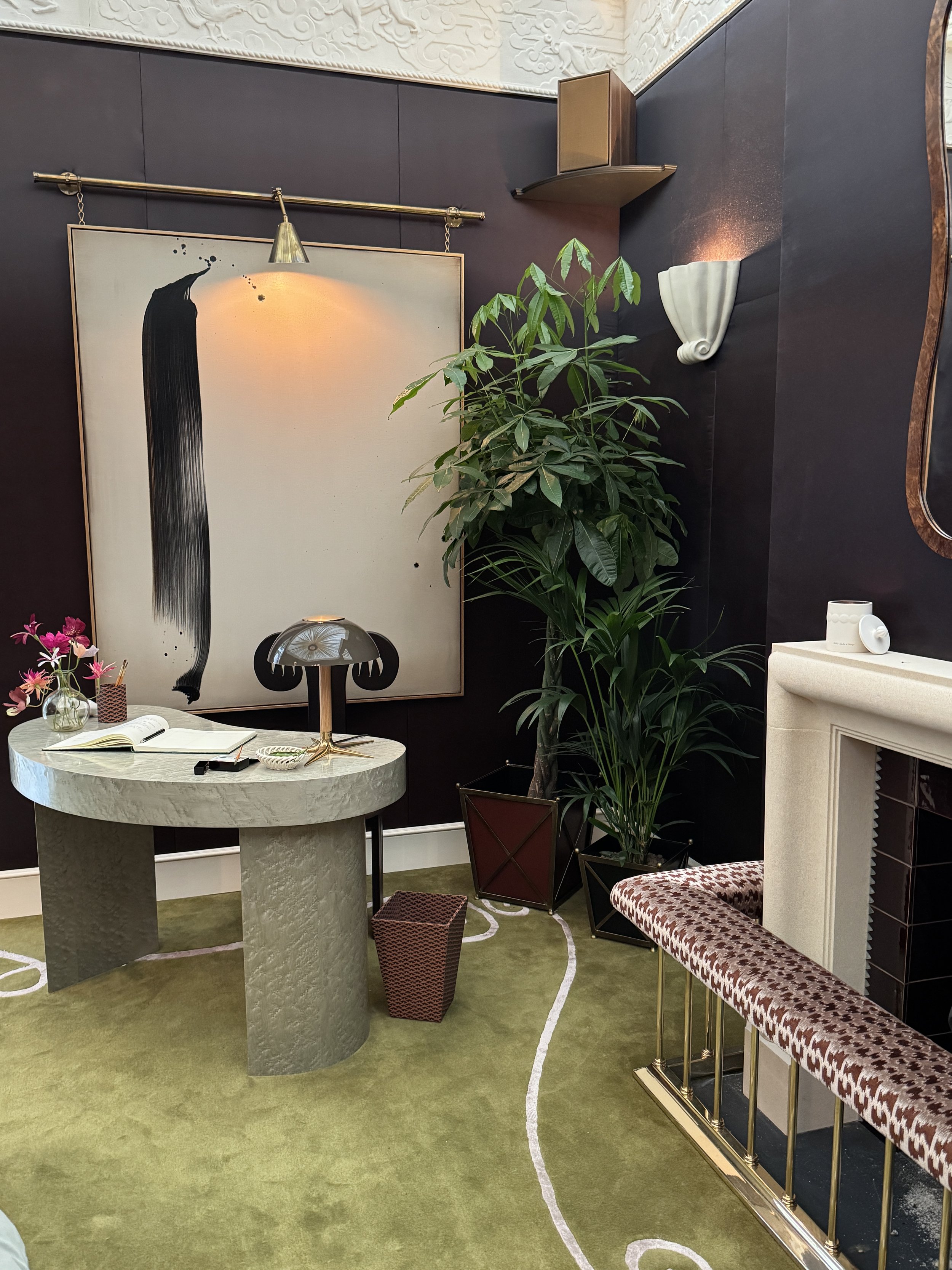
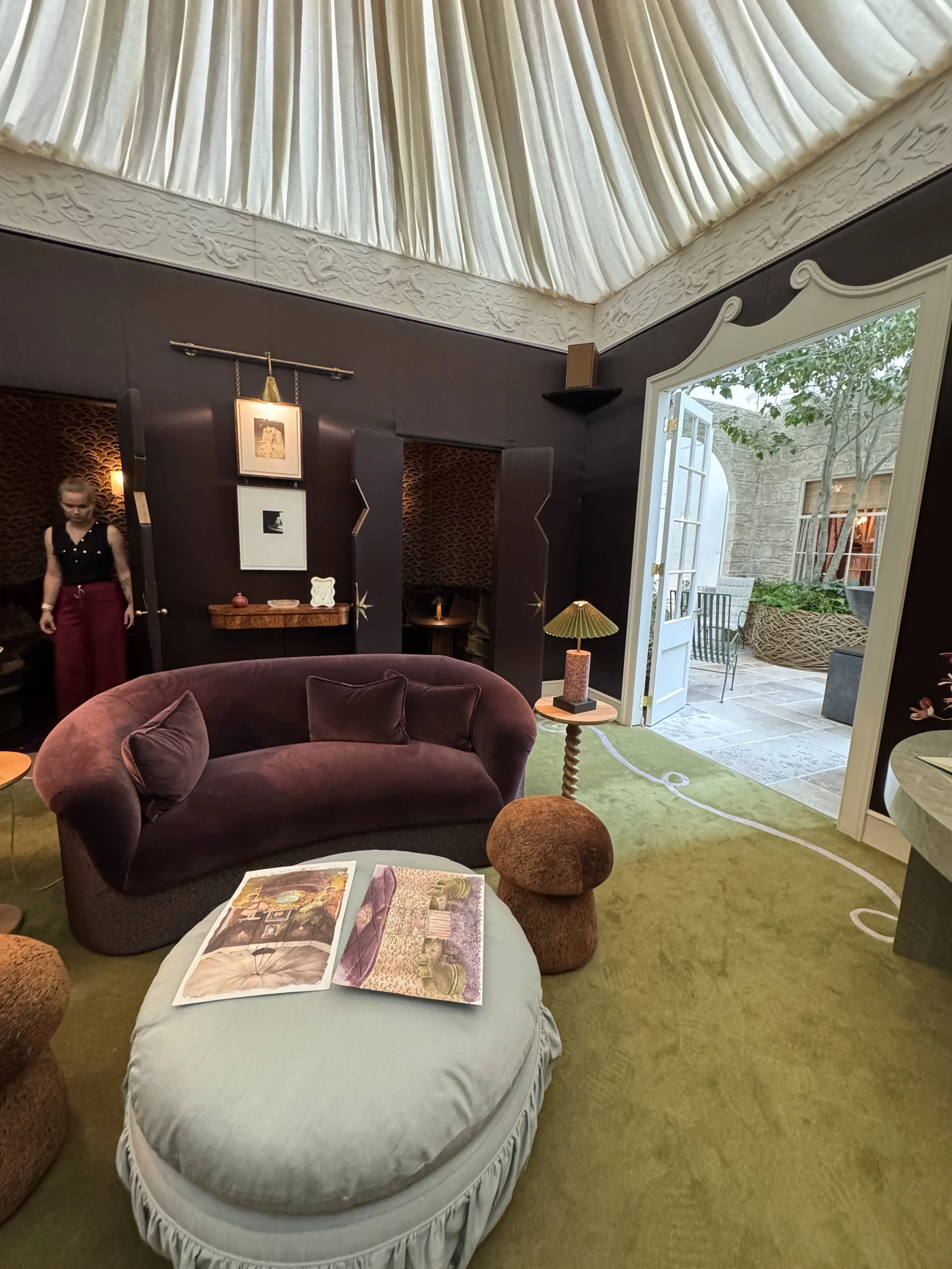
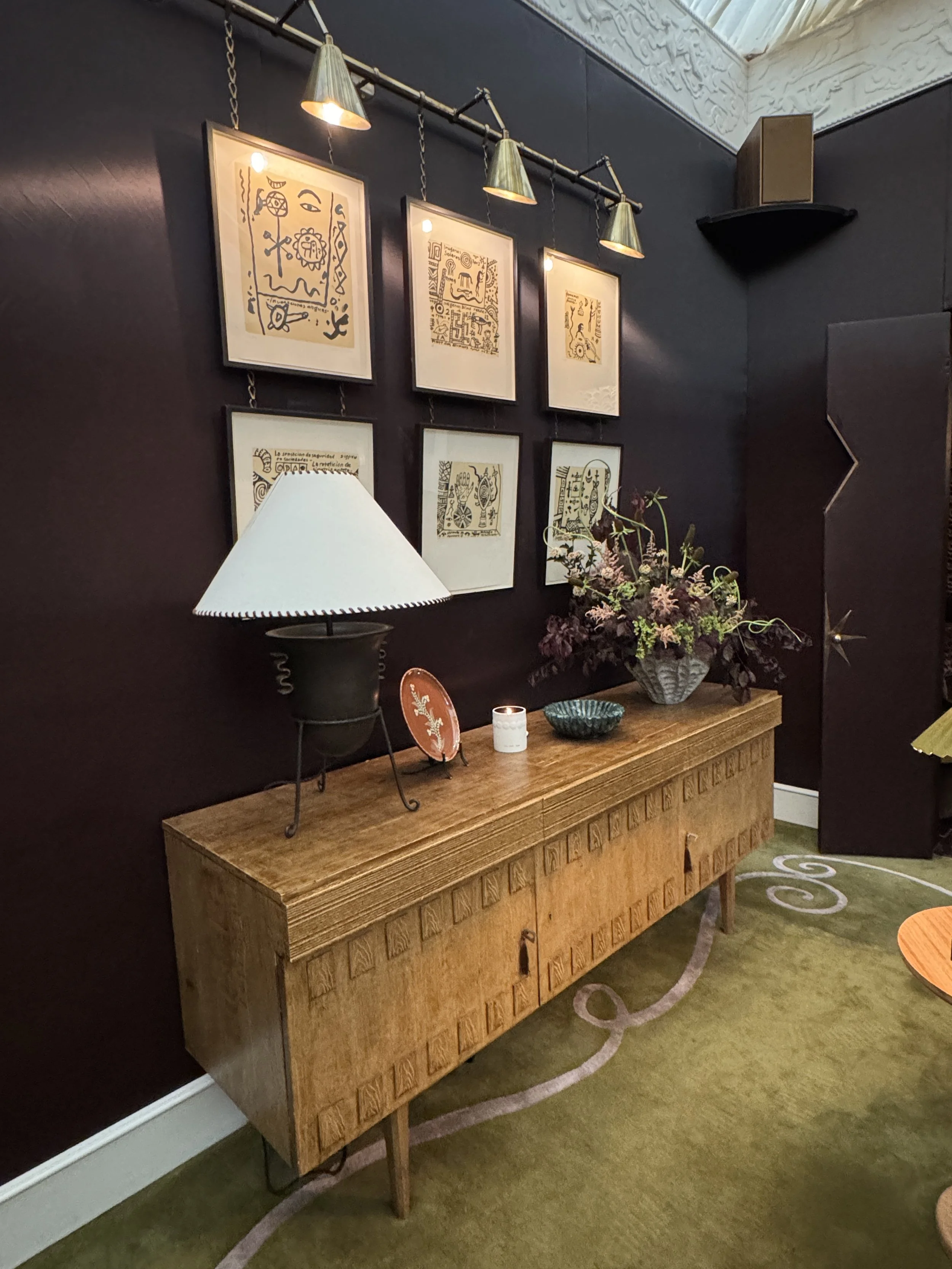
This was another of my favourite rooms, filled with small details that I kept discovering.
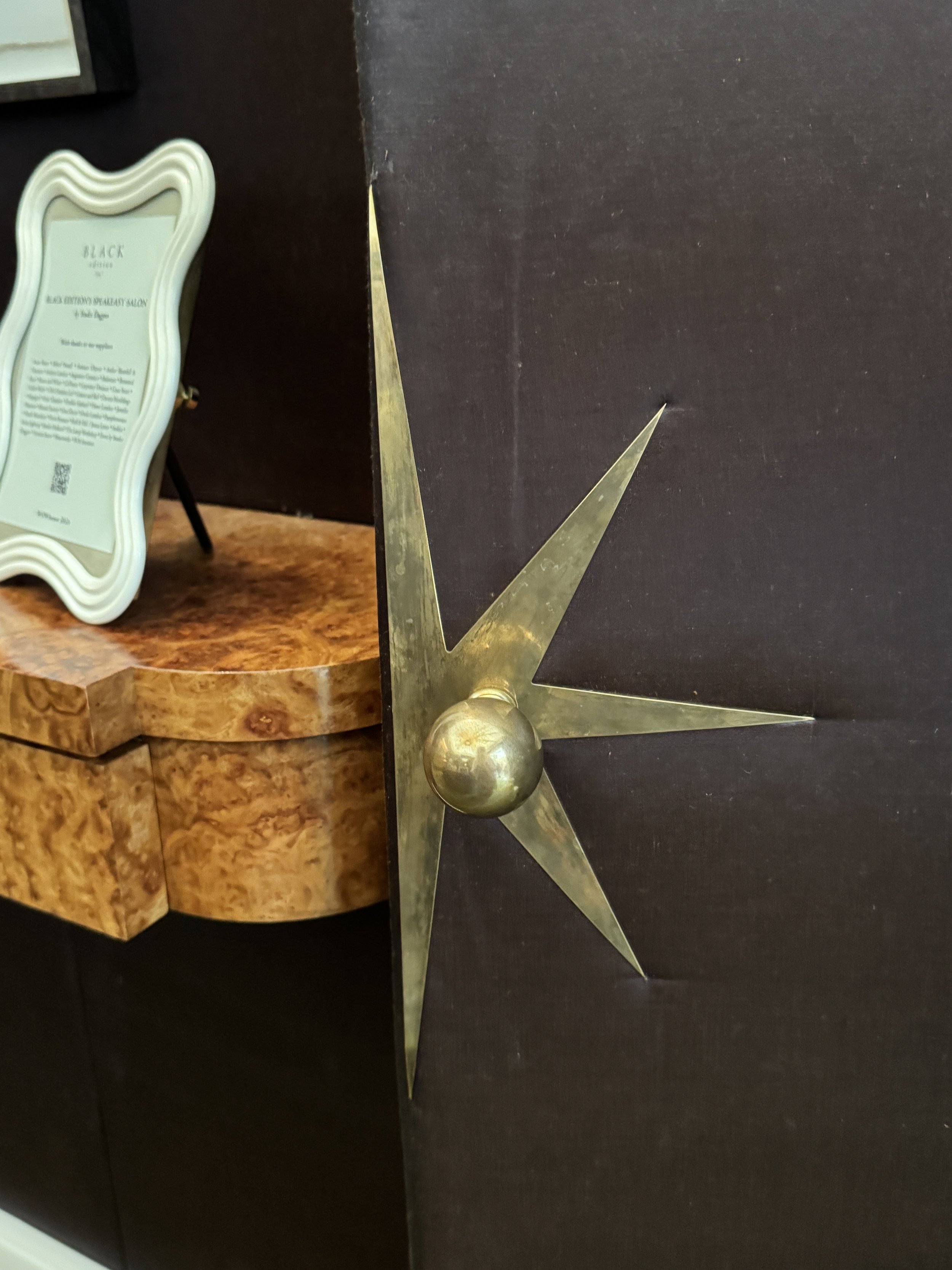
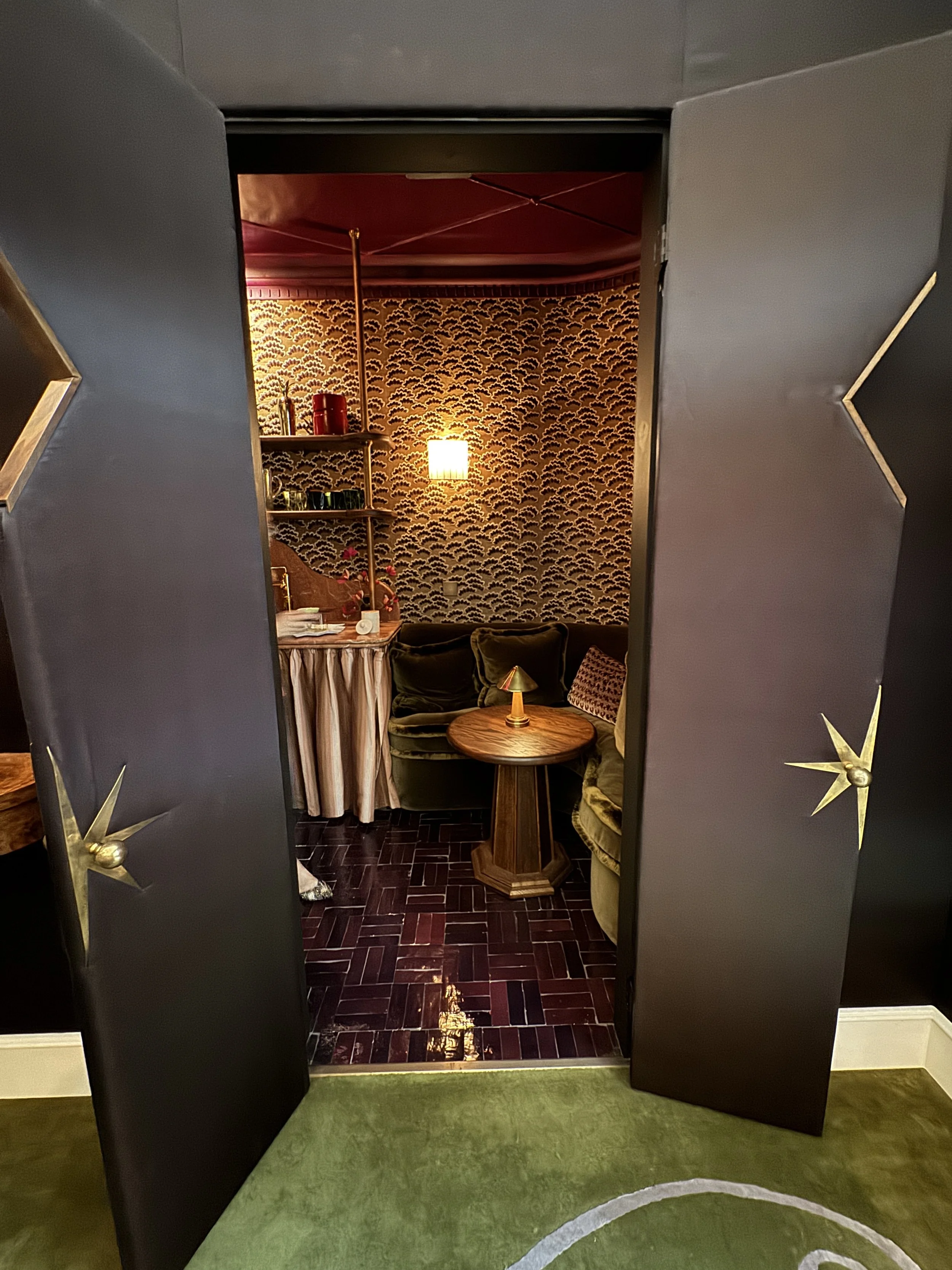
The doors leading into the secret bar had diamond-shaped windows and star-shaped handles. They felt wonderfully magical and were easily the best concealed doors of the day.
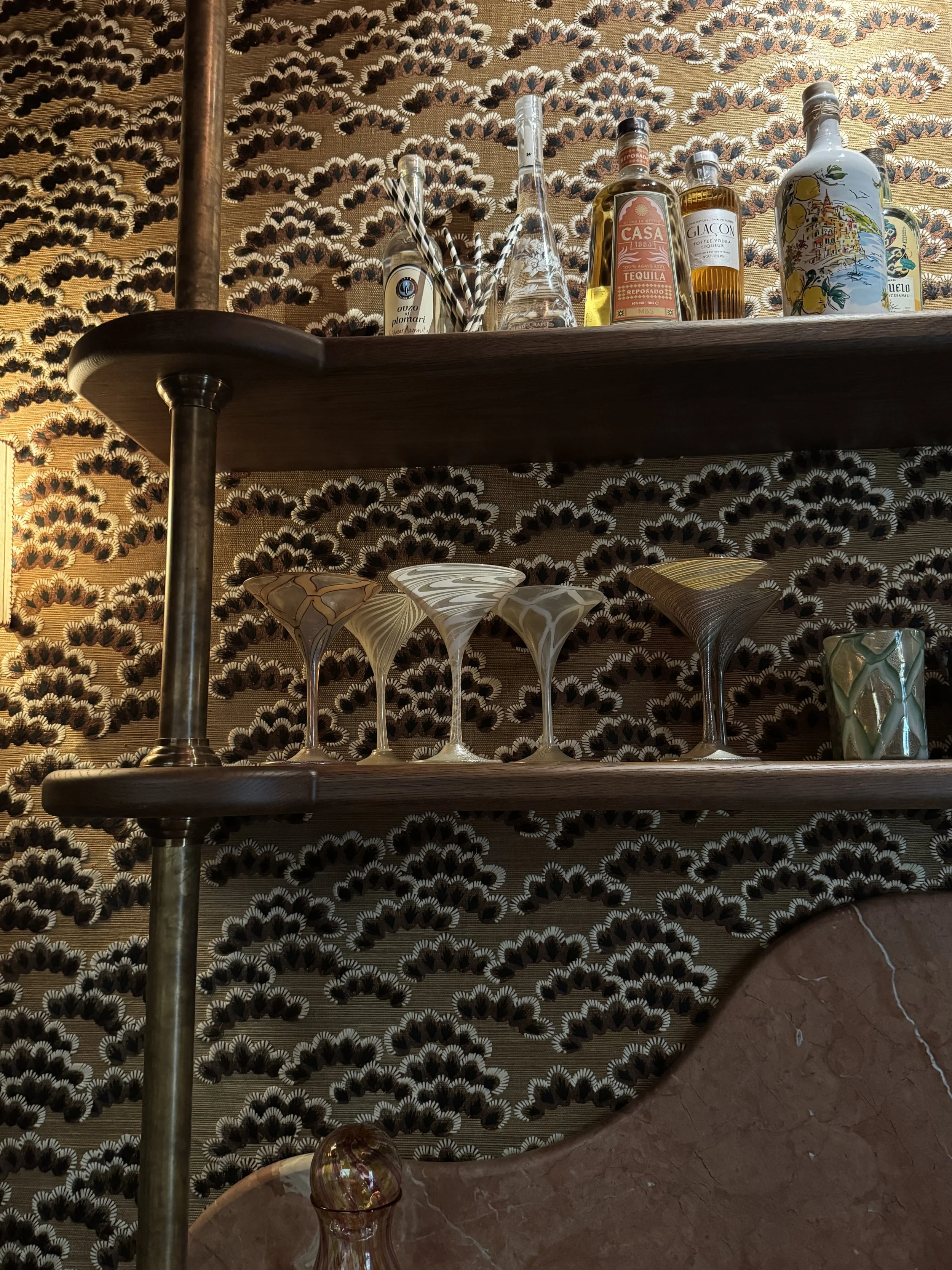
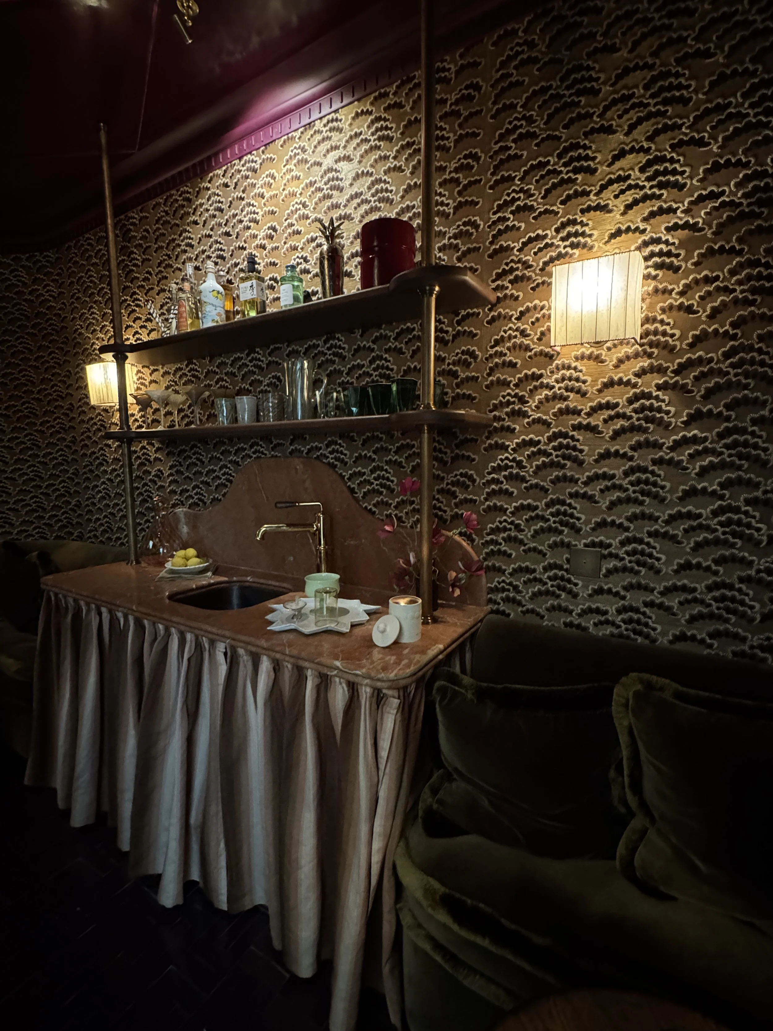
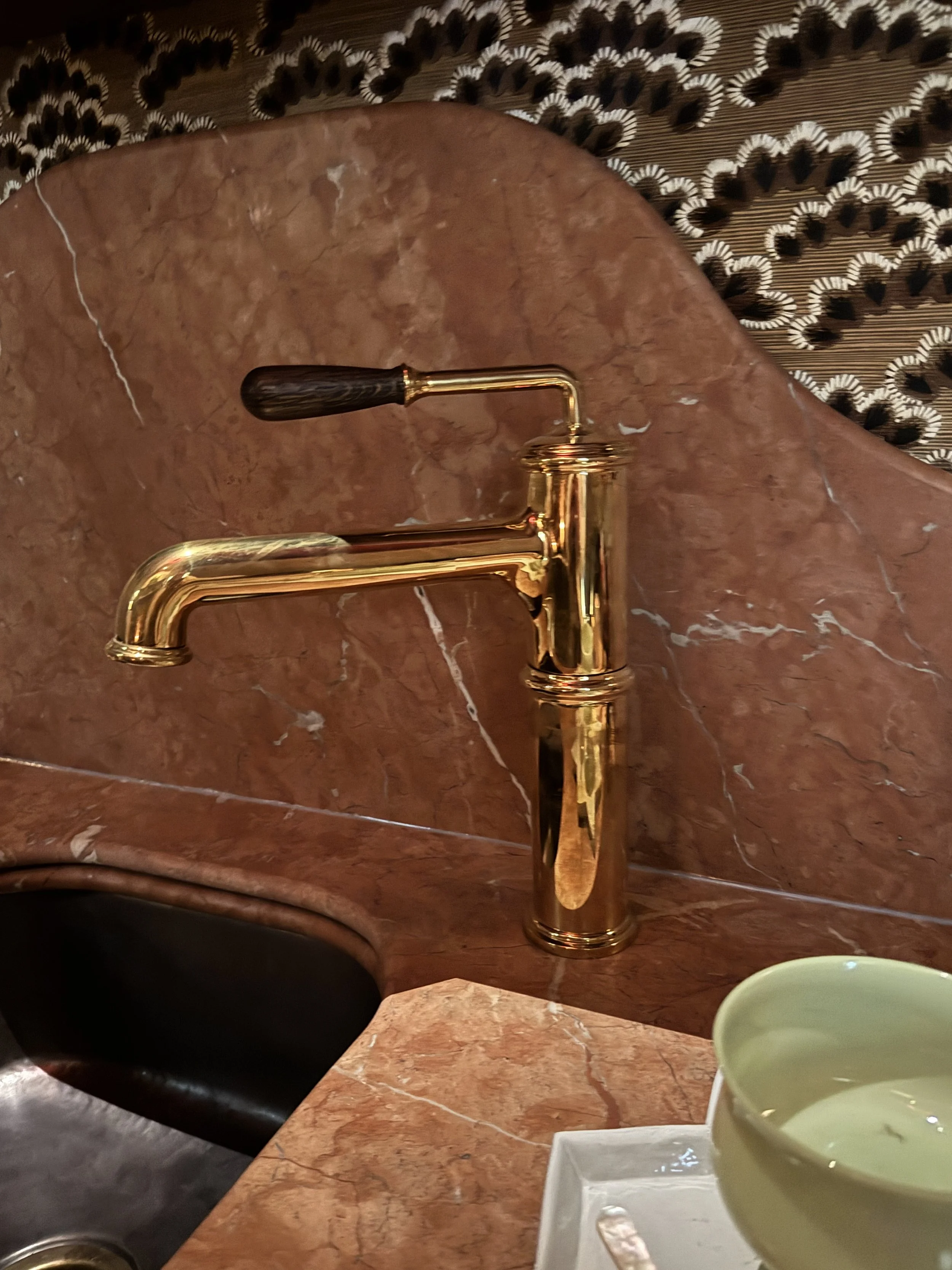
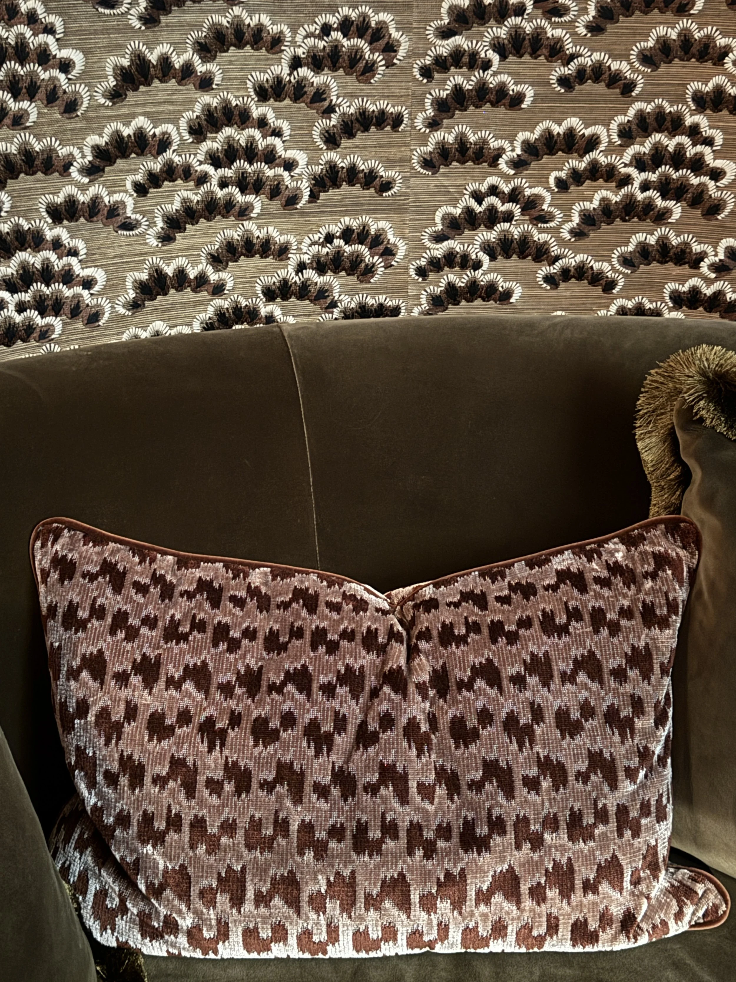
Tiffany Duggan wrapped the bar in Black Edition’s embroidered Imani wallcovering in the Cumin colourway.
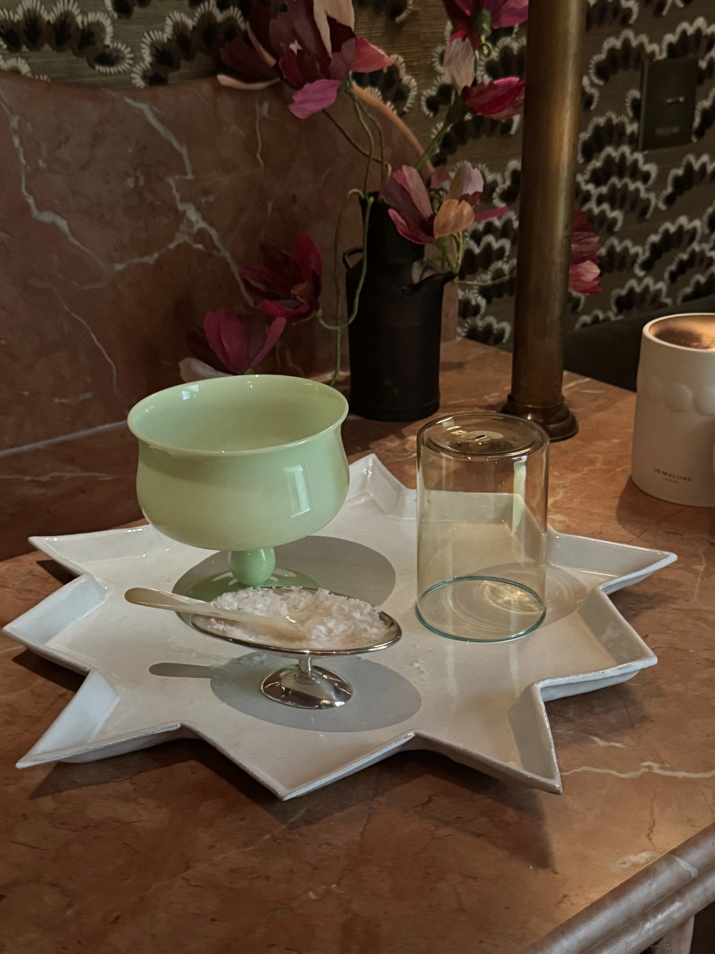
Open shelving sat above a marbled sink area, while a fully gathered fabric skirt in Black Edition’s Ondra fabric concealed the lower part of the cocktail bar.
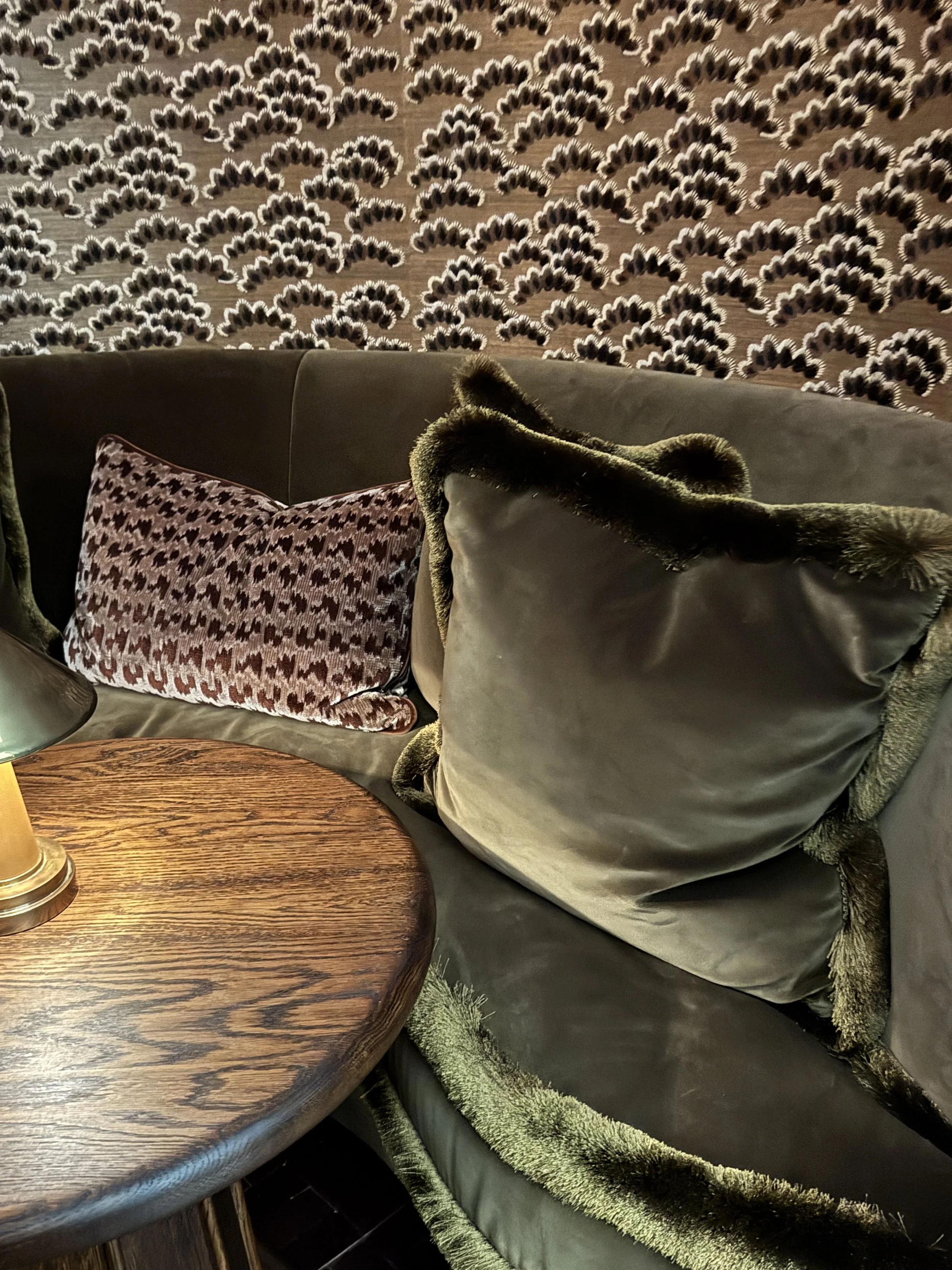
The curved sofa was upholstered in a deep aubergine velvet, Black Edition’s Zeo in Medjool. The walls were also upholstered in Miri, so even the visible architectural surfaces felt soft.
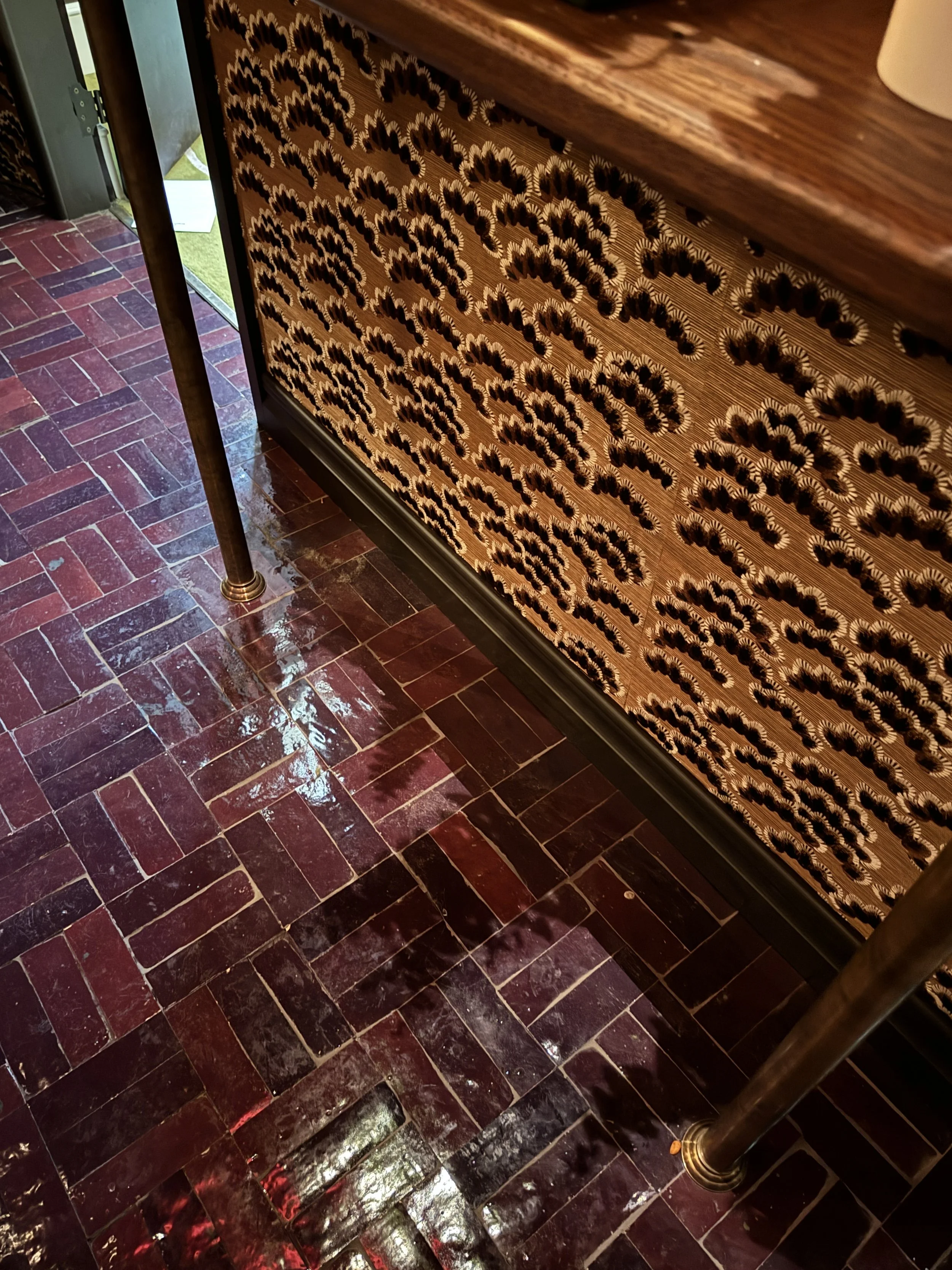
Small glossy burgundy tiles were laid in groups of three, with each group turned by 90 degrees to create a basketweave effect. I noticed several rooms using similar small-format tile arrangements throughout the day.
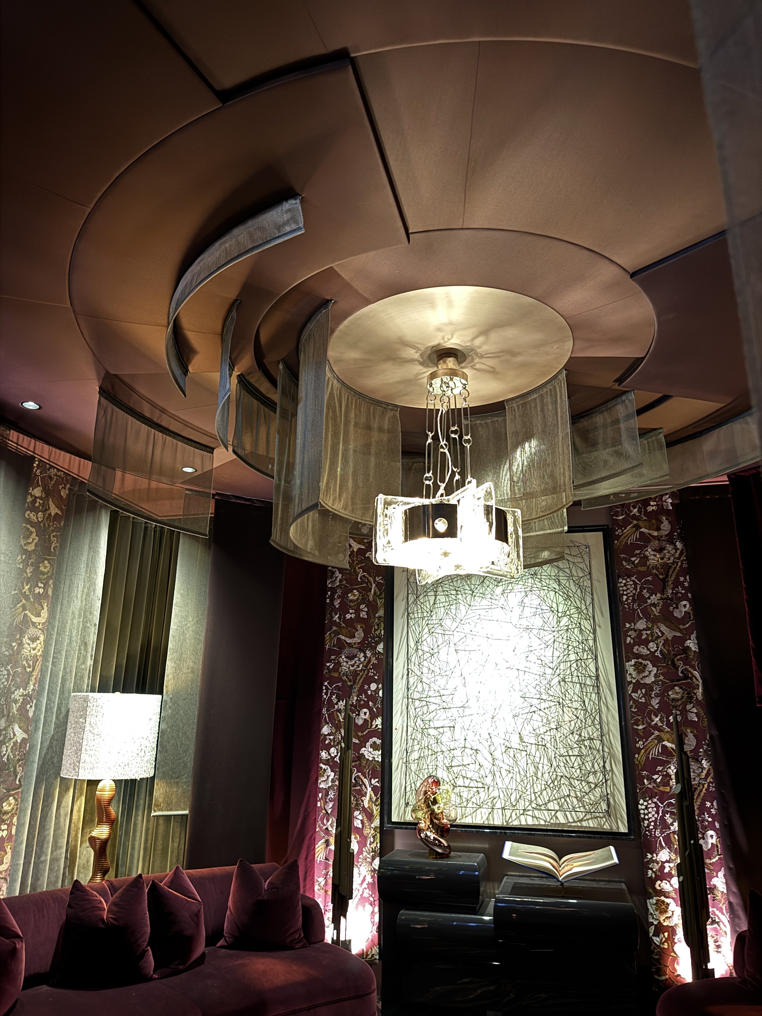
Above it all, a tented ceiling in Romo’s Kylo fabric added real drama. It was combined with high-gloss lacquered ceiling panels and a brass Astral ceiling light by Paolo Moschino.
I imagine this room would truly come alive in the evening. I would have loved to attend the evening event and see it properly lit.
Hidden Pleasures was the perfect name for the room, and it was probably the space from which I took away the greatest number of ideas.
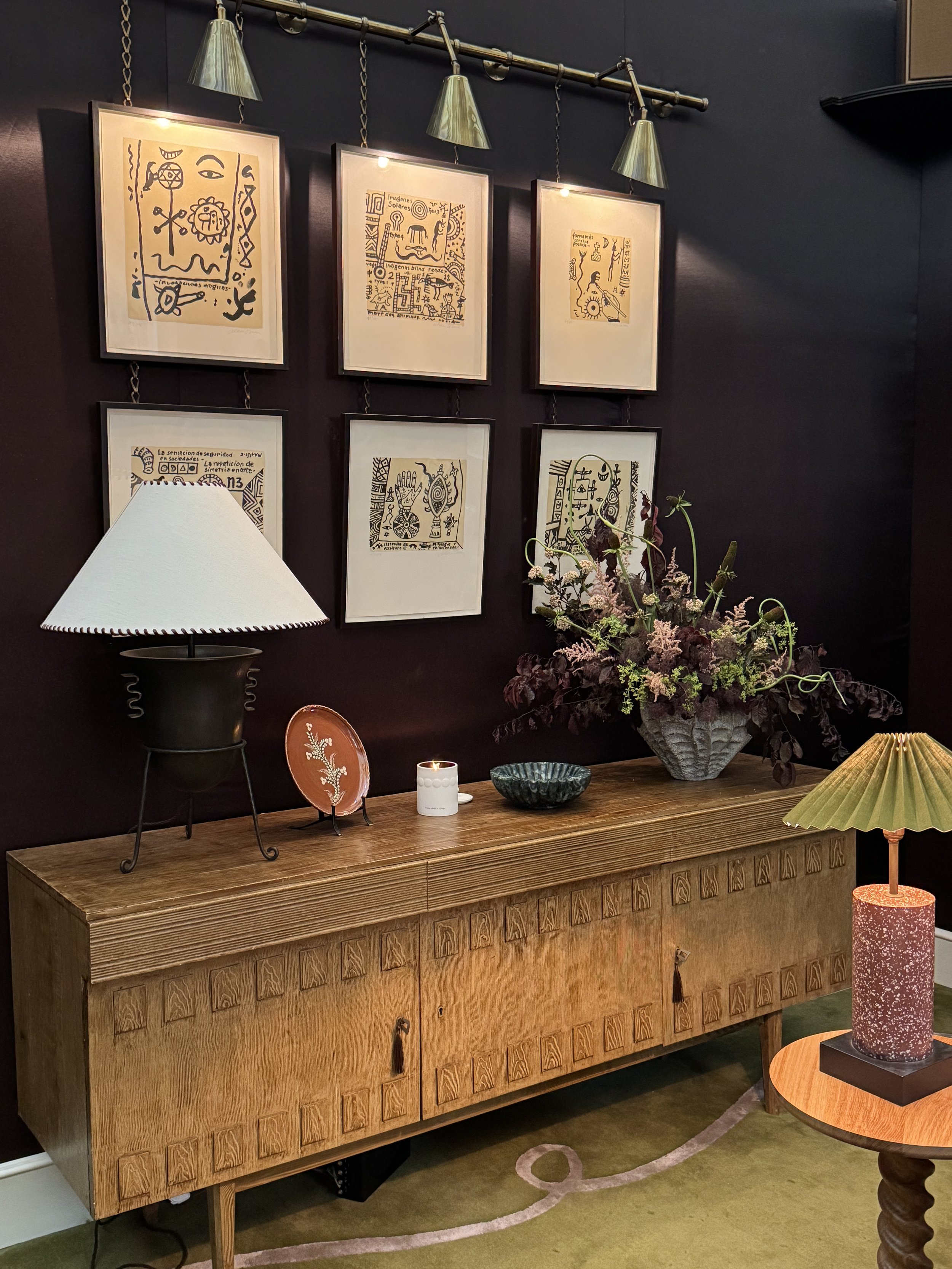
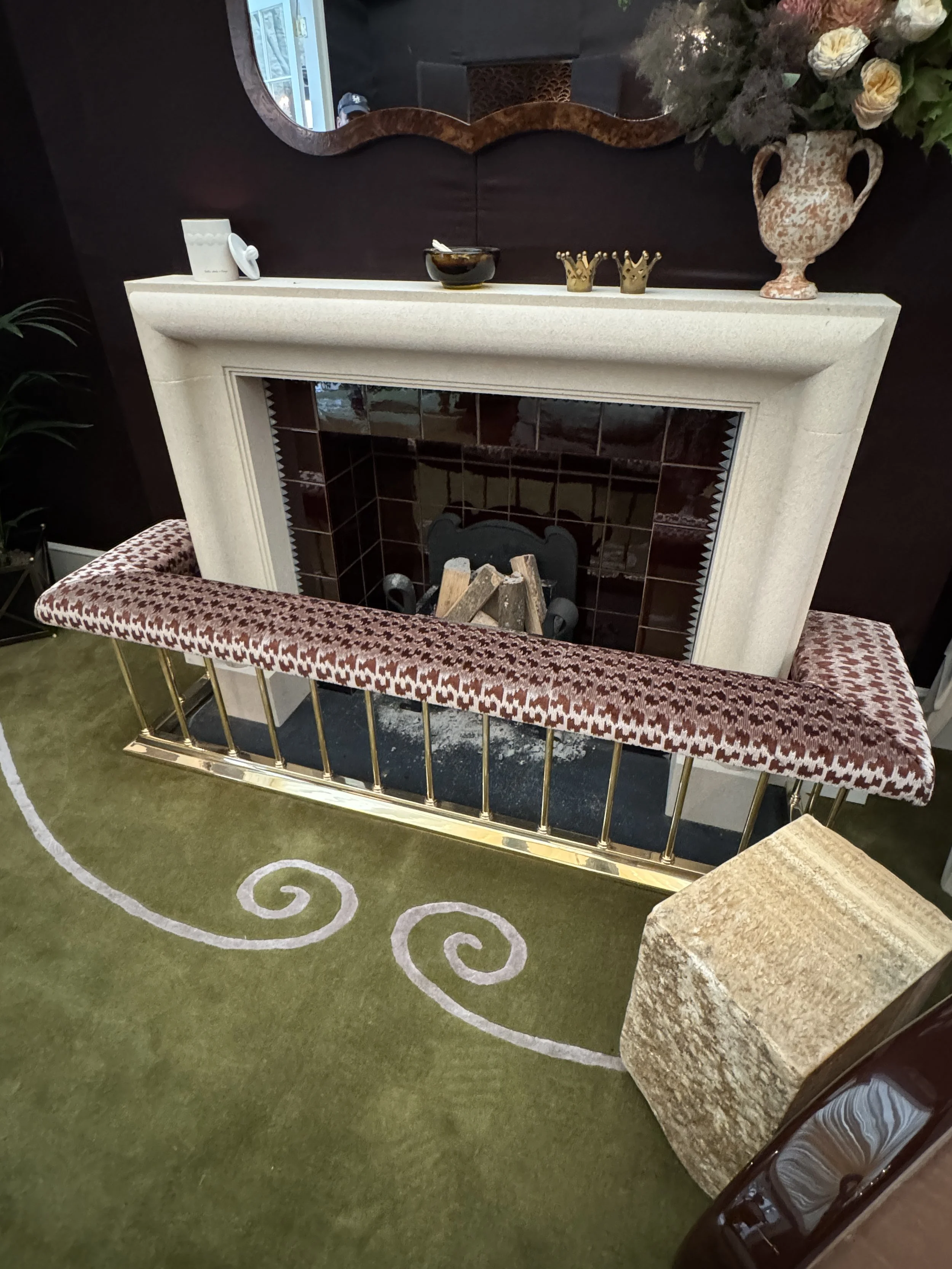
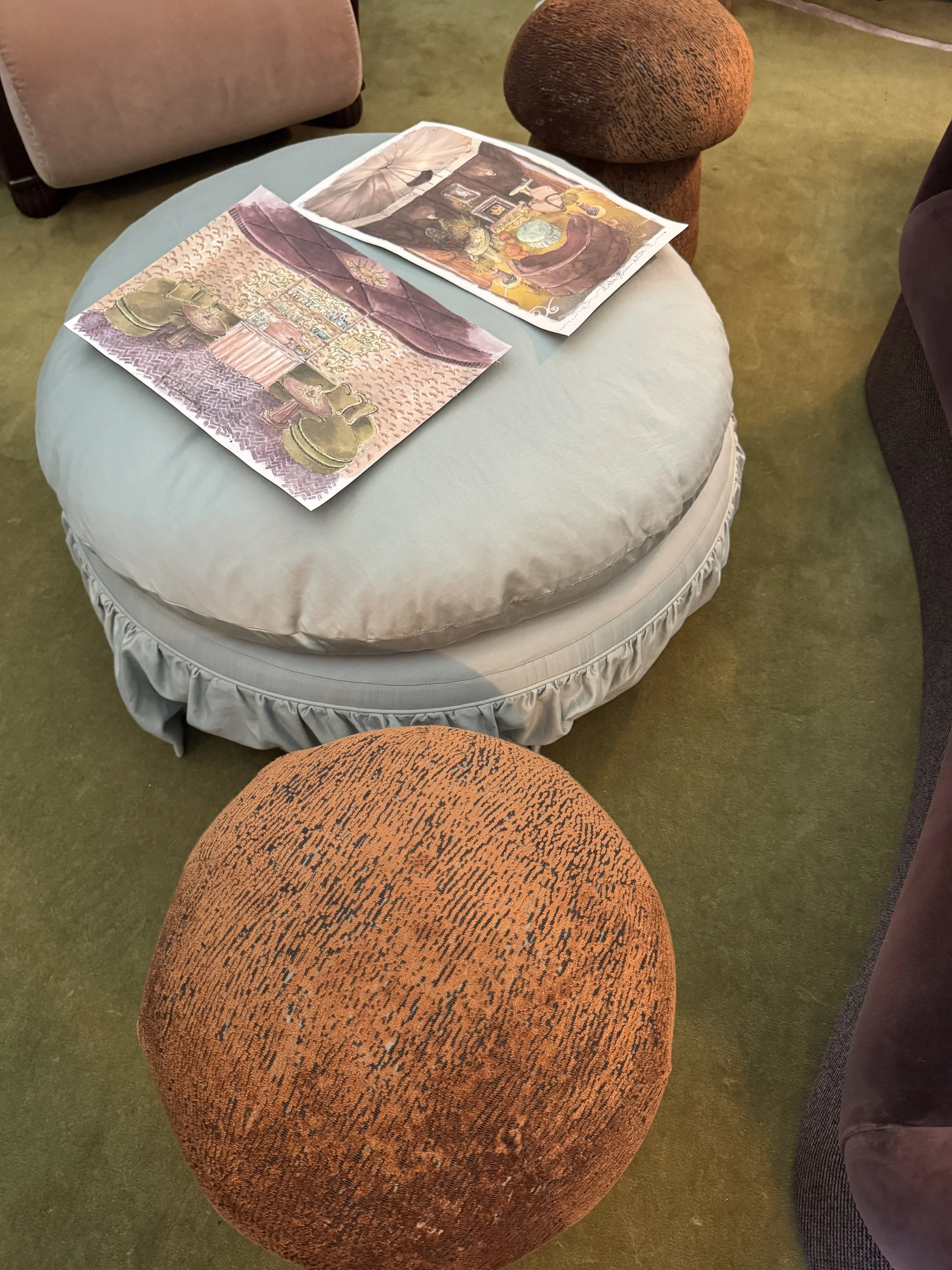
The Parlour by Martin Kemp Design
Hidden Pleasures
The depth and decadence of Black Edition’s fabrics set the tone in this space. Tiffany Duggan has imagined a homeowner with discerning taste, who uses the room for working, relaxing or entertaining – with an aesthetic that explores the interplay between heritage and modernity
The Parlour by Martin Kemp Design
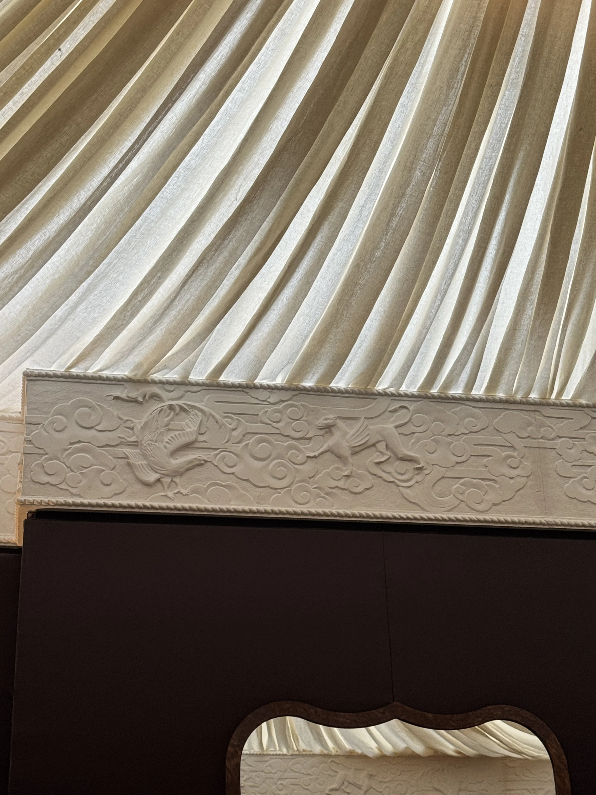
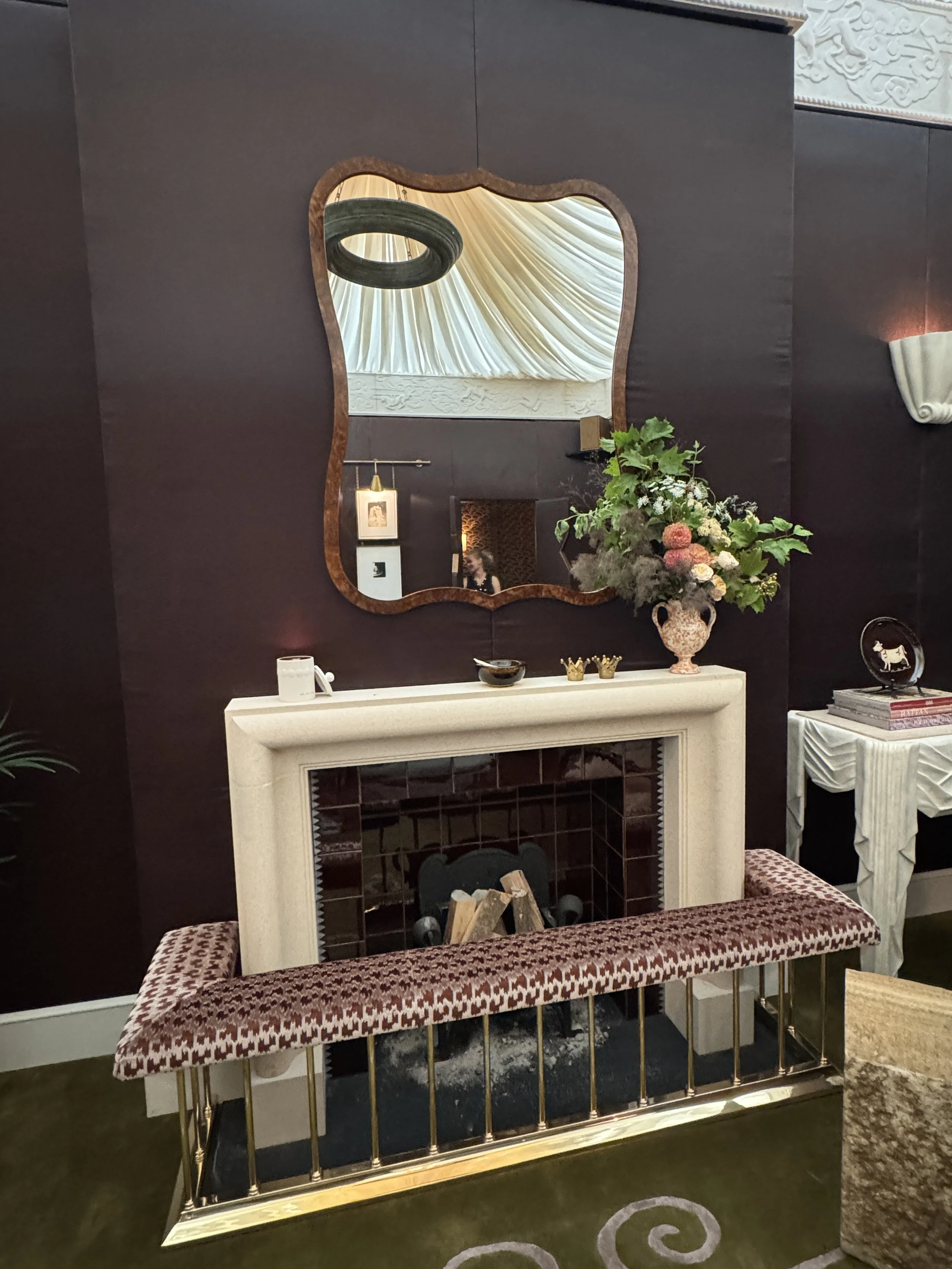
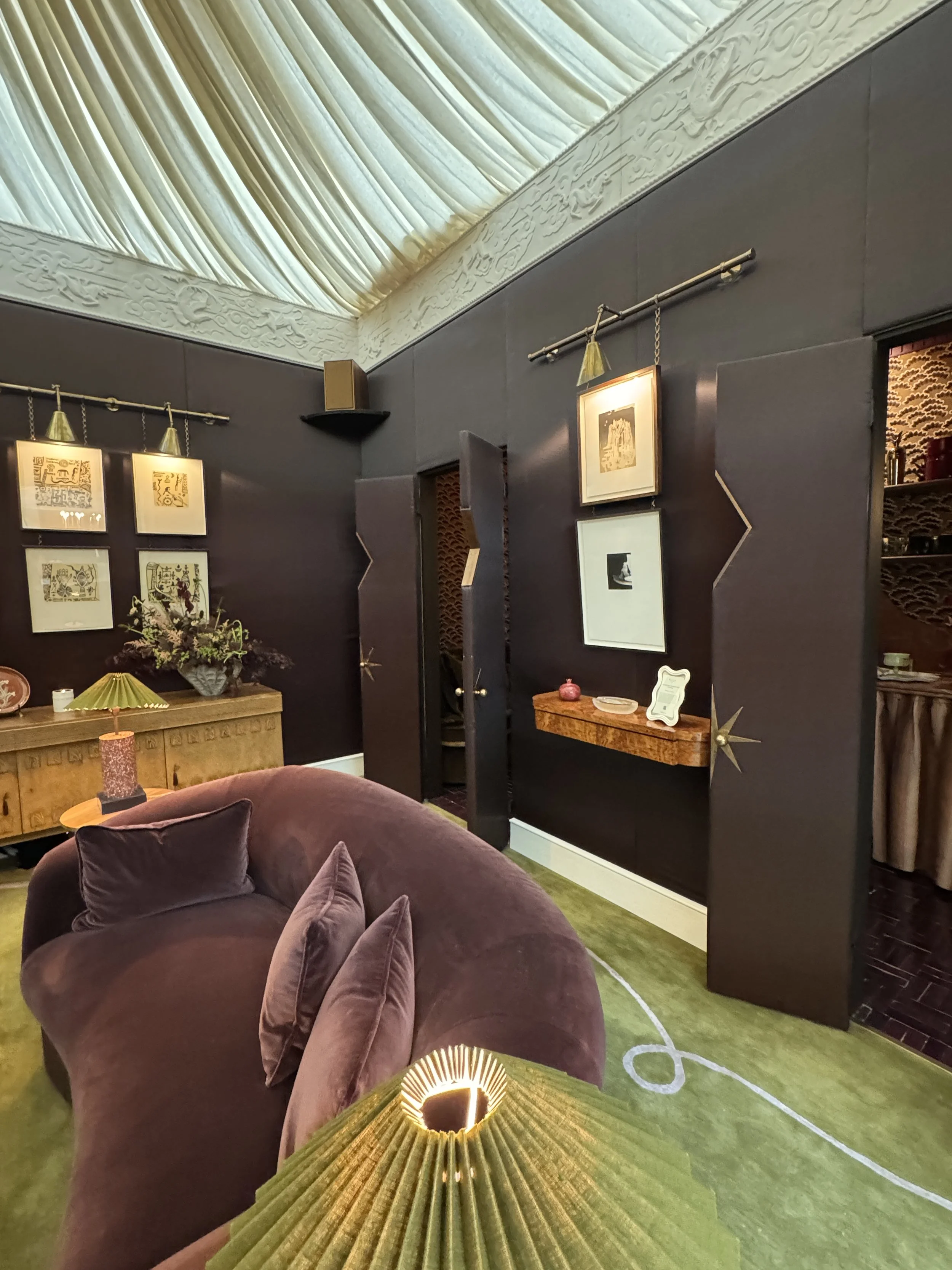
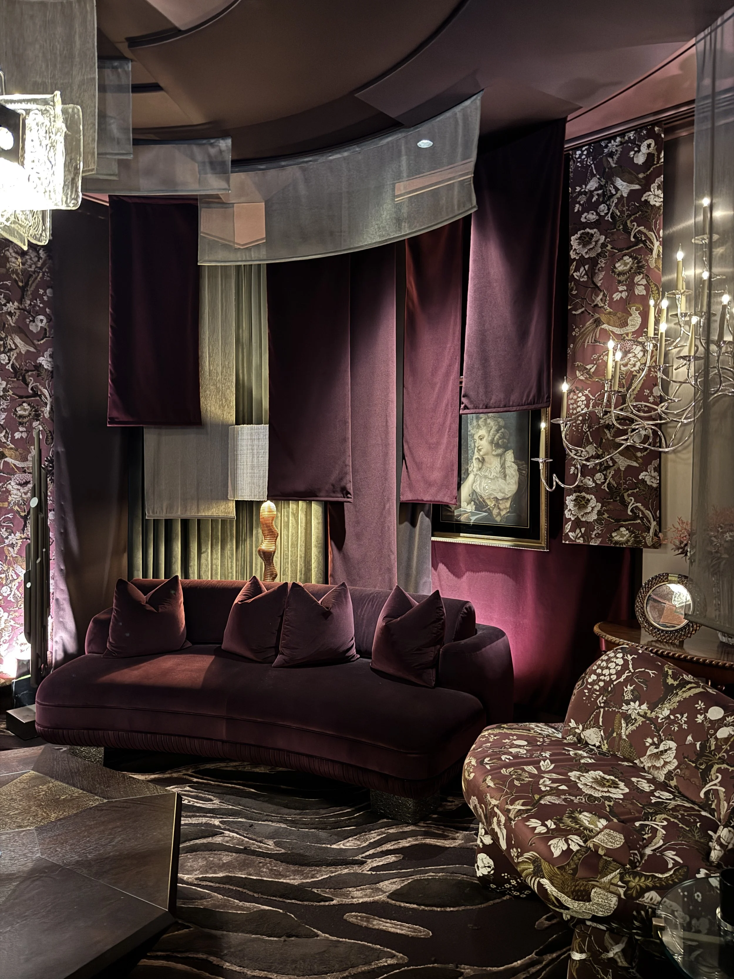
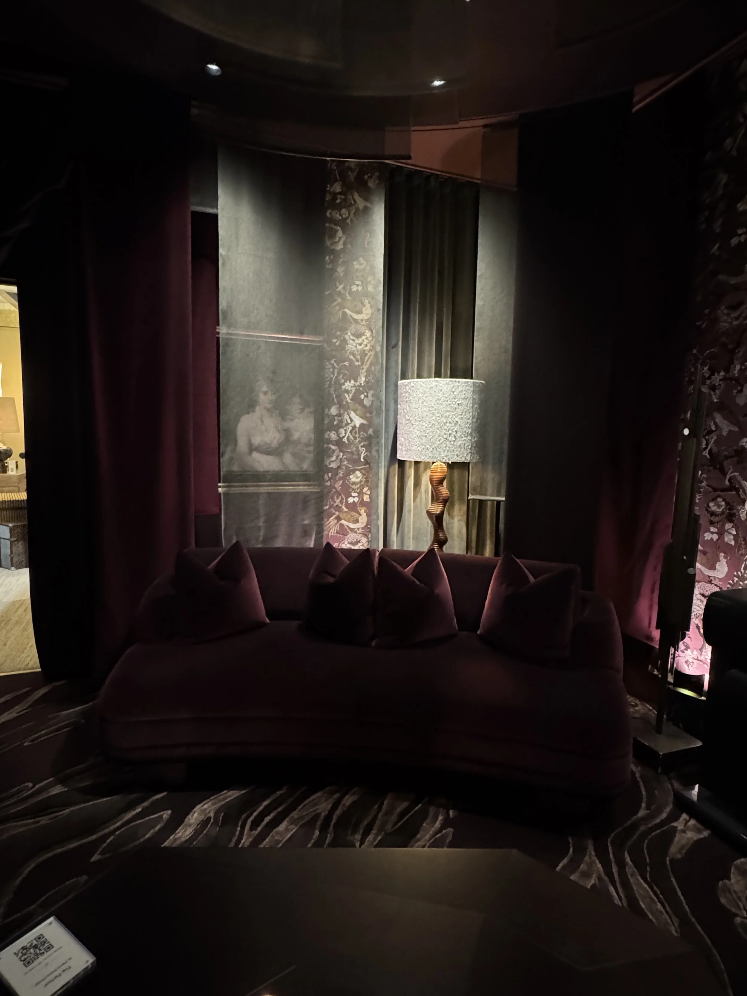
This was my favourite room in the whole house.
It followed beautifully from the Speakeasy Salon next door, but the feeling was quite different.
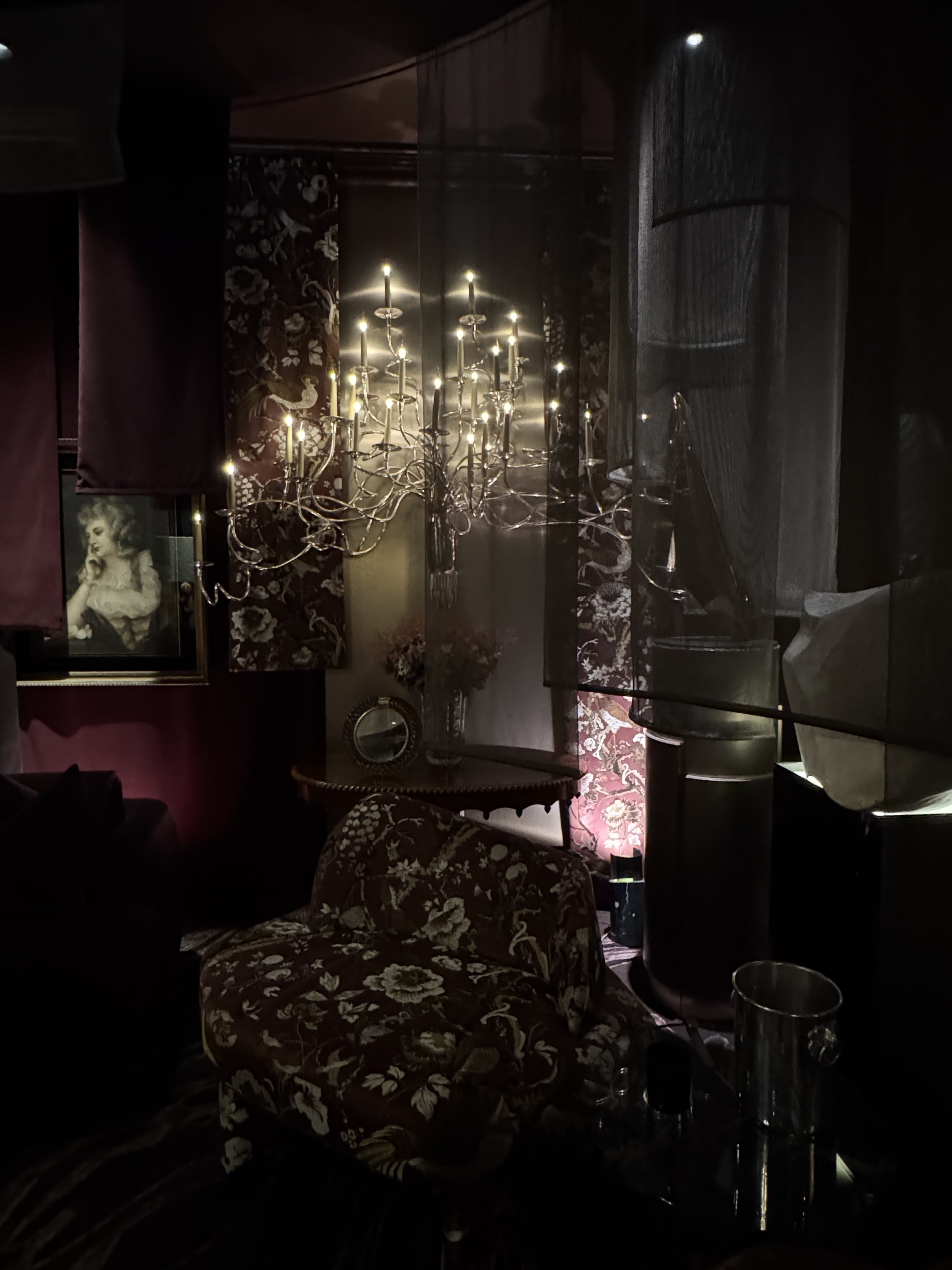
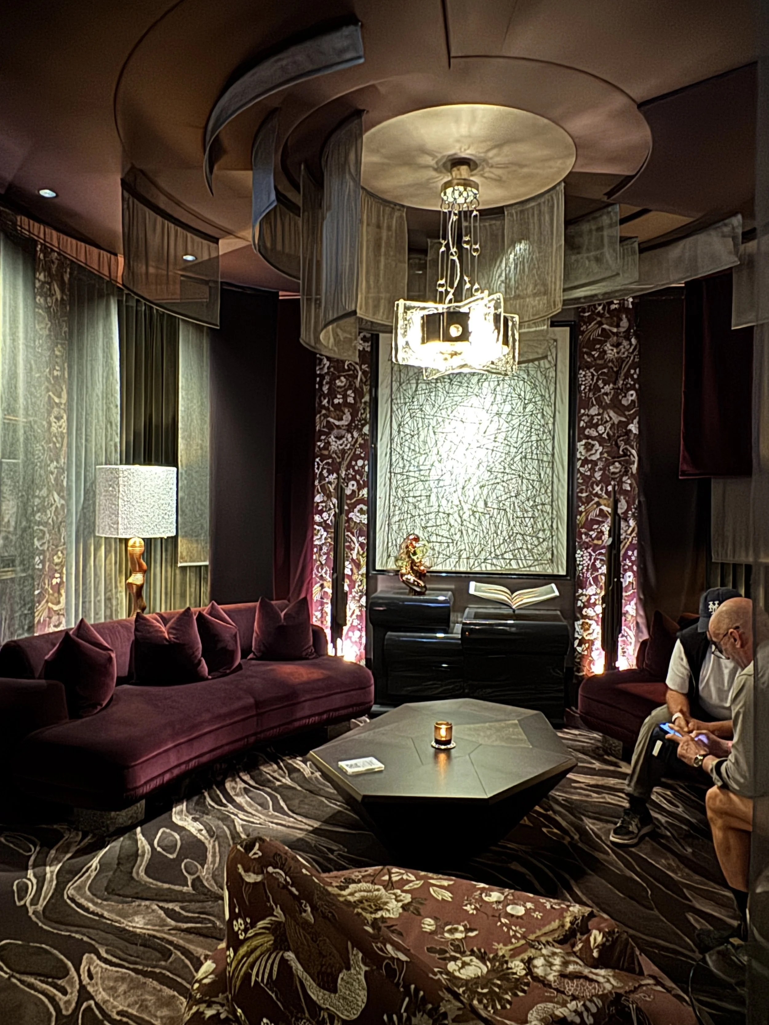
Nearly everything was based around one tonal colour palette, including the walls, panelling and upholstery. After moving through so many contrasting schemes, this room felt like a visual reset.
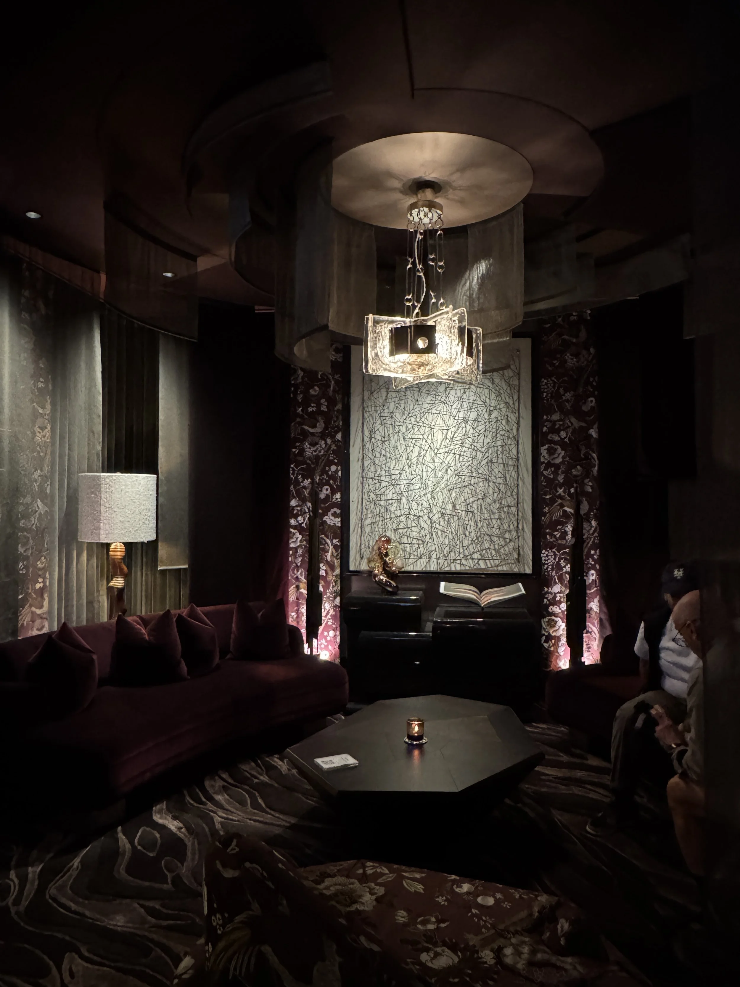
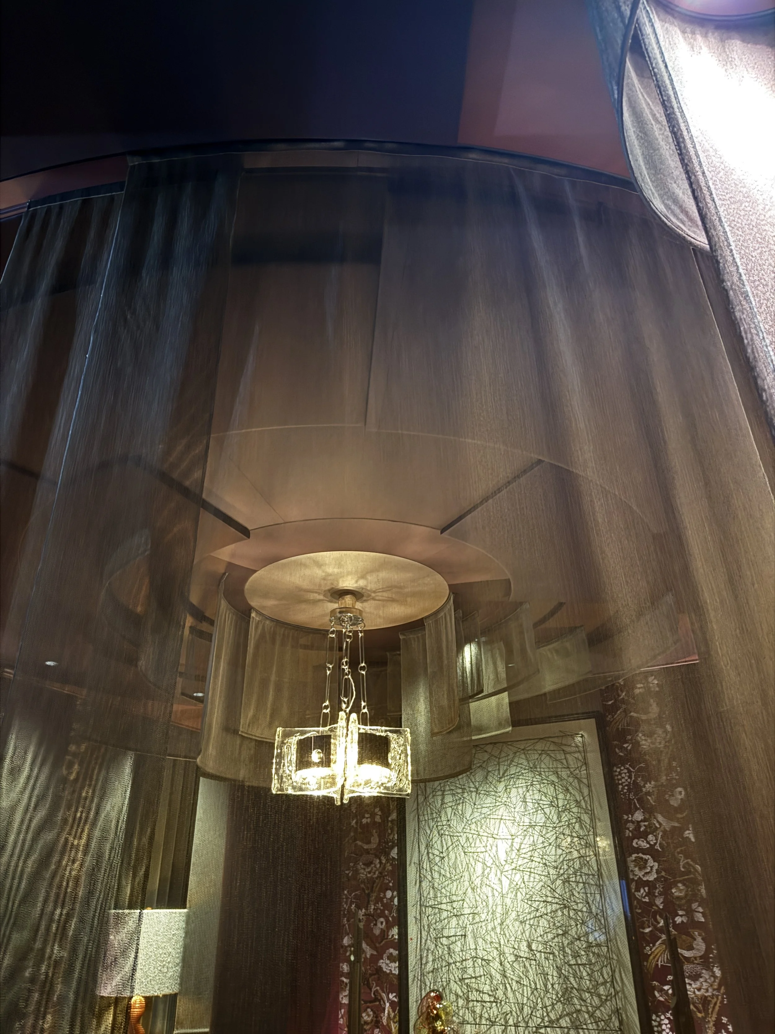
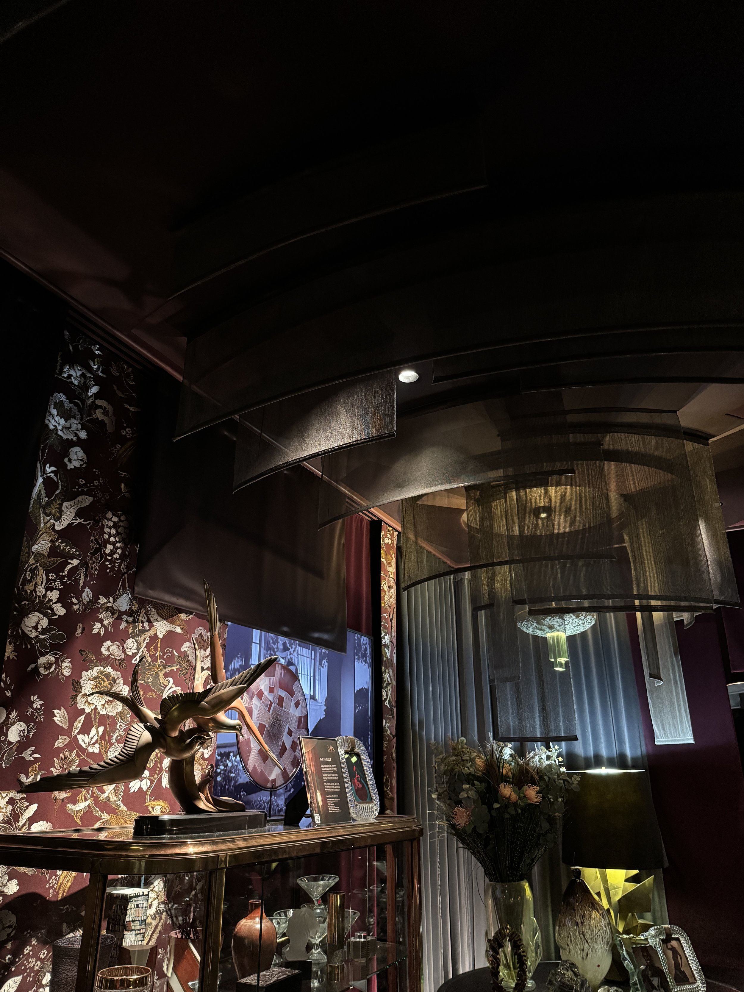
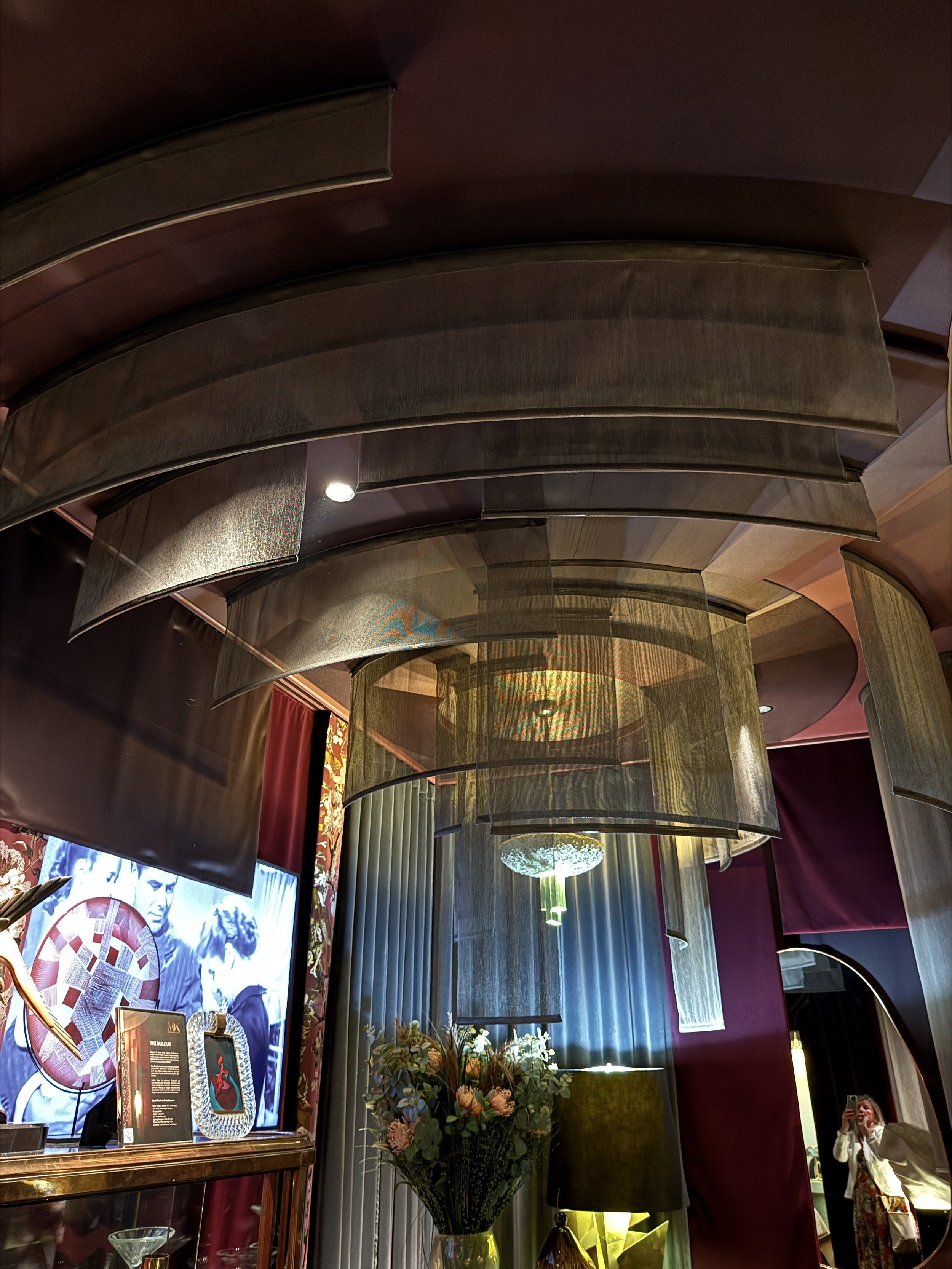
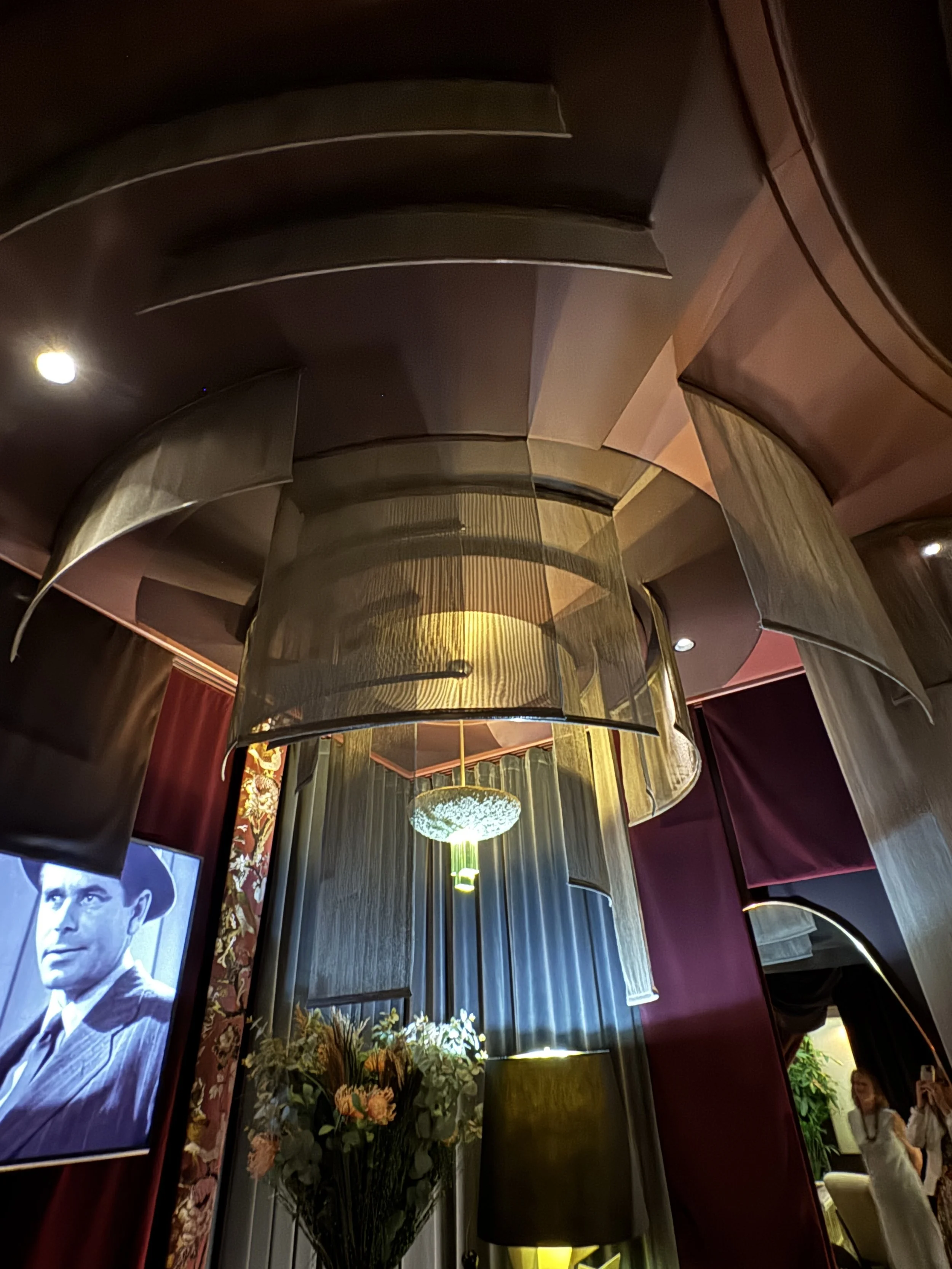
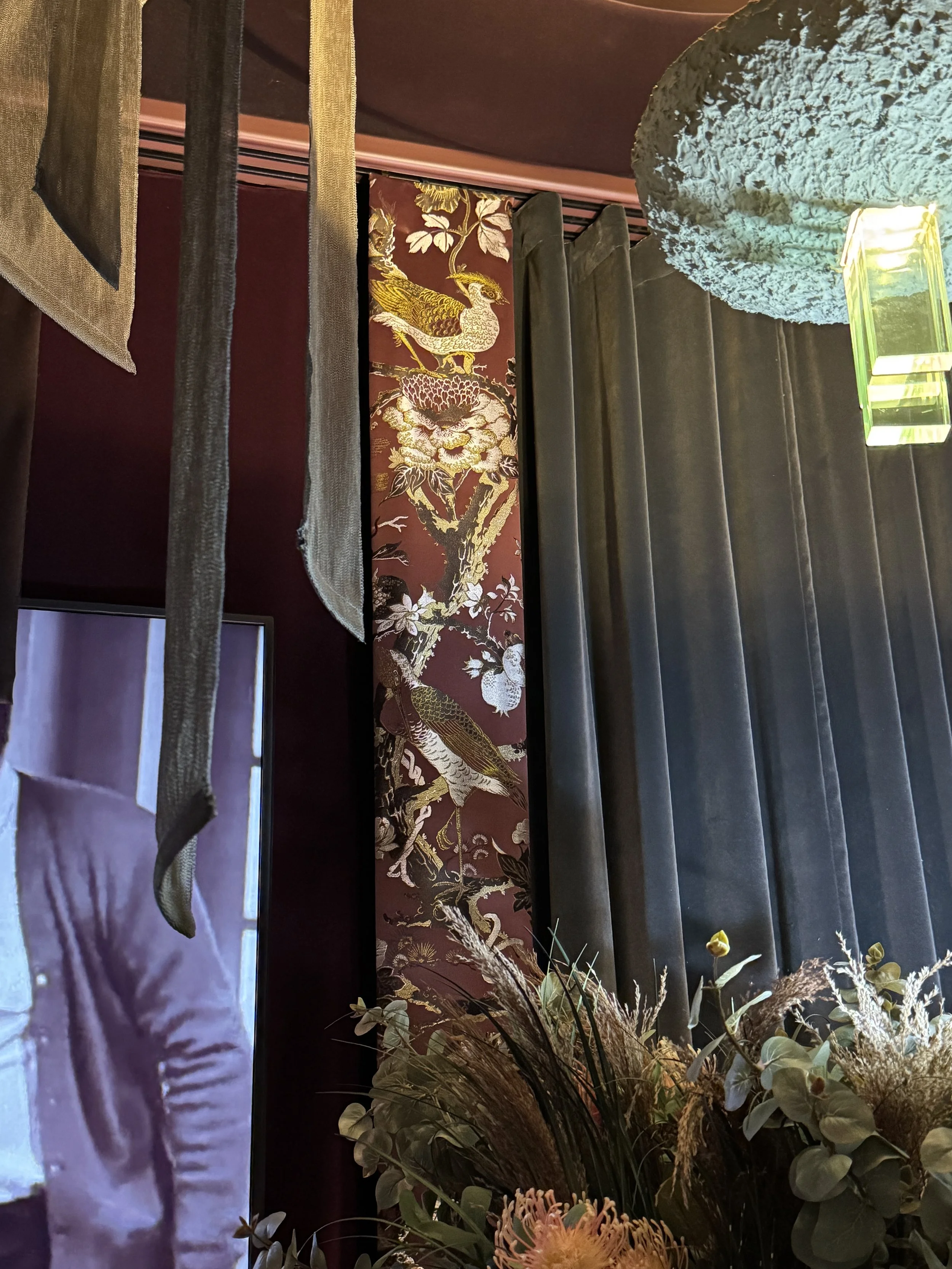
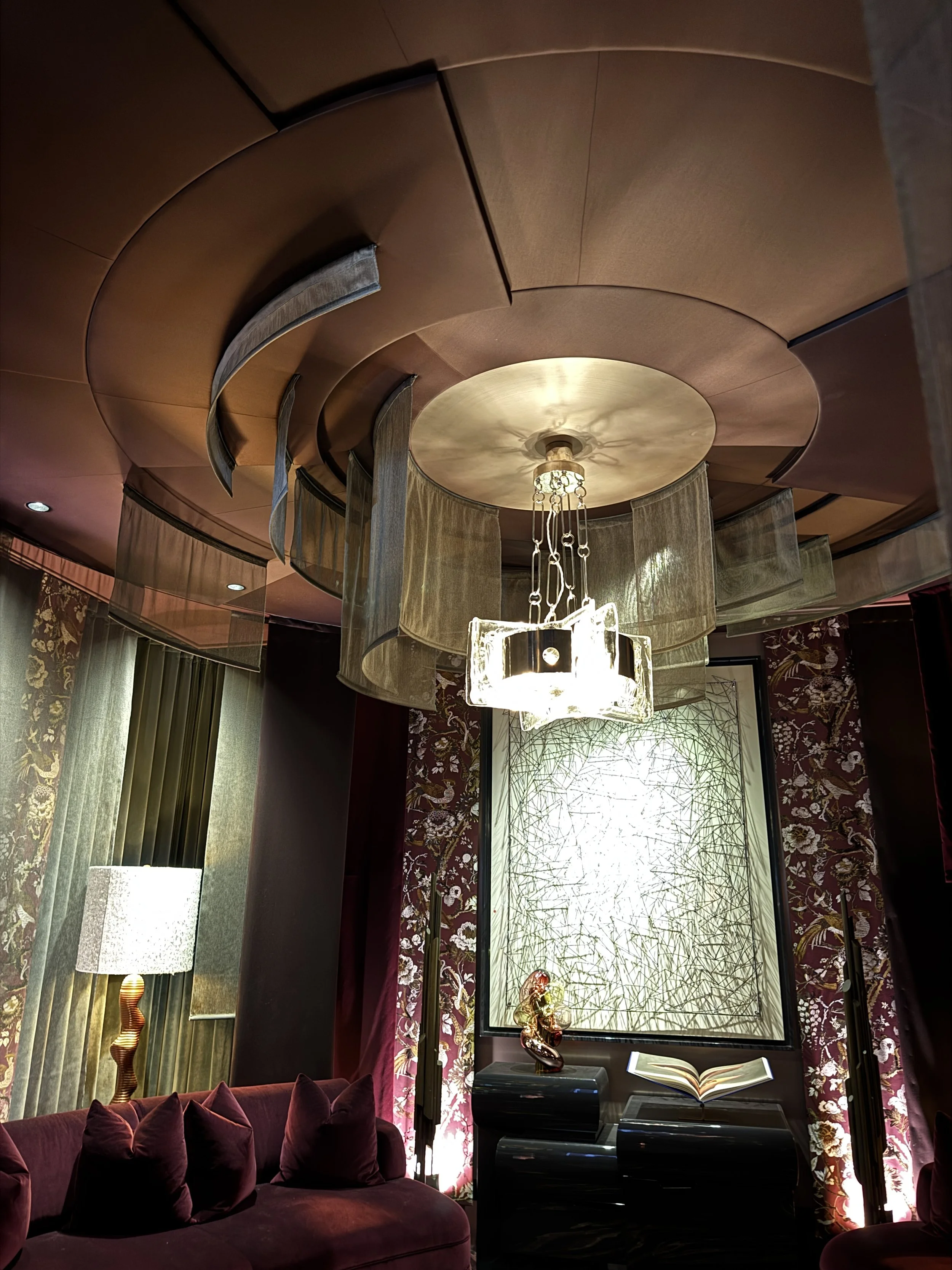
Beautiful embroidered fabrics from Dedar covered the walls. Aplomb, Sunday and Silkbird were hung from curved tracks, with sheer and solid panels finished at different lengths.
Some of the fabrics partially covered the artwork and television area rather than concealing them entirely, which I thought was very clever.
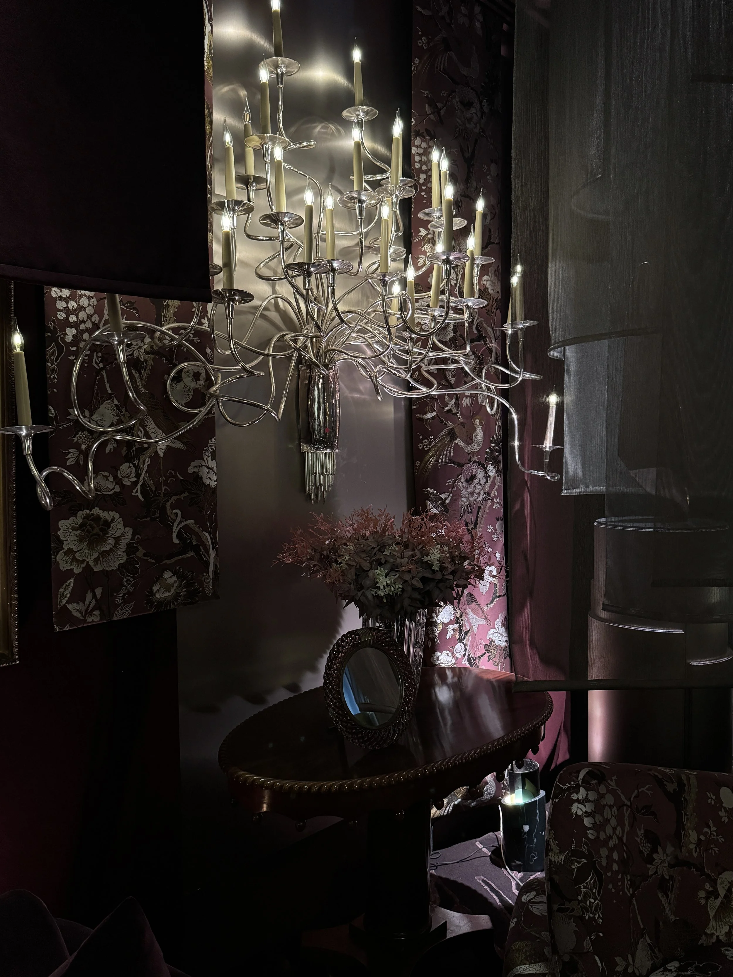
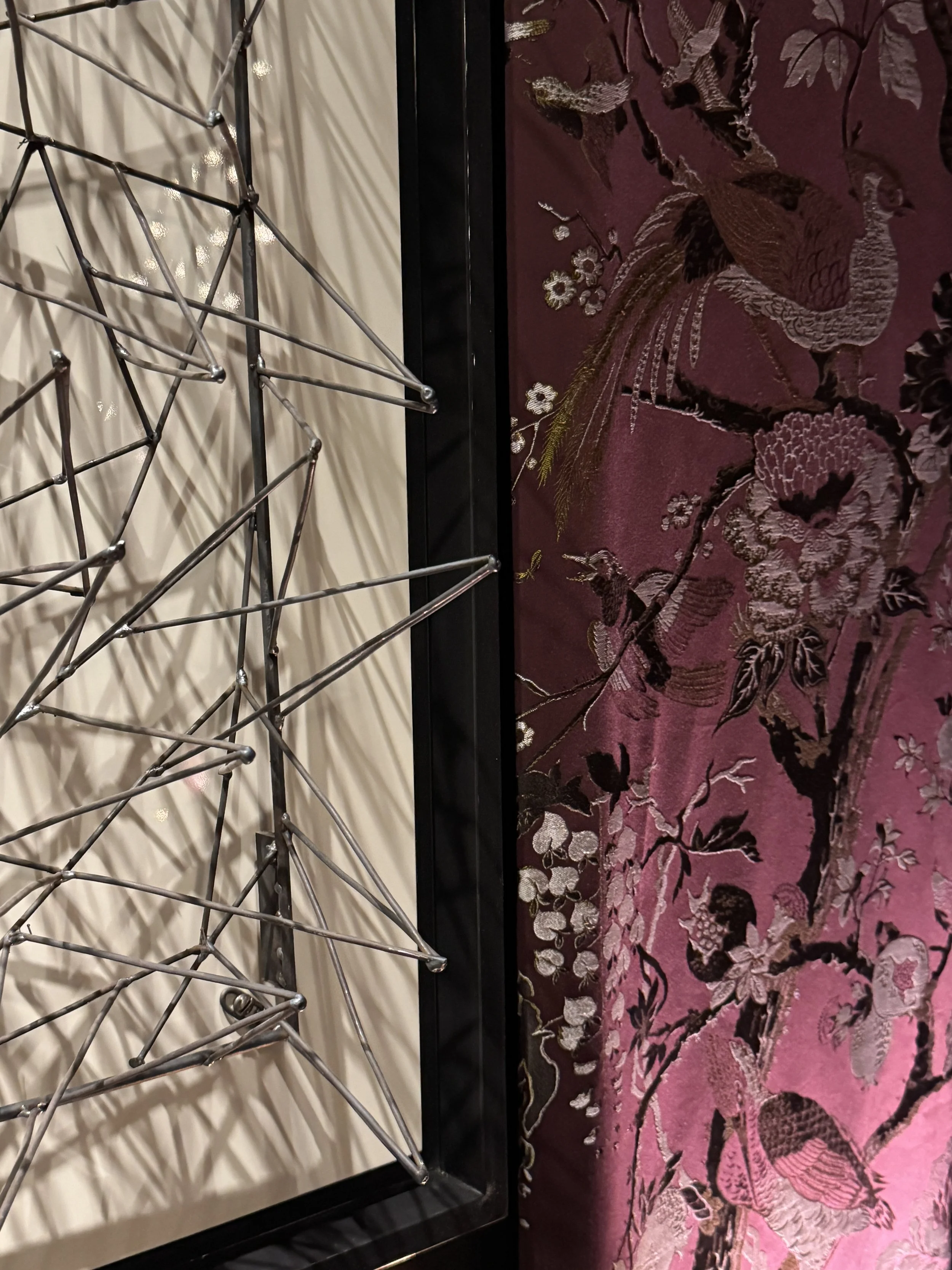
A spiky metal sculpture by Based Upon formed the centrepiece of the room. It caught the light beautifully, casting reflections across the room and appearing to move as you walked around it.
Deep aubergine velvet appeared on the upholstery here too, confirming that this was very much one of the colours of the moment.
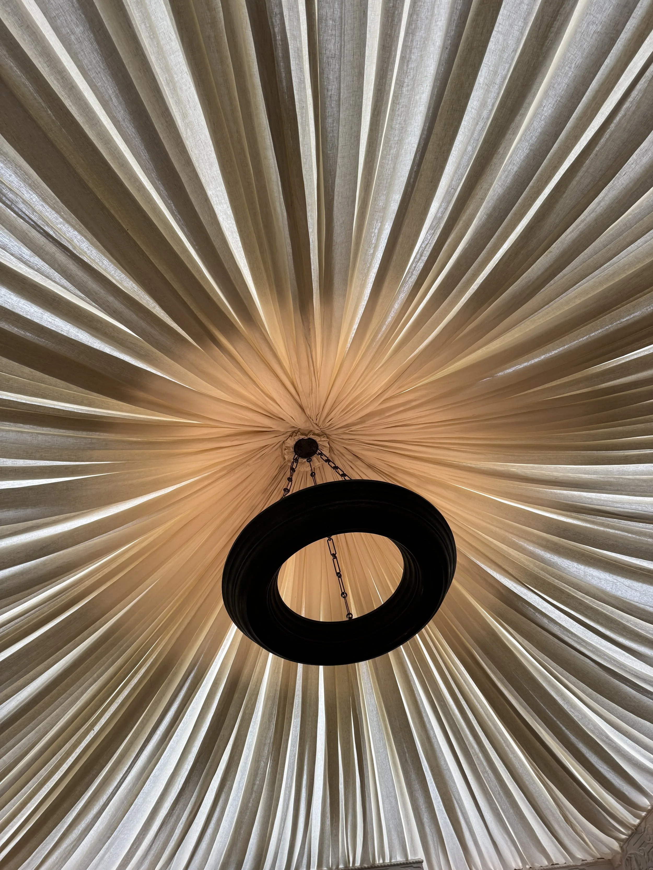
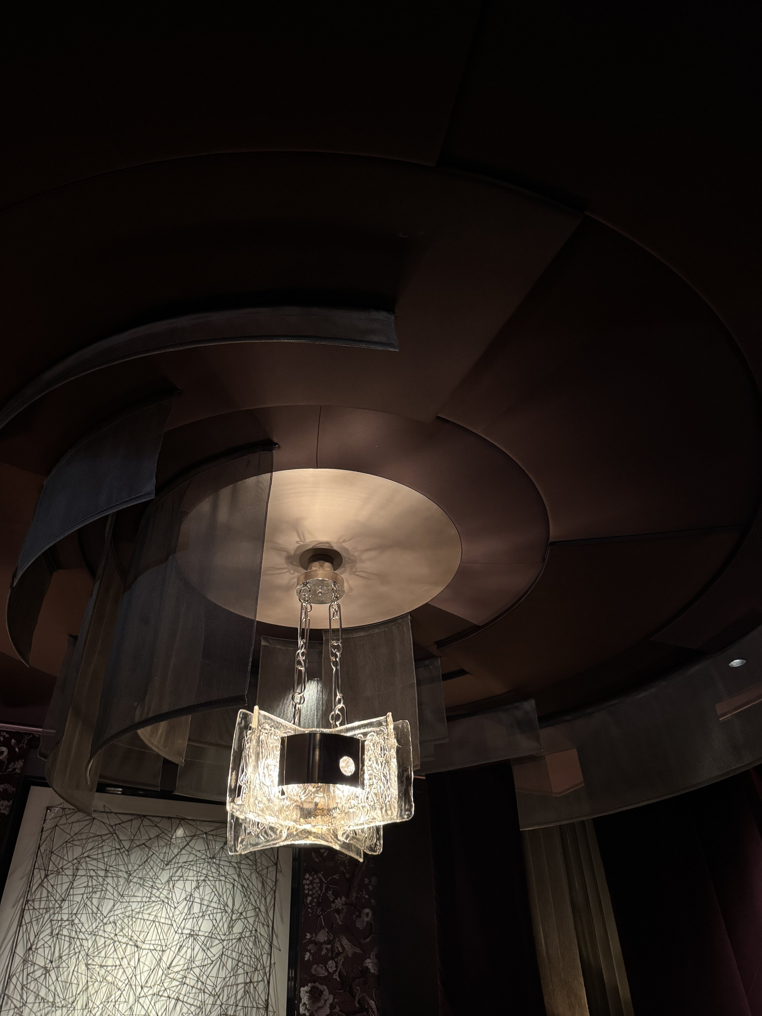
The ceiling was covered in Dedar’s Zen fabric, which was, without question, my favourite ceiling treatment of the entire event.
I would love to use a fabric-panelled ceiling like this on a future project. It has stayed with me ever since the visit, so watch this space.
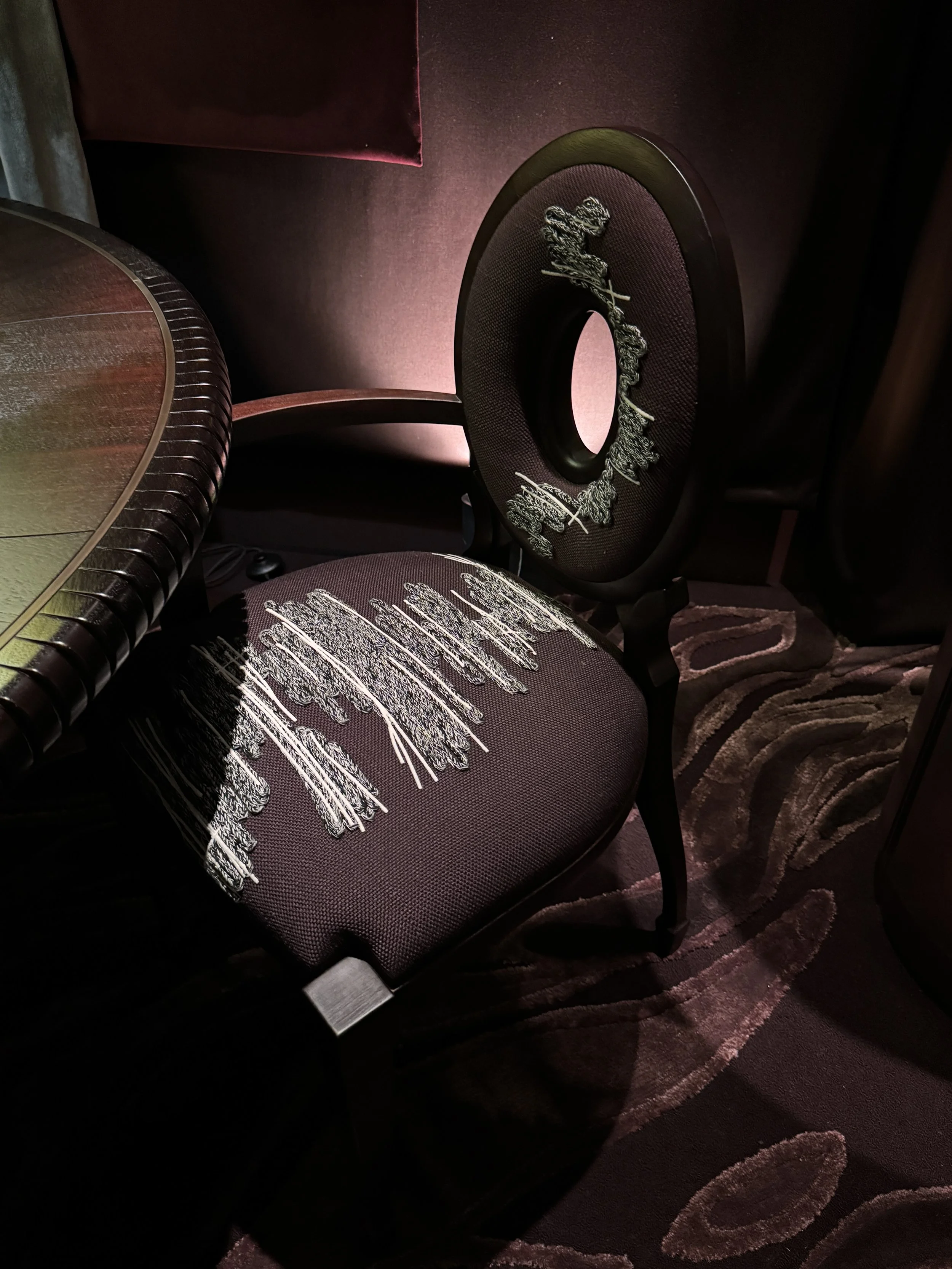
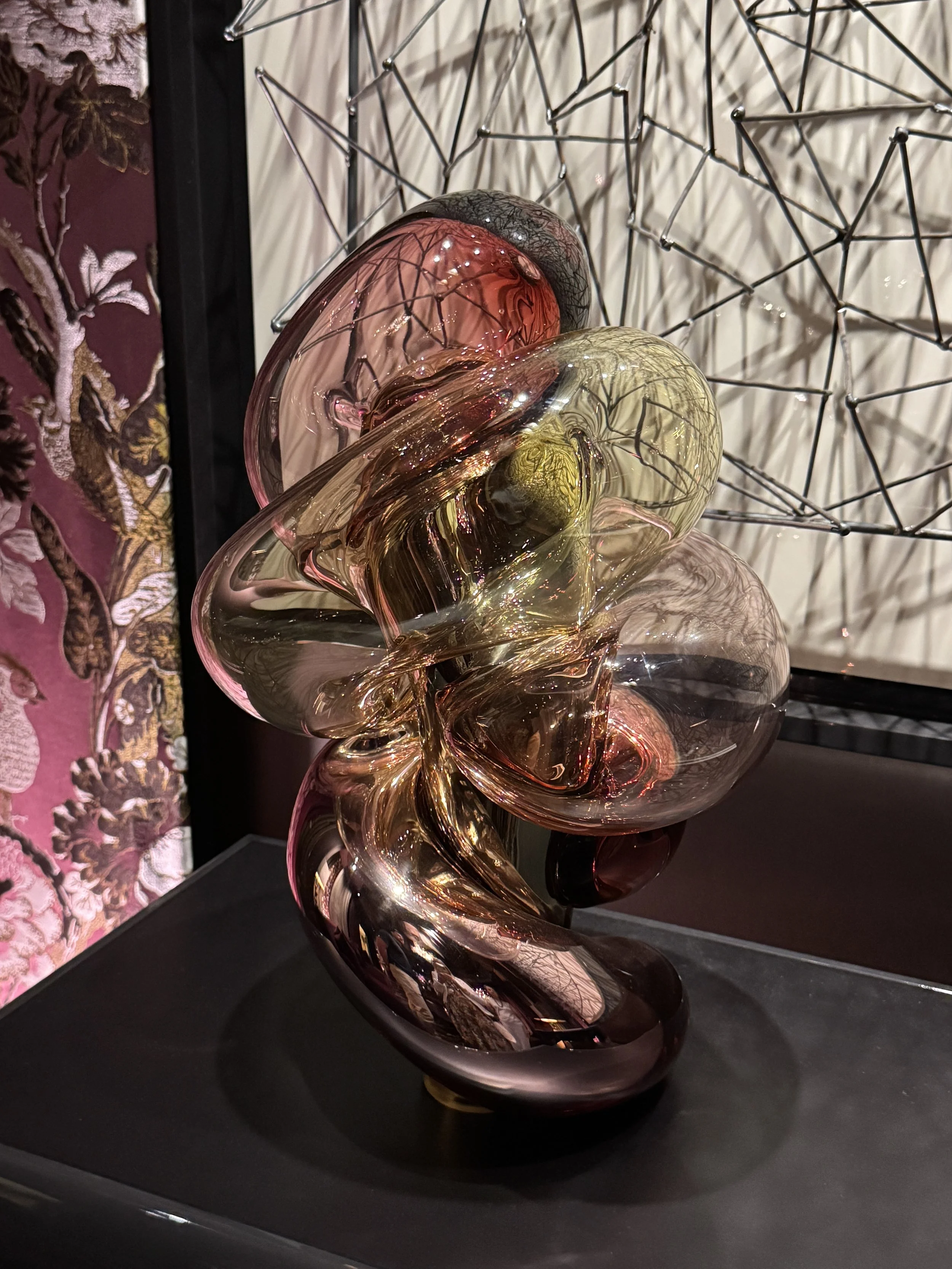
The room also marked the debut of Martin Kemp’s own furniture collection, shown alongside vintage Murano glass, Art Deco pieces and a bespoke Colbourns Wavy rug.
THE BEDROOM SUITE BY
MISIA X HENRI FITZWILLIAM-LAY
A Place to Dream
A Bedroom Suite imagined by Henri Fitzwilliam-Lay as the eclectic retreat of a free-spirited world traveller. The underlying aesthetic takes its cues from art deco, which informs many of the motifs and materials of the room’s sponsor, Misia
Misia for Casamance Group Bedroom Suite by Henri Fitzwilliam-Lay
I moved straight from one favourite room into another.
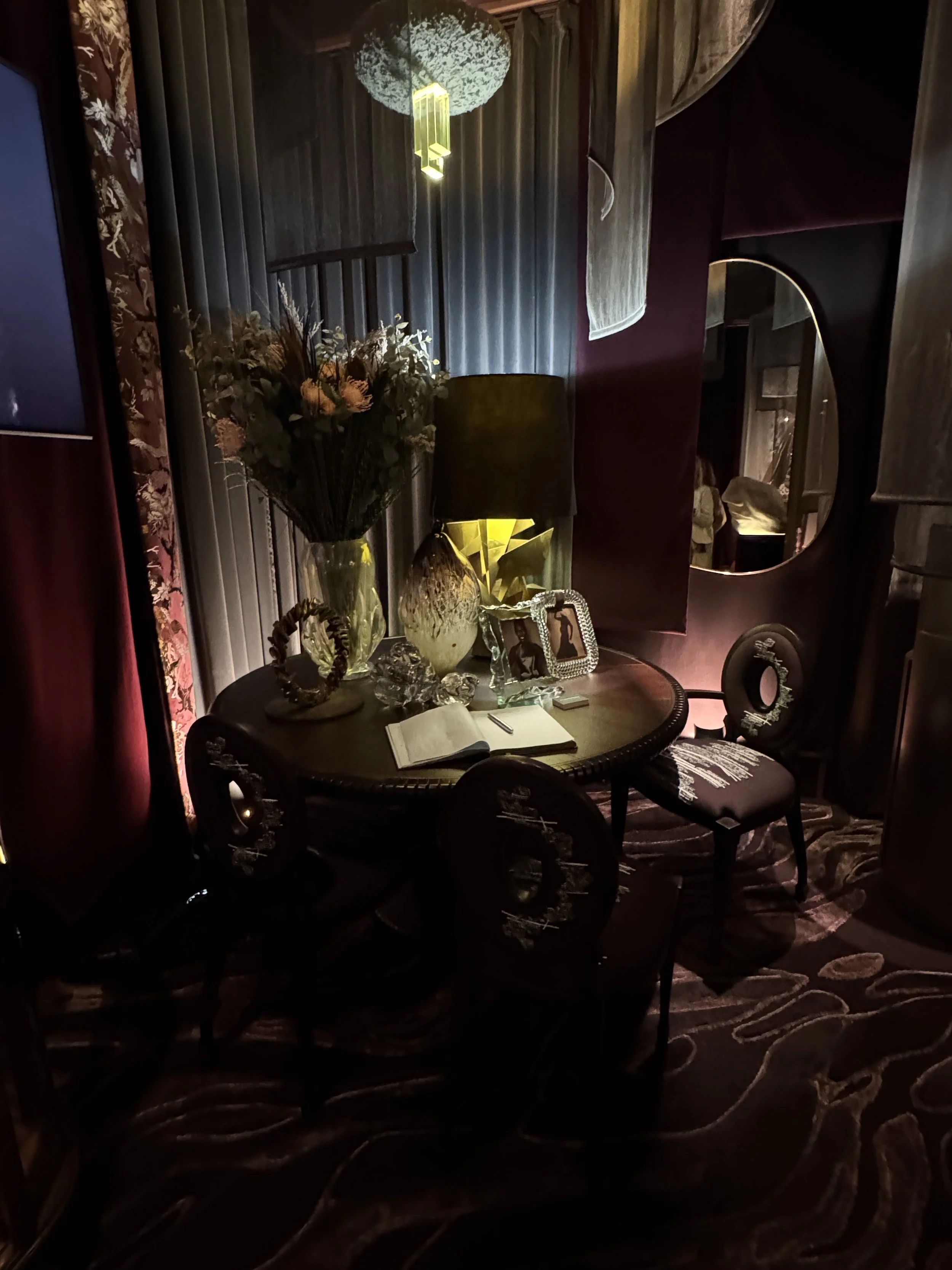
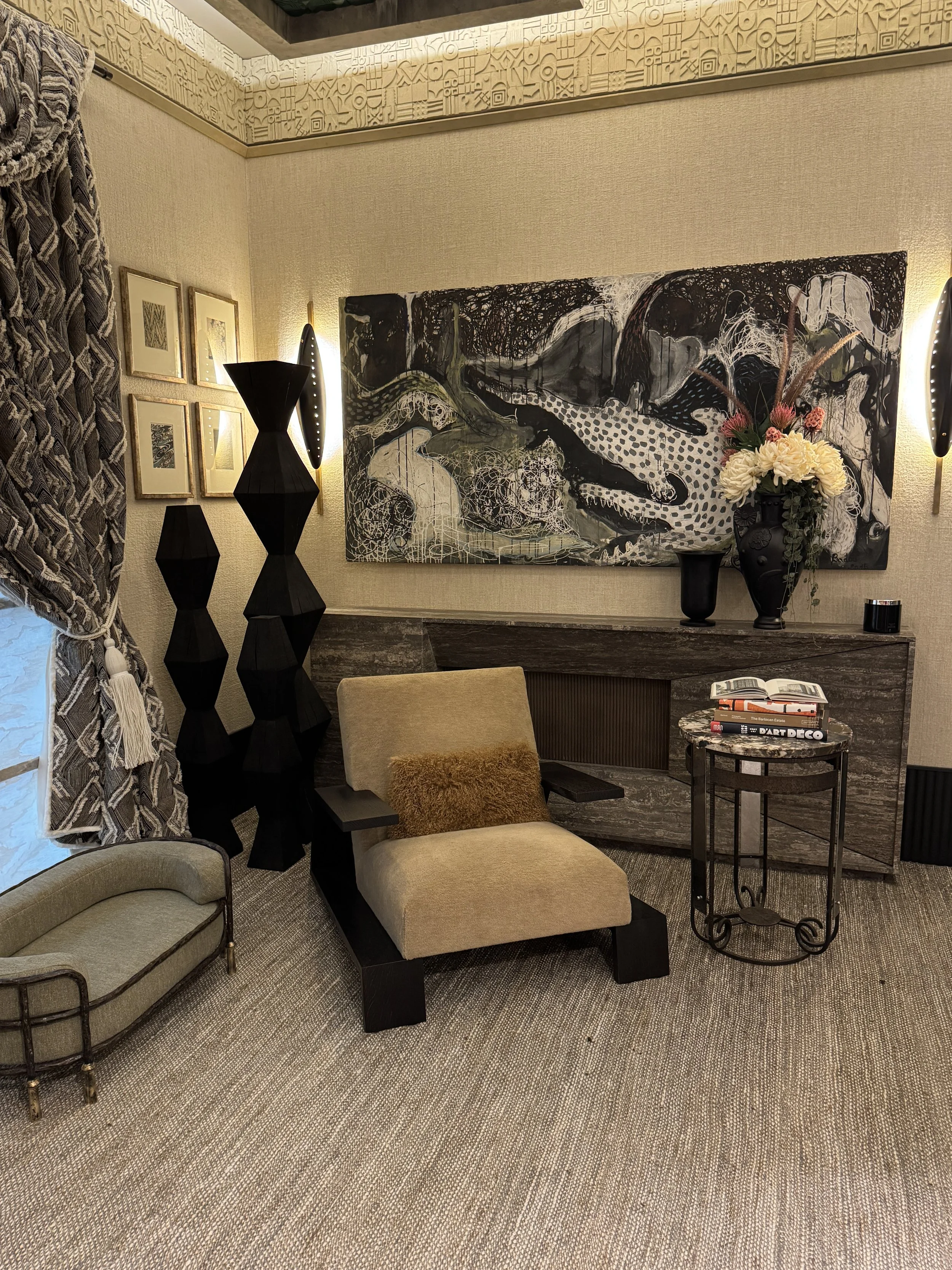
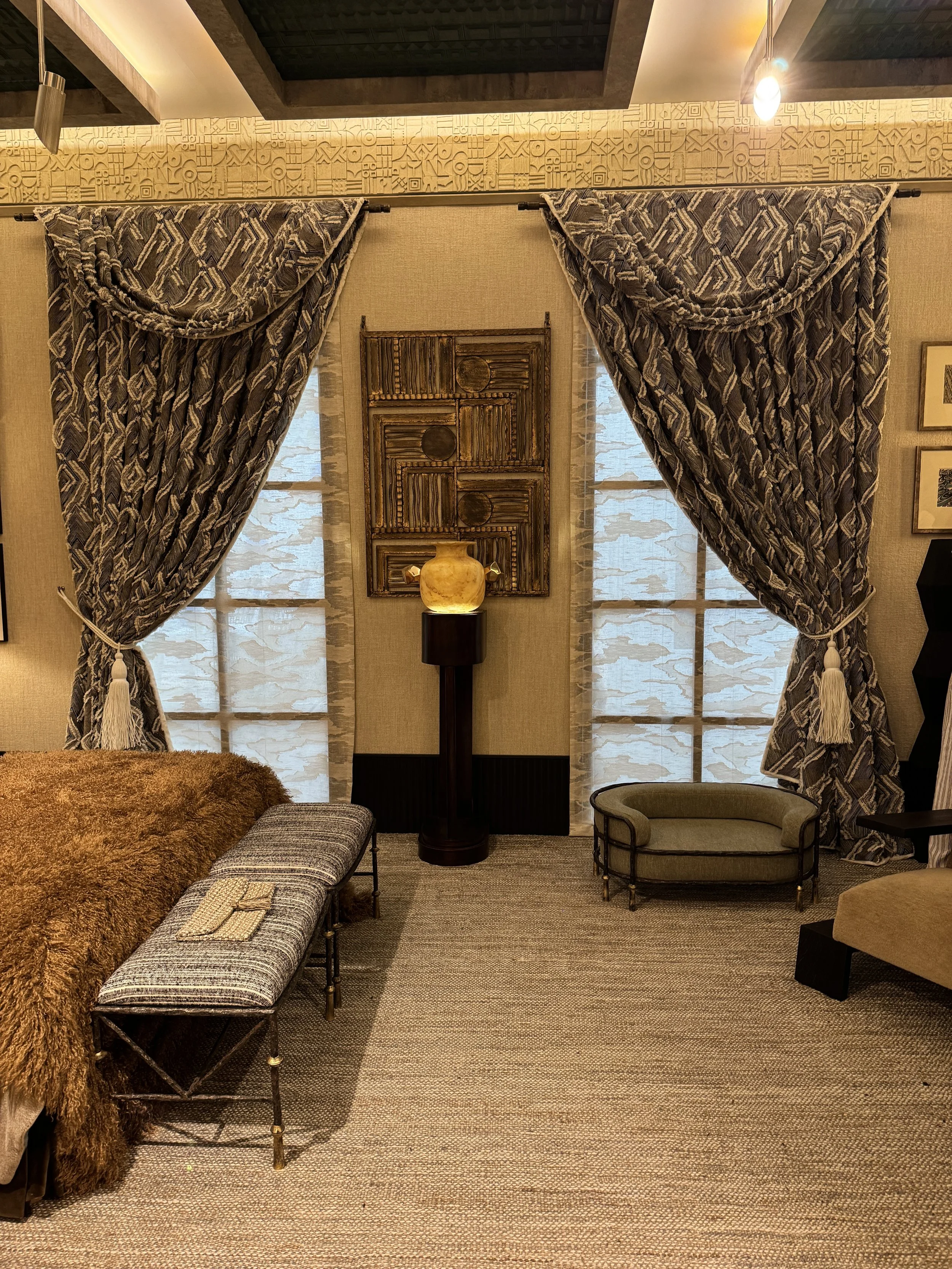
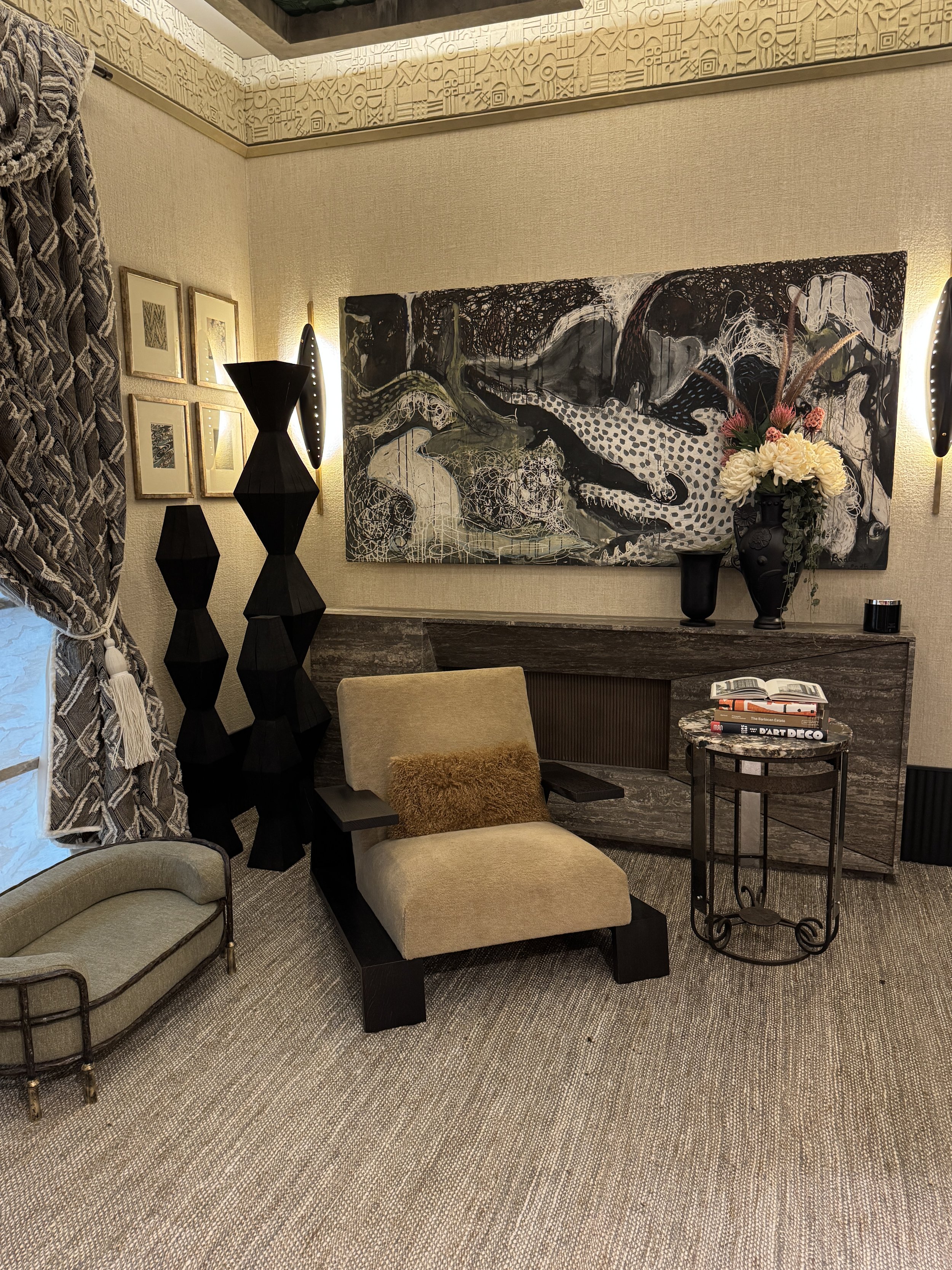
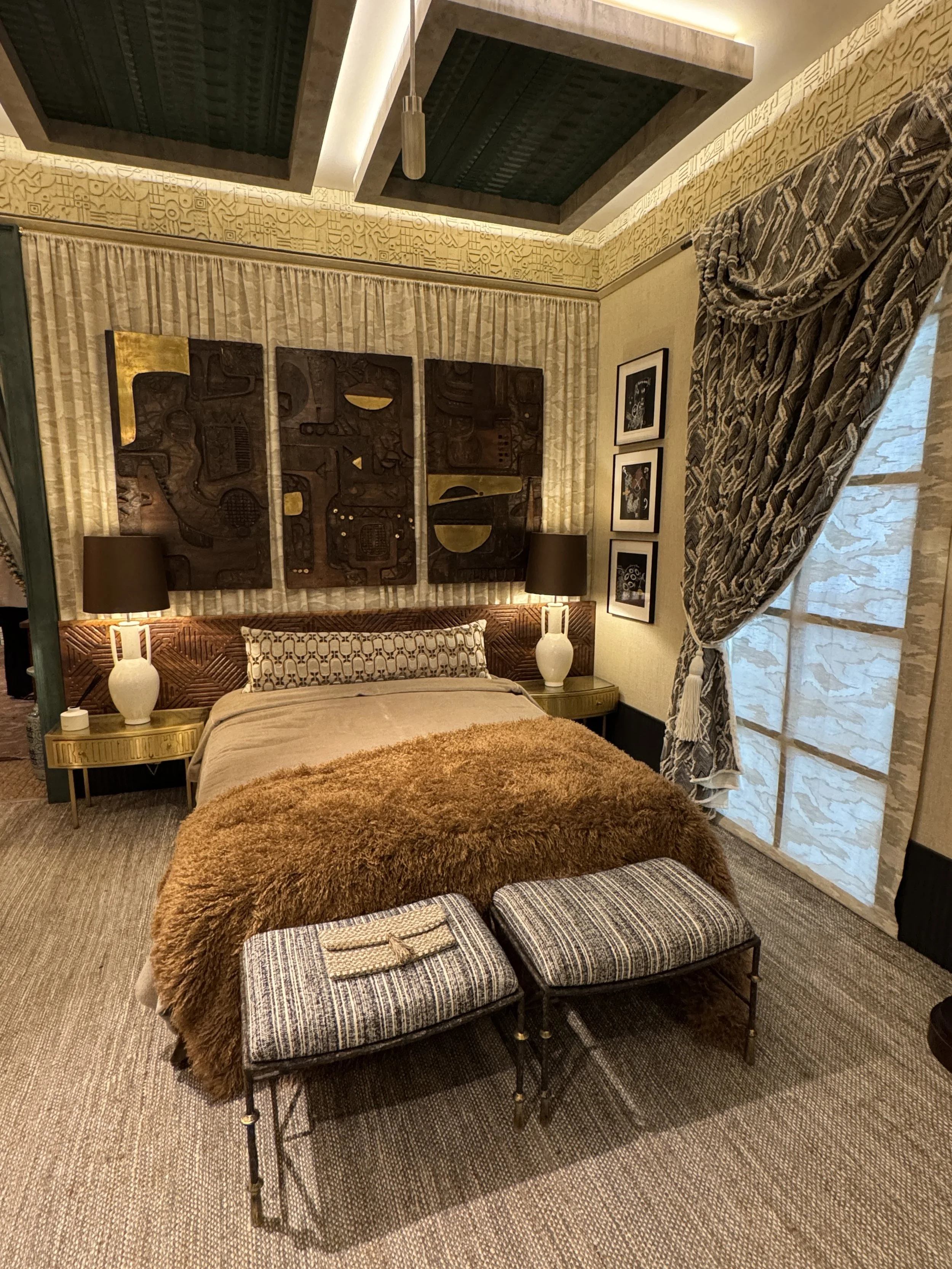
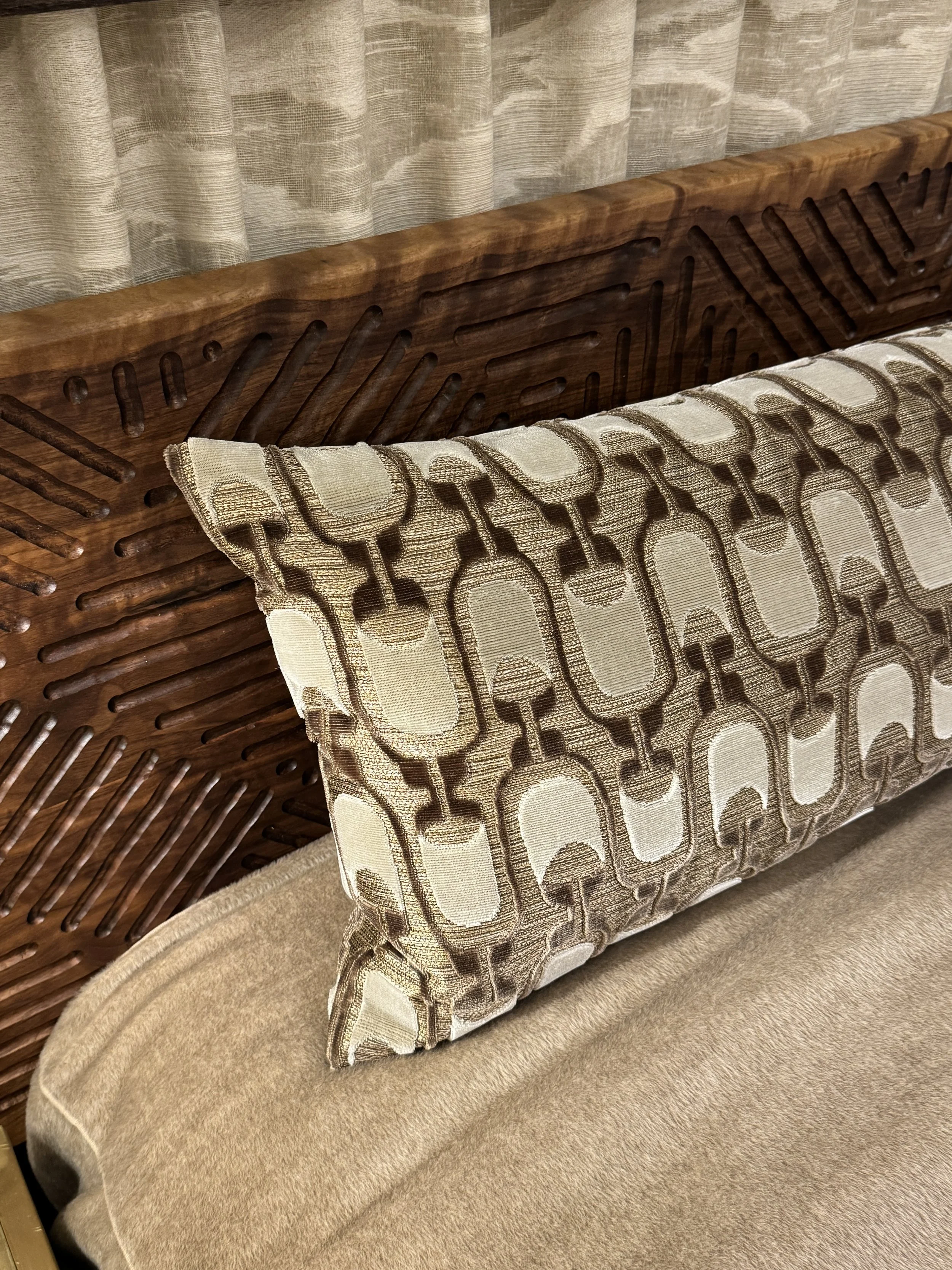
Misia is one of my favourite fabric brands, and more than 30 different Misia designs were used throughout this suite.
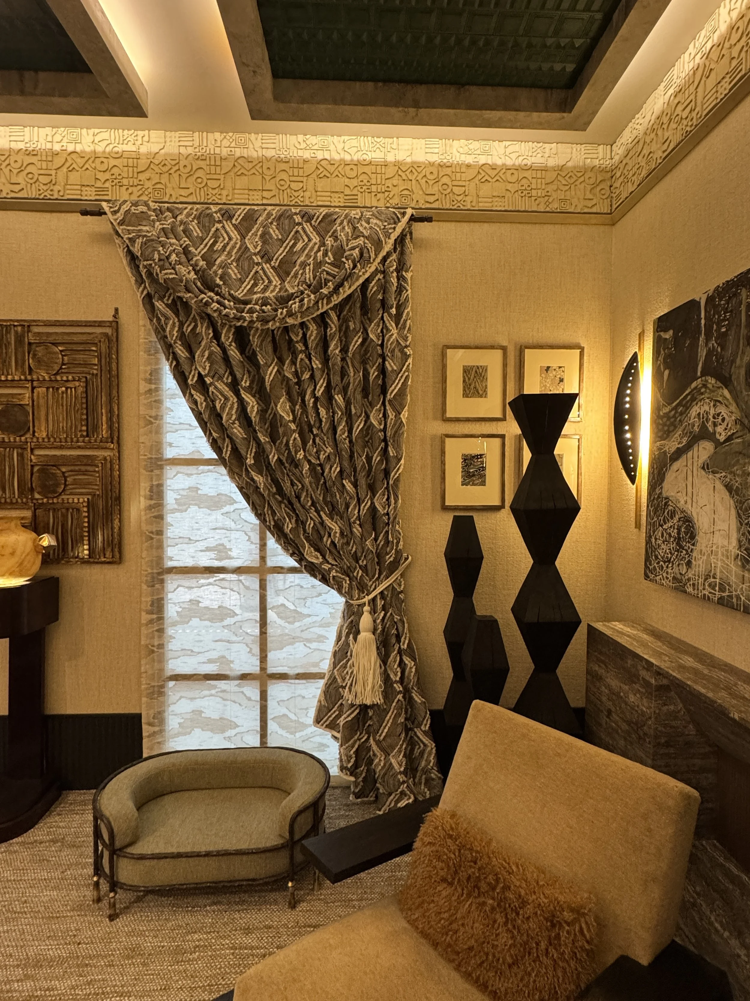
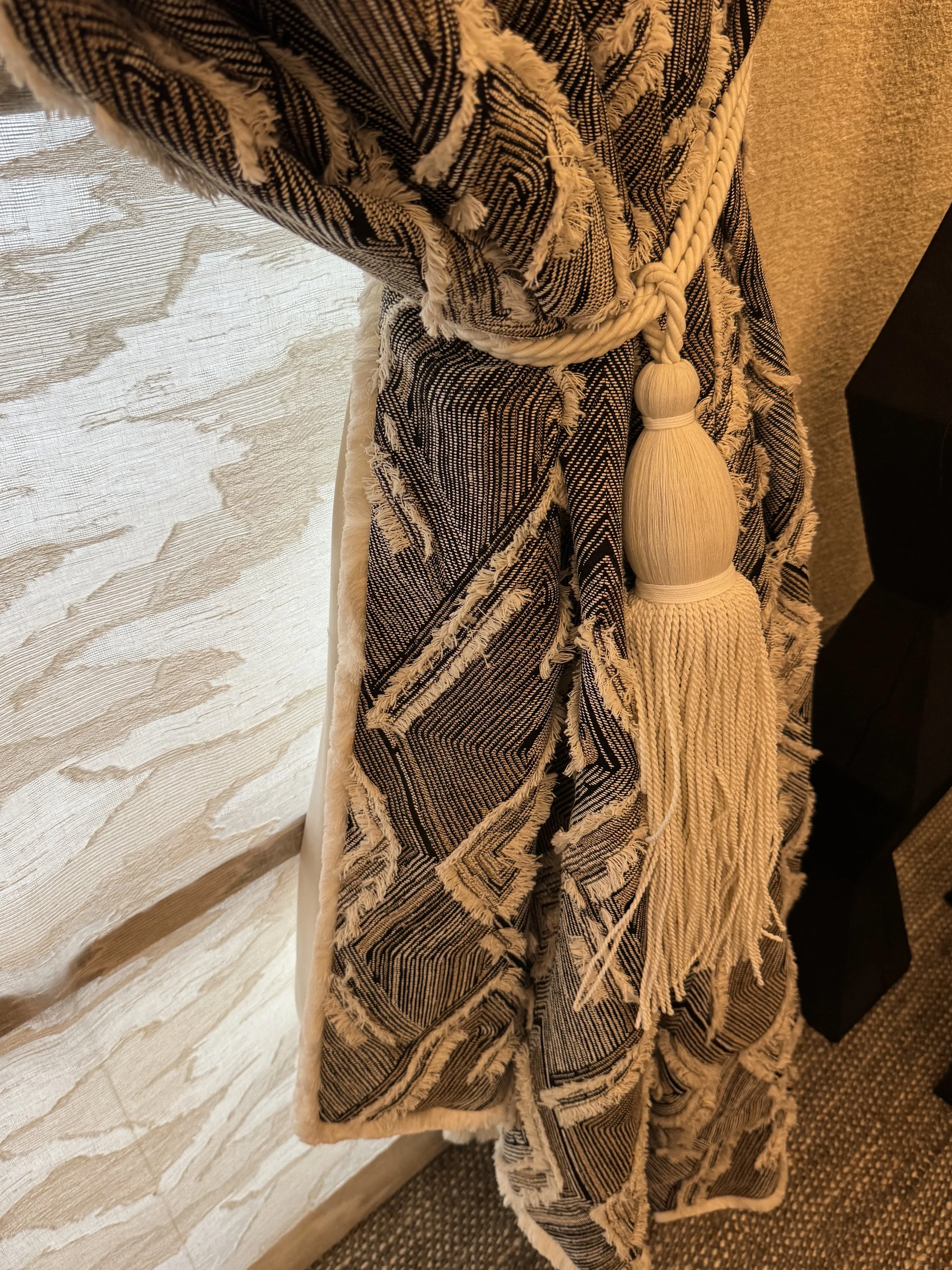
The fabrics appeared on the bedspread, curtains, lampshade linings, dressing robe and even the dog bed.
A decorative plasterwork frieze ran around the room at picture-rail height, giving the scheme a subtle Egyptian Revival influence. The geometrically moulded, coffered ceiling continued the same visual language.
Art Deco itself was heavily influenced by Egyptian motifs following the discovery of Tutankhamun’s tomb, so it is interesting that these references can still feel timeless more than a century later.
Henri Fitzwilliam-Lay also introduced contrasting textures through the doors, hand-carved totem sculptures and fireplace.
A striking monochrome artwork above the fireplace, filled with strong angular shapes, immediately reminded me of Guernica.
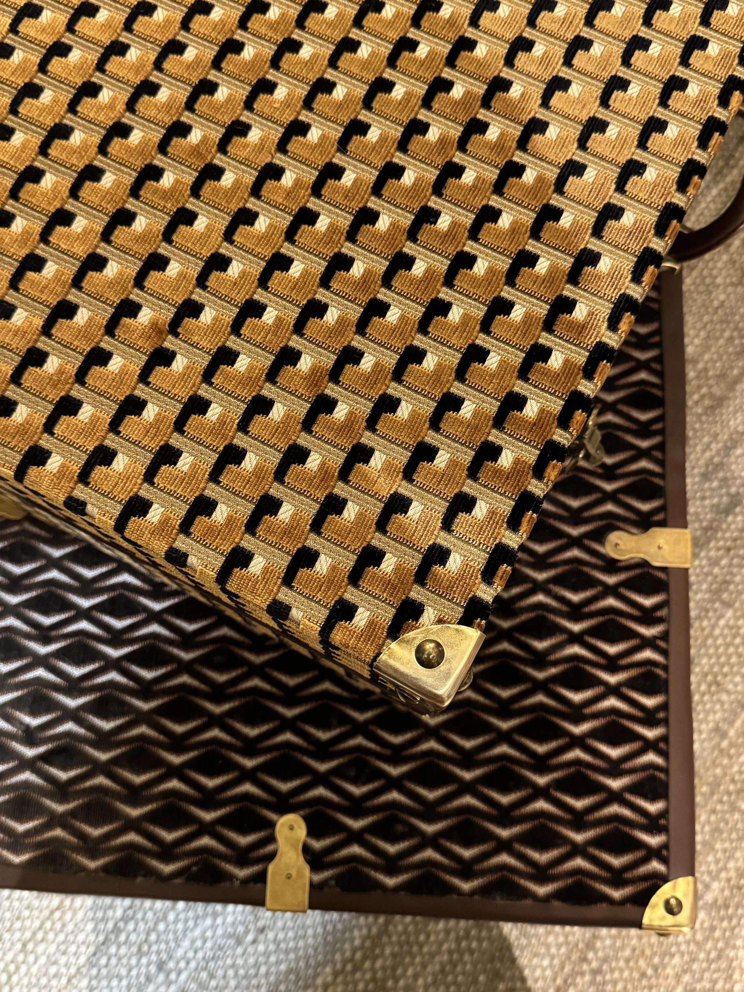
Dark timber lamps with a tribal quality sat alongside boxy, vintage-style suitcases upholstered in Misia fabrics, reinforcing the idea of a well-travelled, free-spirited owner.
The full-width upholstered headboard was hand-carved by Joss Stoddart and finished the room beautifully.
The curtains were made in Misia’s Riviera du Levant. I have used the same fabric in another colourway on a large ottoman for one of my own recent projects.
The cut-fringe detail makes it a particularly interesting textile. It is one of those fabrics that continues to give you new reasons to use it.
I loved almost every detail within this room. It showed that when a strong material story is applied with real confidence and discipline, a scheme can contain a great deal of pattern without feeling chaotic.

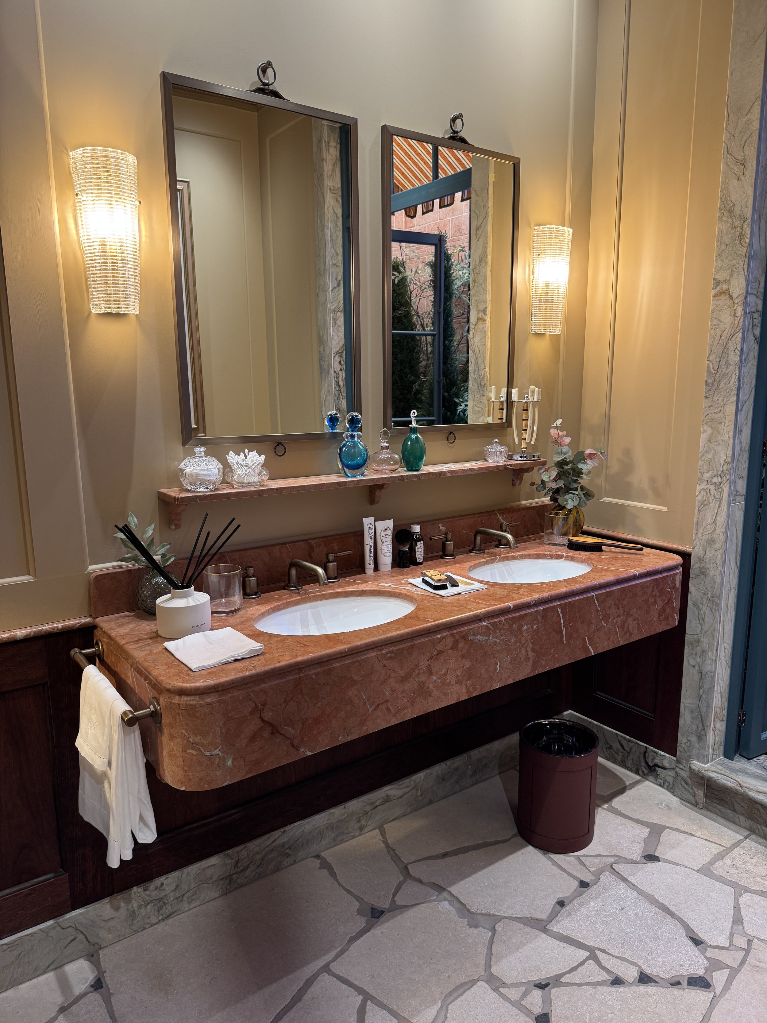
Ca’ Pietra Bathroom by De Rosee Sa
Heat of the Sun
Ca’ Pietra’s mastery of stone comes together with De Rosee Sa’s vision of a sun-drenched bathroom in a Mediterranean hotel suite. Rose-tinted marble, limestone and quartzite push craftsmanship in stone to its limits
Ca’ Pietra Bathroom by De Rosee Sa
This bathroom created a complete change of atmosphere after the bedroom.
Called Heat of the Sun, it drew inspiration from a sun-drenched Mediterranean hotel suite.
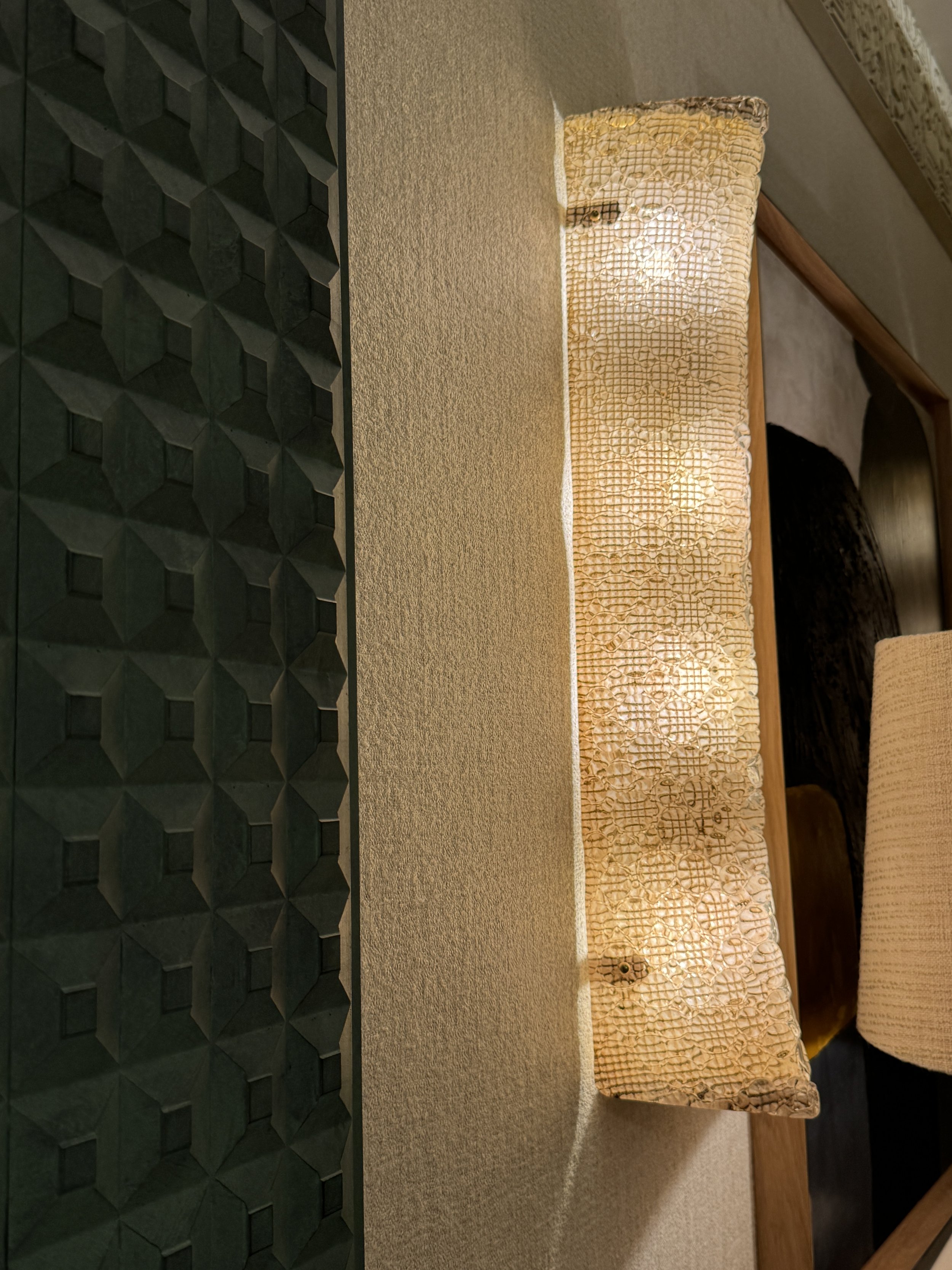
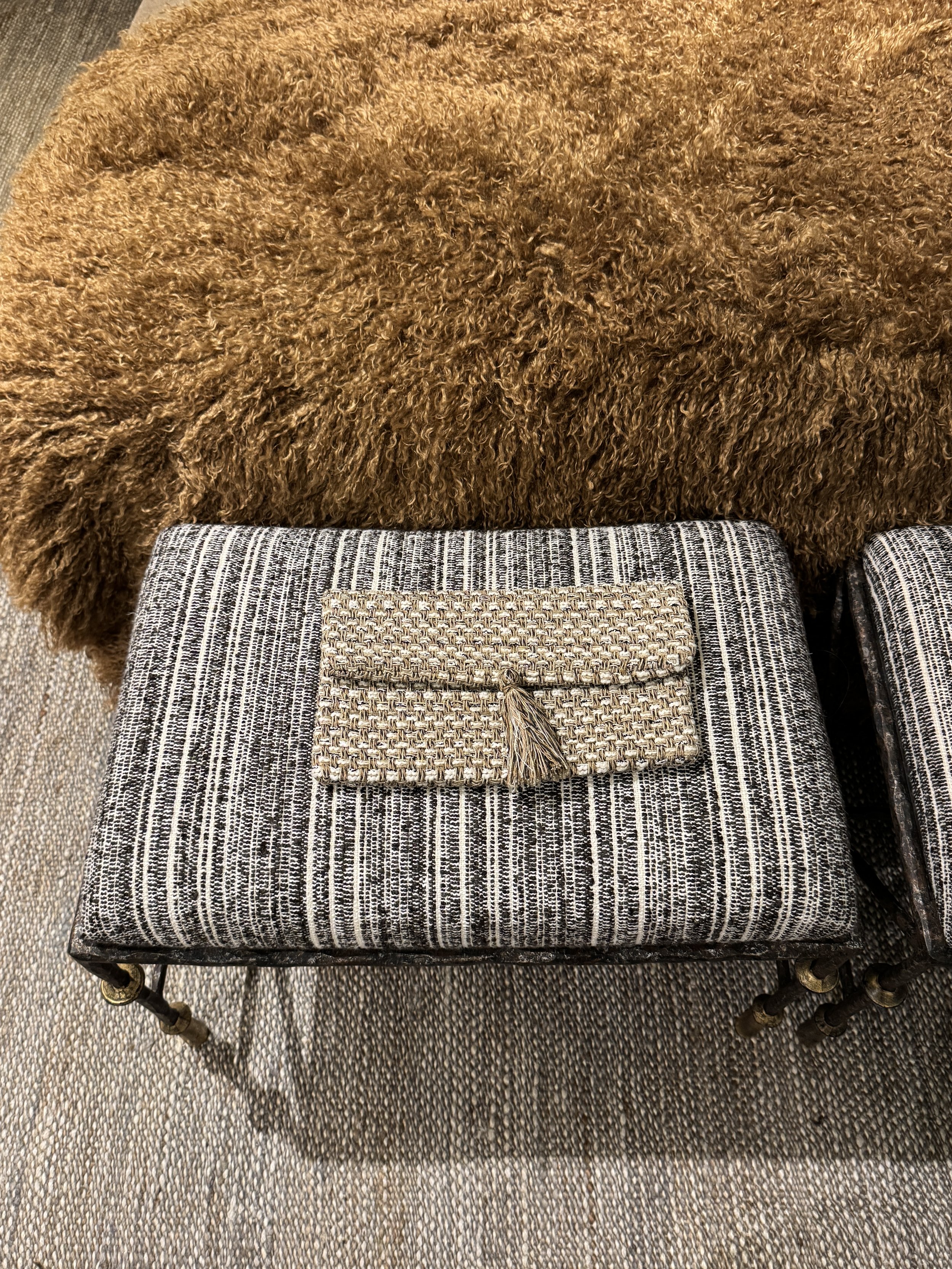
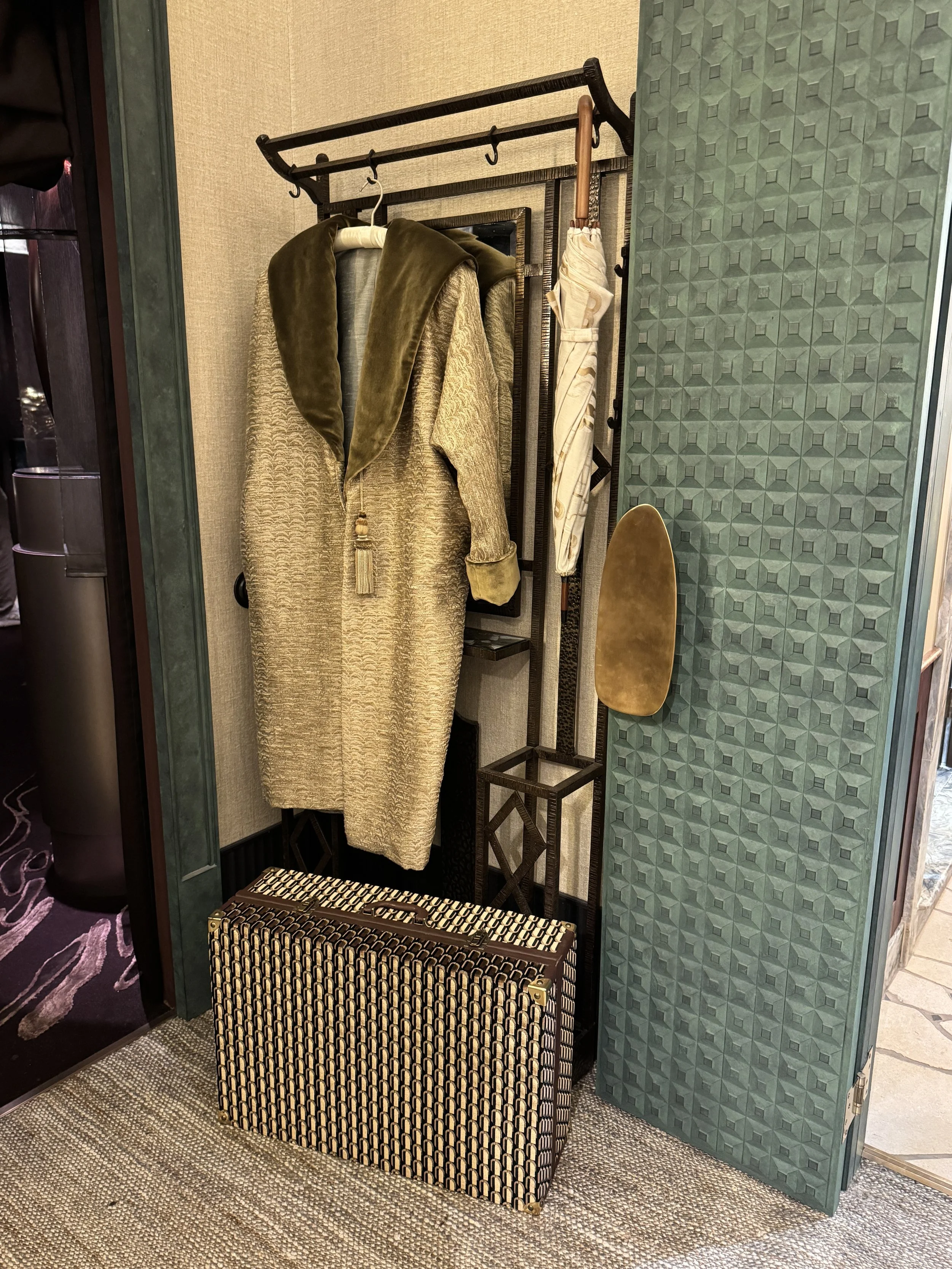
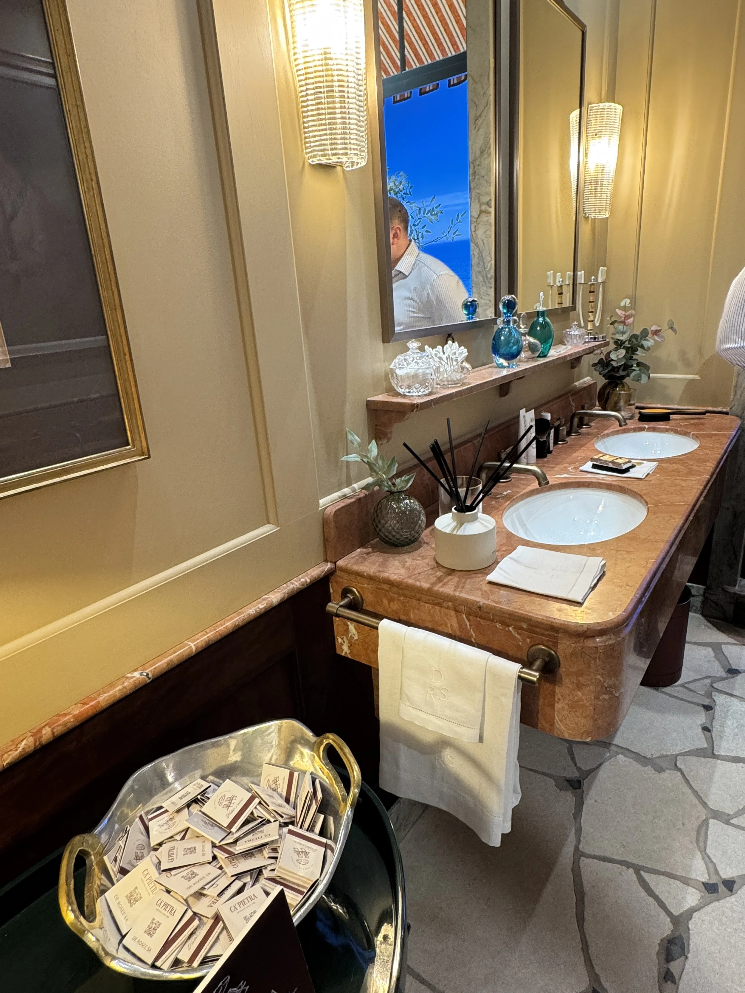
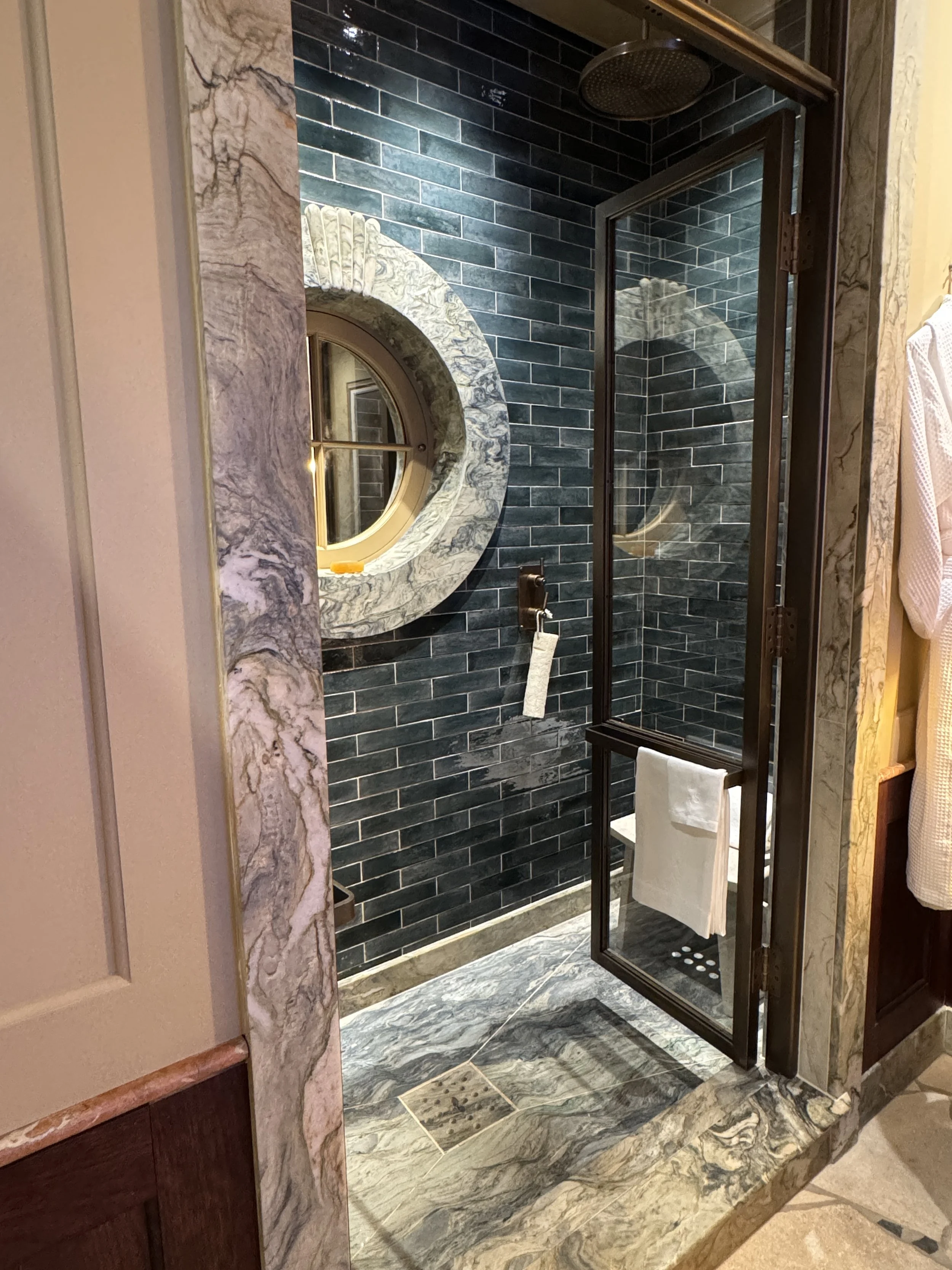
Rose-toned marble, limestone and quartzite from Ca’ Pietra covered the room, while a bespoke leather-wrapped table and small milking stool introduced some warmth against the harder stone surfaces.
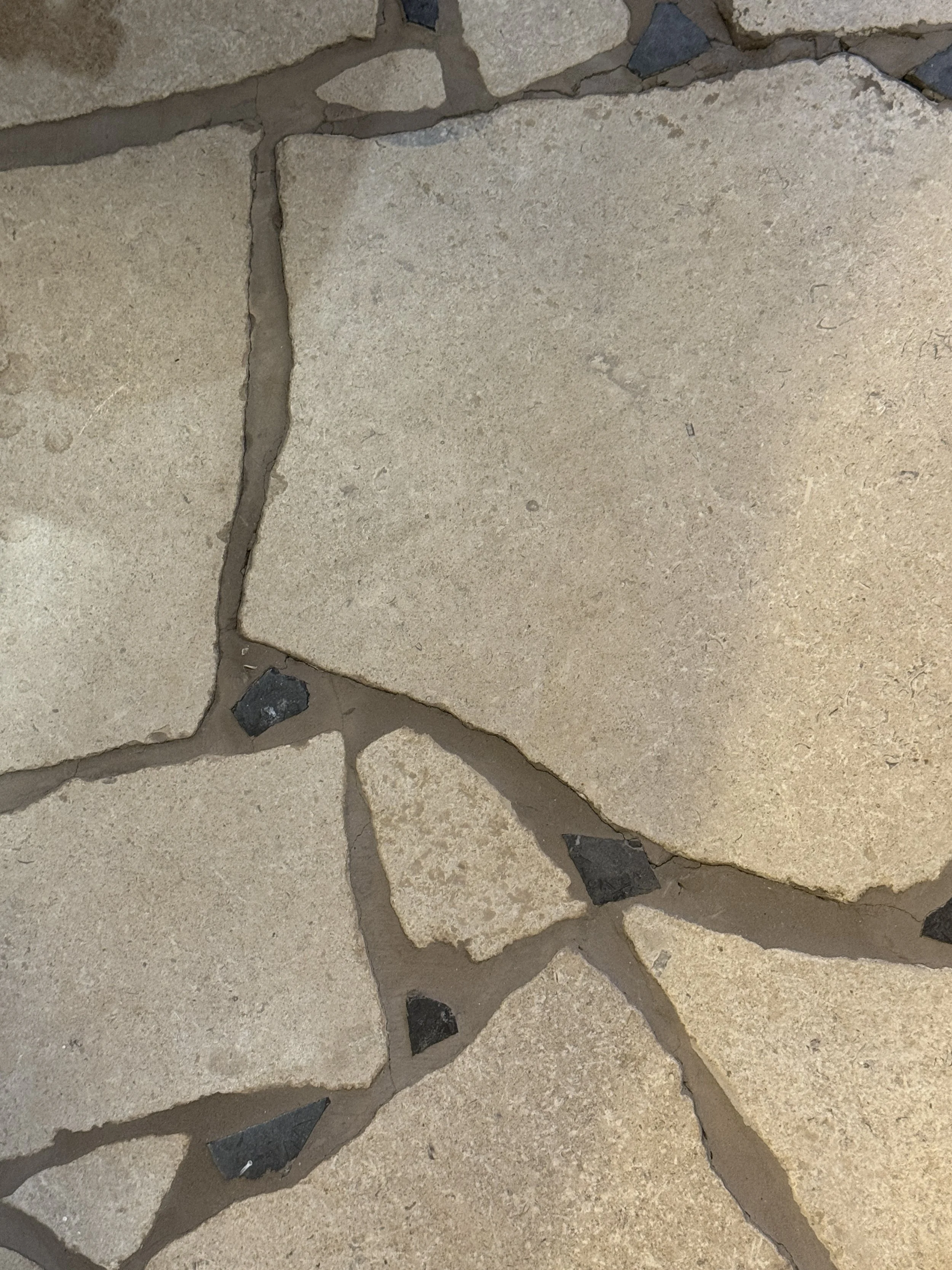
The floor used a loose, crazy-paving style arrangement in Ca’ Pietra’s cobbled Antwerp Granite.
A narrow line of dark navy porcelain tile cut through the floor, giving it an unexpected detail.
Every surface had its own treatment, which was a brave decision in such a compact space. Despite the amount of detail, the overall room still felt quite traditional.
Zardi & Zardi Withdrawing Room by Sean Symington Design
The Joy of Living
Park Avenue meets the English country manor in this room where nothing is kept for best, and everything has a history. Sean Symington Design incorporates fabric and wallcoverings from Zardi & Zardi, known for breathing life into historic designs
Zardi & Zardi Withdrawing Room by Sean Symington Design
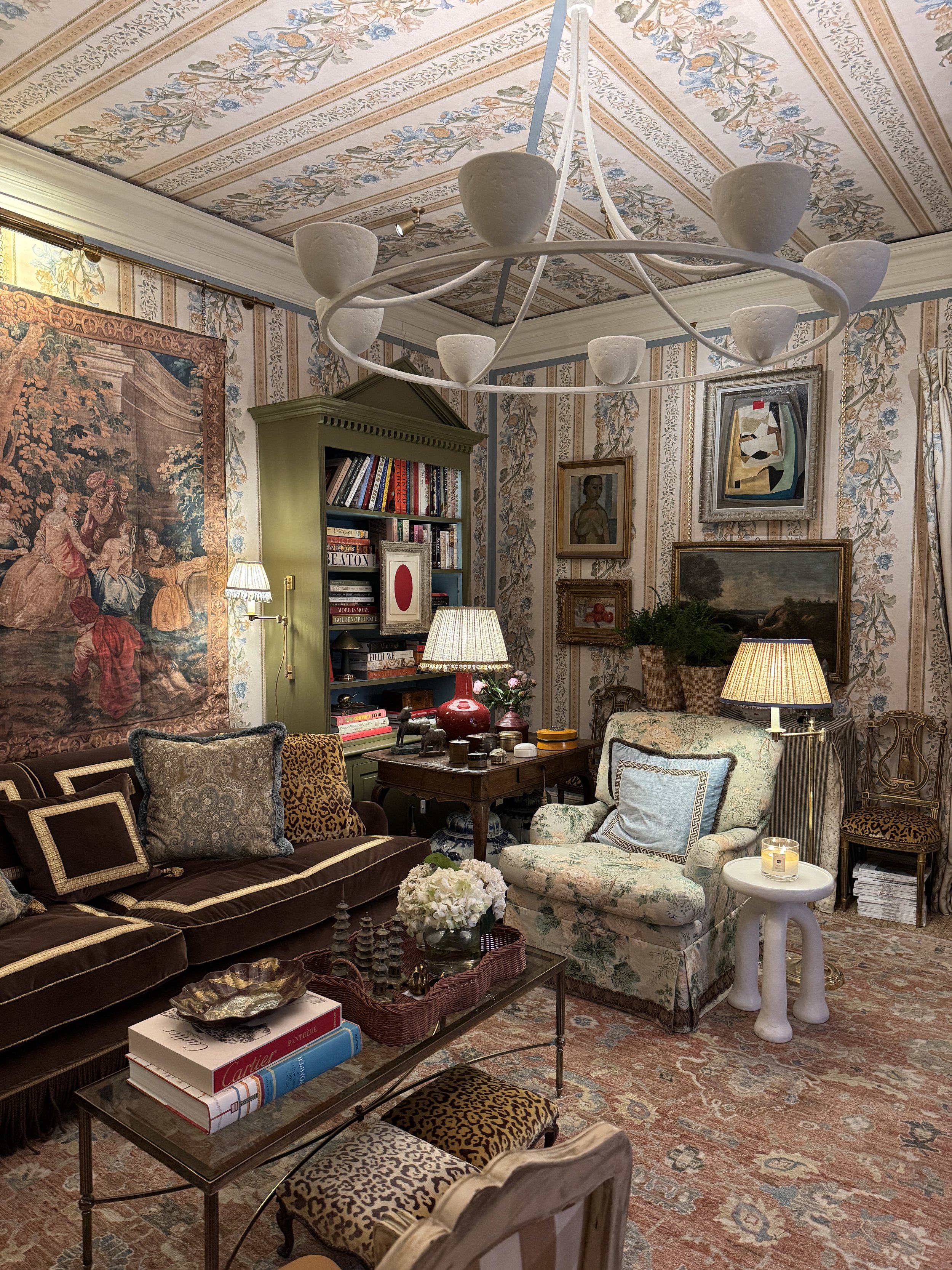
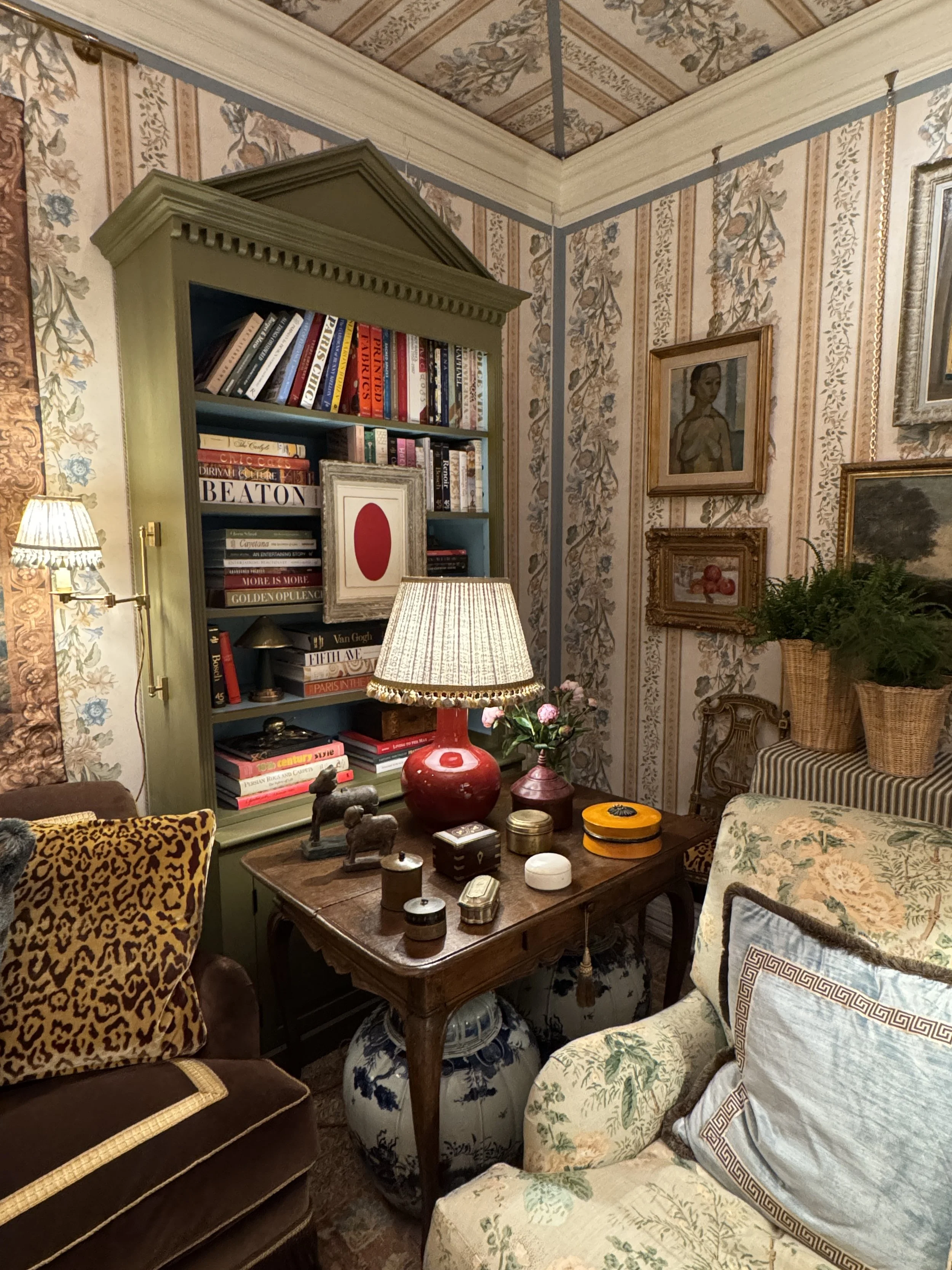
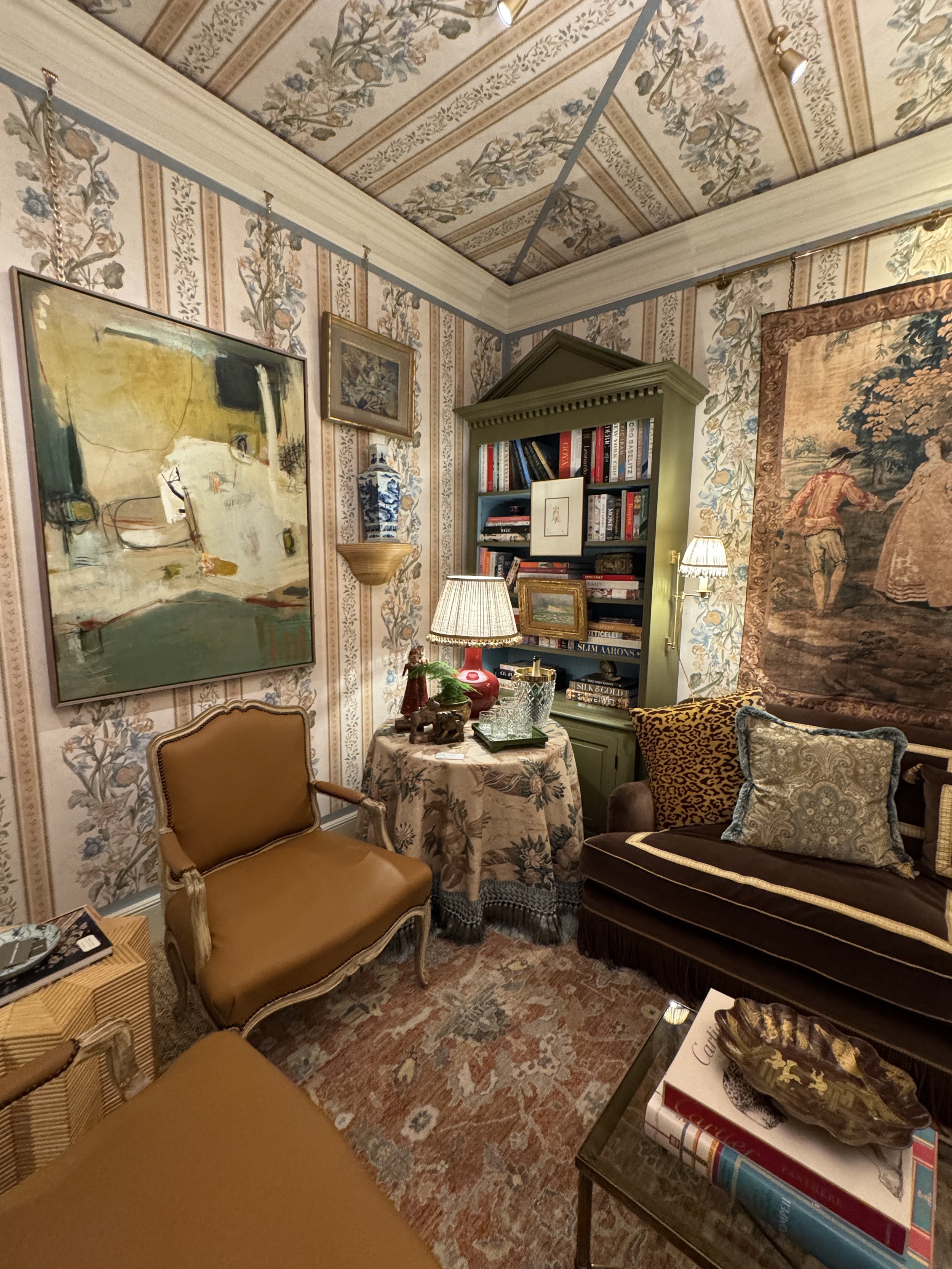
Called The Joy of Living, this room combined Park Avenue glamour with the relaxed quality of an English country manor.
The idea that nothing should be kept only for best ran throughout the scheme.
Pictures had once again been hung along the edges of the bookcase shelves, just as they had in the Salvesen Graham bedroom. There were also collections of objects displayed throughout the room.
A traditional plaster ceiling rose sat above a white Compton chandelier from Porta Romana, which I loved.
Modern artwork and a few contemporary pieces were mixed amongst more traditional pictures and furnishings.
I have to be honest, though, the wallpaper and sofas were not for me. They are the sort of pieces I would probably be sending away to be reupholstered.
There is, of course, a place for every interior style. This particular one simply was not mine.
THG Paris Powder Room by Studio Mark Andrew
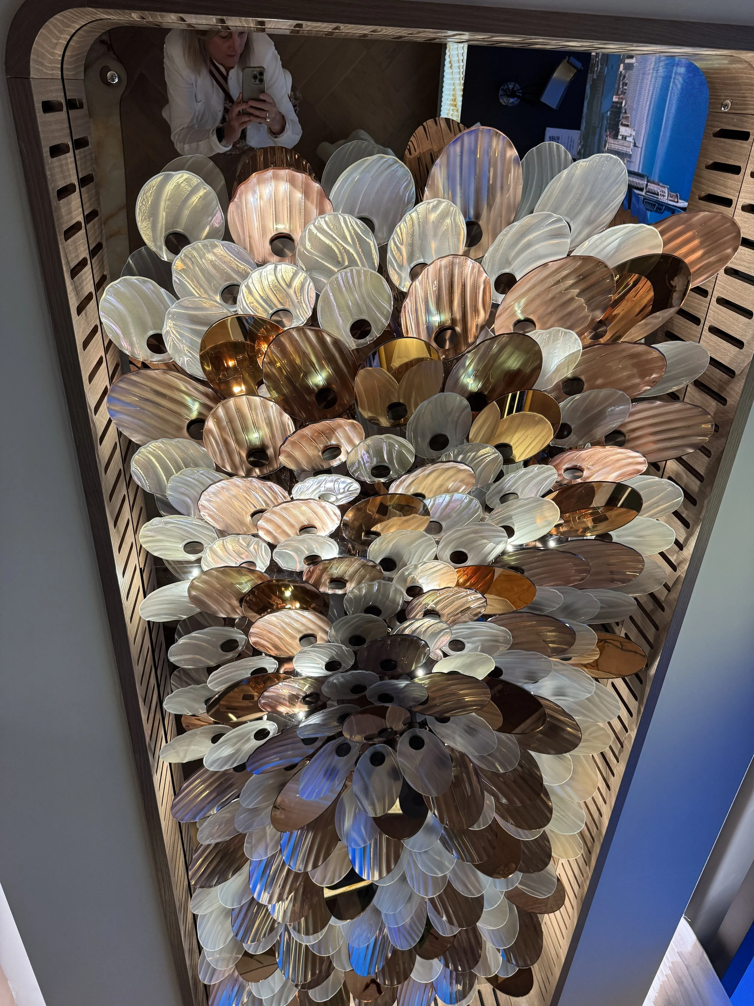
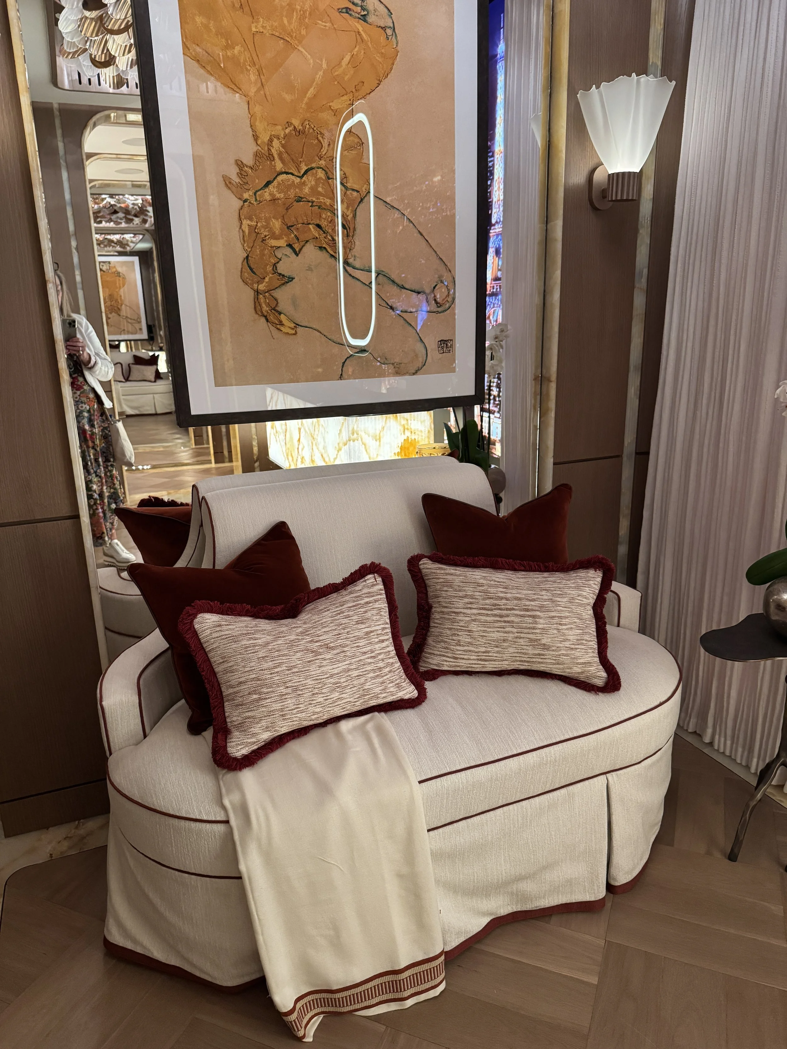
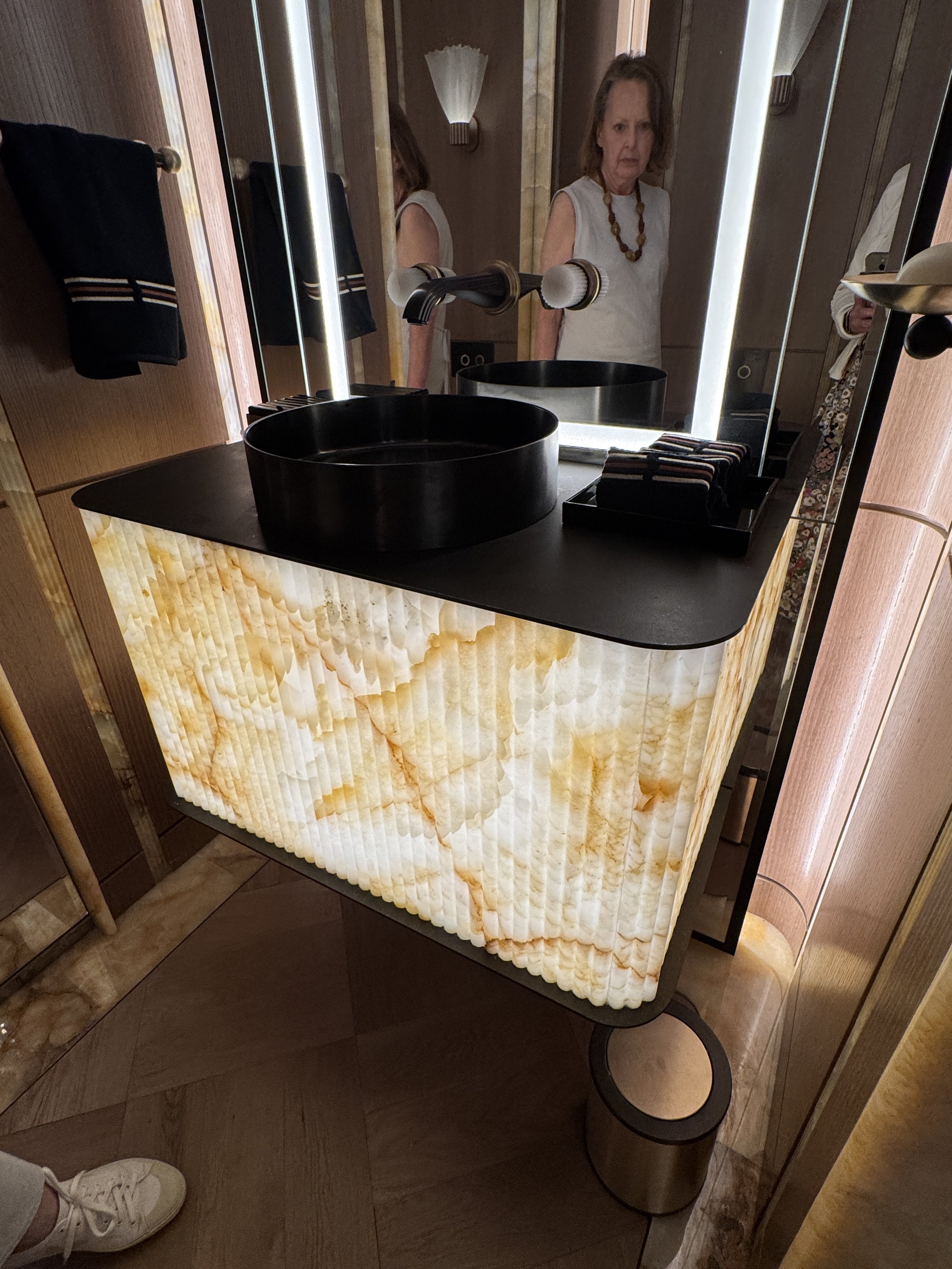
This small powder room was a tour of glamorous materials inspired by international travel.
The illuminated stone vanity immediately caught my attention.
I have used this type of translucent stone before, but I had never considered lighting it from behind. It is an idea I may have to explore on a future project.
The decorative ceiling light looked almost like a piece of couture jewellery suspended above the room, which suited the sense of luxury perfectly.
The space could quite easily have worked as an elegant little cocktail bar too.
Nucleus Immersive Room by Russell Sage Studio
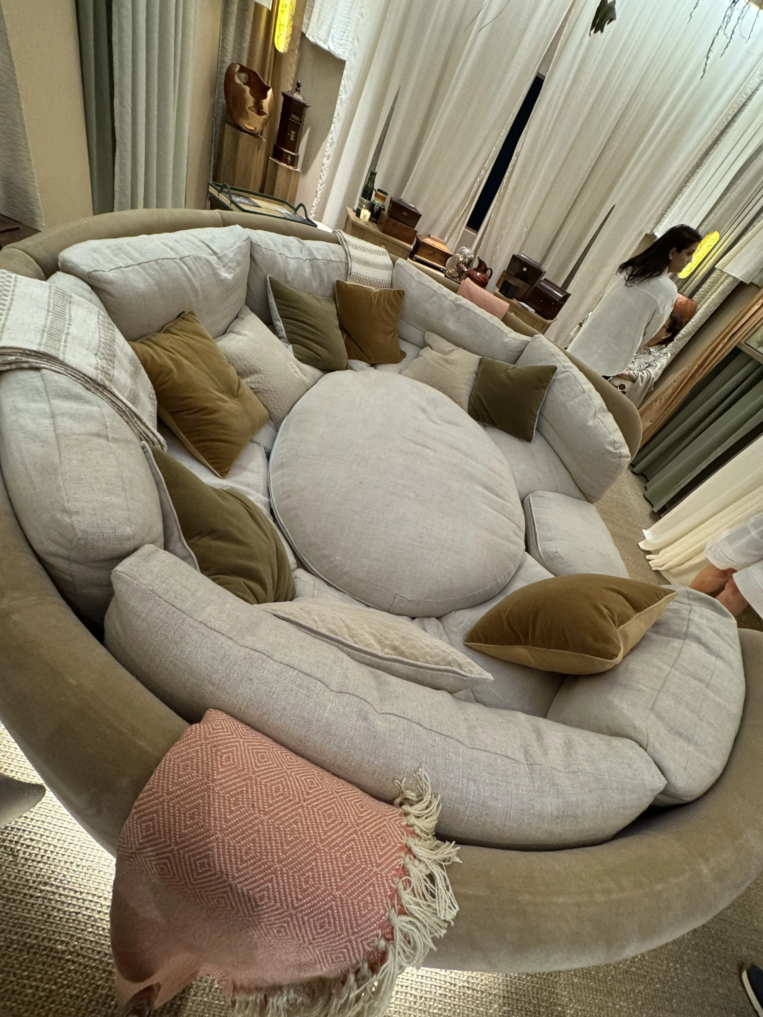
This room was constantly full of people, making it difficult to photograph, although that also demonstrated how much visitors were drawn towards it.
Russell Sage described it as a momentarium, a multi-sensory room featuring integrated home technology from Nucleus.
Layers of sheer and solid fabric panels ran around the walls in waves rather than simply hanging flat or following a straightforward curve.
I wondered whether the fabrics had been designed for acoustic purposes as much as for their appearance.
A sleek brass-framed control panel by the entrance operated the lighting, window shades, music, video, doors and intercom from one screen.
The joinery by MHB Interiors was carefully integrated into the ceiling, walls, television area and even the picture frames, allowing the technology to disappear until it was needed.
It was another excellent example of concealed storage and technology quietly doing the hard work.
For me, the room was not as successful as Martin Kemp’s Parlour, which showed just how important colour can be within these types of schemes.
I also found some of the varying fabric lengths slightly odd. They almost reminded me of a market stall displaying fabric by the metre, which may sound rather rude, but it was honestly my first impression.
What I did love was the large circular sofa bed in the middle of the room. It immediately reminded me of a 1960s conversation pit.
I could see this working brilliantly in a teenage den, cinema room, party house or relaxed family space. It had a slight Rompa-room quality to it, in the best possible way.
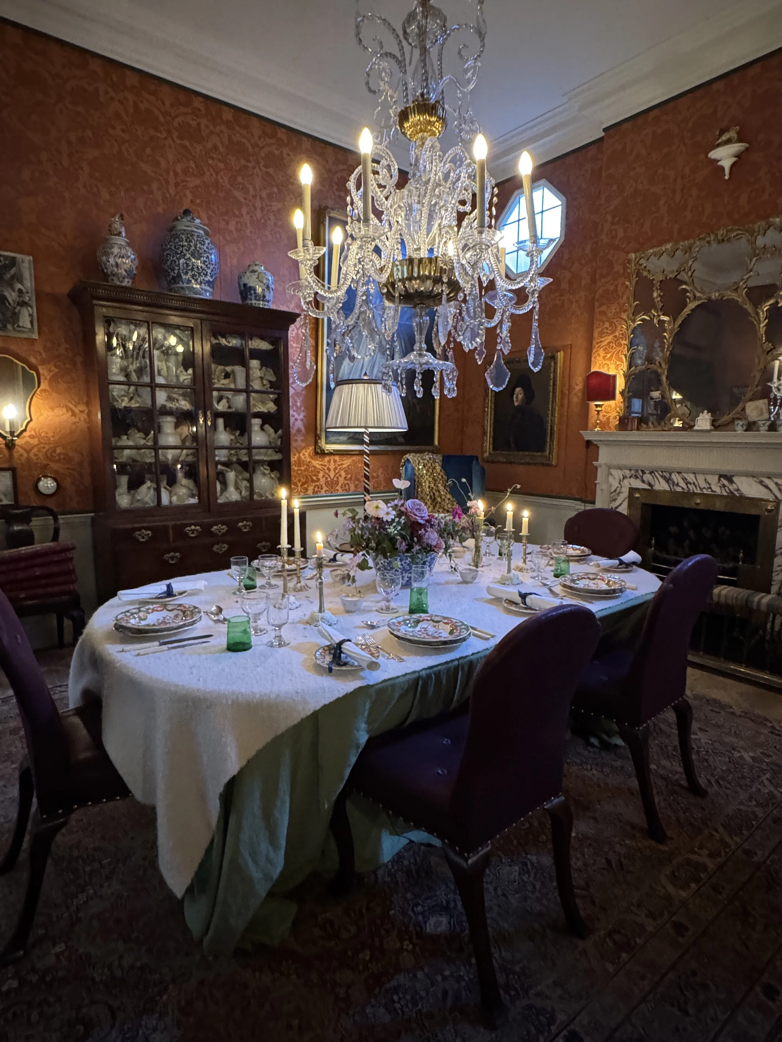
Schumacher Dining Room by Max Rollitt
Feast Your Eyes
Architecturally, Max Rollitt’s Dining Room design sits in the 18th century, but it is ornamented in a way that reflects today’s dining experience. Room sponsor Schumacher’s extraordinary catalogue has been mined to create a sumptuous and atmospheric scene
Schumacher Dining Room by Max Rollitt
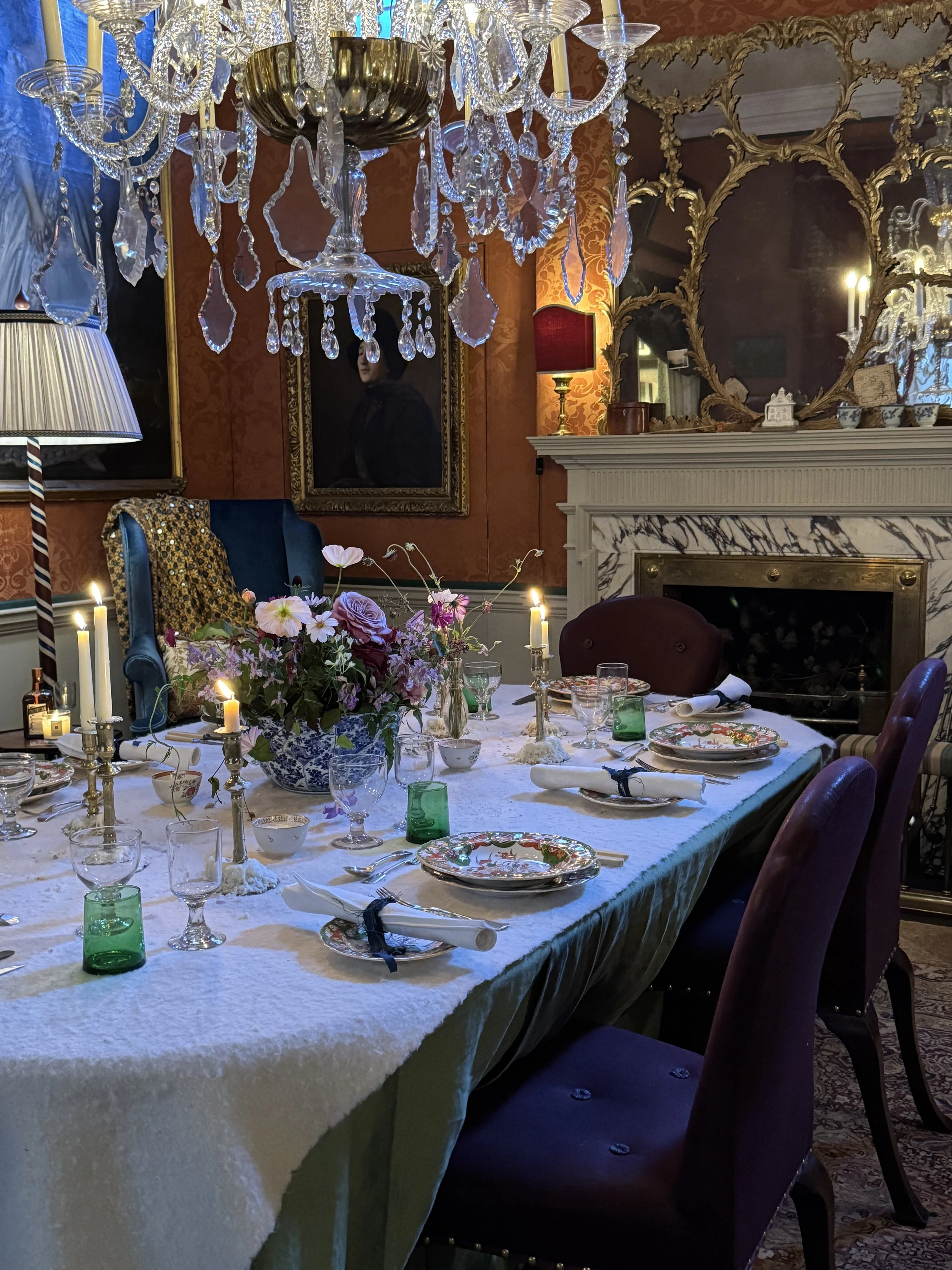
This room felt like stepping into a National Trust house decorated for Christmas.
The architecture referenced the 18th century, while the room itself was arranged for contemporary entertaining.
A traditional ceiling rose and cornice from A.R.M. Fibrous Plaster Mouldings framed a large 19th-century Spanish crystal chandelier.
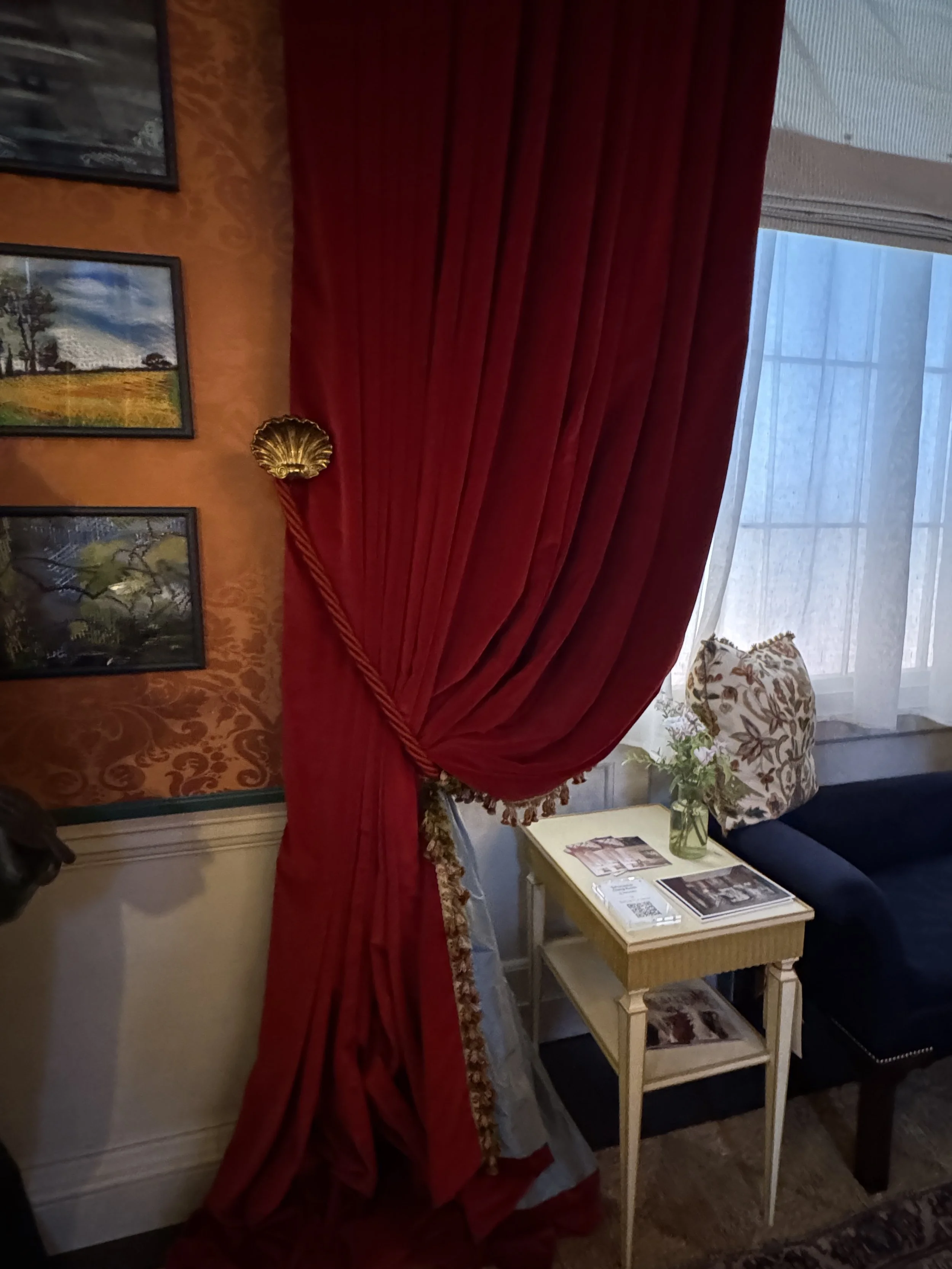
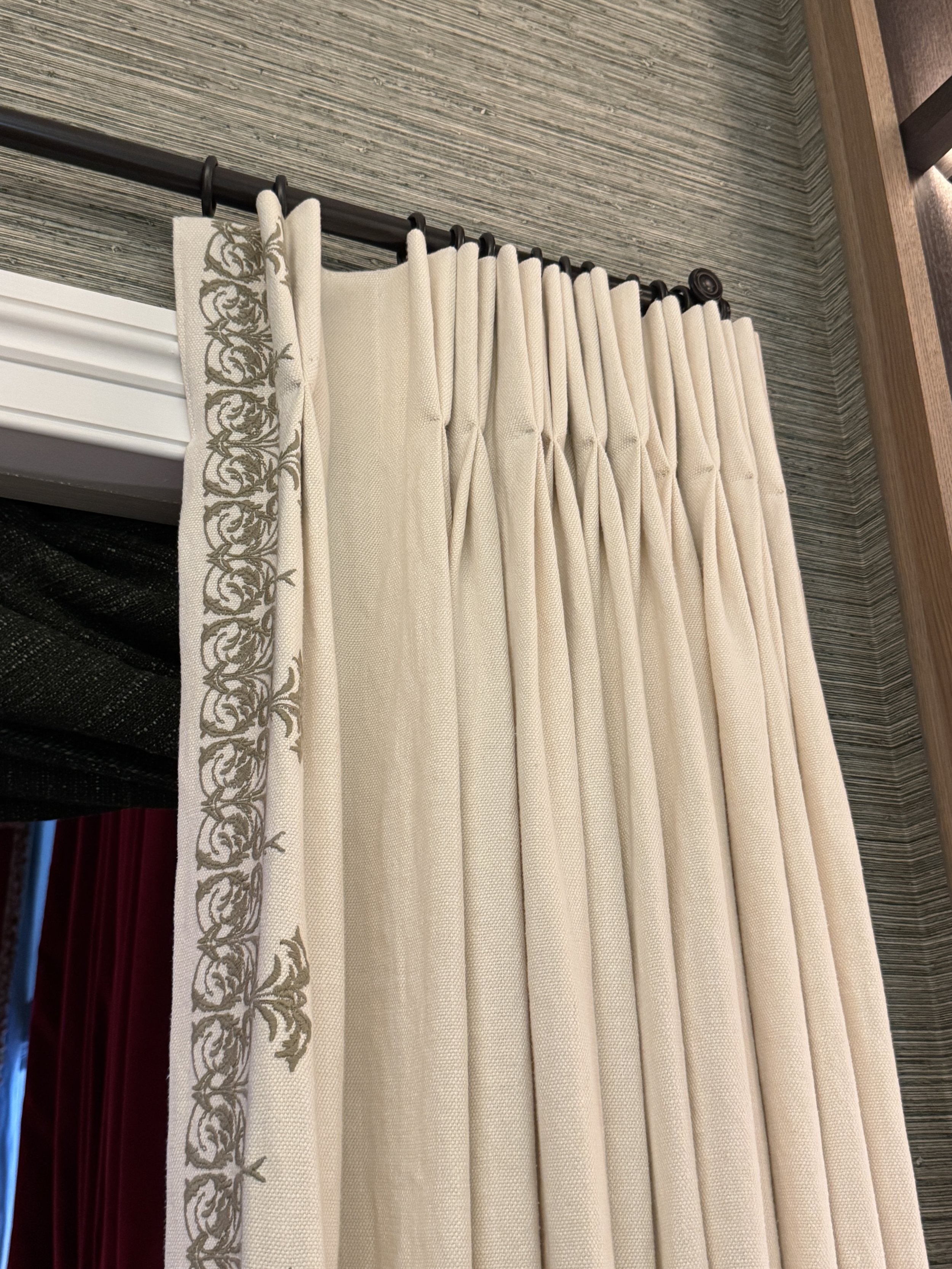
Rich red curtains in Schumacher’s Gainsborough Velvet were trimmed and swept back into gilded, shell-shaped holdbacks.
It was exactly the sort of considered detailing that makes curtains feel properly finished rather than simply hung.
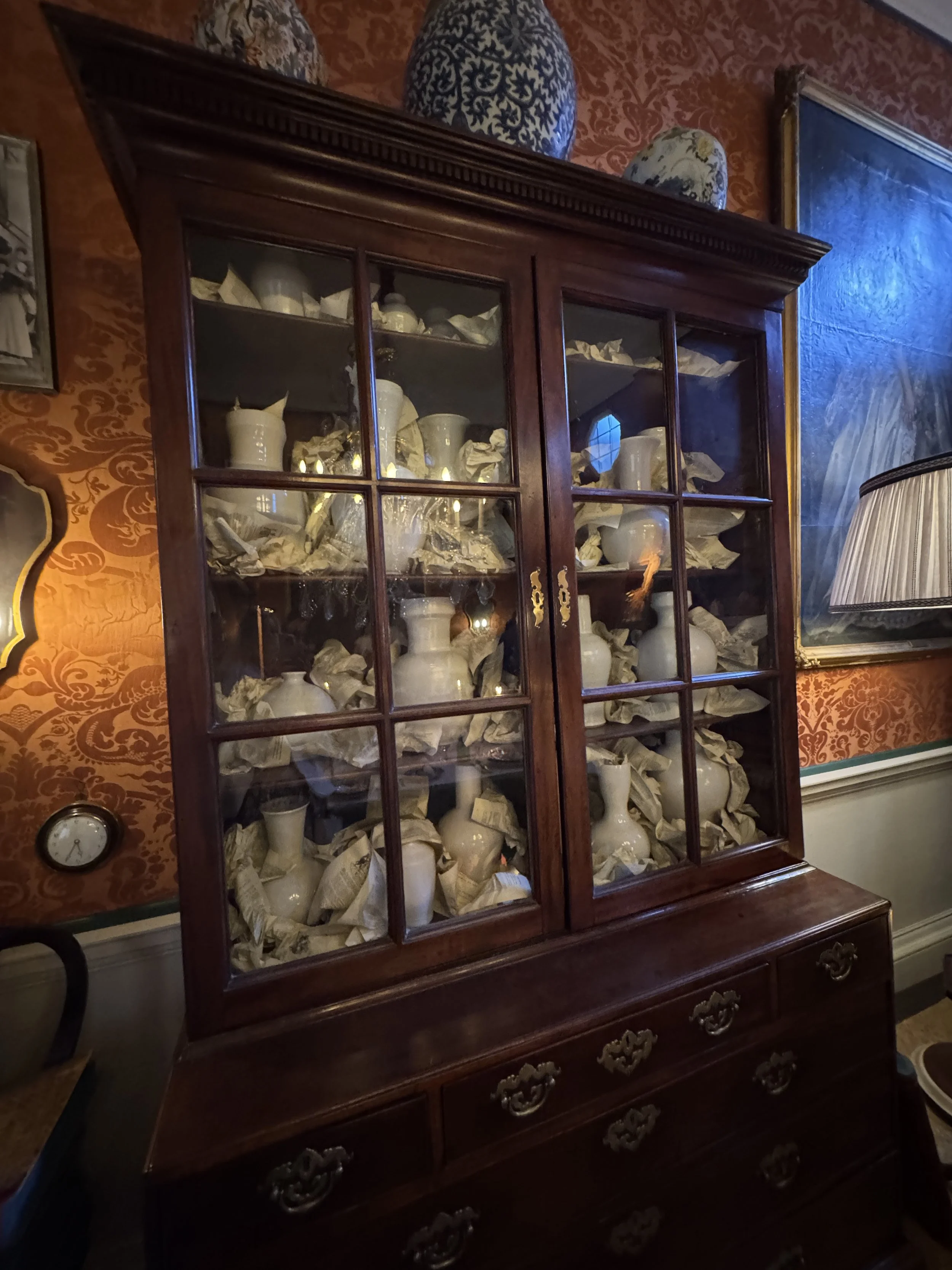
I also loved the styling inside the glass cabinet. Scrunched newspaper had been packed around a collection of plain white ceramic vases.
It was unexpected, slightly eccentric and a very effective way to fill the shelves.
Martin Moore Kitchen with Samantha Bartlett
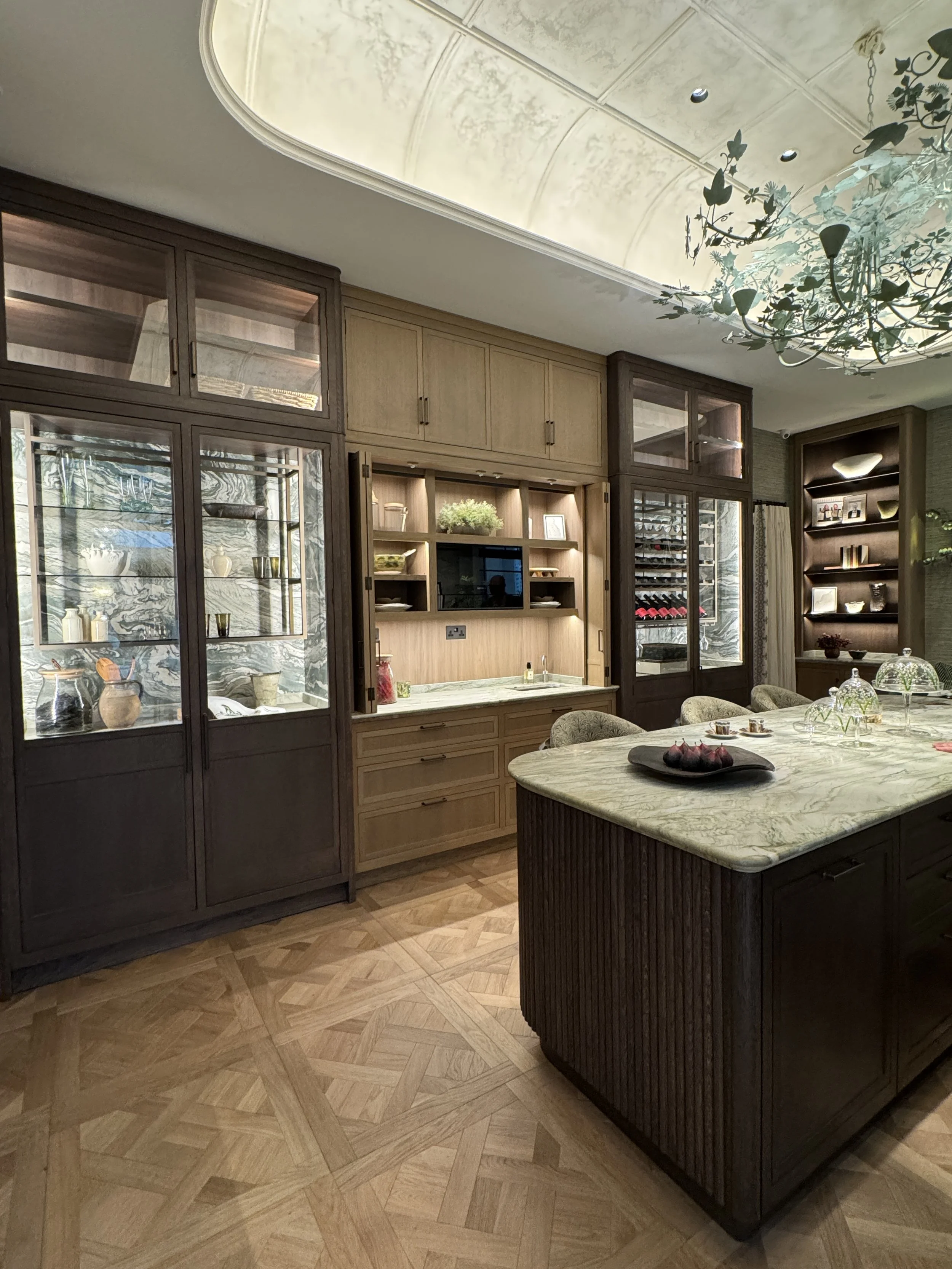
The final stop was a beautiful bespoke kitchen by Martin Moore.
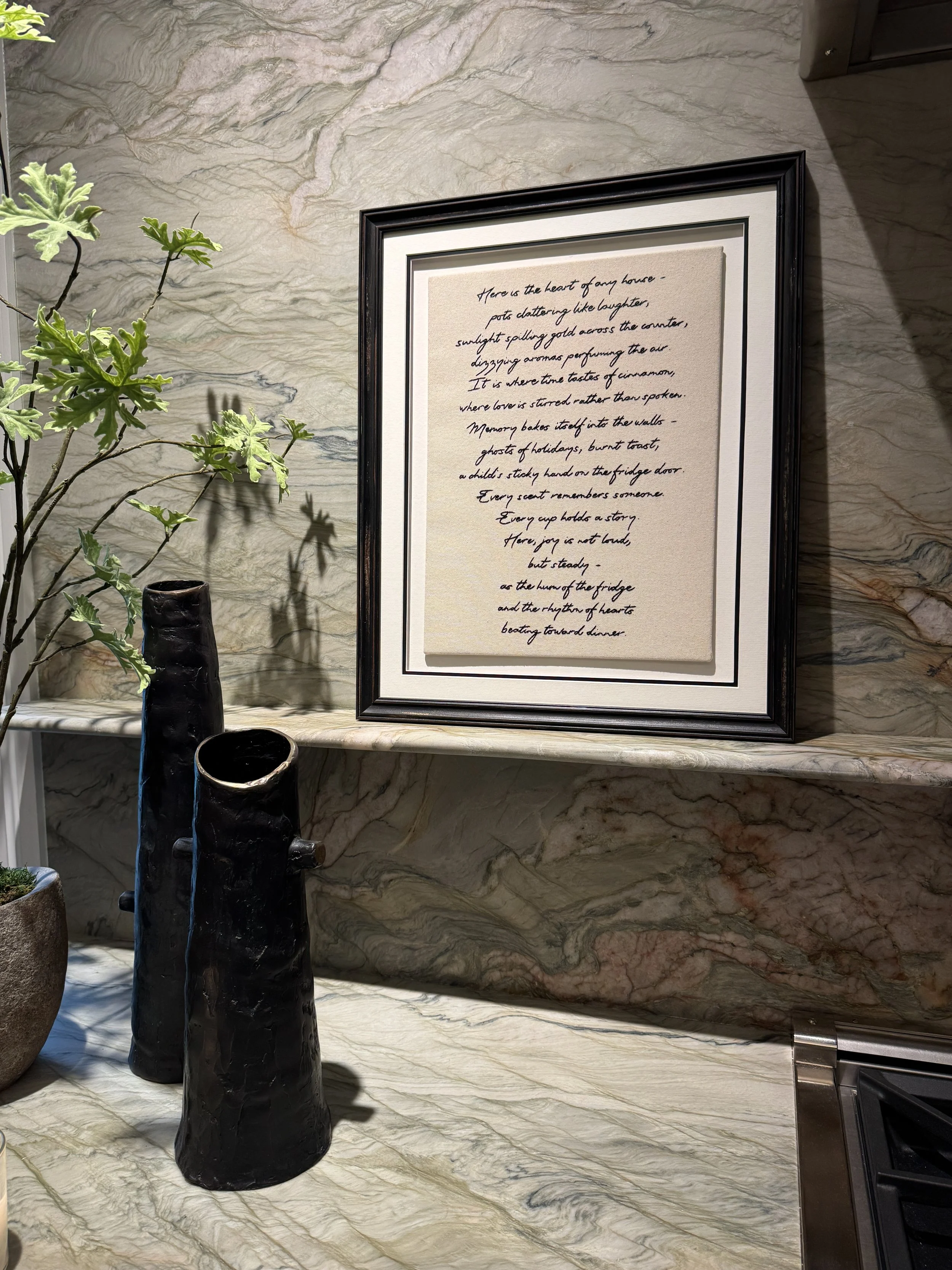
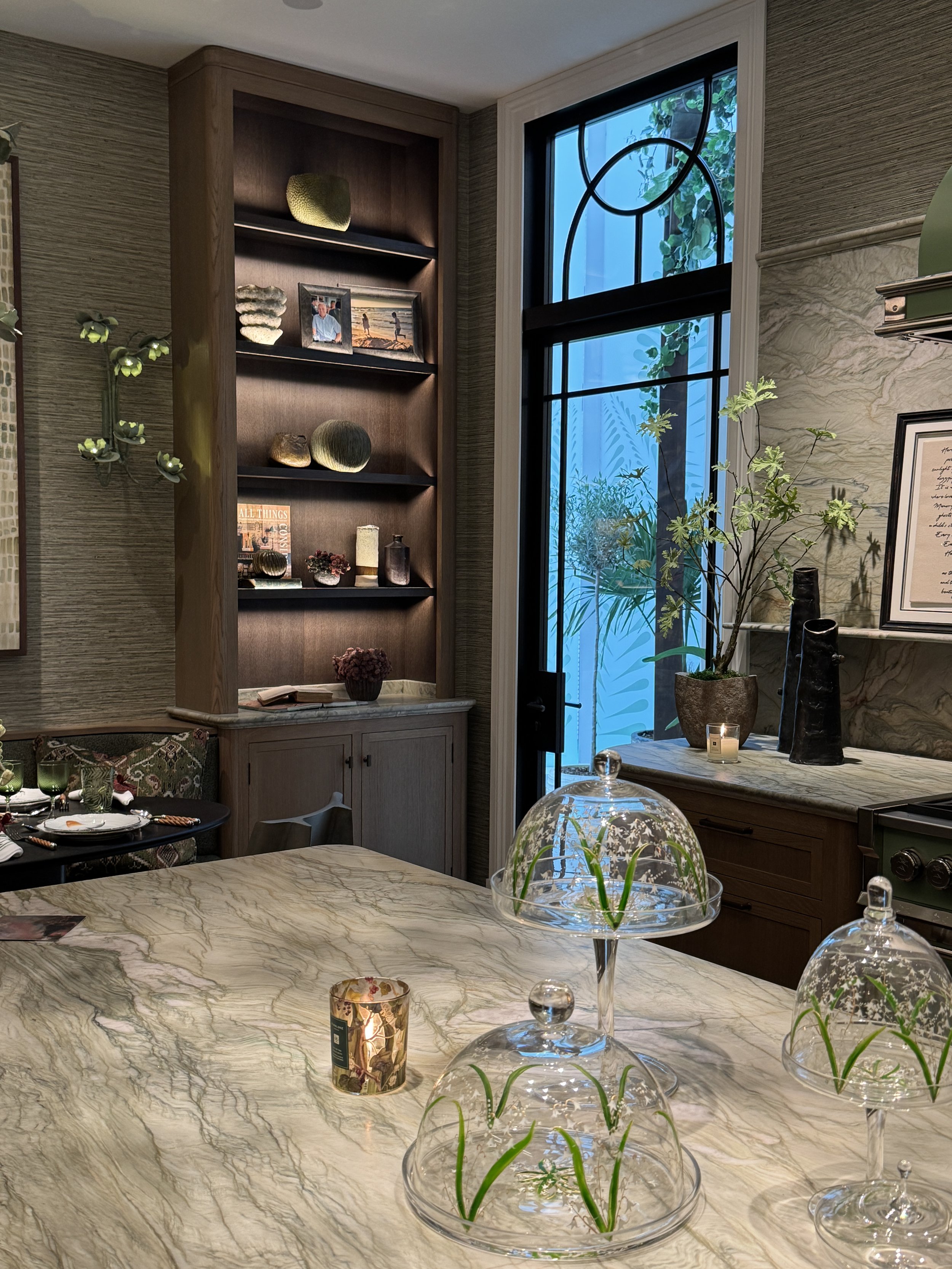
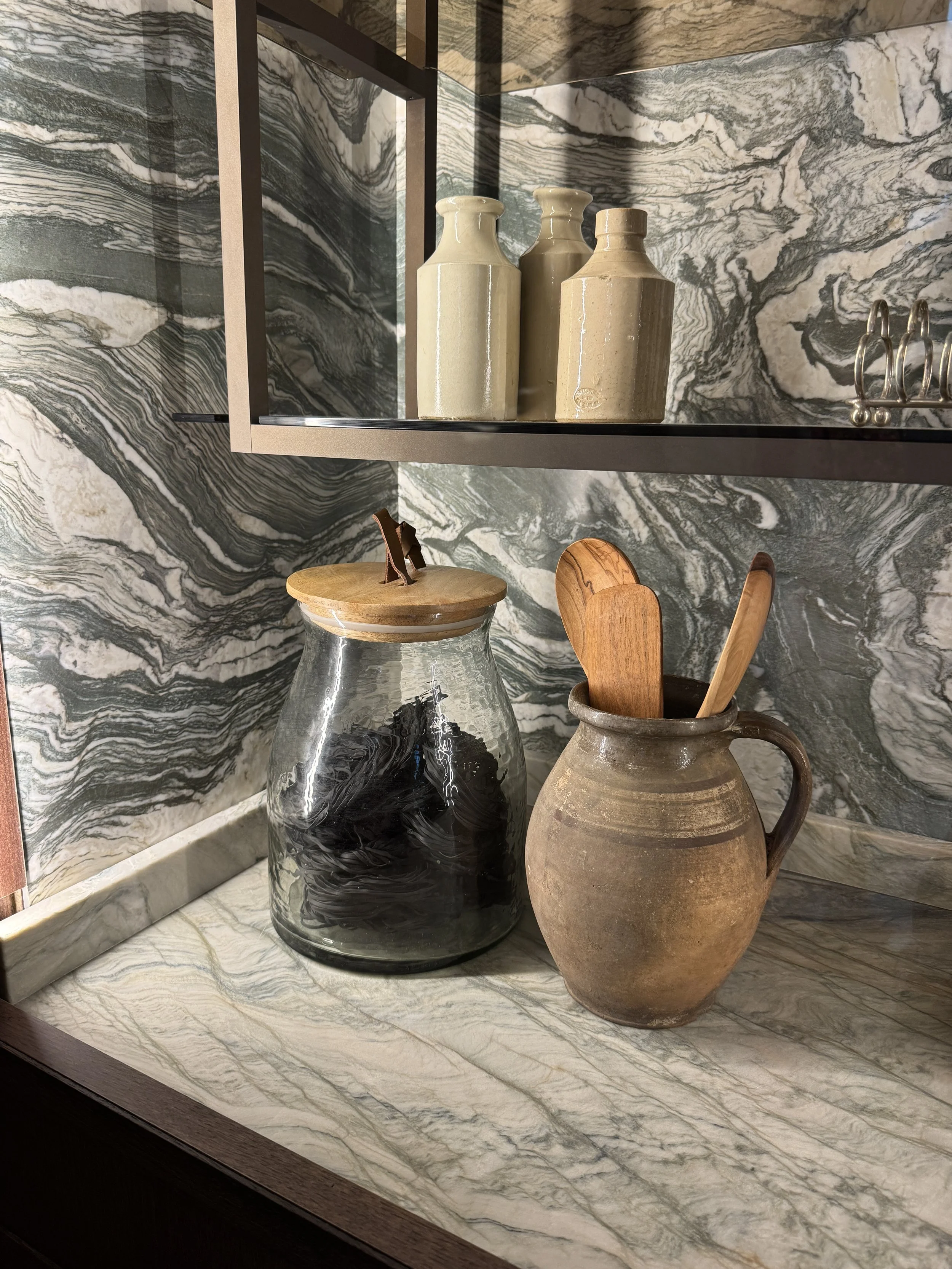
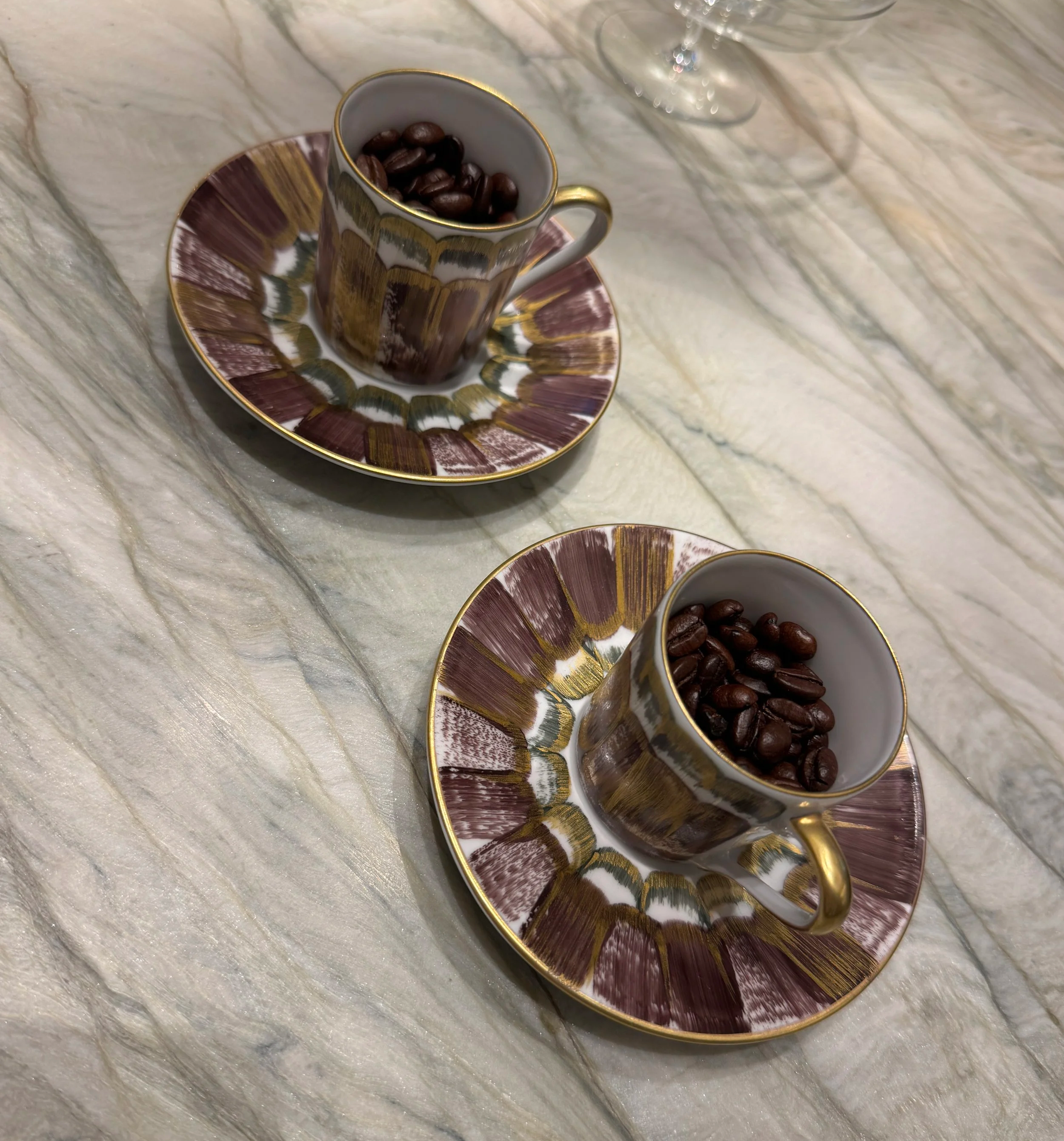
I particularly loved the worktops, made from Martin Moore’s Verde Natura quartzite.
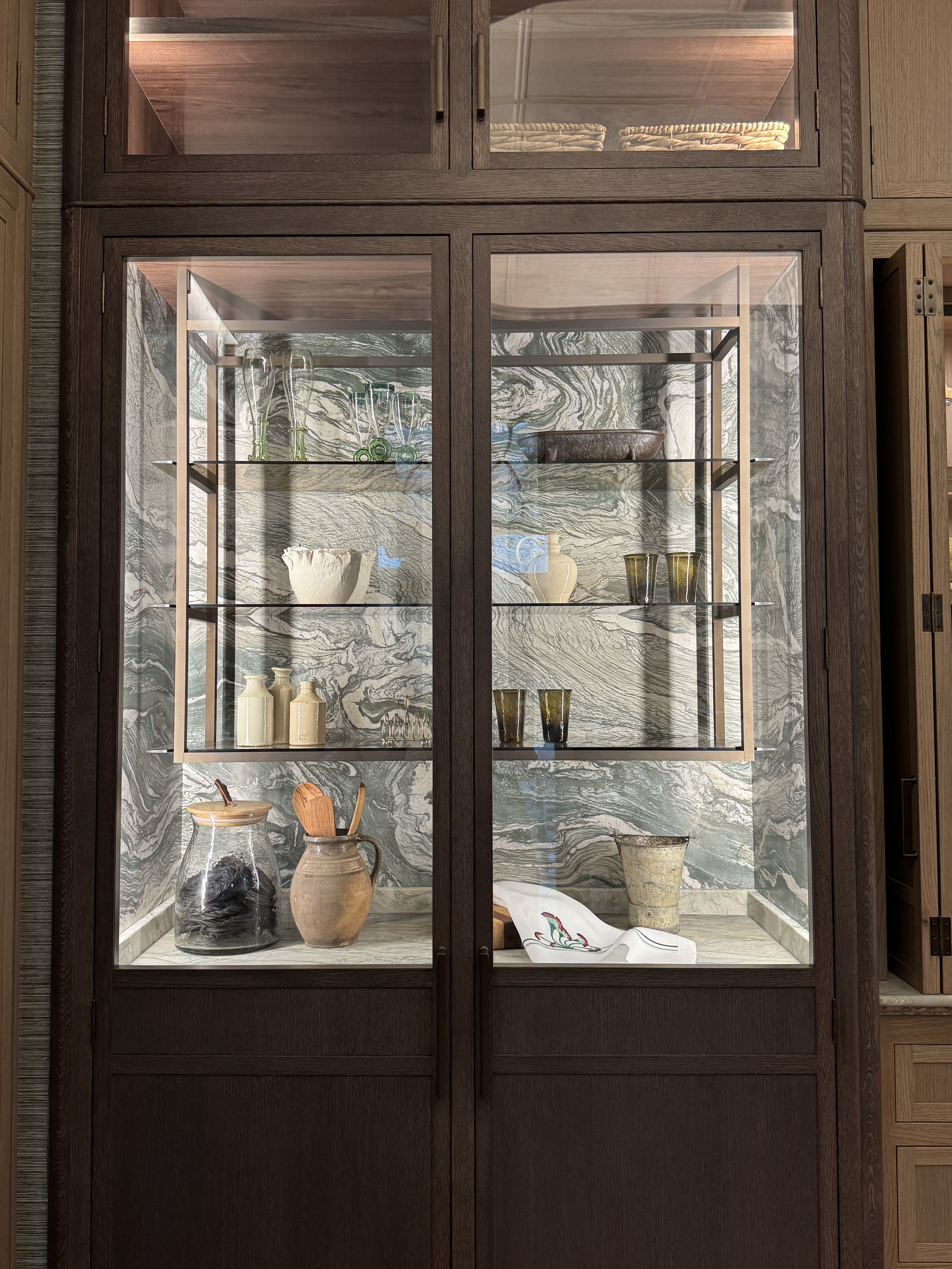
The soft, wavy stone continued across the worktops, splashbacks and inside the display cabinets, allowing the material to tell one continuous story around the room.
Samantha Bartlett introduced botanical motifs throughout the scheme, including a specialist lustre finish on the ceiling by Mercer & Mercer.
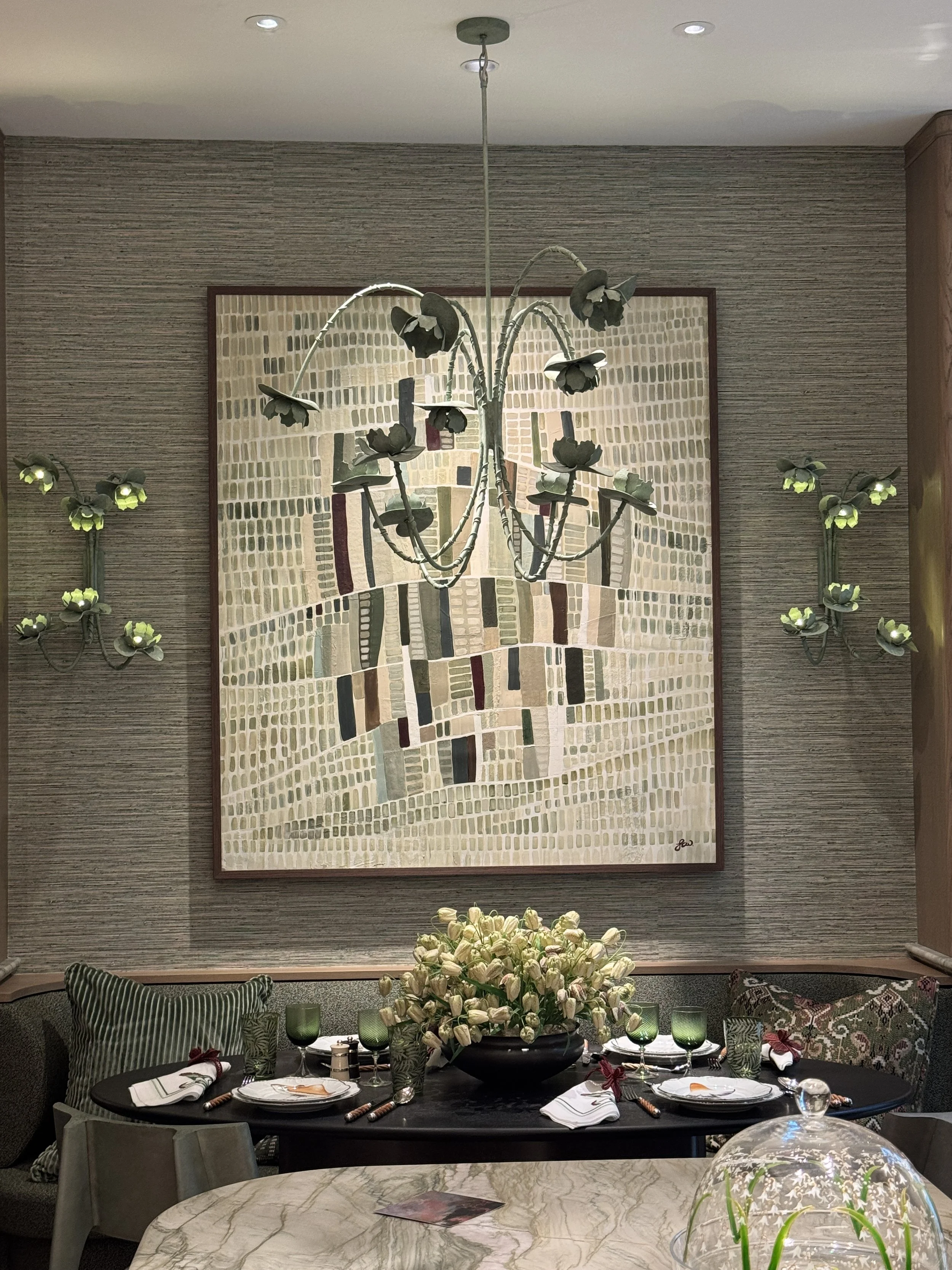
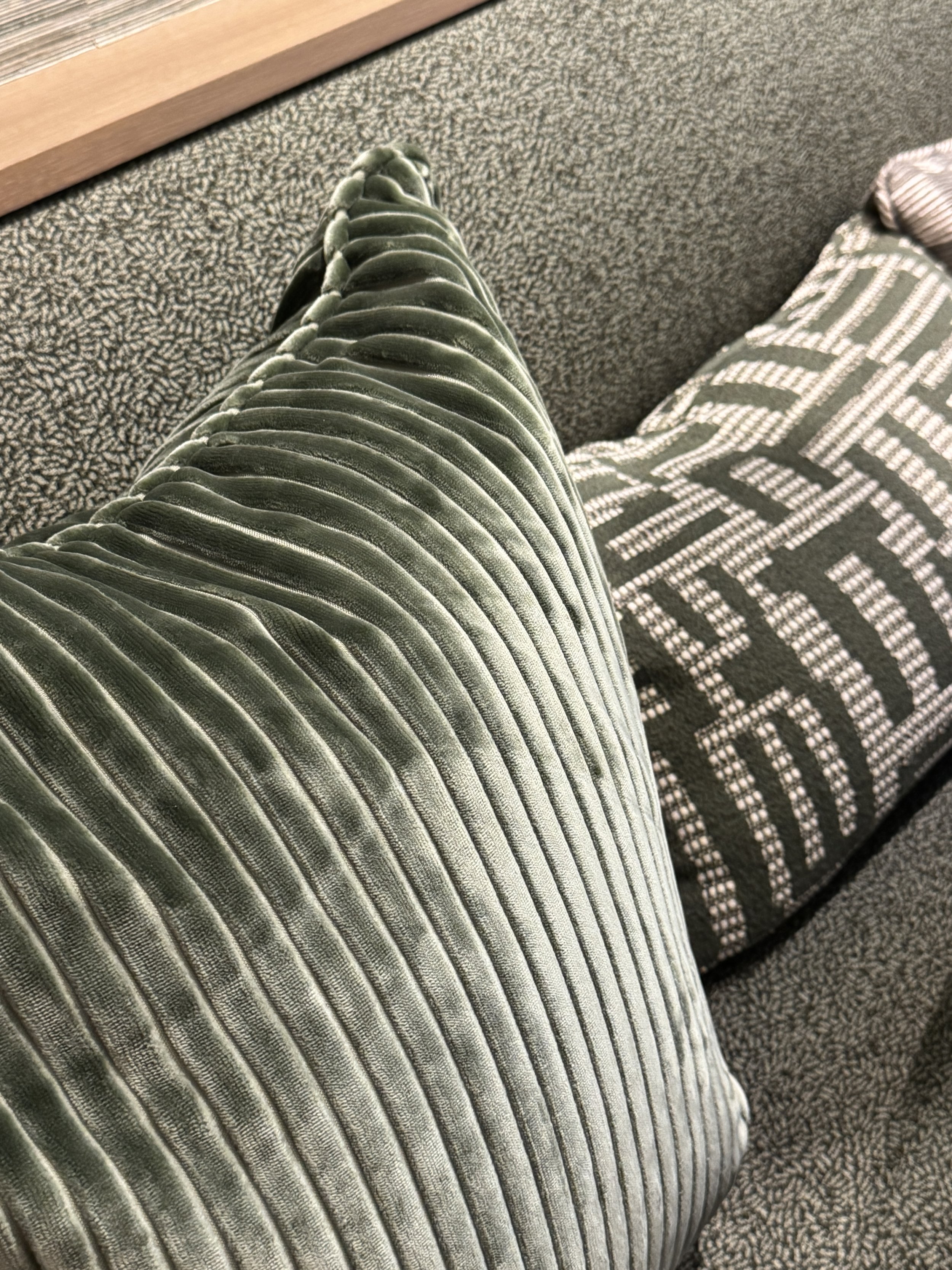
I also recognised Casamance’s Plan Libre fabric in green on the upholstered bench and cushions.
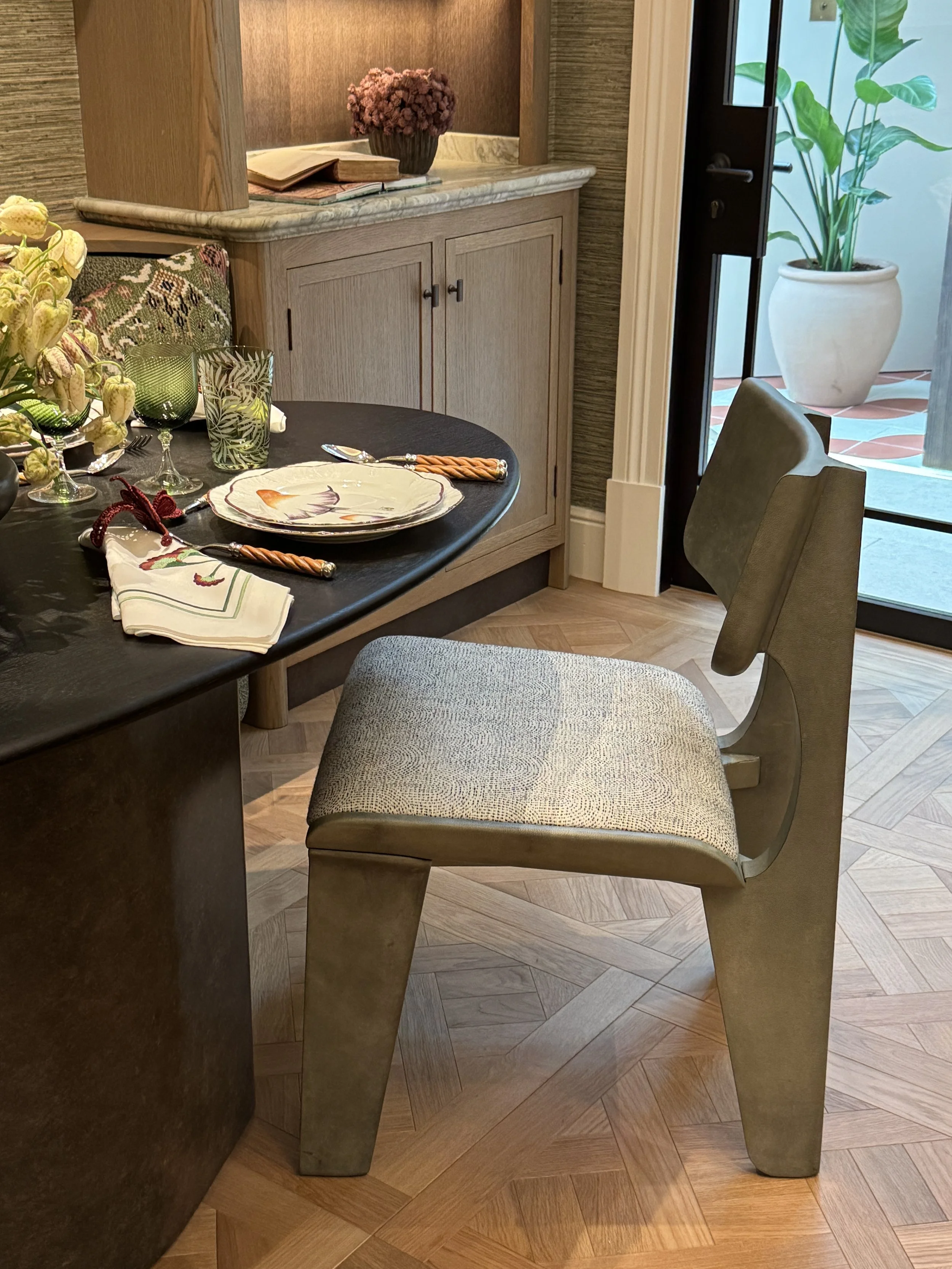
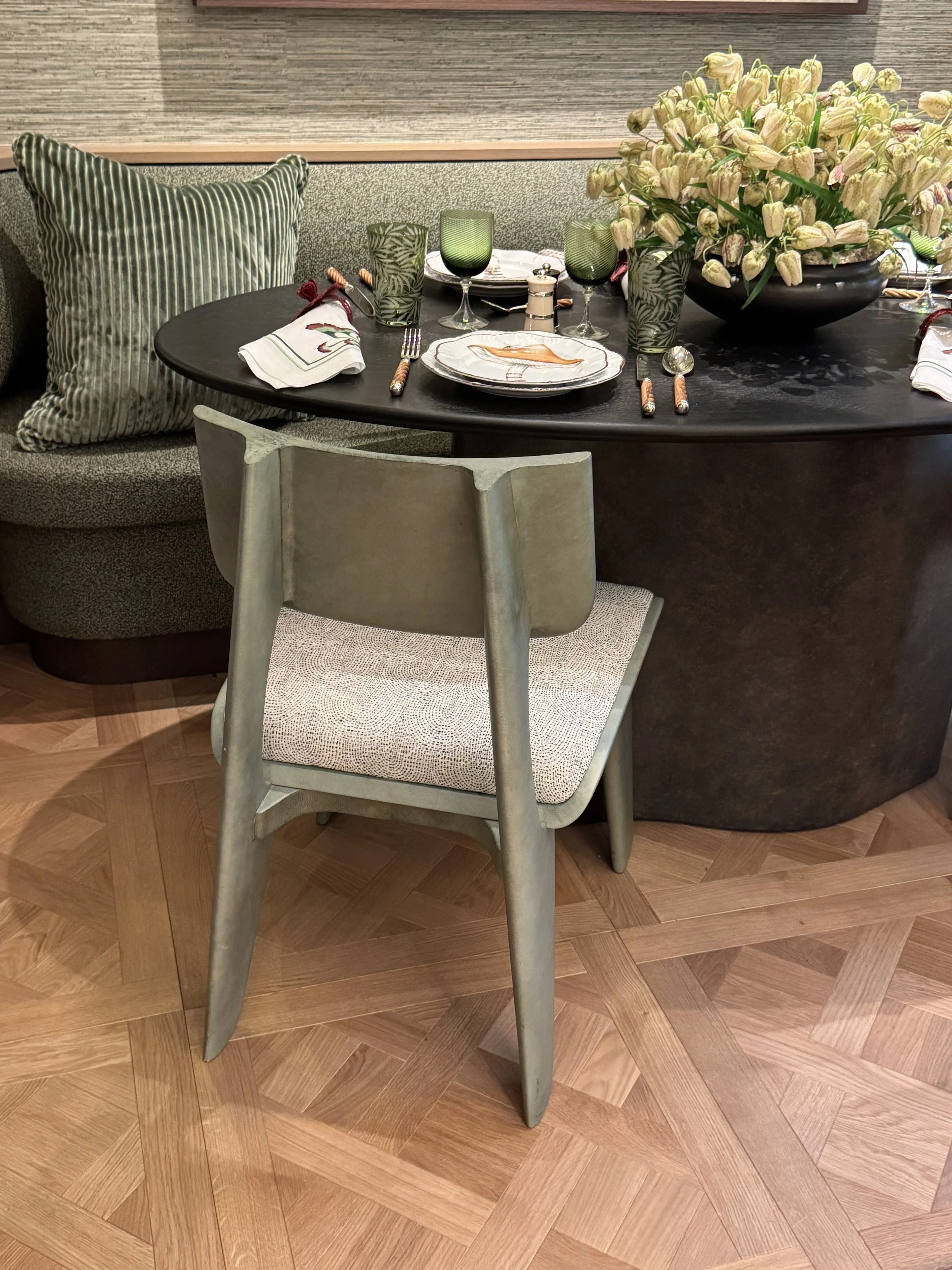
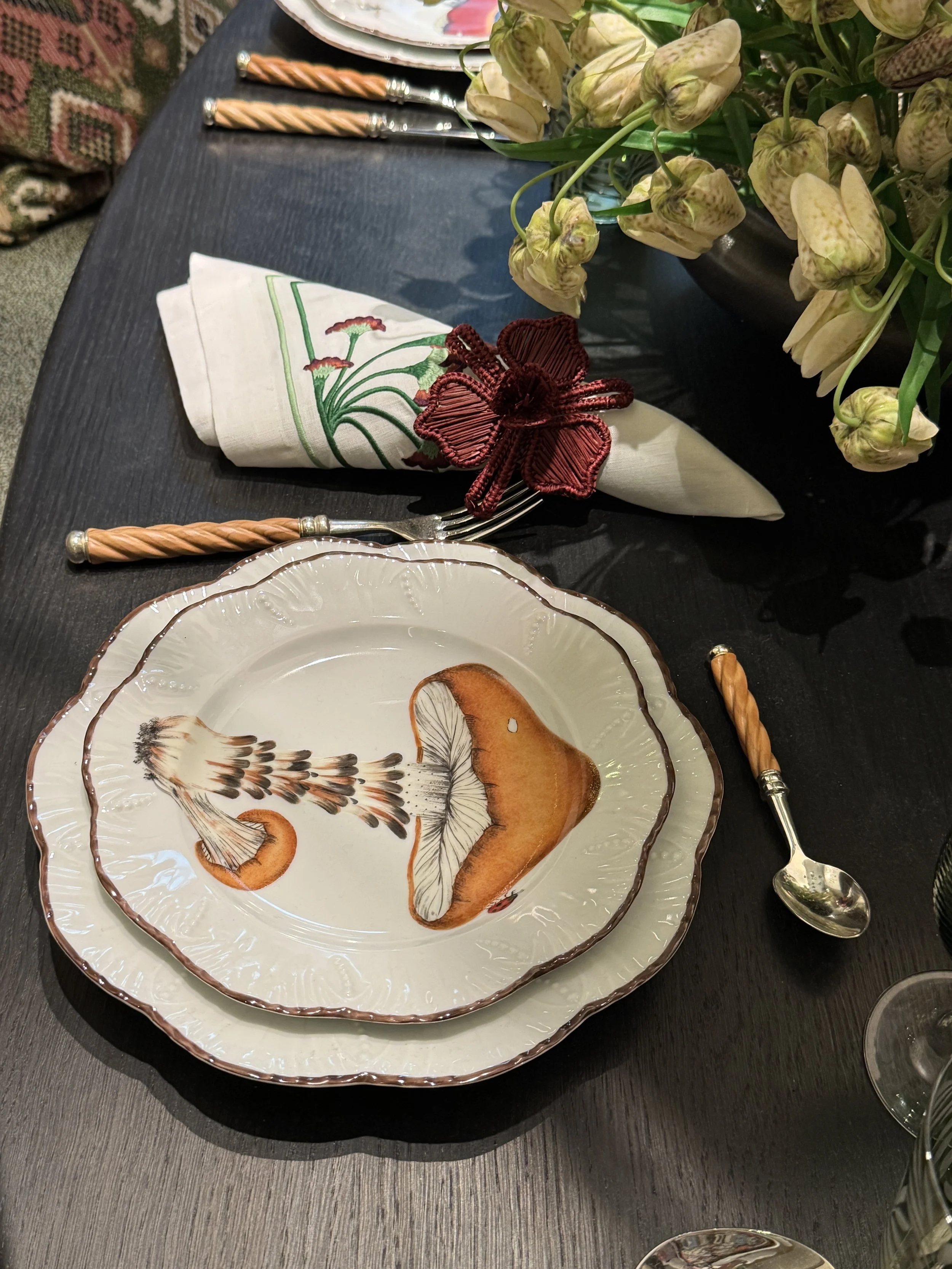
The dining chairs had a lovely shape and colour, while the dark pewter oval dining table worked beautifully against the green upholstery, giving the room a sense of depth.
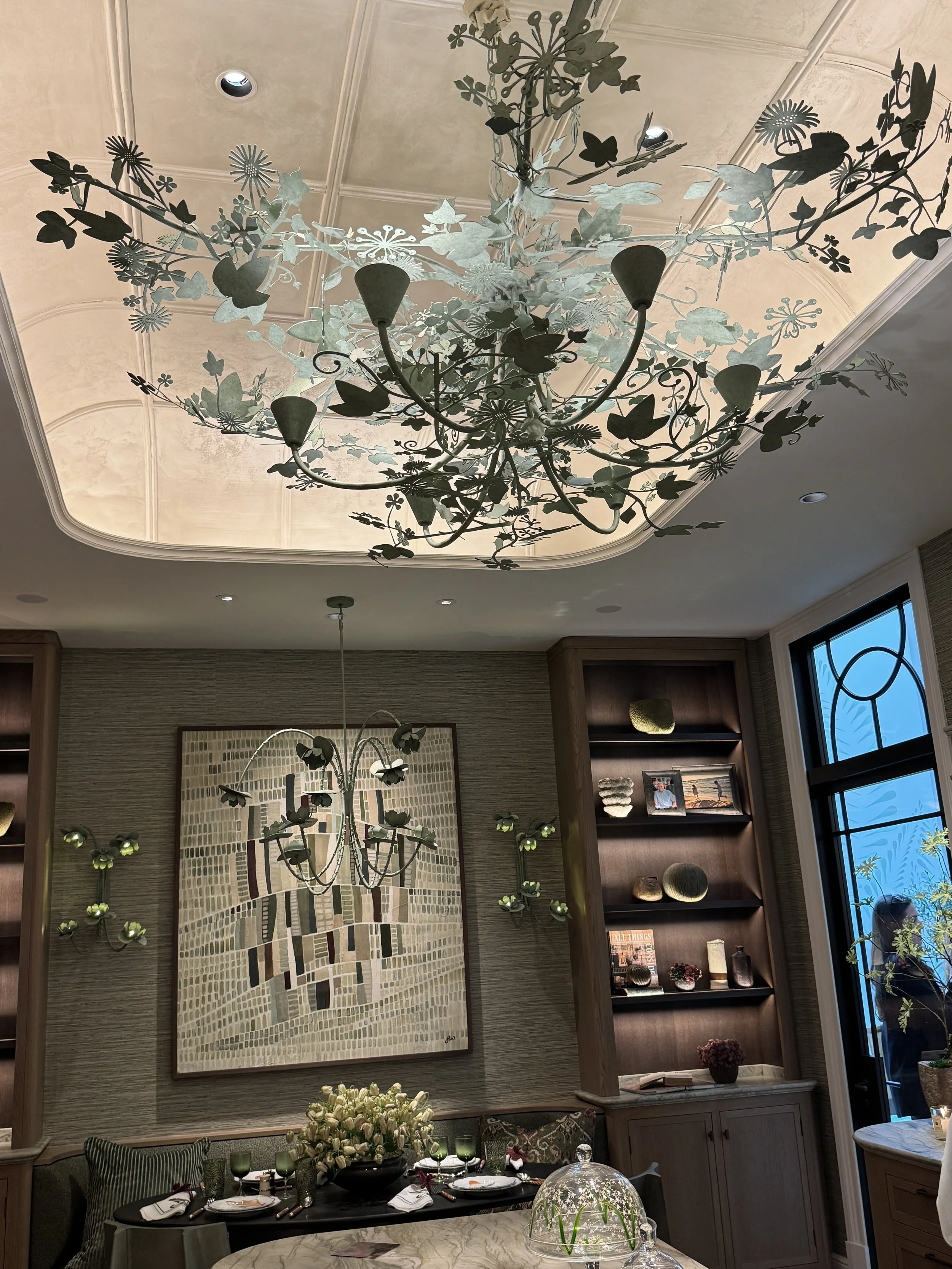
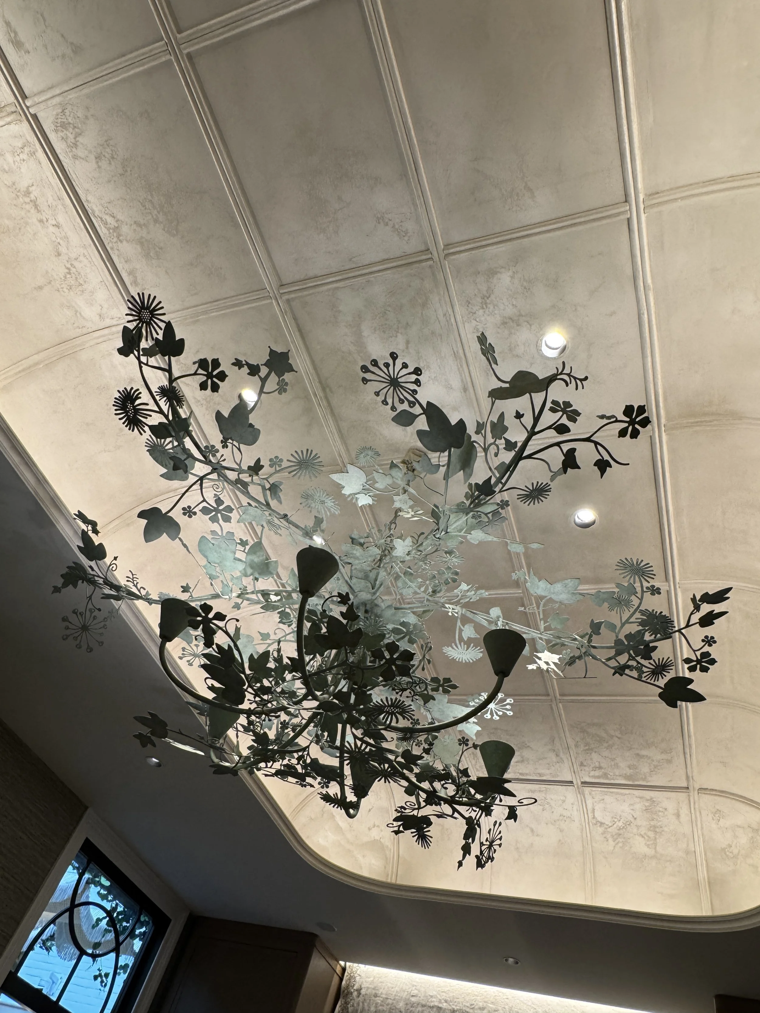
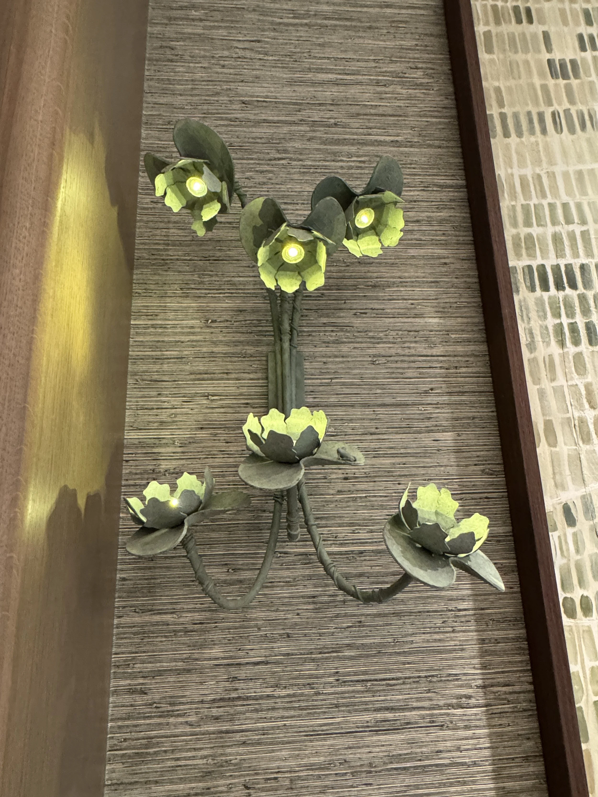
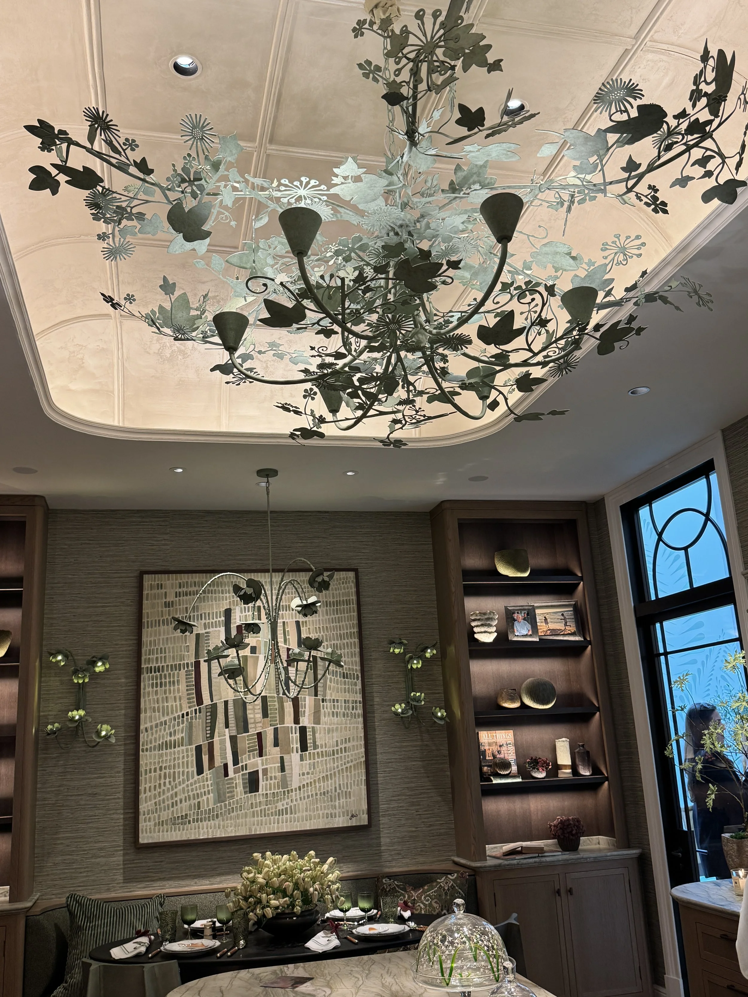
Above the island was the chandelier I have kept thinking about since my visit: the Ivy Shadow Chandelier by Tord Boontje for Porta Romana.
The light is made from delicate, hand-painted metal ivy, which twists around a central frame and casts botanical shadows across the ceiling when illuminated.
It is exactly the sort of light that makes you stop and look upwards rather than focusing only on the cabinetry below.
I have owned several pieces designed by Tord Boontje, including glassware and one of his Tyvek curtain panels, for around 20 years.
It was wonderful to see his work used here in a bespoke colourway as part of a new Porta Romana collection.
A large artwork above the dining table brought the entire room together. Its layered green, field-like shapes echoed the greens used elsewhere in the scheme.
It was a quietly glamorous kitchen and exactly the right room on which to finish the visit.
Perennials and Sutherland Garden Terrace by Fettle Design
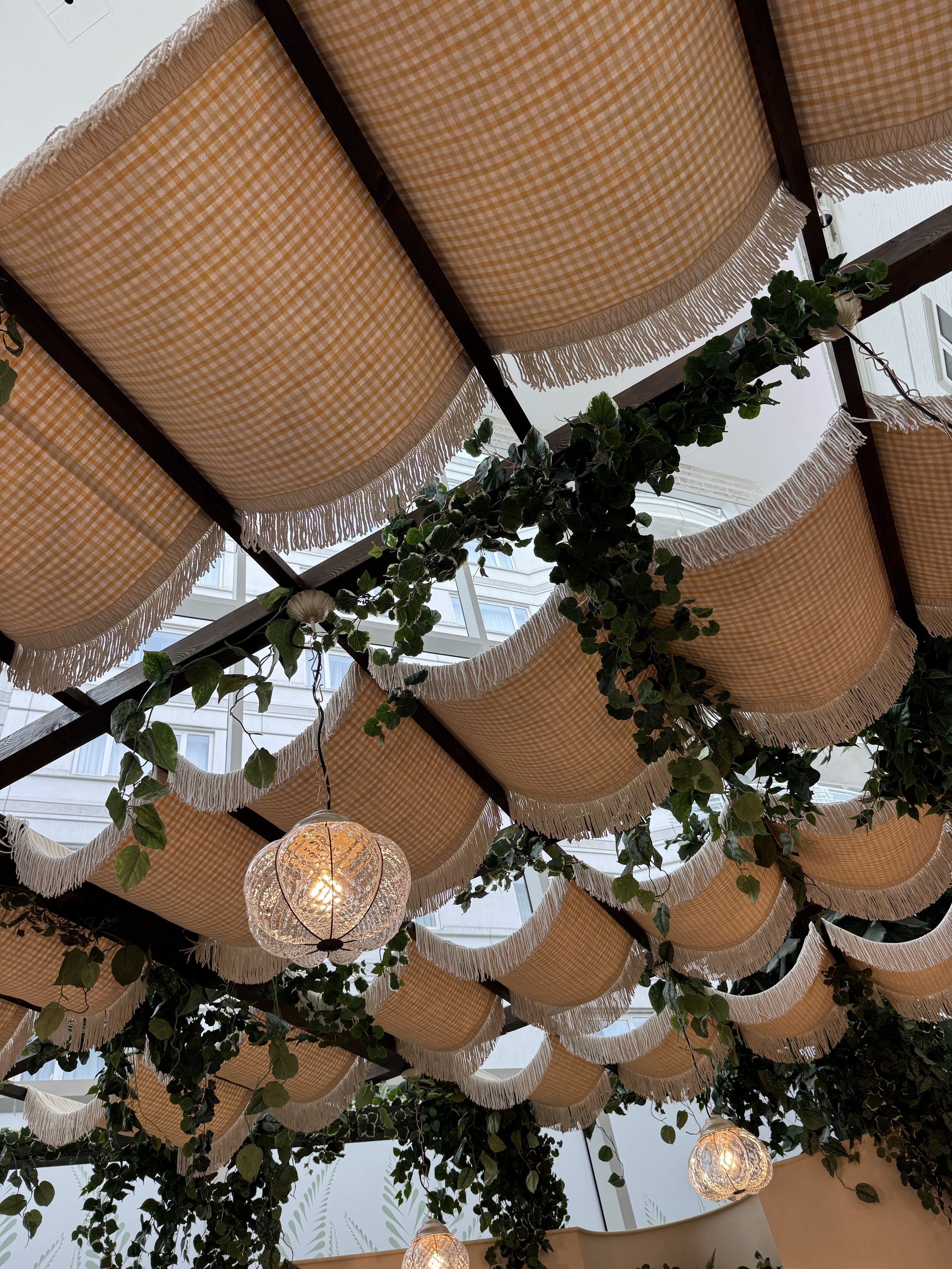
Life is Sweet
Fettle Design has conjured a romantic Italian terrace filled with the joyful spirit of relaxed Mediterranean living. Take a seat at Sutherland’s inviting furniture, upholstered in Perennials’ performance fabrics, at this immersive celebration of outdoor life
Final Thoughts
Five years into WOW!house, this was my first visit, and I am slightly ashamed that I had not been before.
It completely refreshed my sense of what is possible when a designer is given full creative freedom and the support of a serious luxury brand or supplier.
The ceilings alone were worth the trip.
What I found most valuable was not necessarily seeing complete rooms that I would recreate exactly as they were. It was discovering individual ideas, materials, finishes and small details that could be interpreted in a completely different way within a real home.
The fabric-panelled ceilings, concealed cocktail cabinets, upholstered walls, illuminated stone and carefully integrated technology all gave me ideas that I would love to explore on future projects.
Because work of this quality, from many of these particular designers, is so rarely available for the public to see, WOW!house is now firmly going into my calendar every year.